




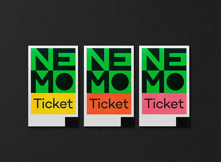
Studio Dumbar creates a new identity for NEMO science museum, which “functions like a beacon”
Each project by Rotterdam-based graphic design team Studio Dumbar is contemporary, effortlessly cool and most importantly, very coherent.
A recent example of the studio’s design flair is an identity redesign of the NEMO Science Museum, Amsterdam. “NEMO, housed in the landmark building designed by Renzo Piano, is famous for its innovative, joyful way to make science understandable for children in the age of six-14,” explains Studio Dumbar. “But not everyone knows that NEMO is also responsible for many other initiatives that make science and technology accessible for all generations.”
To address the multifaceted institution, the studio were asked to develop a new visual identity, shining a light on the museum’s many capabilities. “NEMO is the organisation behind, for instance, education programmes, festivals and online magazine Kennislink, the popular information source for students, teachers and many others,” they explain. “It’s also the organisation people can turn to, to stay up-to-date and understand what’s going on.”
To clearly direct an audience towards all the facilities NEMO can offer, Studio Dumbar found the answer in “a strong identity that intrigues, activates and surprises and strongly increases the visibility of NEMO”. In order for patrons to “find their way to NEMO”, Studio Dumbar has designed a clear logo in a bright green, that can even be seen from across the river the museum sits on. The logo is also used in multiple situations also: “The symbol is iconic; clear and instantly recognisable on all communication, from flags to online,” the studio explains. Additionally, when used in print, the logo is combined with clever colour combinations from pink to yellow, which offset its brightness slightly, but still remain punchy. “It functions like a beacon, just like NEMO itself.”
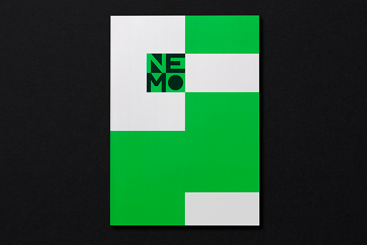
Studio Dumbar: NEMO Science Museum
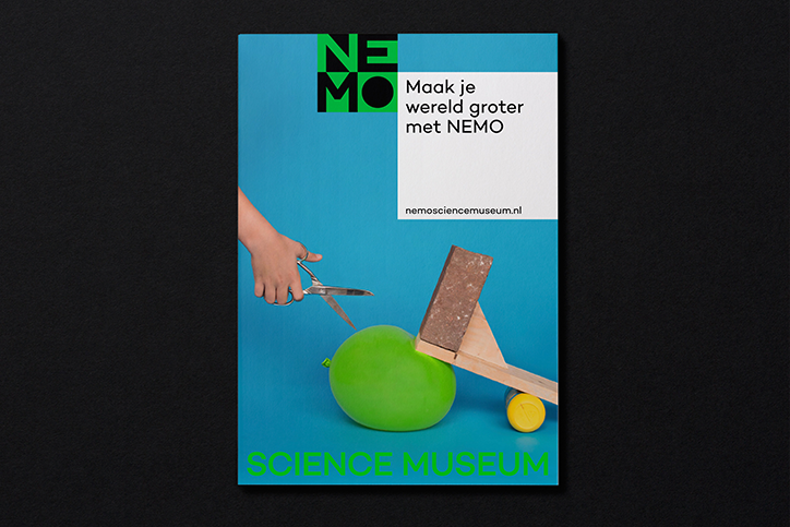
Studio Dumbar: NEMO Science Museum
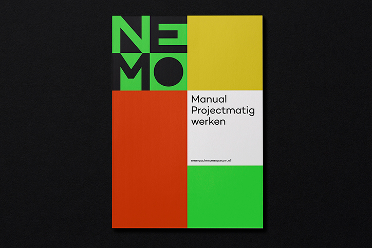
Studio Dumbar: NEMO Science Museum
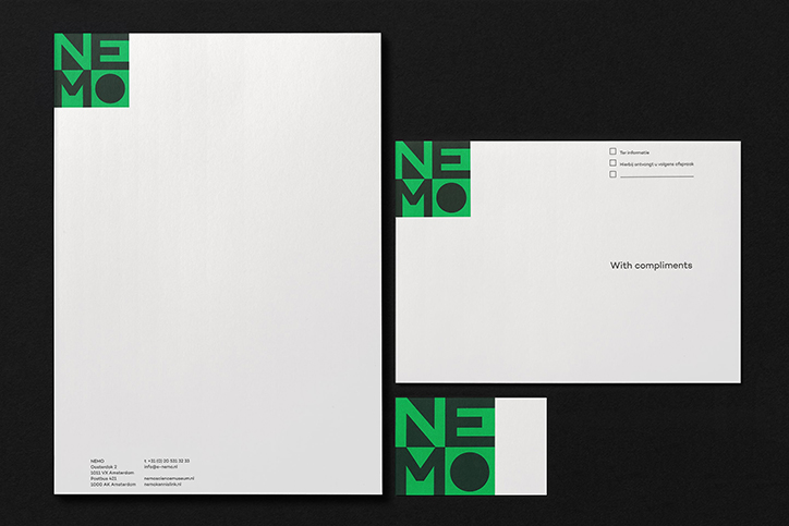
Studio Dumbar: NEMO Science Museum
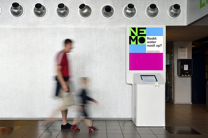
Studio Dumbar: NEMO Science Museum
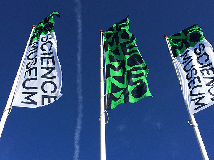
Studio Dumbar: NEMO Science Museum
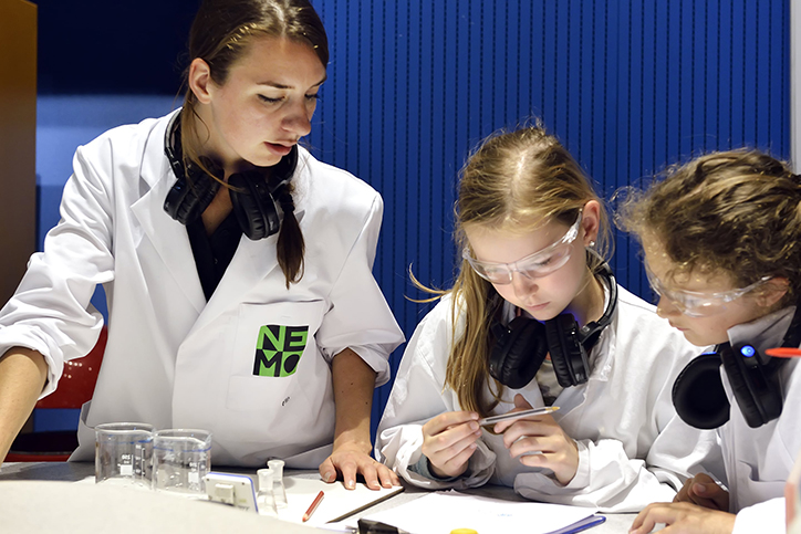
Studio Dumbar: NEMO Science Museum
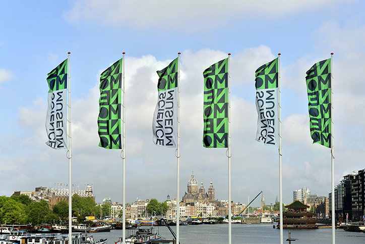
Studio Dumbar: NEMO Science Museum
Share Article
Further Info
About the Author
—
Lucy (she/her) was part of the It’s Nice That team from 2016–2025, first joining as a staff writer after graduating from Chelsea College of Art with a degree in Graphic Design Communication, eventually becoming a senior editor on our editorial team, and most recently at Insights, a research-driven department with It’s Nice That.



