
Studio Frith’s design system for Erotic Review imitates the body during arousal
The relaunched journal wants to meet new audiences – Frith has served up an identity that speaks to the universality of desire.
Art and literary platform Erotic Review has relaunched 26 years after it was first founded in 1997 as a bimonthly magazine. Designed and art directed by Studio Frith, the newly refreshed journal leads with graphic language that propels the concept of “give and take”, featuring suitably sensual work that straddles (ahem) the digital and physical.
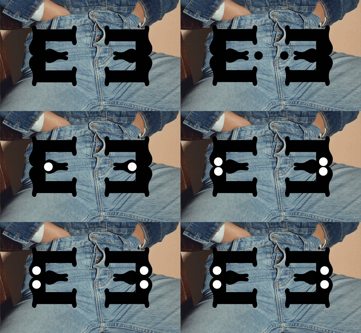
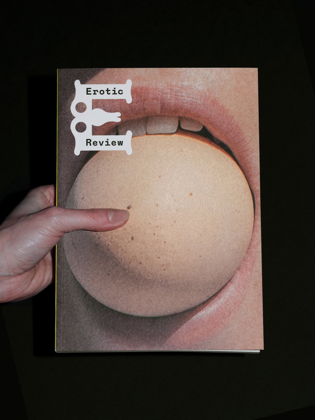
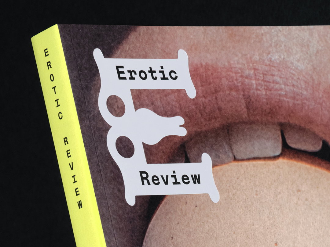
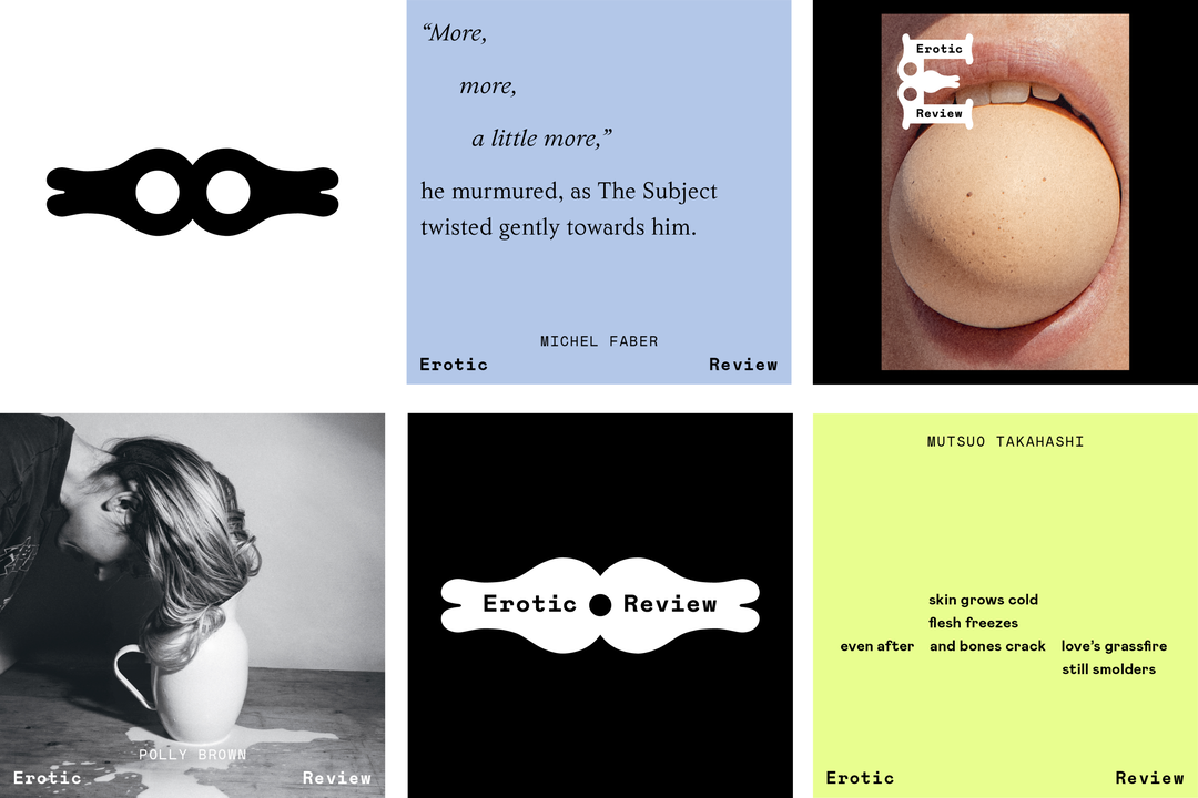
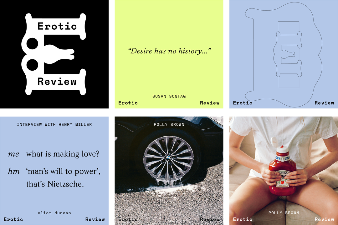
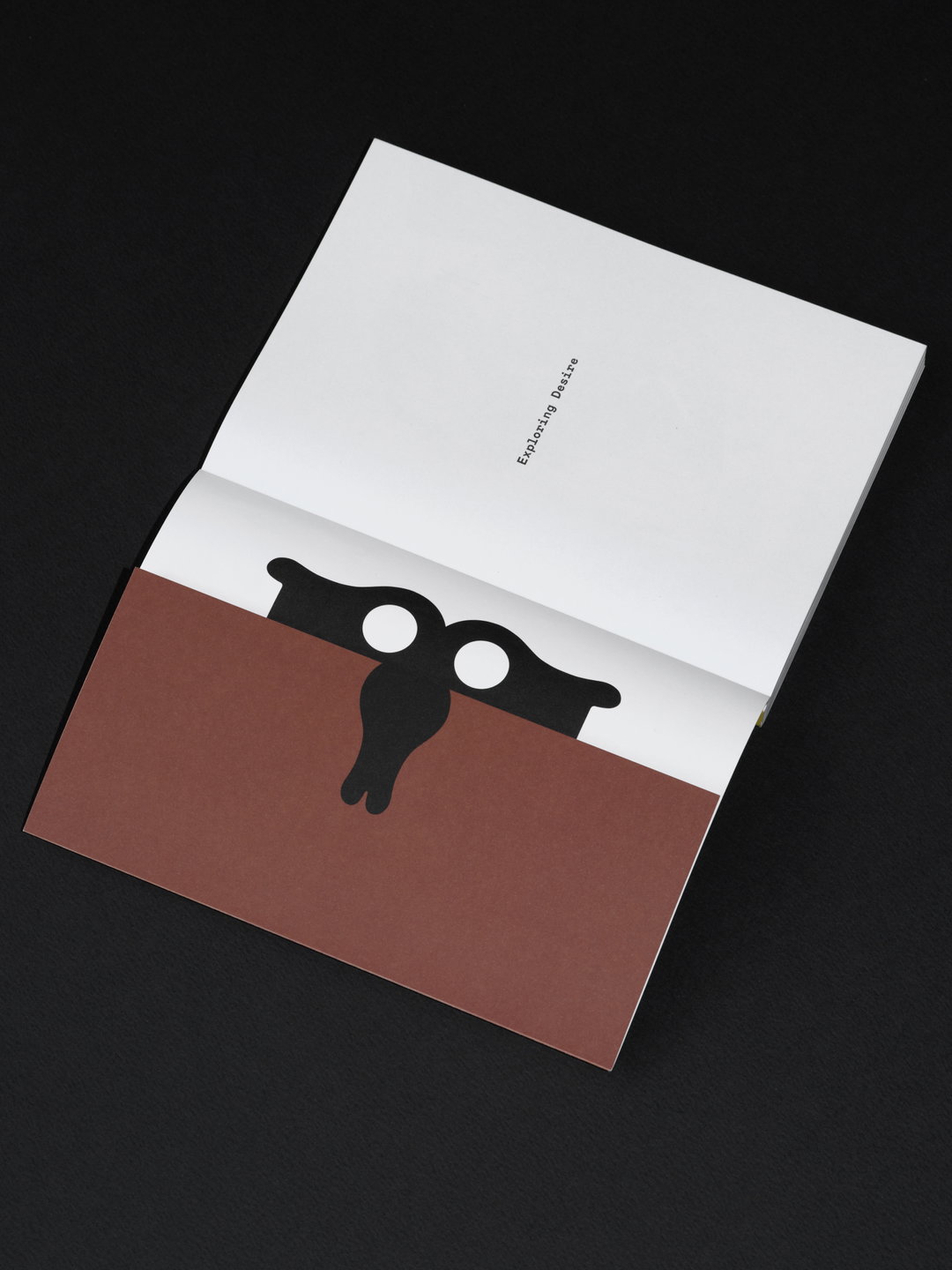
For the typeface and logotype, Frith mimics the physical changes that happen to the body during arousal. Sitting at the core of the rebrand is the E logotype, which acts as an “erotic symbol”, and in animated assets exchanges, pulsates, inhales, absorbs and releases. While you could argue the E is reminiscent of sexual organs and bodily forms, the rounded shape is purposefully “abstract” and “fluid” in both form and behaviour, representing the idea that “desire is fundamental to all creatures”, says Frith Kerr, founder of Studio Frith.
The custom typeface that sits within the E and permeates the rest of the identity is called Give and Take, its more graphic, angular form complementing the fleshy serifs of the E. Adjoined to the typeface and logotype is a series of illustrated “emblems” which feature throughout the website and publications which, “become vessels for title pages, play with headings, interrupt and punctuate what is written”.
Studio Frith: Erotic Review (Copyright © Studio Frith, 2024)
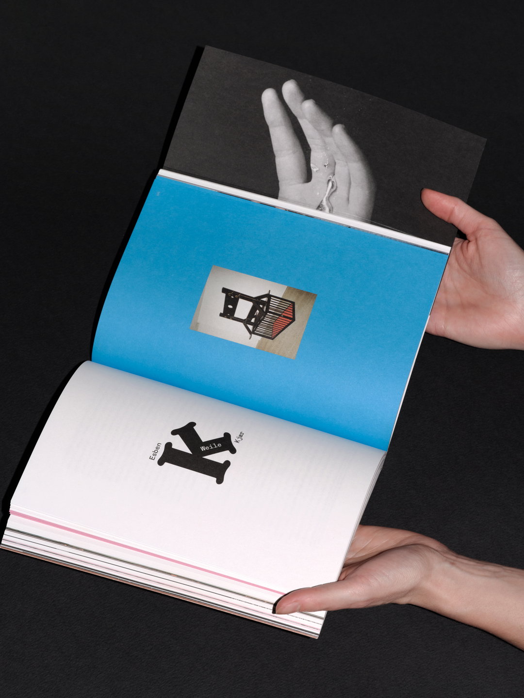
When it came to the physical publication, Frith mirrored the core ethos of the journal and created something “desirable”. Made textually and physically engaging with thick pages, pull out flaps and inserts, and an effective balance of words and imagery, the form invites further exploration. “Making something desirable in design is fundamental – not just a beautiful lamp or hotel room, but in wayfinding – the desire to be seen: a book jacket, the desire to be opened,” says Frith.
This was helped along by the commissioning of photographer Polly Brown for the first edition of the relaunch, whose work is “primarily erotic, but in explicit ways”, says Frith. The front cover is adorned by her image of an egg placed in an open mouth, while other double spread moments show a ketchup bottle placed in between open legs, and the residue of soapy cleaning water dripping from the wheel of a car. “Desire runs through all her work, in the way she playfully inspects the everyday,” Frith continues. “She manages to capture the human mood in modernity and transforms the still into something living.”
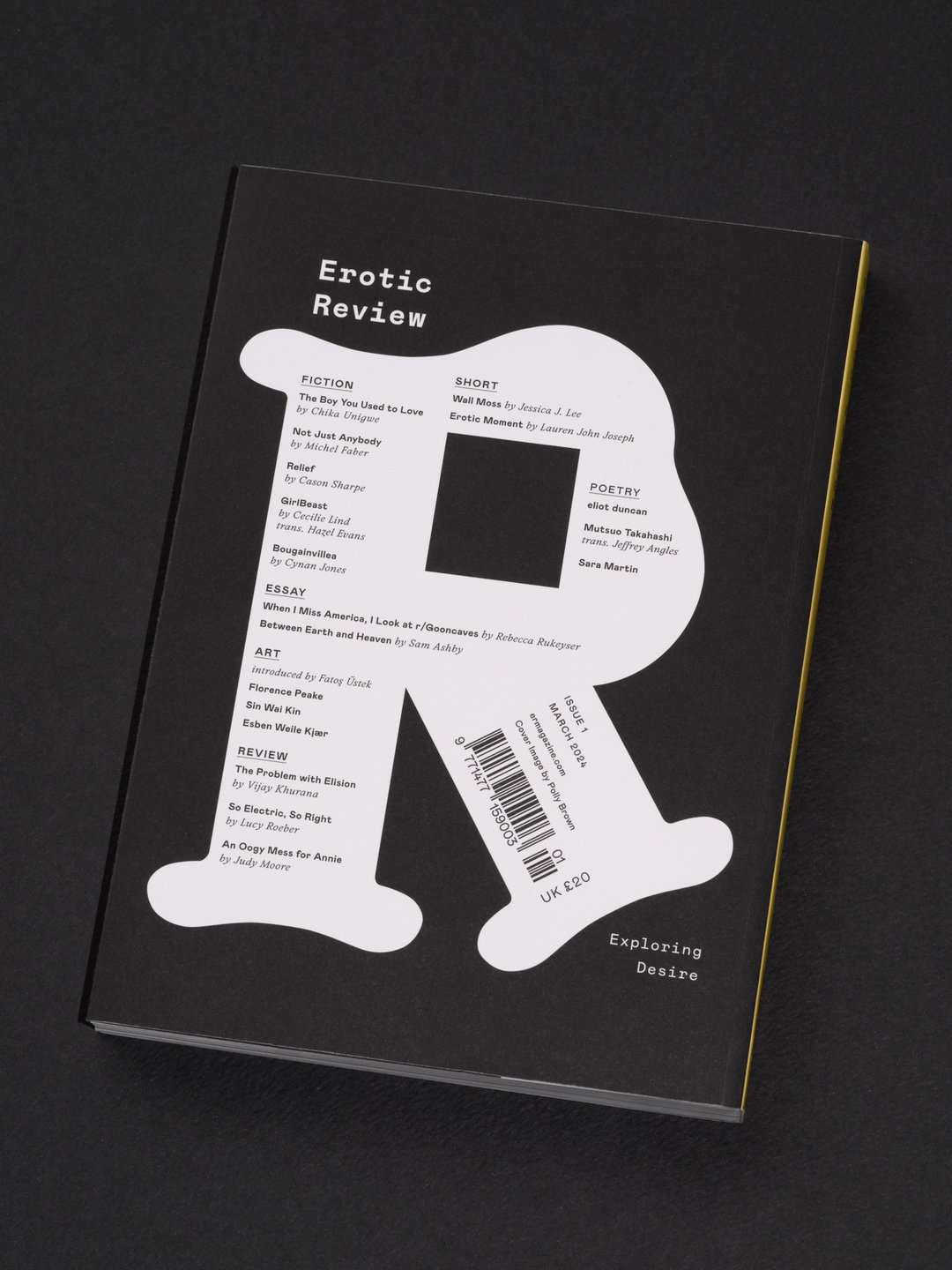
The relaunched review is edited by Lucy Roeber and Saskia Vogel and aims to tread new paths, speaking to a “larger, more diversified audience”, Frith says. Each issue is set to be curated by an art editor and will feature poetry and essays from writers across the world, established and emerging. The first edition is curated by Fatoş Üstek, curator of the 2023 Frieze sculpture park, features art from Florence Peake, Sin Wai Kin and Esben Weile Kjaer, and includes writing from Michel Faber, Vijay Khurana, Cynan Jones, Chika Unigwe and more.
GalleryStudio Frith: Erotic Review (Copyright © Studio Frith, 2024)
Hero Header
Studio Frith: Erotic Review (Copyright © Studio Frith, 2024)
Share Article
Further Info
About the Author
—
Olivia (she/her) is associate editor of the website, overseeing the day-to-day editorial projects as well as Nicer Tuesdays events. She joined the It’s Nice That team in 2021. ofh@itsnicethat.com
To submit your work to be featured on the site, see our Submissions Guide.