Studio Herrström gives disruptor music label a lightning logomark and palette made of milkshake flavours
Drawing on the familiar forms of car window stickers, Studio Herrström’s gives music label Milkshake the visual structure it needs to scale.
Share
The music label Milkshake was made to be a little bit of a disruptor in the industry, favouring a more artist-first approach through its part-label-part-mangagement set up, whilst also having the structural backing to support artists due to it being a division of Sony Music Entertainment. The Stockholm-based label has only grown since its founding in 2019, and with its increasing roster of alternative pop artists, Milkshake was in need of a visual shakeup of its own.
It turned to Studio Herrström, the Viennese design agency that has translated the upstanding intention of the label’s founding and its progressive everyday approach to artists into a brand that feels incredibly punchy and, equally, grounded. It feels both extra and ordinary; harbouring a satisfying graphic tension between default, commonplace visual cues and florid forms.
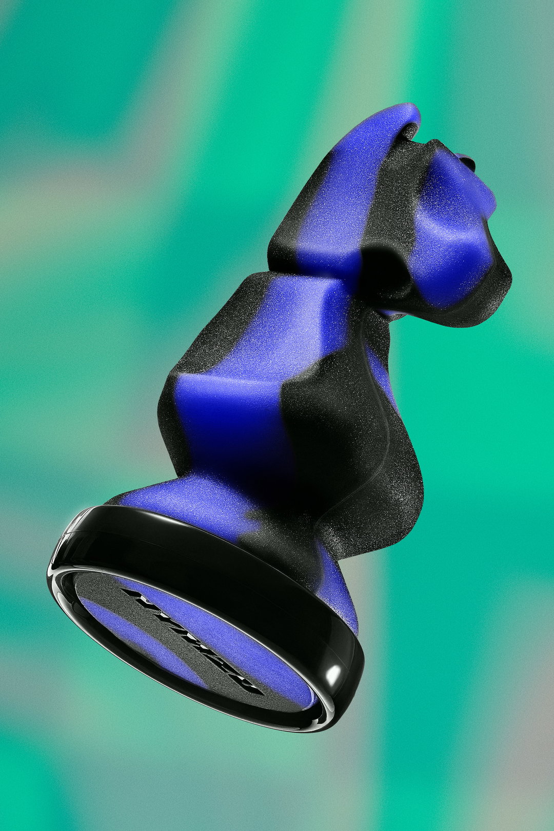
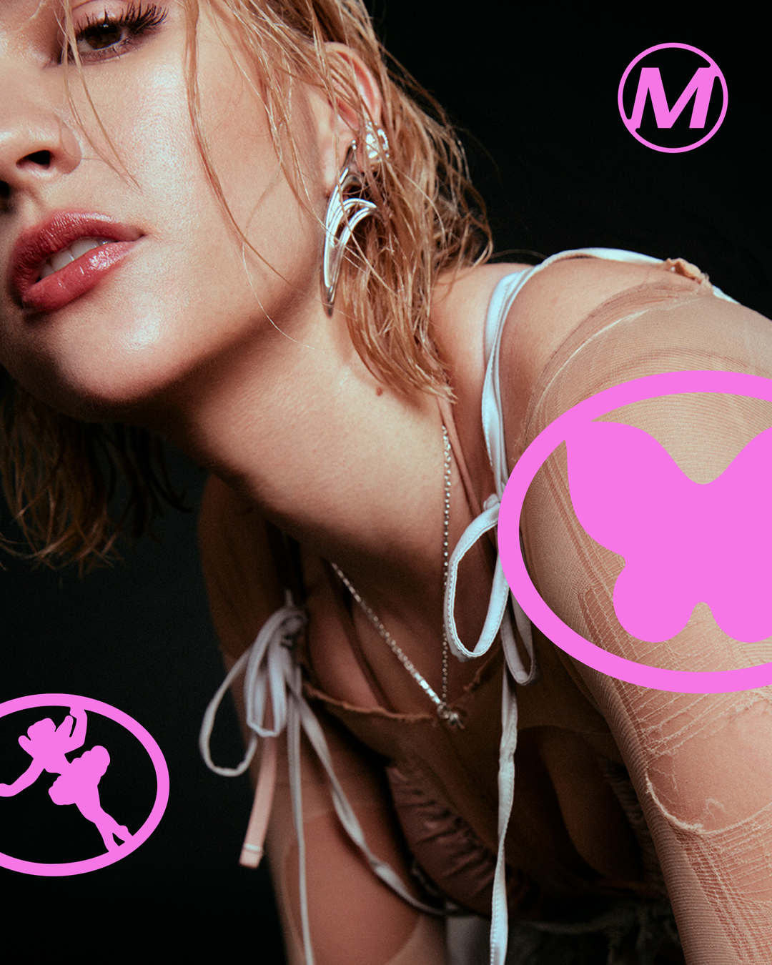
GalleryStudio Herrström: Milkshake (Copyright © Studio Herrström, 2026)
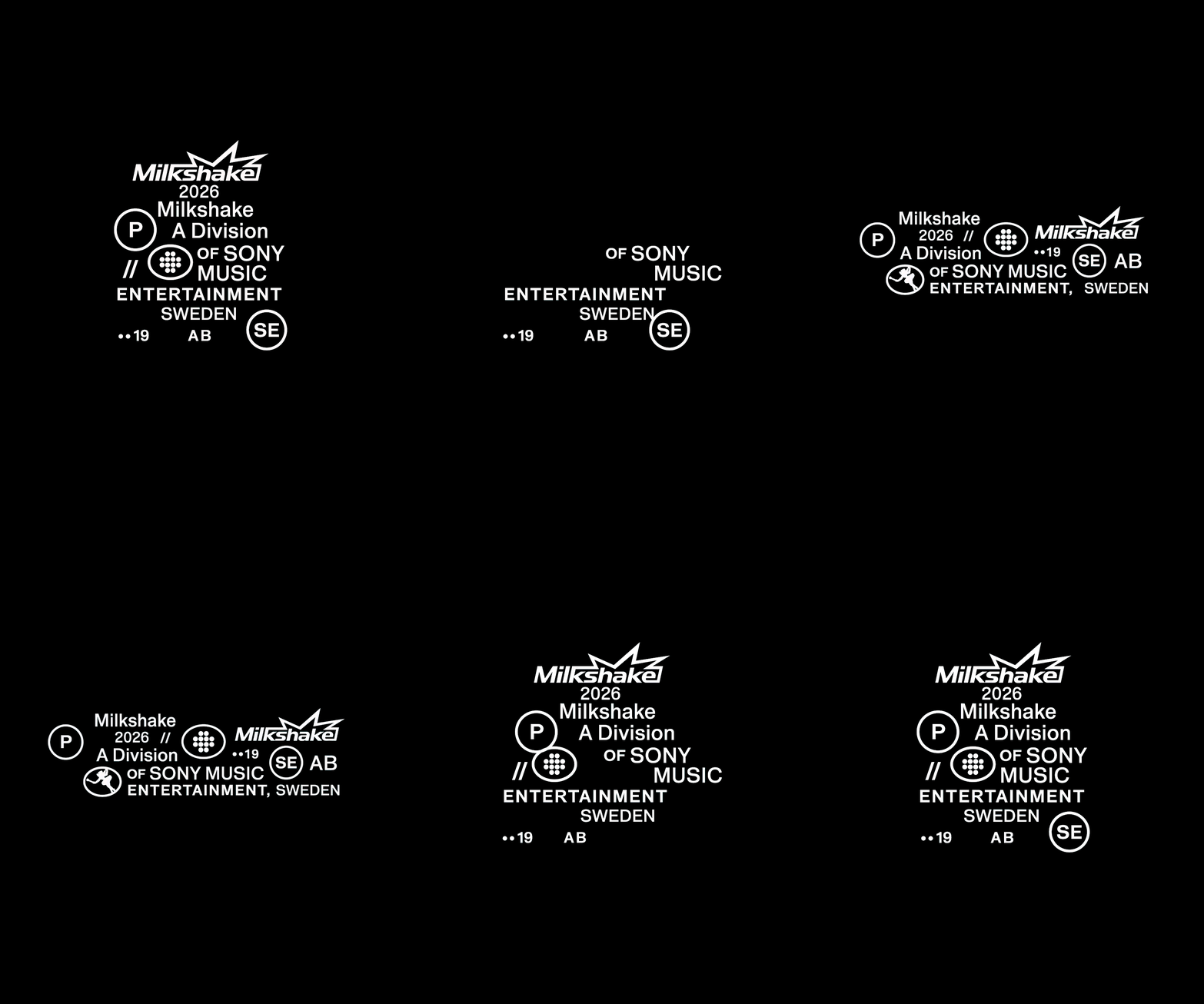
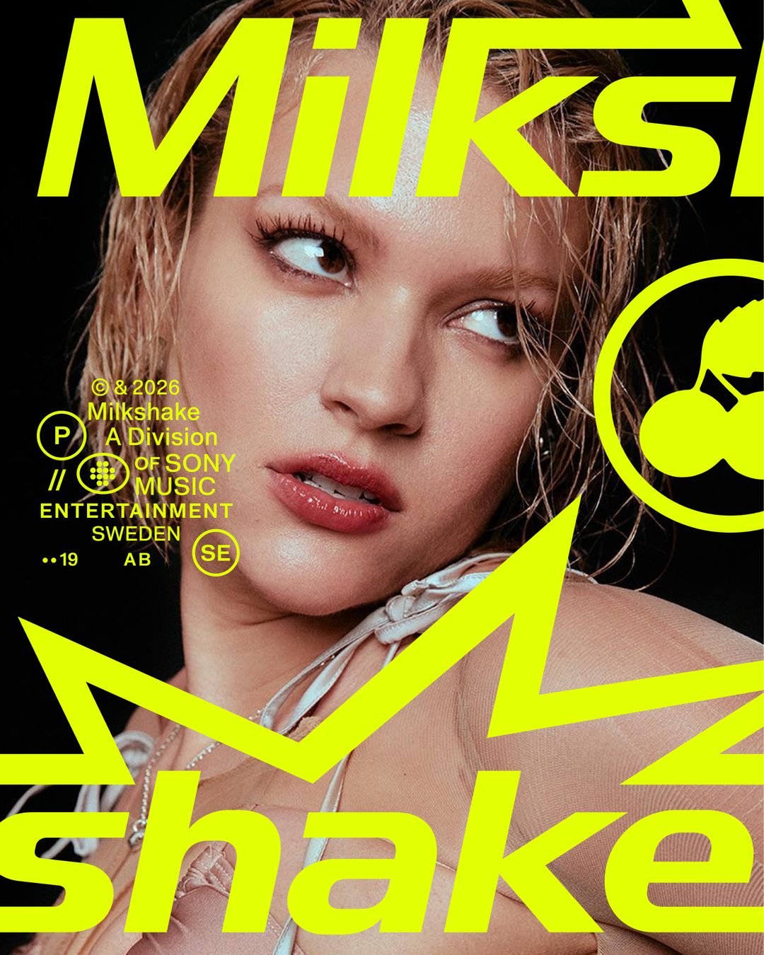
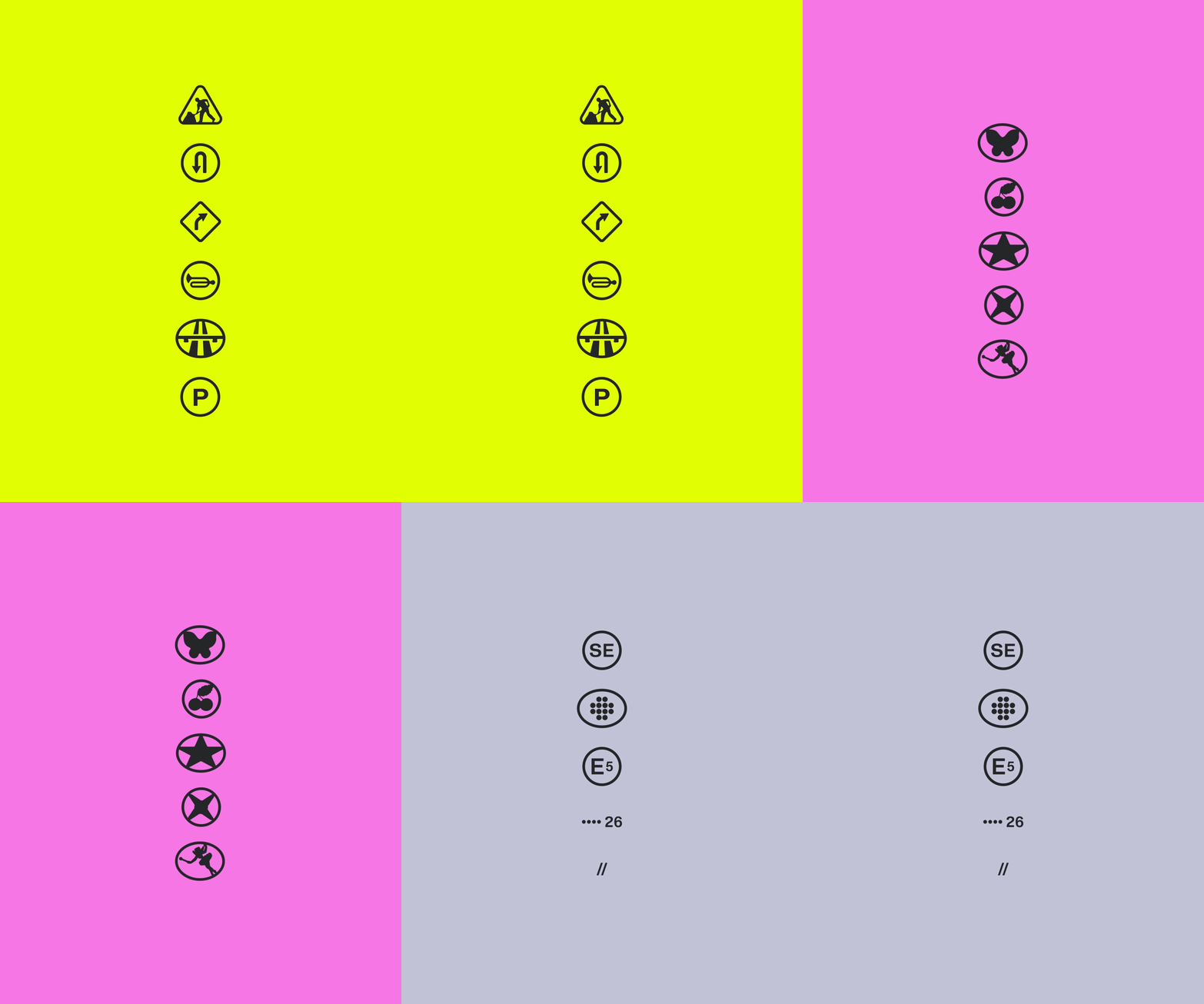
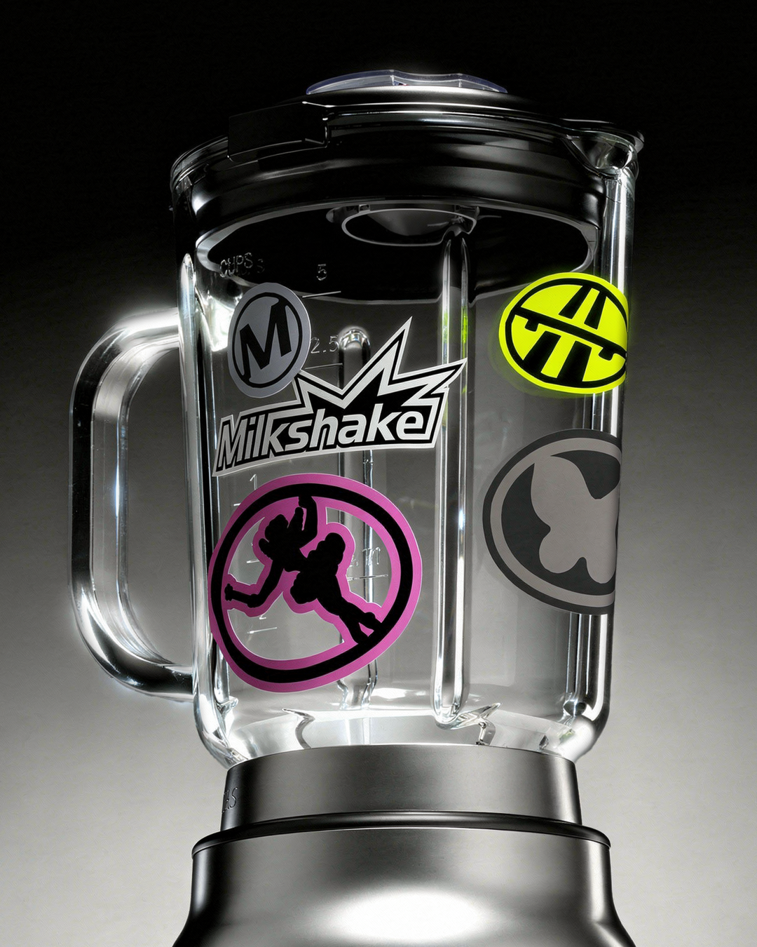
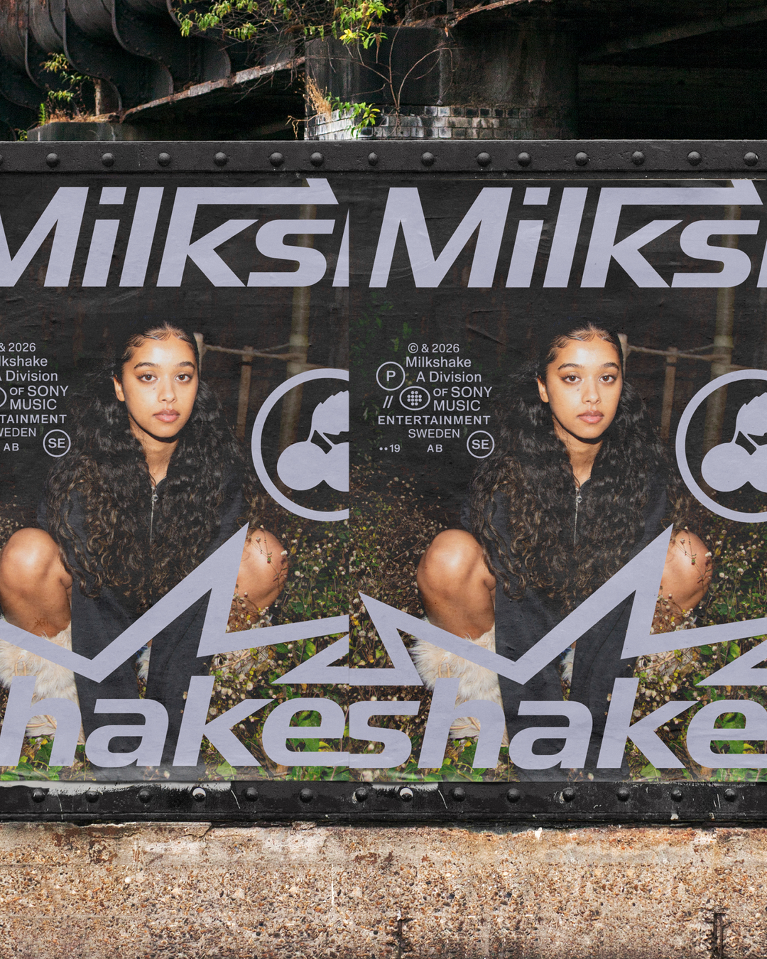
This contrast comes directly from the label’s origin story, with its namesake being first suggested by the founding team during a drive. From that point on, the car became a recurring motif throughout the brand, playing on the colloquial terminology of taking new music for a spin and Milkshake’s spry energy as a label. Car window stickers soon became key influences on Studio Herrström’s approach to the identity, where it opted for Context Type’s neo-grotesque, Gates, as the primary typeface. Both the typeface’s form and the structural lockup of Milkshake’s graphic language speak to these oh-so familiar stickers – stalwarts of childhood trips staring out the window – along with road sign-inspired iconography that pops up throughout the brand too.
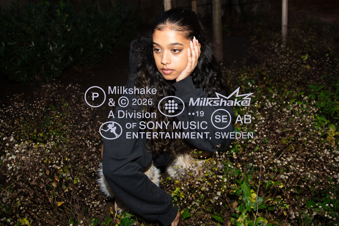
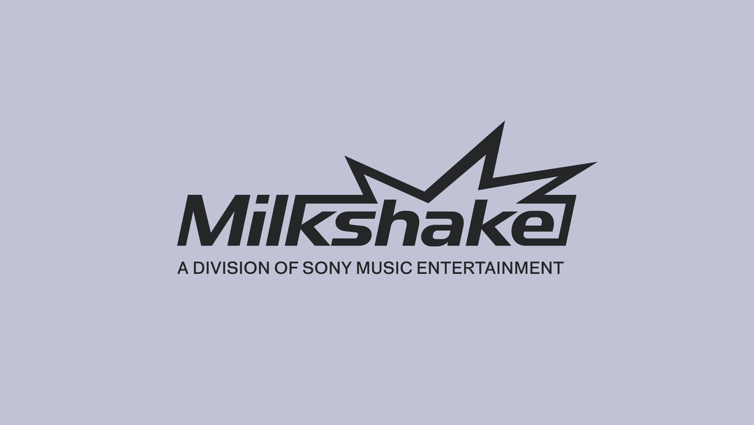
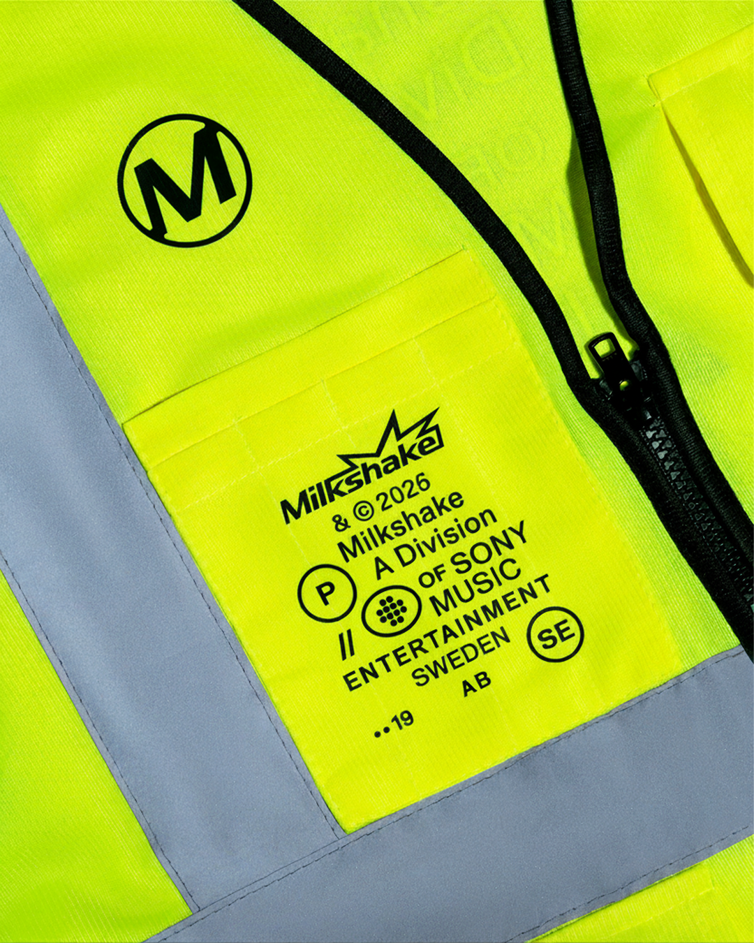
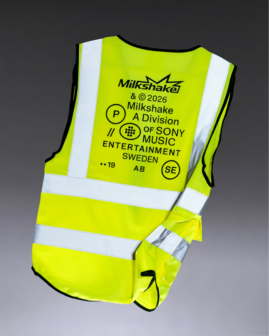
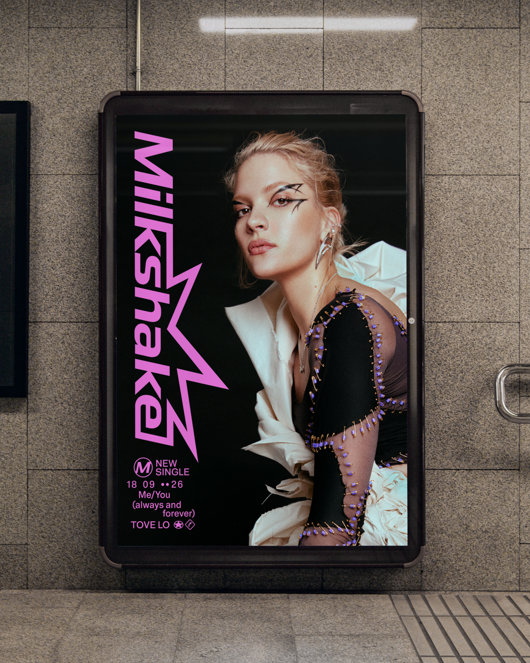
The brand’s familiar feeling extends to its use of colours. Studio Herrström kept the vibrancy associated with the label’s previous identity but skewed the tones to reference milkshake flavours, further associations of which the studio embedded into the logomark. Making a splash, so to speak, Studio Herrström’s lightning-like logomark channels the kinetic vibe of the label whilst feeling fluid, becoming an embodiment of the wider brand’s visual philosophy. In execution, the brand has real energy and mobility behind it, but is equally grounded in simplicity and structure. As Milkshake continues to evolve, the architectural nature of the identity, coupled with its razzle-dazzle, will mean it can support both artist and agency alike as it scales.
GalleryStudio Herrström: Milkshake, Case Study Photography: Goda Kraštinaitytė (Copyright © Studio Herrström, 2026)

Hero Header
Studio Herrström: Milkshake (Copyright © Studio Herrström, 2026)
Share Article
Further Info
About the Author
—
Hailing from the West Midlands, and having originally joined It’s Nice That as an editorial assistant in March 2020, Harry is a freelance writer and designer – running his own independent practice, as well as being one-half of the Studio Ground Floor.