




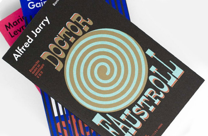
The consistently great Studio Laucke Siebein strikes again
There is no doubt that the work of Studio Laucke Siebein is consistently outstanding. Made up of Dirk Laucke and Johanna Siebein this power duo of design are responsible for some of the finest identities, typefaces and magazines to date. Basically, this pair have got it all. In this instance however, it is their identity and further book design for new Dutch publishers Bananafish that caught our eye.
Bananafish are also everything you would want a young publishers to be. It is dedicated to producing literature never before available in Dutch, with its company statement being, ‘Oddly Enough Never Translated’. It’s selection so far mixes the classics, and the very odd. Its decision to partner with Studio Laucke Siebein is especially exciting, it declares a clear contemporary voice, but one that is unafraid to call upon the classics when relevant.
For the Bananafish identity Dirk and Johanna evidently took note of the tongue-in-cheek nature of its name, illustrating a bananafish of their very own. This neat little creature sits amongst all their books (whether it be a very serious piece of literature or not), and is the perfect example of what Studio Laucke Siebein does best, they make work that could that could otherwise appear intimidating but is cheerfully accessible.
This is the same for the book designs Dirk and Johanna have produced so far. Each cover is designed in a range of complementary colours, often combinations that appear slightly nostalgic, often reflecting the time in which the book was originally published. On top of this Studio Laucke Siebein have additionally designed a publication in which the first eight books released are discussed and extracts are revealed, in it’s very own “book about books”.
It is Studio Laucke Siebein’s evident understanding of these publishers that makes this design so pertinent and precise. It is a partnership that we hope continues for a long long time.
Studio Laucke Sieben: Corporate Identity for Bananafish
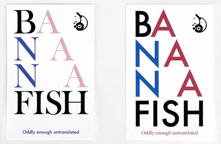
Studio Laucke Sieben: Corporate Identity for Bananafish
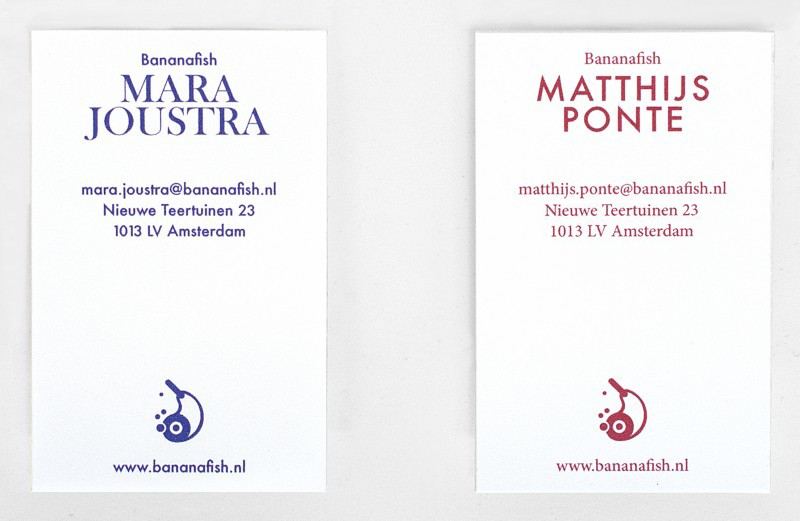
Studio Laucke Sieben: Corporate Identity for Bananafish
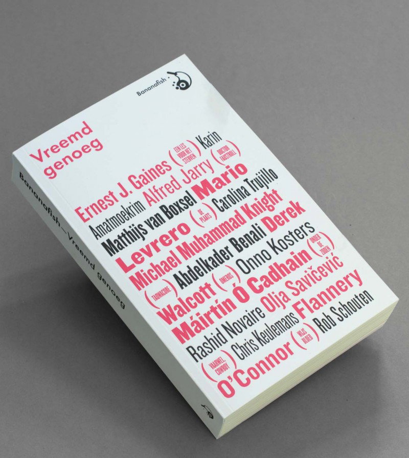
Studio Laucke Sieben: Vreemd genoeg. Published by Bananafish.
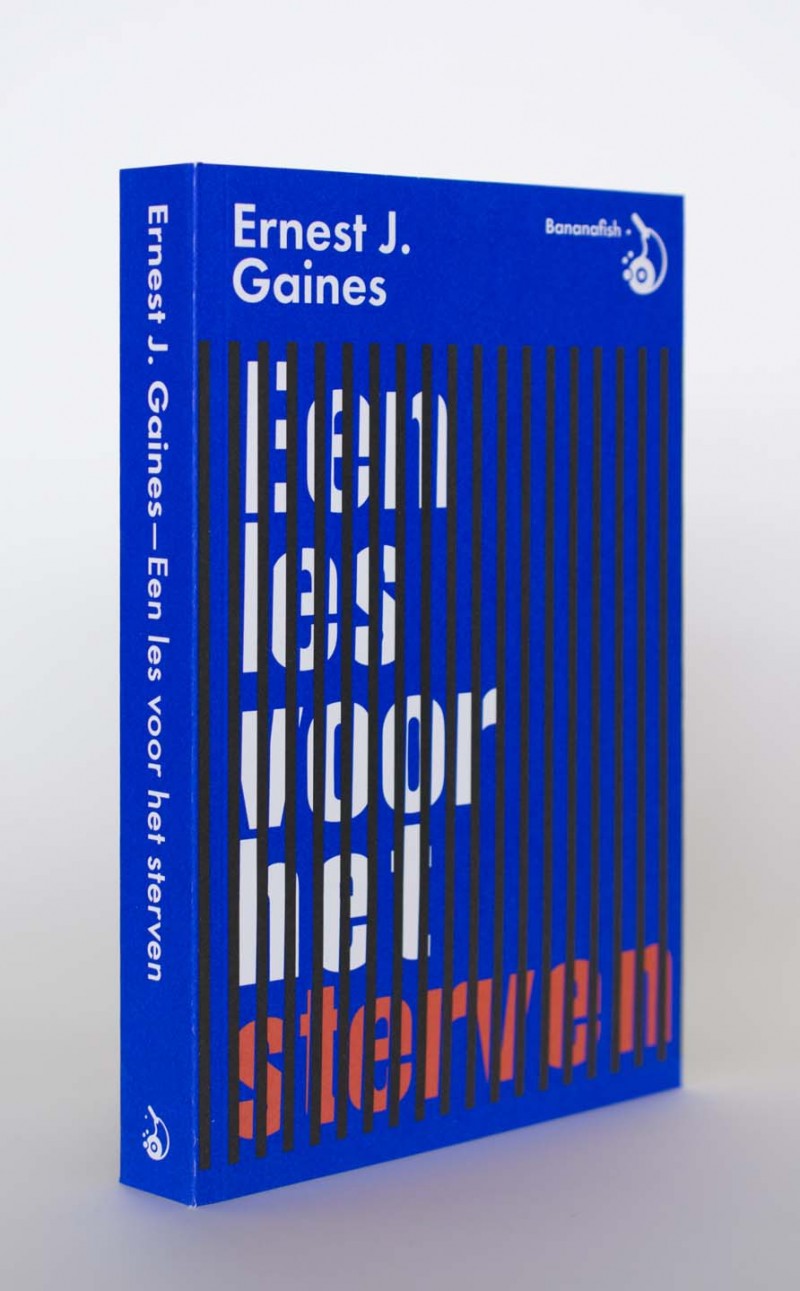
Studio Laucke Sieben: Een les voor het sterven by Ernest J.Gaines. Published by Bananafish.
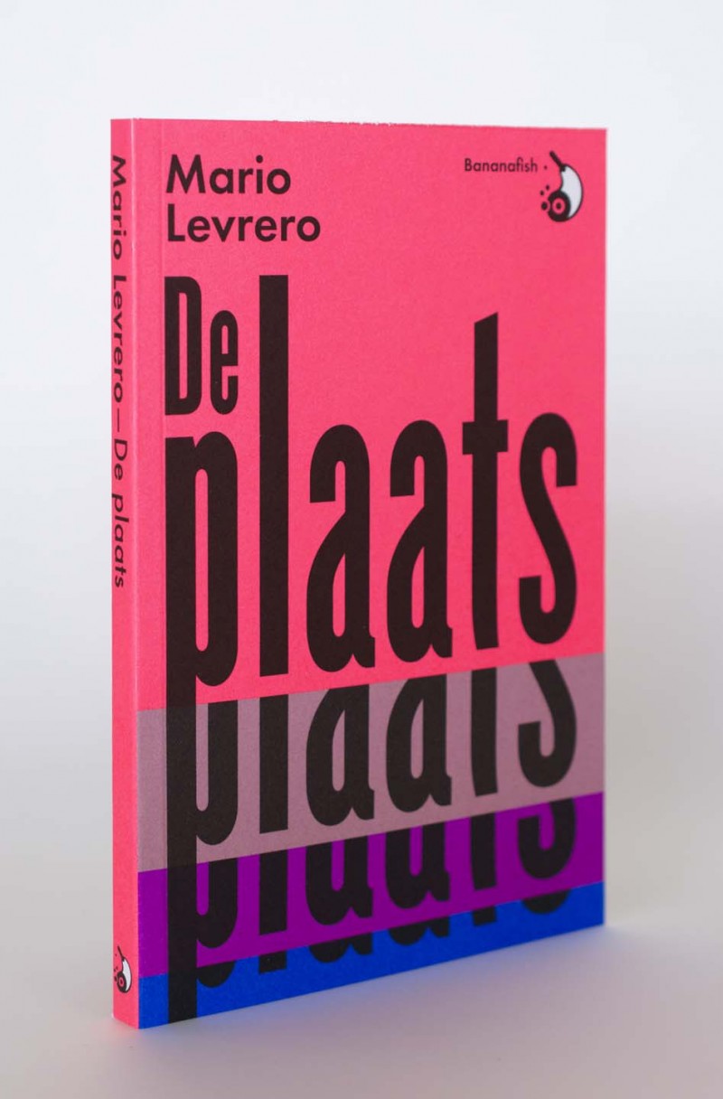
Studio Laucke Sieben: De Plaats by Mario Levrero. Published by Bananafish.
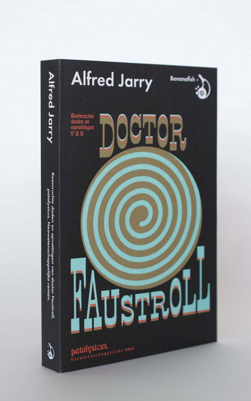
Studio Laucke Sieben: Doctor Faustroll by Alfred Jarry. Published by Bananafish.
Share Article
Further Info
About the Author
—
Lucy (she/her) was part of the It’s Nice That team from 2016–2025, first joining as a staff writer after graduating from Chelsea College of Art with a degree in Graphic Design Communication, eventually becoming a senior editor on our editorial team, and most recently at Insights, a research-driven department with It’s Nice That.



