Launch Recite Me assistive technology
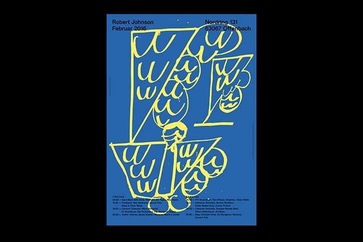
A blue poster featuring bold, yellow abstract line drawings that resemble stylised letters or shapes. Text at the top reads “Robert Johnson”, “Februar 2016” and an address in “Offenbach”.

Studio Michael Satter’s sophisticatedly simple graphic design portfolio

—
Date
16 March 2017

Michael Satter and his Frankfurt-based studio of the same name cover a range of disciplines within graphic communication. Visual identities, books and publications, exhibition design, signage, art direction, editorial design and websites for national and international clients – the list is vast and the work is impressive.

Acting like a chameleon of graphic design, Michael’s practice regularly collaborates with others. One project in particular, a poster series for the Robert Johnson Club in Offenbach, sees Michael and illustrator Tom Król: Robert Johnson Club create a regular combination of illustration and design. “For many years Robert Johnson Club didn’t use any print advertising like monthly posters or flyers,” Michael tells It’s Nice That. “In 2016 the club’s management decided to be more visible in public space.” Michael and Tom’s series displays a bold illustration style in a palette of primary colours. Their composed but relaxed approach to the series certainly stands out from the crowd of posters on subway systems. Each month Tom delivers a new artwork, while Michael concentrates on the typography, often using Dinamo Oracle, and the composition.

Michael’s collaborations also stem further back than just a year prior. Since 2009 the designer has created artworks for labels Live At Robert Johnson, Hivern Discs, Die Orakel and Rivotan Records. “I have a long-time passion for electronic music, my cover artworks reflect the identity of the artist, and reference to the tracks on the record.” These sleeves are sophisticatedly contemporary, simplistic designs that incorporate print, photography and illustration. On the surface their design appears simple, but the exemplary layouts are far from simple to create.
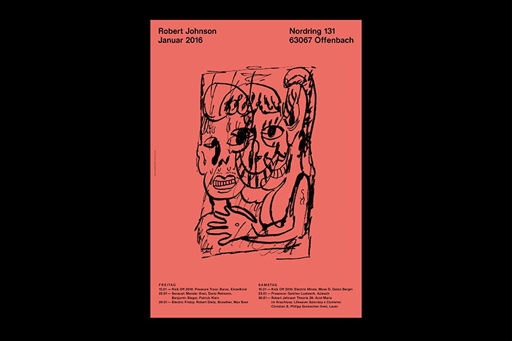
A poster on a red background featuring a black line drawing of a distorted, surreal face. Text at the top reads “Robert Johnson Januar 2016” and “Nordring 131 63067 Offenbach”. A list of dates and performers is printed at the bottom.
Above

Studio Michael Satter and Tom Król: Robert Johnson Club
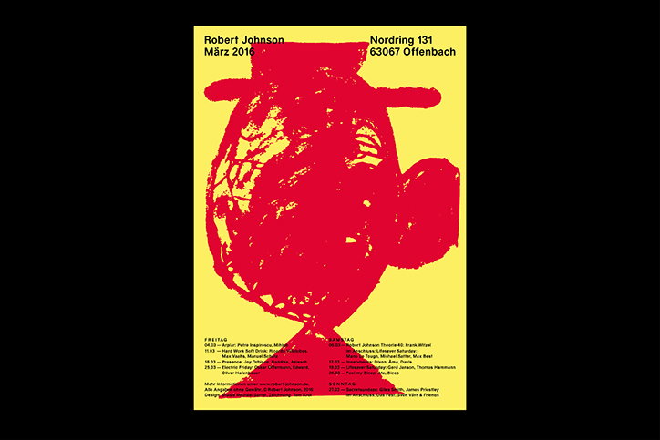
A red graphic poster on a yellow background features a distorted, textured figure. Text at the top reads “Robert Johnson”, “März 2016” and an address in “Offenbach”. A detailed schedule of events and names is listed across the bottom.
Above

Studio Michael Satter and Tom Król: Robert Johnson Club
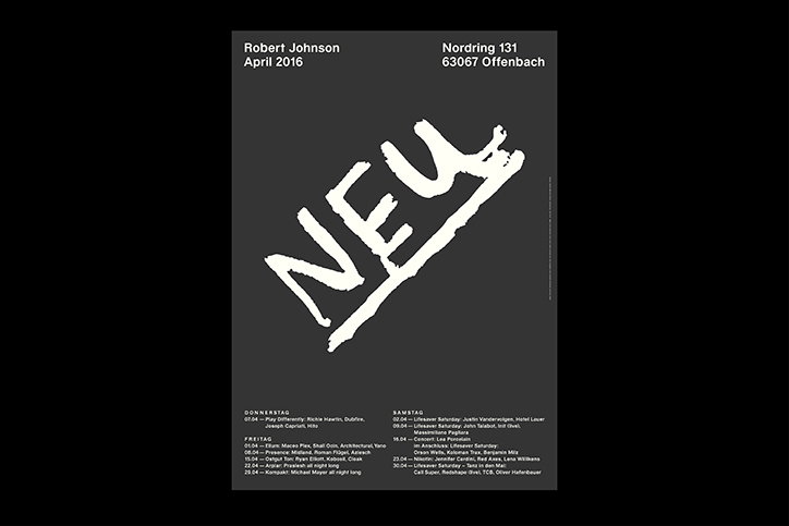
A black and white poster for “Neu” featuring a large, gestural white wordmark across the centre. Text at the top lists “Robert Johnson”, “April 2016” and an address in Offenbach. A detailed line-up of artists and dates is listed at the bottom.
Above

Studio Michael Satter and Tom Król: Robert Johnson Club
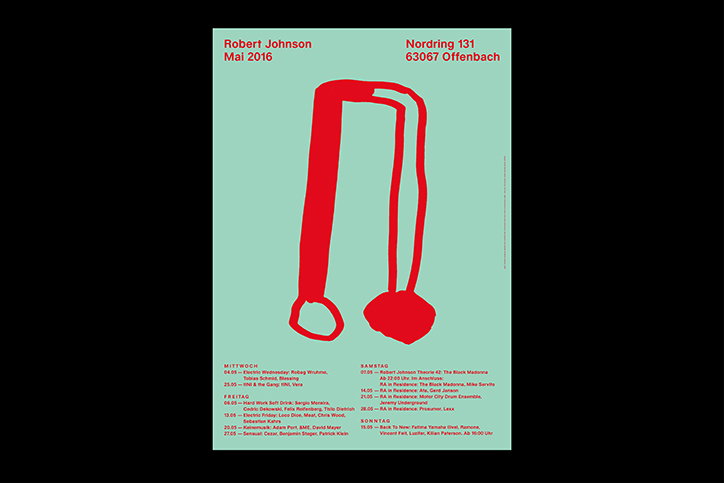
A poster on a pale green background features a red, abstract line drawing of a figure. Text at the top reads “Robert Johnson Mai 2016” and “Nordring 131 63067 Offenbach”. Two columns of event listings and dates are printed in red at the bottom.
Above

Studio Michael Satter and Tom Król: Robert Johnson Club
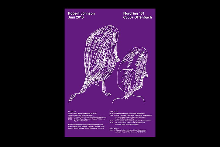
A purple poster featuring two white line drawings of figures facing each other. Text at the top reads “Robert Johnson Juni 2016” and “Nordring 131 63067 Offenbach”. Detailed event schedules for Friday, Saturday and Sunday are listed at the bottom.
Above

Studio Michael Satter and Tom Król: Robert Johnson Club
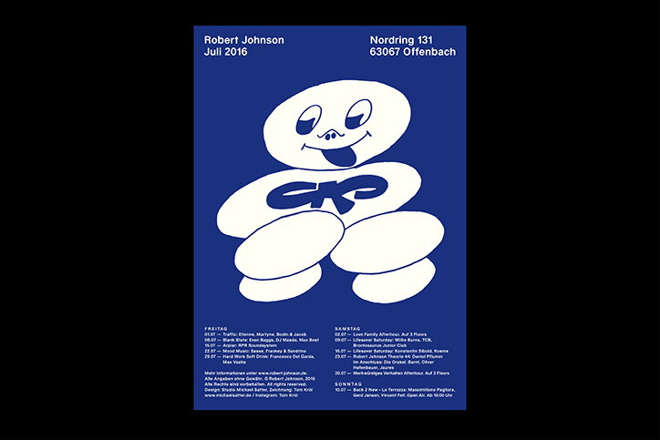
A blue and white poster featuring a stylised, cartoonish figure with a tongue poking out. The figure has the letters “CKP” written across its chest. Text at the top reads “Robert Johnson Juli 2016” and “Nordring 131 63067 Offenbach”. A detailed event schedule is listed at the bottom.
Above

Studio Michael Satter and Tom Król: Robert Johnson Club
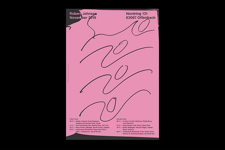
A pink poster for Robert Johnson features a large, abstract black line drawing that loops across the page. Text at the top reads “Robert Johnson November 2016” and “Nordring 131 63067 Offenbach”. At the bottom, two columns list event dates and performers under the headings “Freitag” and “Samstag”.
Above

Studio Michael Satter and Tom Król: Robert Johnson Club
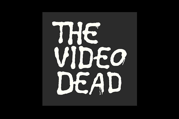
White, dripping text on a dark grey background reads “THE VIDEO DEAD”. The letters have a rough, distorted quality.
Above

Studio Michael Satter: Chinaski, The Video Dead
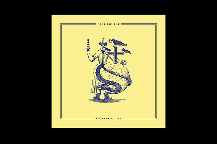
An illustration of a crowned figure standing beside a globe wrapped in a snake. The figure holds a string of beads and stands next to a cross with two birds perched on it. Text at the top reads “Fort Romeau” and text at the bottom reads “Secrets & Lies”.
Above

Studio Michael Satter: Fort Romeau, Secrets Lies
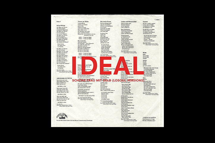
A lyric sheet with columns of German text is overlaid with the word “IDEAL” in large, bold red capitals. Smaller red text below reads “SCHÖNE FRAU MIT GOLD (LOSOHER VERSION)”.
Above

Studio Michael Satter: Ideal, Schöne Frau mit Geld
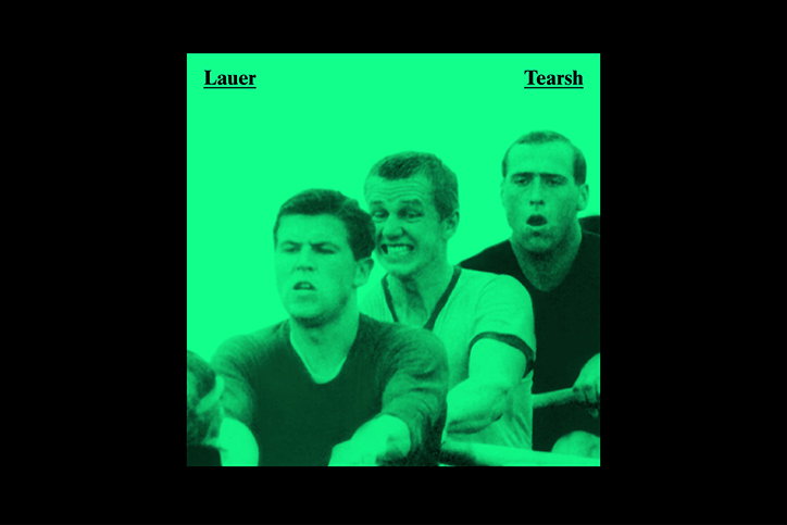
Three people are captured in a high-contrast, green-tinted image with strained facial expressions. The words “Lauer” and “Tearsh” appear in the top corners.
Above

Studio Michael Satter: Lauer, Tearsh

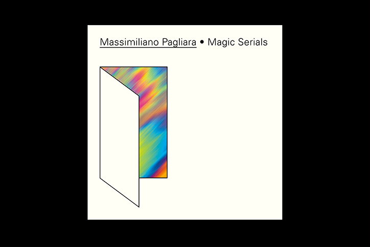
An album cover with the text “Massimiliano Pagliara • Magic Serials” at the top. Below, a 3D rectangular shape opens like a door to reveal a vibrant, rainbow-coloured gradient inside.
Above

Studio Michael Satter: Massimillano Pagllara, Magic Serials
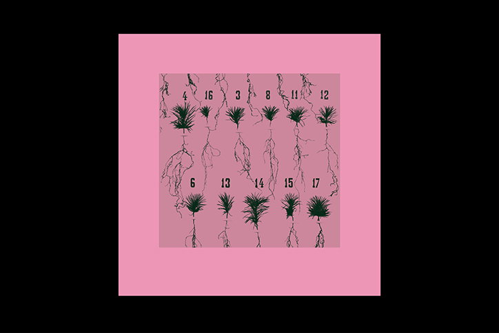
An illustration of 11 small green plants with long, spindly roots, arranged in two rows on a pink background. Each plant is labelled with a number, including “4”, “16”, “3”, “8”, “11”, “12”, “6”, “13”, “14”, “15” and “17”.
Above

Studio Michael Satter: Thomalia, Imaginary Solutions
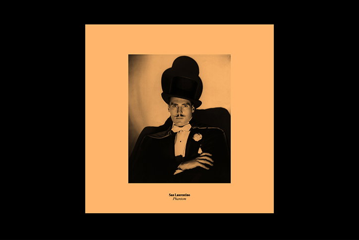
A person wearing a tall black top hat and a tuxedo looks directly at the camera. Below the image, small text reads “San Laurentino” and “Phantom”.
Above

Studio Michael Satter: San Laurentino, Phantom
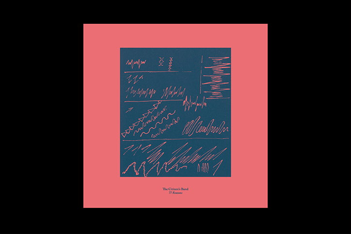
An illustration of a dark blue square set against a coral pink background. The square contains a series of abstract, hand-drawn scribbles and jagged lines in coral pink. Small text at the bottom reads “The Citizen’s Band” and “77 Reasons”.
Above

Studio Michael Satter: TCB, 77 Reasons

Share Article

About the Author

Lucy Bourton

—

Lucy (she/her) was part of the It’s Nice That team from 2016–2025, first joining as a staff writer after graduating from Chelsea College of Art with a degree in Graphic Design Communication, eventually becoming a senior editor on our editorial team, and most recently at Insights, a research-driven department with It’s Nice That.


It's Nice That Newsletters

Fancy a bit of It's Nice That in your inbox? Sign up to our newsletters and we'll keep you in the loop with everything good going on in the creative world.