Studio Tillack Knöll’s ultimate goal is to communicate, rather than just design for design’s sake
Studio Tillack Knöll is a graphic design duo who’s first-rate studio output is highly accessible and visually communicative. Founded by Steffen Knöll and Sven Tillack, the Germany-based pair constantly challenge each other’s ideas in order to create the best work. “Through this method we can combine different approaches to design and work for a variety of clients from culture, commerce and architecture”, the duo tell It’s Nice That. “We aren’t specialised in any particular field”, from designing books and signage to design in three-dimensional space, the pair also teach at the State Academy. “Besides constantly challenging the other’s view, we are always discussing the relationship between content, image and text with the ultimate goal to communicate more than just design for design’s sake”.
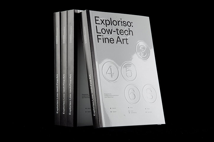
Exploriso is a book about Risograph printing written, designed, published and financed by Sven. The book is at the edge of high-art and low-tech and divided into two parts where the middle part is a colour-profile specimen, simulating CMYK-printing by using four Risography-spot colours. Self-published at Duplo-Press, the book is printed on two different kinds of papers as well as having an embossed cover. Exploriso serves as both an accessible manual and a historical research paper about Risograph printing.
Earlier this year, Studio Tillack Knoll designed the identity for the AA School of Architecture’s summer school in Stuttgart. The identity and website embody the ideas of the school which discuss the future of design and architecture; at the edge of the humankind merging together with technology. The website and printed matter explore these ideas visually and how they will effect our lives in the future. The graphic designers use a clear and crisp aesthetic to execute these concepts, as well as designing a memorable visual identity for the longevity of the summer school.
Studio Tillack Knöll collaborated with Mark Julien Hahn to create the poster design for ÜberDauer, encompassing the idea that “Architecture is for eternity, right?” Architecture has to outlast generations of societies “but at the same time it can be temporary and exclusively represent a certain zeitgeist or a specific time in history”, the designers explain. These questions inform the design of the poster which depicts evolving and bold letterforms that seem more architectural than typographic, reflecting the fast-moving industry of architectural styles.
Additionally, Nike commissioned Studio Tillack Knöll and Studio Mark Bohle for an ambitious campaign, Born of Concrete. “Being approached by a big, international company can be daunting, but working with a super-chilled art director with a fine brief and loads of freedom concerning the designs, we felt like it was more like being on a playground than actually working”, says Steffan and Sven. Overall, this graphic design studio is a fine example of how through working collaboratively with clients, the outcome’s design is well-executed and reflects the conceptual integrity of a subject matter as seen throughout all of Studio Tillack Knöll’s outputs.
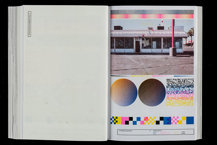
Studio Tillack Knöell: Exploriso
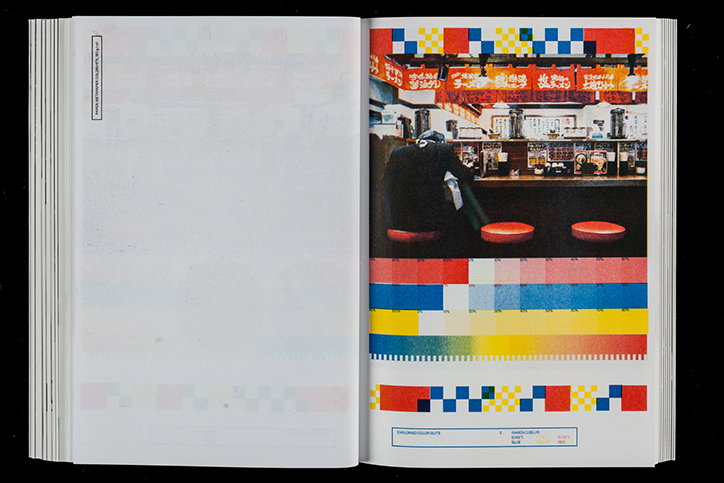
Studio Tillack Knöell: Exploriso
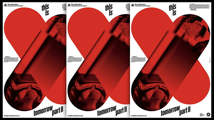
AA Summer School: Valentin Alisch and Studio Tillack Knöll
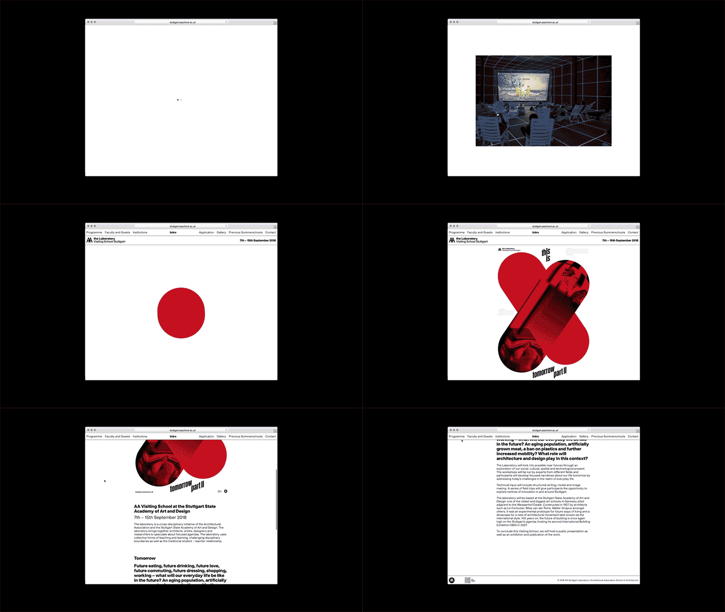
AA Summer School: Valentin Alisch and Studio Tillack Knöll
AA Summer School: Valentin Alisch and Studio Tillack Knöll
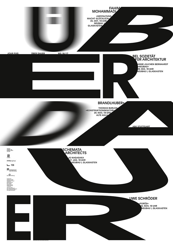
ÜberDauer: Mark Julien Hahn and Studio Tillack Knöll
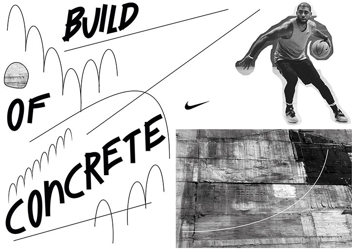
Nike: Studio Mark Bohle and Studio Tillack Knöll
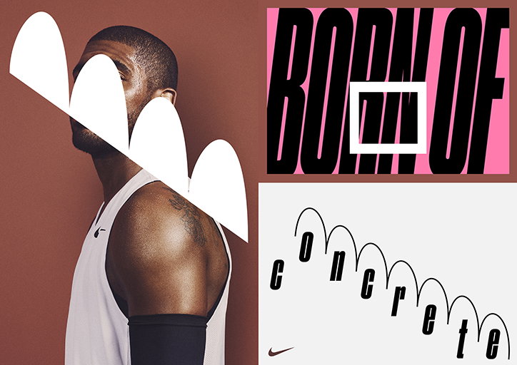
Nike: Studio Mark Bohle and Studio Tillack Knöll
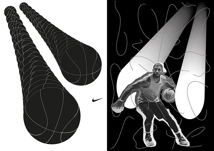
Nike: Studio Mark Bohle and Studio Tillack Knöll
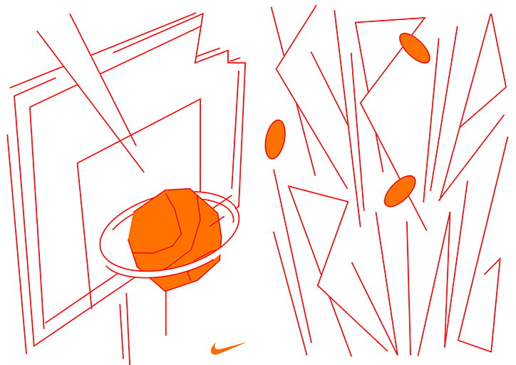
Nike: Studio Mark Bohle and Studio Tillack Knöll
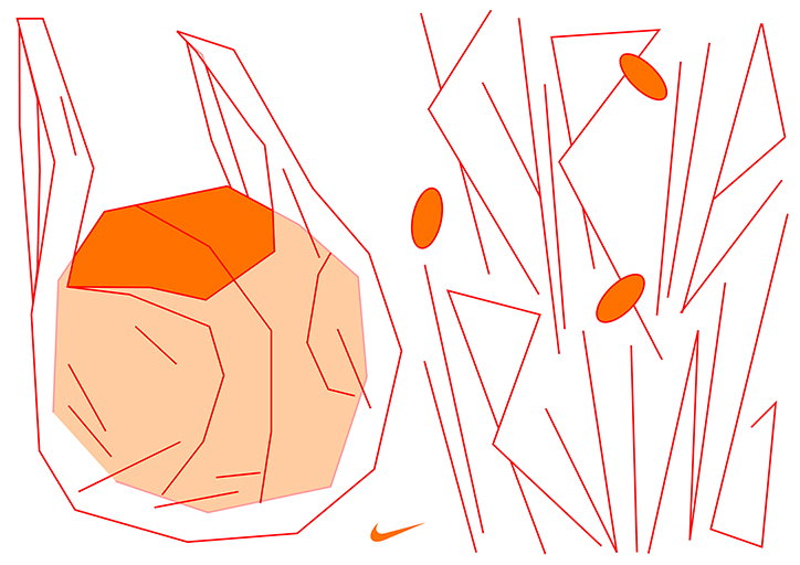
Nike: Studio Mark Bohle and Studio Tillack Knöll
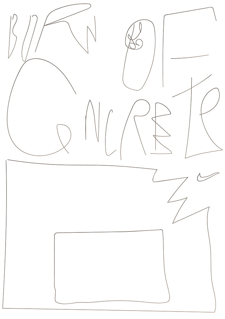
Nike: Studio Mark Bohle and Studio Tillack Knöll
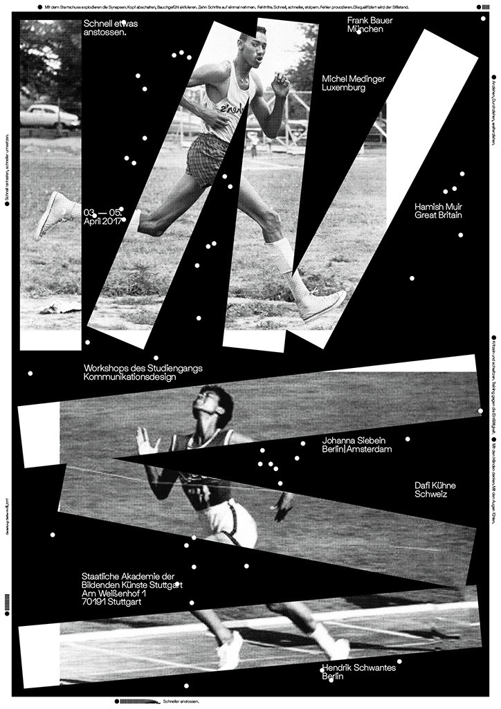
Studio Tillack Knöell: Workshop
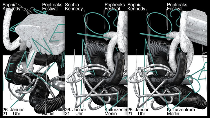
Sophia Kennedy: Nam Huynh and Studio Tillack Knöll
Share Article
Further Info
About the Author
—
Jynann joined It’s Nice That as an editorial assistant in August 2018 after graduating from The Glasgow School of Art’s Communication Design degree. In March 2019 she became a staff writer and in June 2021, she was made associate editor. She went freelance in 2022.