




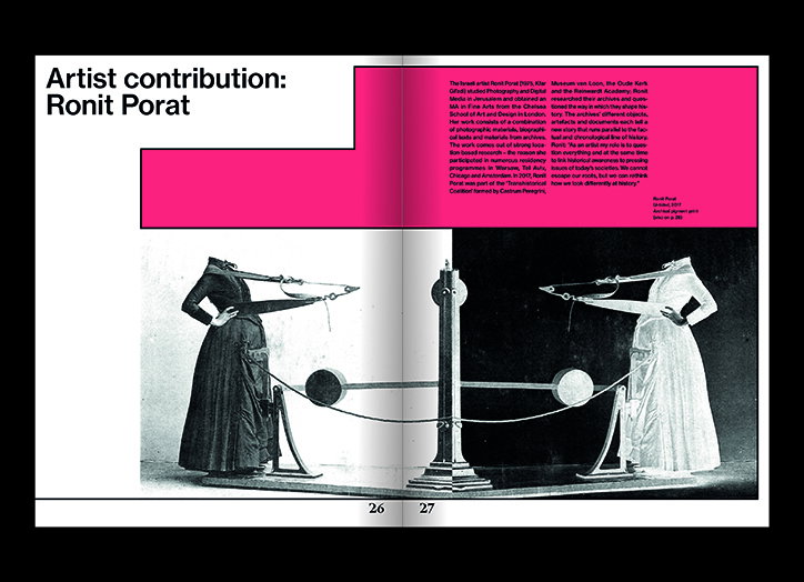
The Female Perspective highlights and challenges social divisions through its design
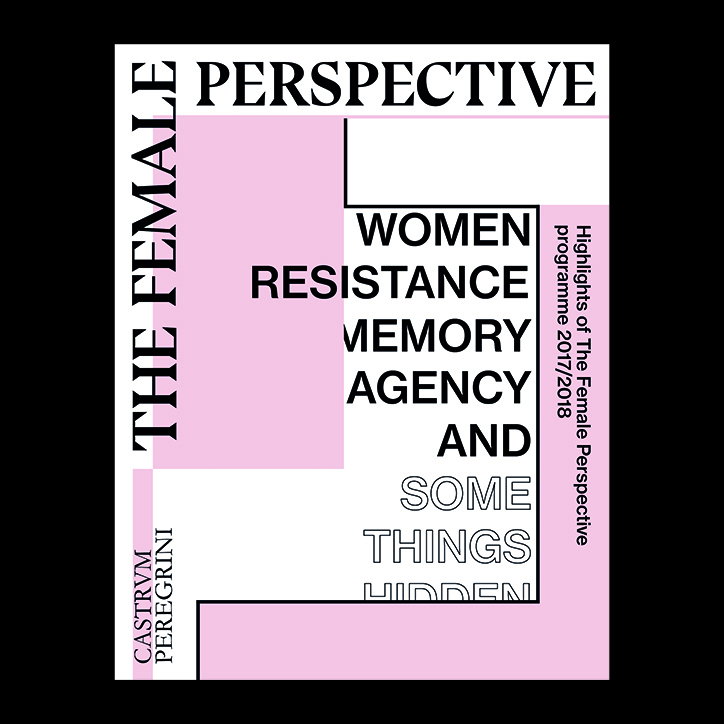
Male or female, gay or straight, society has been, and continues to be, organised into binaries. The Female Perspective is a journal designed by Amsterdam-based Roosje Klap and Pauline Le Pape – who collaborate under the name Atelier Roosje Klap – that highlights and challenges these social stratifications. The magazine was initially published to complement an exhibition at Castrum Peregrini, curated by Nina Folkersma, about “the cultural meanings of female identity, sexuality, feminism and gender, both in relation to the historical context and to current events,” the two designers tell It’s Nice That. The Female Perspective is a compilation of the talks, exhibitions, lectures, performances and screenings that took place during the year-long exhibition and consists of contributions by more than 25 artists and writers.
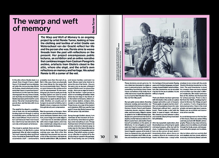
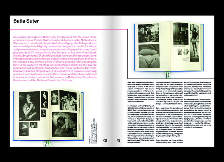
“The layout is defined by division lines, which function as metaphors for the complex and convoluted divisions between men and women. "We played around with these lines and grids in relation to the type,” Atelier Roosje Klap explains. The content of The Female Perspective is framed by restrictive lines that cut between essays and images. The overall effect feels heavily symbolic; various examples of visual and written expression are contained by external checks, which shines light on the pervasive role of gendered divisions. “The paper we used is matte on the outside and glossy on the inside, which again enhances contradictions,” the duo continues. In this way, The Female Perspective’s design can be understood as a visual representation of social and cultural regulations and classifications.
Highlighting injustice is not The Female Perspective’s sole message. Atelier Roosje Klap also sought to break through these cultural moulds through its nuanced colour and type choices. “We used many different colours of pink, which is the most obvious and cliché colour of female representation. We chose pink in order to question the notion of femininity. Each part of the program has a different nuance or shade of pink, almost bordering burgundy colours, to represent each and every one of us.” The duo also explain that they turned to serif and non-serif to symbolise multiple representations and to promote diversity.
Perhaps the most striking element of The Female Perspective is the publication’s clear spaces, the parts left blank, which can be understood as emblematic of the many female experiences that that remain unarticulated, unexplored and hidden. Atelier Roosje Klap’s design provides space for new stories to be written and new narratives to be told. In this way, The Female Perspective both highlights the various binaries that define our society, but also creates a platform for new voices to share their experiences.
Atelier Roosje Klap: The Female Perspective
Atelier Roosje Klap: The Female Perspective
Atelier Roosje Klap: The Female Perspective
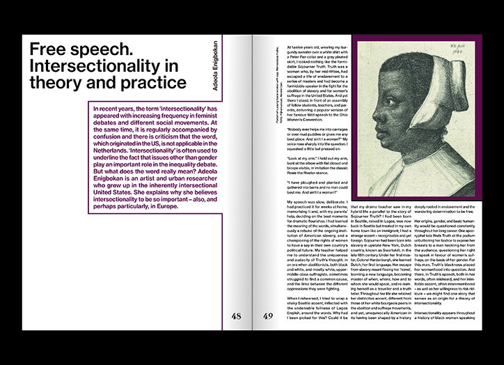
Atelier Roosje Klap: The Female Perspective
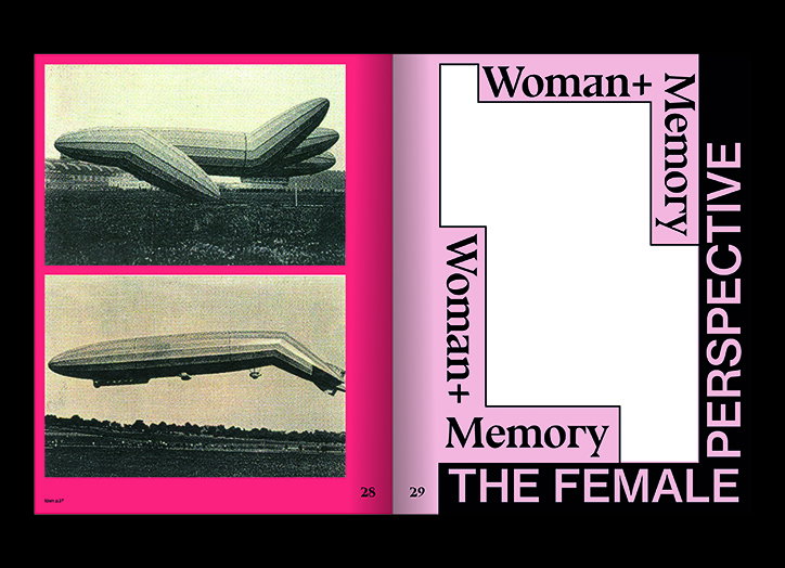
Atelier Roosje Klap: The Female Perspective
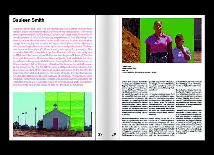
Atelier Roosje Klap: The Female Perspective
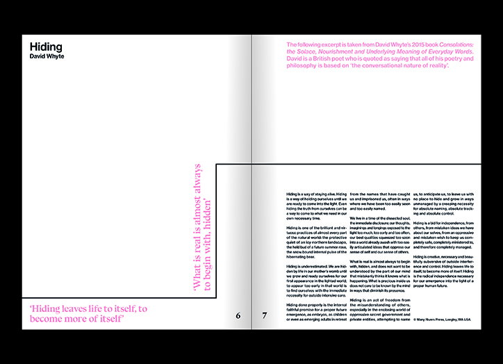
Atelier Roosje Klap: The Female Perspective
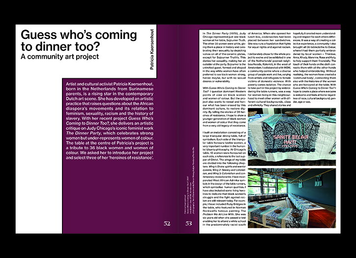
Atelier Roosje Klap: The Female Perspective
Share Article
Further Info
About the Author
—
Daphne has worked for us for a few years now as a freelance writer. She covers everything from photography and graphic design to the ways in which artists are using AI.
