Devour the extensive design feast that is The Singapore Graphic Archive
The Singapore Graphic Archive is a visual treat for any design enthusiast. Founded in 2011 by Justin Zhuang, the archive is a treasure trove of vintage Singaporean design created before the 2000s. The entire archive, in its web and Instagram form, is solely down to Justin’s interest in his country’s design history.
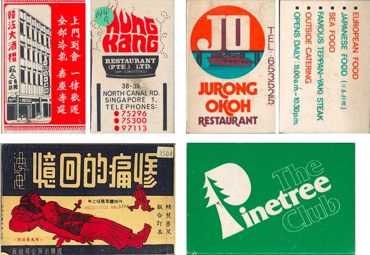
After writing a book titled Independence: The History of Graphic Design in Singapore since the 1960s, Justin compiled his research into the archive. Collecting material from interviewees, old newspapers, publications and more, the archive highlights beautiful design from matchboxes to bus times guides uncovering Singapore’s rich layers of history, from its colonial past to its economically prosperous present.
Speaking to It’s Nice That, Justin explains that “like any design, Singaporean design reflects the contexts, cultures and times that it was created in.” As a former British colony from 1819-1959, there is an evident colonial influence in the design seen in clear visual references to art deco and modernism. However, when Singapore became independent in 1965, the government established its first national design school, the Baharuddin Vocational Insitute, and sent its lecturers to study in countries like the US, Japan and Canada which has also affected the country’s design tone.
In a particularly small country in terms of land mass, measuring only 721.5 km squared, Singapore’s design has a distinct voice that is extensively captured through the archive. Post-independence, Singapore tended to outsource its creative directors from Australia and the UK as the country rebuilt its national identity after over 100 years of stifling, British rule. As a result, this is “one reason why Singaporean design has a generally ‘international’ feel.” Though the products in the archive are largely confined to souvenirs, there is a strong sense of the designers “exploring local culture and heritage”. For instance, the choice of typefaces is visually reminiscent of calligraphic, Chinese characters. Not to mention the various references to local architecture and historic folklore seen across a multitude of graphic paraphernalia.
“Singaporean designers have definitely come a long way from simply being in the ‘hands’ of ad agencies and design houses led by expatriates”, says Justin. Increasingly recognised overseas for its design excellence, design in Singapore has paved a reputation for commercial success. The Singapore Graphic Archive founder finally adds: “the question now, is whether the community will dare, and be knowledgeable enough in taking its skillset to societal, cultural and even political settings.”
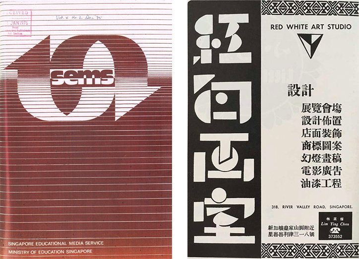
The Singapore Graphic Archive
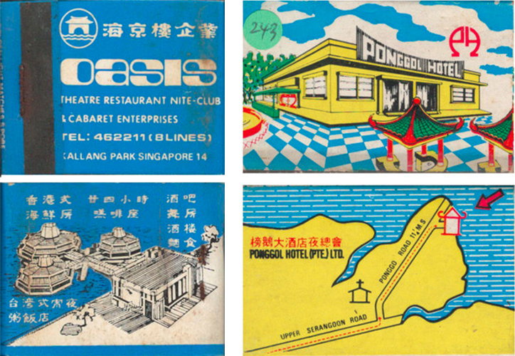
The Singapore Graphic Archive: Matchboxes
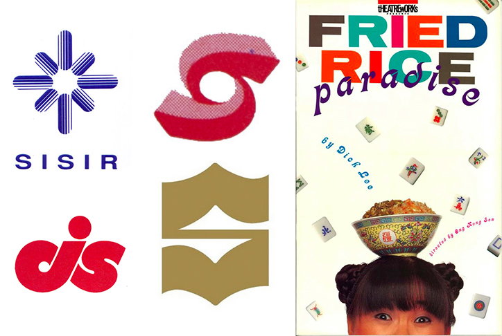
The Singapore Graphic Archive
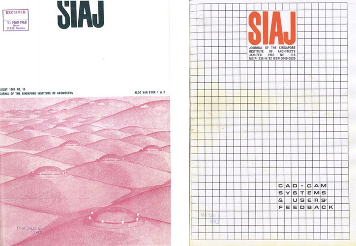
The Singapore Graphic Archive: SIAJ publication for the Singapore Institute of Architects, Graphic Publications
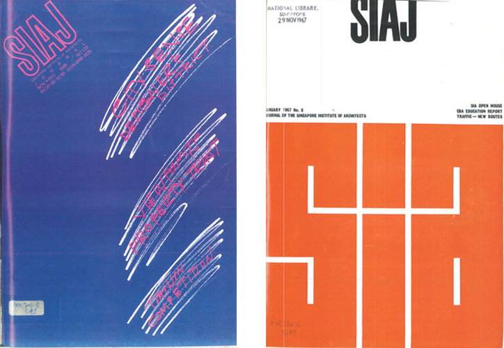
The Singapore Graphic Archive: SIAJ publication for the Singapore Institute of Architects, Graphic Publications
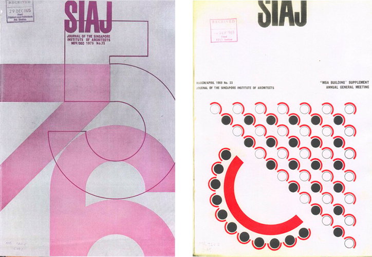
The Singapore Graphic Archive: SIAJ publication for the Singapore Institute of Architects, Graphic Publications
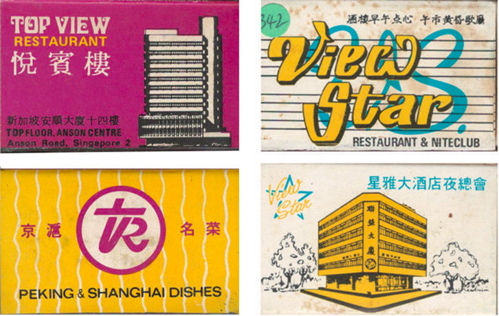
The Singapore Graphic Archive: Matchboxes
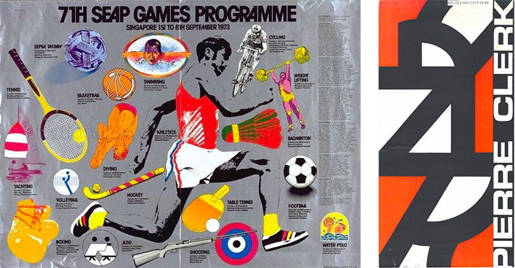
The Singapore Graphic Archive
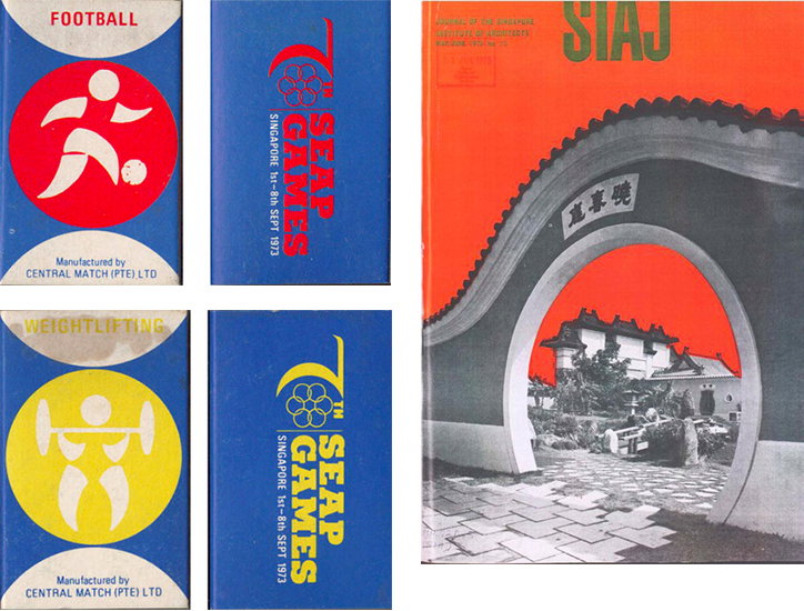
The Singapore Graphic Archive
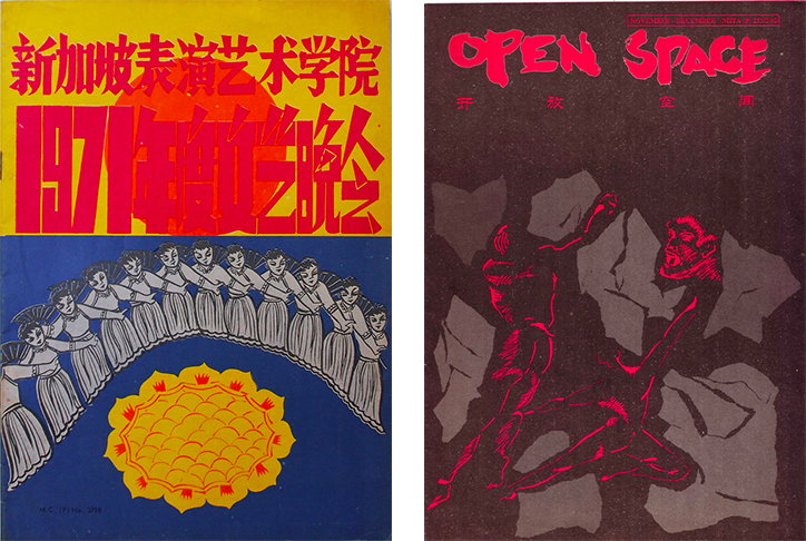
The Singapore Graphic Archive
Share Article
Further Info
About the Author
—
Jynann joined It’s Nice That as an editorial assistant in August 2018 after graduating from The Glasgow School of Art’s Communication Design degree. In March 2019 she became a staff writer and in June 2021, she was made associate editor. She went freelance in 2022.