A bike-happy, tasty reindeer of a Things feature - with some stickers thrown in for good measure
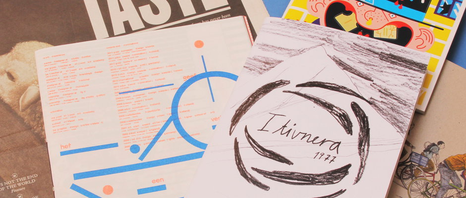
It’s been another mighty week for Things – we’ve been getting all manner of delightful post arriving each morning at the It’s Nice That headquarters. This week we’ve been indulging in 1990’s stickerbook nostalgia, a bit of bike-spotting, a freaking awesome piece of self-promo, a beautiful publication on food aaaaand a very nice illustrated book involving reindeer and the Greenland landscape.
Emilie Aastrup: Itivnera 1977
Emilie Aastrup: Itivnera 1977
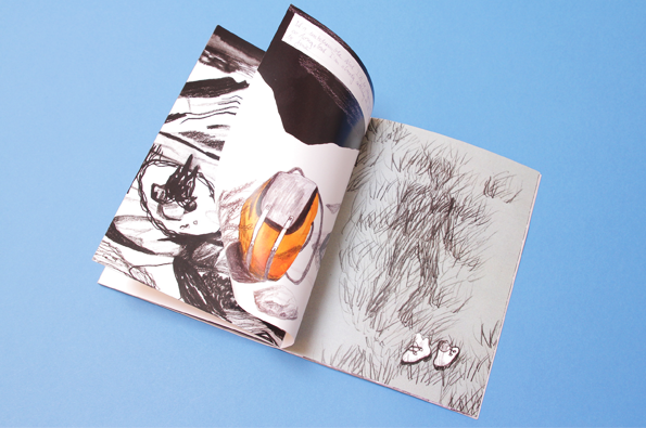
Emilie Aastrup: Itivnera 1977
Emilie Aastrup: Itivnera 1977
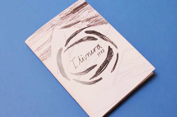
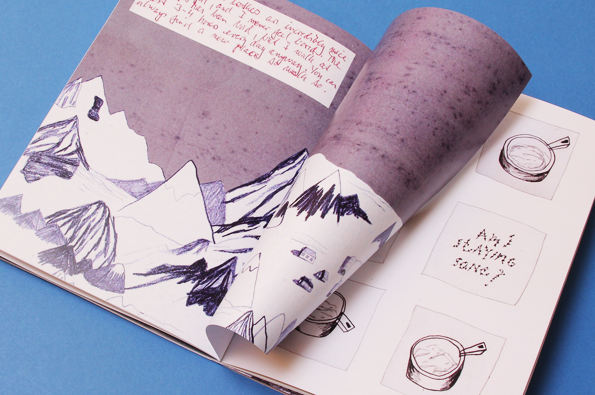
Here we have Itivnera 1077, by London-based Danish illustrator Emilie Aastrup. The title comes from the name of a small village of seven reindeer-herders in West Greenland, where her father spent a six-month research stint in 1977 (at the age of 24). The book is a representation of his time spent there, and juxtaposes fragments of handwritten text from his letters home, with Aastrup’s illustrations of the landscapes, buildings, cooking utensils, and equipment of the immediate and surrounding environment. The non-linear sequence lends itself to a truthful evocation of memory, while the pen-lined, textural qualities of the images convey a strong sense of atmosphere and a time that is both drawn-out and compressed. Very cool indeed.
www.emilieaastrup.com
ICO Design: Taste
ICO Design: Taste
ICO Design: Taste
ICO DESIGN: Taste
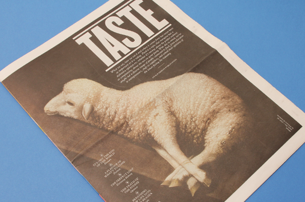
Food, glorious food! It’s a universal topic – though if we reflect more broadly on this as a statement, we know that it can be discussed, interpreted, and debated in any number of ways and contexts. Likewise, a publication on the subject can go many ways, but here Taste presents a delicious smörgåsbord of articles, commentary, and interviews that we can dig into at our leisure.
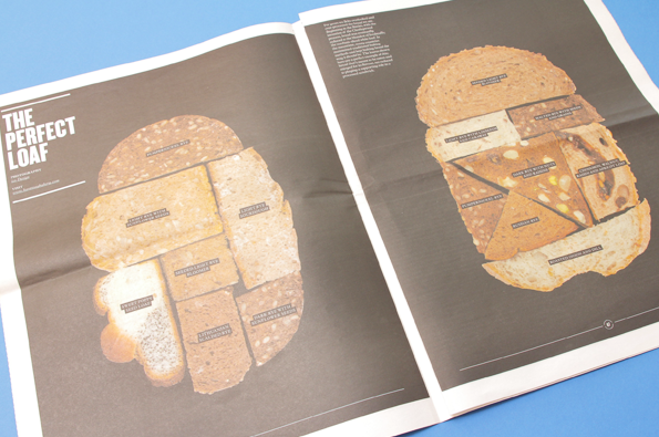
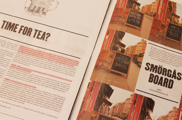
Designed by ICO, it’s beautifully laid-out; the text has pale highlights in significant areas, while each piece of content is presented in a way that consistently engages. There are interesting cultural investigations, like how tea-swigging Londoners fell for coffee, and comments on flavour-forecasting and sustainability. There are also some beautiful and playful photographs – The Perfect Loaf, for example, presents various cross-sections of different types of bread, labeled and arranged together to form the shape of a perfect slice. YUM.
www.icodesign.com
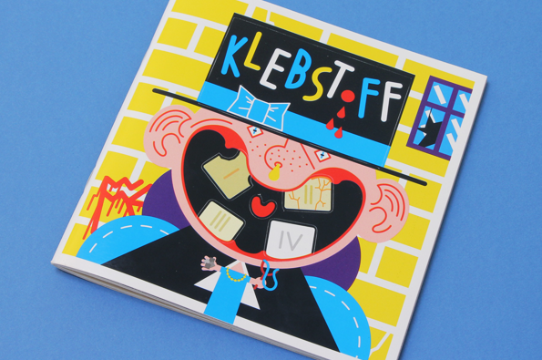
Klebstoff: Issue 4
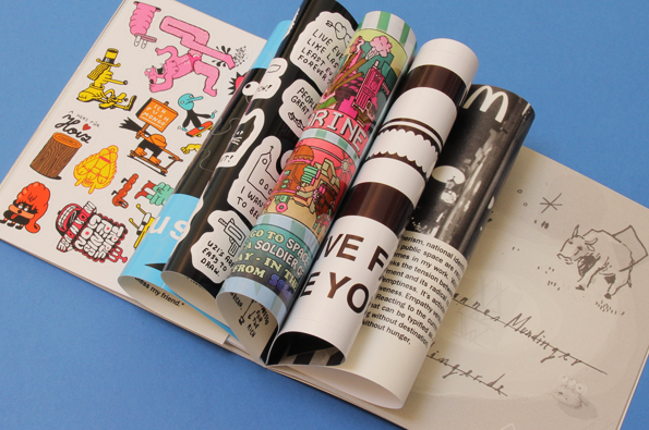
Klebstoff: Issue 4
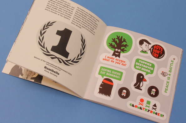
Klebstoff: Issue 4
Klebstoff – Issue 4
Do you remember stickerbooks? I had one… but the quality of the glossy paper wasn’t good, which meant that once stuck, I could never transfer the stickers without tearing them, so it sort of defeated the purpose. But the near-hysteria surrounding the buying and swapping of stickers of different textures, colours, cartoon-characters and glitter-levels was something else. And I guess it provided nice layout exercises to those who were destined to become graphic designers.
Well, the people at Klebstoff have certainly been influenced by all this; apparently it’s the first type of magazine to be entirely composed of stickers, and in this fourth issue, there are all sorts of stickers designed by all sorts of artists. Most sticker-pages are accompanied by the profile of the artist on the opposite page, and, content-wise, there’s basically everything under the sun. We have great plans for these…
www.stickermag.com
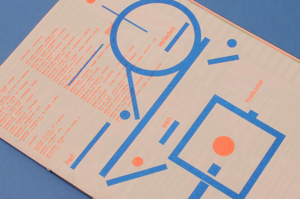
Rejane dal Bello: Promo Work
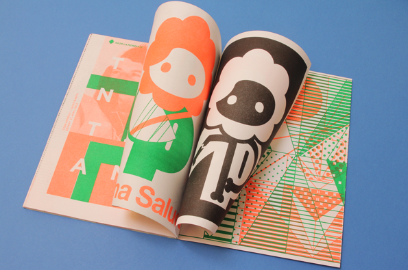
Rejane dal Bello: Promo Work
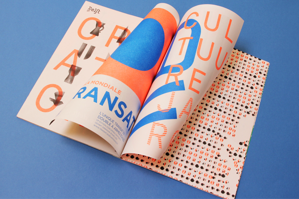
Rejane dal Bello: Promo Work
Rejane dal Bello: Promo Work
Wow. When Rejane dal Bello’s work came through our letterbox we thought it was a super-cool magazine of some kind, but in actual fact… it’s a sample or promo piece of her work. And it is amazing. Originally from Rio de Janeiro, she has studied under Milton Glaser at the School of Visual Arts in New York and at the Post St Joost Academy in the Netherlands – where she has been based for the past eight years – and is about to move to London to work at Wolff Olins. Featuring beautifully riso-printed geometric shapes, linear forms, and illustrations in blues, greens, blacks, and vibrant oranges, her work is a clear indication of her already super-accomplished career. Awesome.
www.rejanedalbello.com
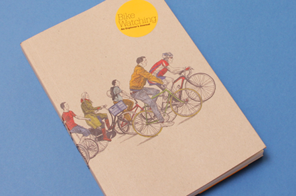
David Sparshott: Bike Watching – An Explorer’s Journal
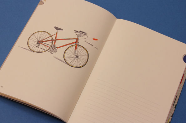
David Sparshott: Bike Watching – An Explorer’s Journal
David Sparshott: Bike Watching – An Explorer’s Journal
David Sparshott: Bike Watching – An Explorer’s Journal
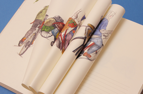
A couple of years ago I had a lovely bright red bike named Flann. We’d navigate extremely dense student bike-traffic together, and you’d see all sorts of stuff out there on the bike-lanes – there was one guy rode a circus-height unicycle to class. No joke. Anyway, nowadays I’m bike-less, but am often sidetracked (not to say tempted!) by the sight of a beautiful bike locked to a lamppost or leaning against a wall. Which is why the illustrations in Bike Watching – An Explorer’s Journal are so captivating. There are beautifully drawn illustrations by David Sparshott of specific bike-models with a label next to each and a table on the facing page where you can jot down your sightings – as well as sections for accessories, components, and day-to-day observations. Haven’t spotted Flann just yet (he was a beach cruiser), but will keep an eye out! (Also, if you’ve never read it and like bikes, The Third Policeman, written by Flann’s namesake, is an absolute must-read)
www.laurenceking.com/bike-watching
www.davidsparshott.com