Tom Noon on his musical, spontaneous and illustrative approach to graphic design
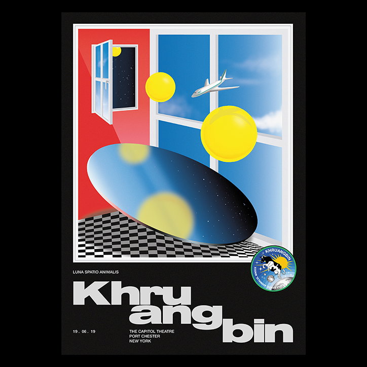
Tom sees illustration and design as two media that “aren’t mutually exclusive”. Instead, he combines these elements in a spontaneous process for clients such as Adidas, Jadu Heart, Low Island and Khruangbin.
Never one for future planning, Tom Noon resultantly had a rather star-shaped path to where he is today. The Bristol-based designer and illustrator was, of course, an arty child, which meant that he went on to study graphics and illustration at college – but surprisingly, what followed was a degree in politics and international relations at university. “After graduating,” Tom says, “I swiftly decided that I didn’t fancy taking on the role of prime minister – so I pivoted to a job in advertising.”
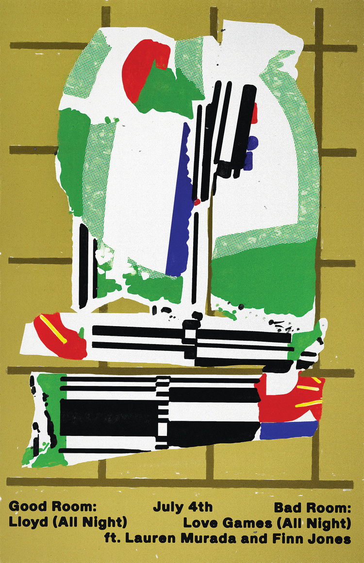
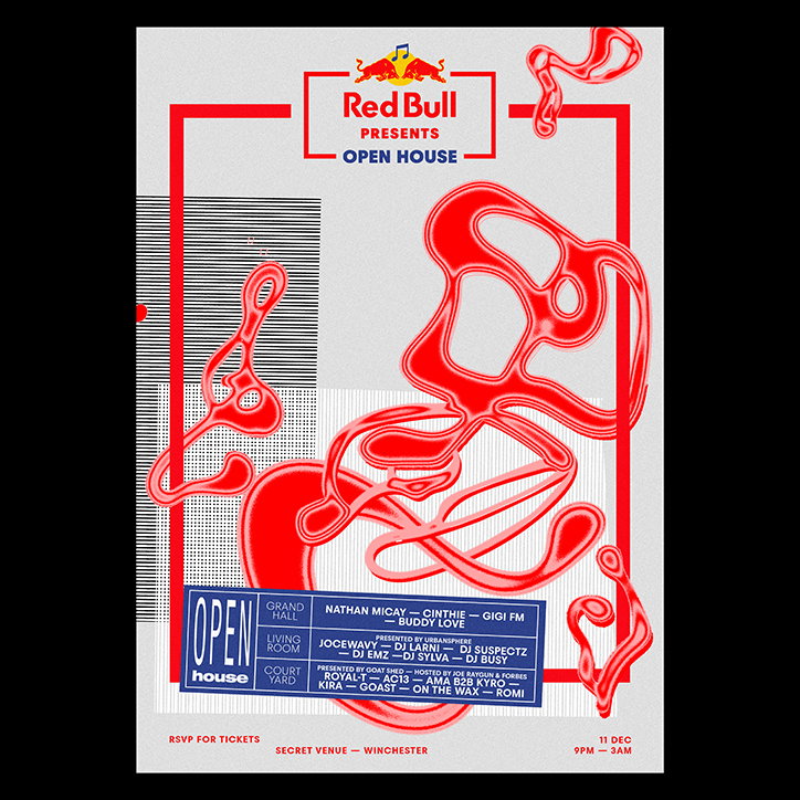
During his studies, Tom set up a club night with his friends and took charge of the poster work, creating low-fi pieces that pushed him to learn new software. This, alongside a stint as a runner at Mother London before starting a role as an account manager at advertising agency McCann London, is purely demonstrative of his broad and varied background. In the search for something more creative, he went on to work at Red Bull for two years, looking after the nightlife venues in east and central London, such as Fabric and XOYO where “a load of [his] favourite DJs would play on the reg”. Getting his foot in the creative music scene was most certainly a win, yet Tom found himself becoming envious of those who were producing the artworks for the shows. “I felt like I still wasn’t in the right role,” he says. “It was time to pursue design and illustration more seriously.”
Provoking a move to study an intensive design course at Shillington College, London, Tom was gloriously met with a fast-paced working environment filled with design and illustration techniques that ultimately prepared him for the work he’s doing today. Working freelance, Tom has utilised his past connections and picked up work at agency The Midnight Club, working alongside his friend Rory Knibbs on a project for Adidas, as well as a multitude of music clients ranging from Jadu Heart to Low Island, as well as Khruangbin. “A lot of my work seems to be through word of mouth, which is really sweet,” he comments.
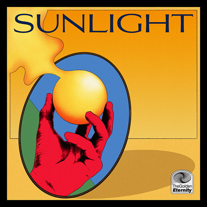
Tom Noon: Sunlight
Day-to-day, Tom’s work is somewhat interchangeable. “I think as a freelancer, things are inherently unpredictable,” he says. “I like that”. And, since moving from Peckham to Bristol where he’s now “set up shop” in art’s quarter Spike Island, Tom seeks out the more collaborative projects that flit between both locations. Yet there are a couple of things that remain the same: that is, The Do!! You!!! with Charlie Bones breakfast show on NTS – a “morning ritual” – plus a deep dive into mixes and playlists to supply his soundtrack for the rest of the day. “The genres of which will depend on what mood I’m in, but I definitely think music has a significant influence on my output,” he says.
Aside from his musical influences, Tom explains how he’s rather open-minded and experimental when it comes to working methods and design details used throughout – particularly in the sense of combining analogue and digital. “I think it’s important to create work that feels fresh and has unpredictable elements, rather than adopting a one-size-fits-all aesthetic.” This approach can be seen through music and cultural projects, whereby Tom is especially drawn towards those with a unique and new subject matter. An example of this is his recent commission for Crack magazine, where Tom was given an extra couple of days for intensive research to create the accompanying illustrations for an article by Will Pritchard, documenting “Britain’s Rap Revolution” over the past decade. This enabled Tom to “identify some nice hooks… particularly surrounding the role of the internet in the proliferation of Grime and other sub-genres.”
Most importantly, Tom sees illustration and design as two media that “aren’t mutually exclusive”. Instead, he combines these elements across the board to build on his spontaneous process. “I rely on instinct to dictate what direction to take visually, but I definitely don’t have a preferred medium,” he explains. “I’m more satisfied when I feel like what I’m producing is a meaningful expression of the core values of the project, rather than just me shoe-horning an execution style because it’s what I’m into.”
GalleryTom Noon
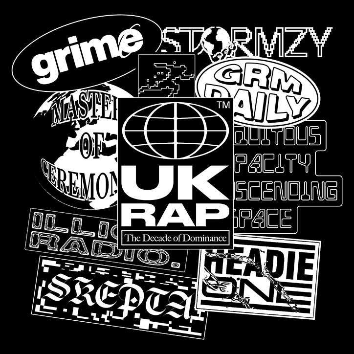
Crack Magazine
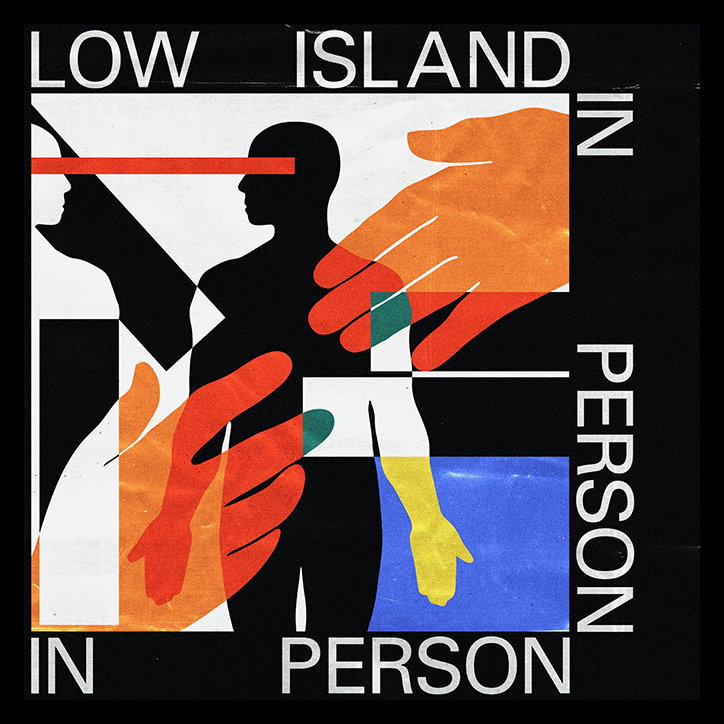
Low Island, In Person
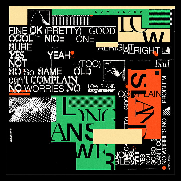
Low Island, Long Answer
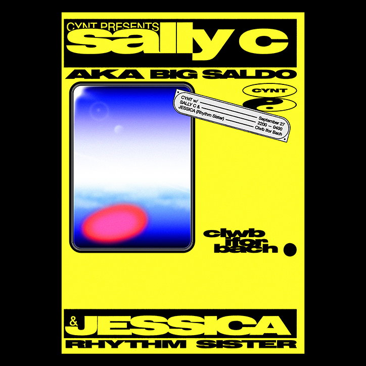
Sally C
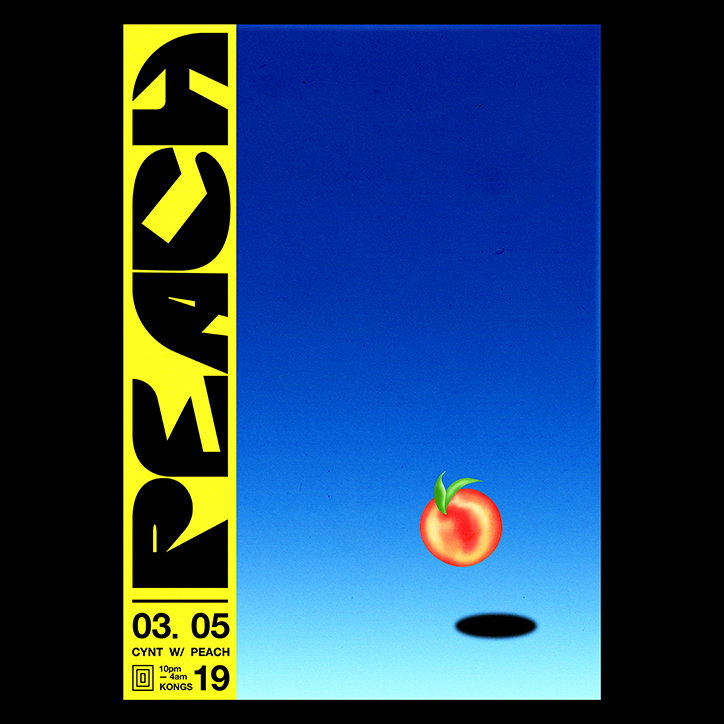
Peach
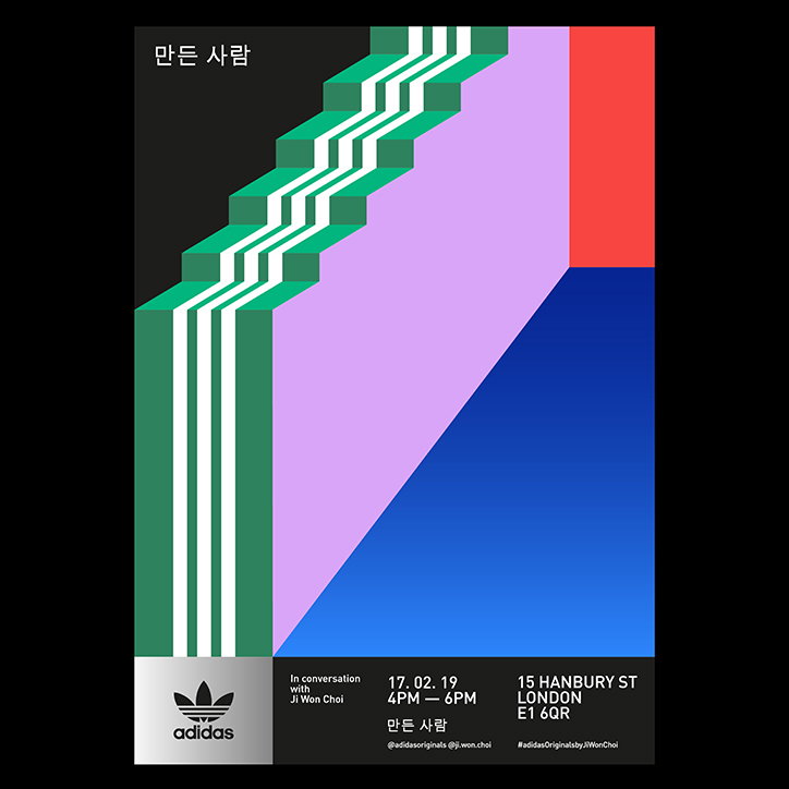
Adidas
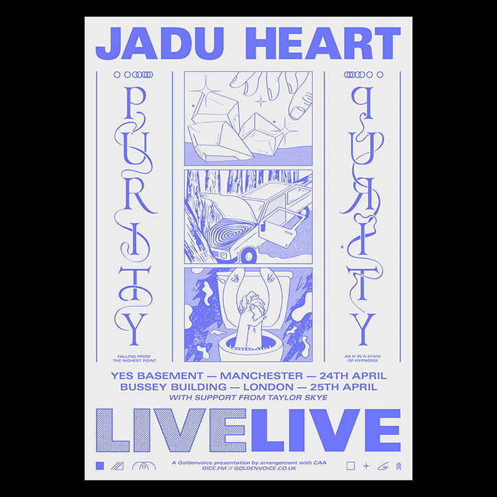
Jadu Heart
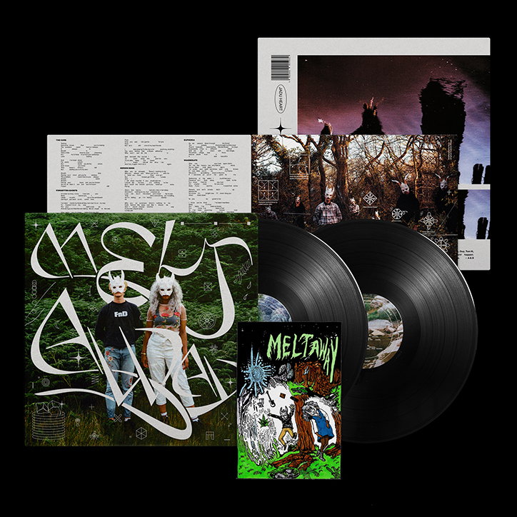
Jadu Heart
Share Article
Further Info
About the Author
—
Ayla is a London-based freelance writer, editor and consultant specialising in art, photography, design and culture. After joining It’s Nice That in 2017 as editorial assistant, she was interim online editor in 2022/2023 and continues to work with us on a freelance basis. She has written for i-D, Dazed, AnOther, WePresent, Port, Elephant and more, and she is also the managing editor of design magazine Anima.