




Meet graphic designer Tor Weibull and his tubular metal typography
Swedish graphic designer Tor Weibull’s education and practice features an impressive back catalogue of institutions and studios.
Growing up in the Gotland, an island in the Baltic, he moved to Gothenburg to study graphic design at HDK and studied visual communication for a semester abroad at ZHDK in Zurich which, “had a big influence on the work I’m doing today,” he tells It’s Nice That. While studying, Tor also did an internship at Lundgren + Lindqvist and won Adobe’s Nordic Creative Talent Award in 2015. Since graduating in 2016 he has begun working at Studio Claus Due, alongside his own projects and is working on an “exciting project for and with my friends Anny and Tim, who run the studio Wang & Söderström”. This autumn, Tor will begin a master’s in type design at prestigious design school, Ecal.
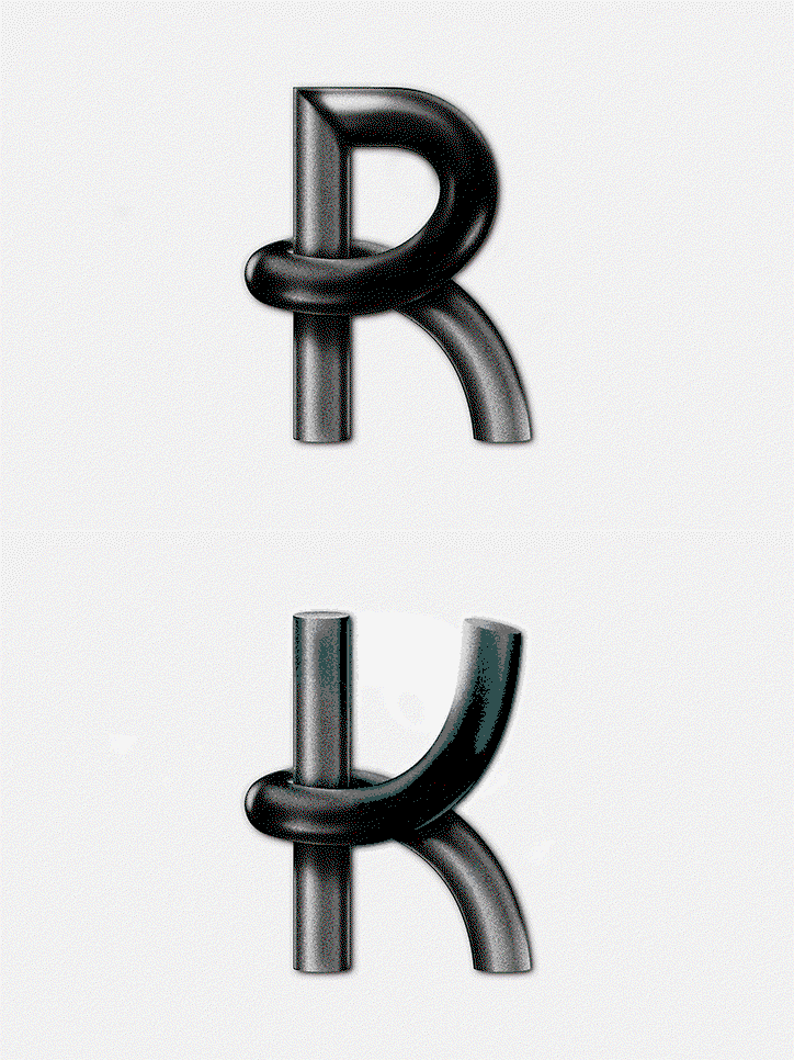
Type design is an area in Tor’s portfolio where his work becomes excitingly experimental. A recent example of this is Reflective Fascination, a publication which sees the designer create type resembling bent metal tubes. “The nature of metals has fascinated mankind over the centuries, since these materials provided people with tools of unsurpassed properties both in war and in their preparation and processing,” Tor explains. “How would we survive without metals today, it is everywhere. It’s in your pocket, in our bodies and even in this publication. If the old hip hop group Aphrodelics only knew how their song Rollin’ on Chrome is for today’s modern society, because the world is literally rollin’ on chrome and other metals.”
The publication was created for a photo book exhibition, Book on the Fritz, where Tor “created metal letters for the book headers, with the intention of creating the fake experience of being bent metal photographed from above,” says the designer. “The process of drawing the letters was quite hard and I was struggling. I started by doing tests, bending steel wires to see how I could form and shape the material into letters.” Next, the designer bulked out the thin material, drawing vector lines to add an extra thickness. “The most time-consuming part was adding shadows and highlights, which give the appearance of being made from metal. Since I had no clue how to use 3D programmes such as CAD, I simply painted all the shades and highlights.” Modestly, Tor admits, “the lighting isn’t 100% realistic, I’m well aware of that, and I’ve increased the highlights and shadows in some places where it was necessary to strengthen the shape of the letter in order for it to be more obvious for the observer or reader”. The designer’s work with shadows is elevated when Reflective Fascination is printed using risograph, where the grainy texture lifts the type off the page.
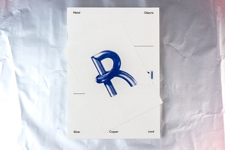
Tor Weibull: Reflective Fascination
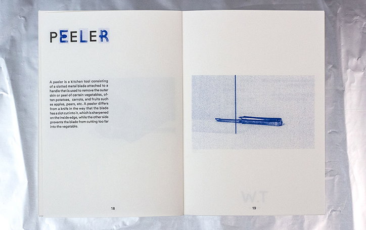
Tor Weibull: Reflective Fascination
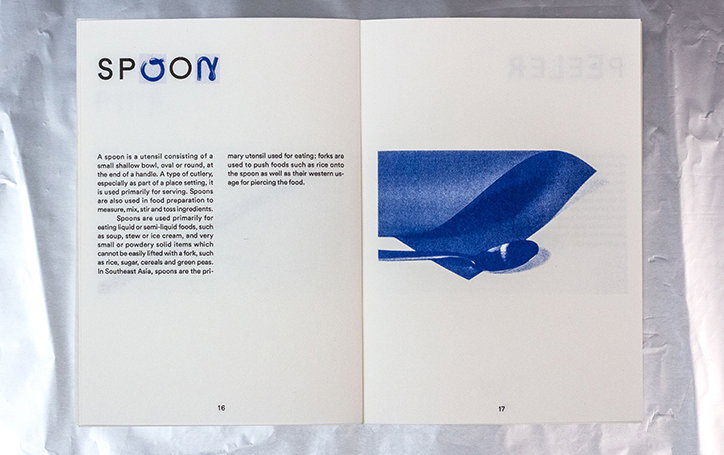
Tor Weibull: Reflective Fascination
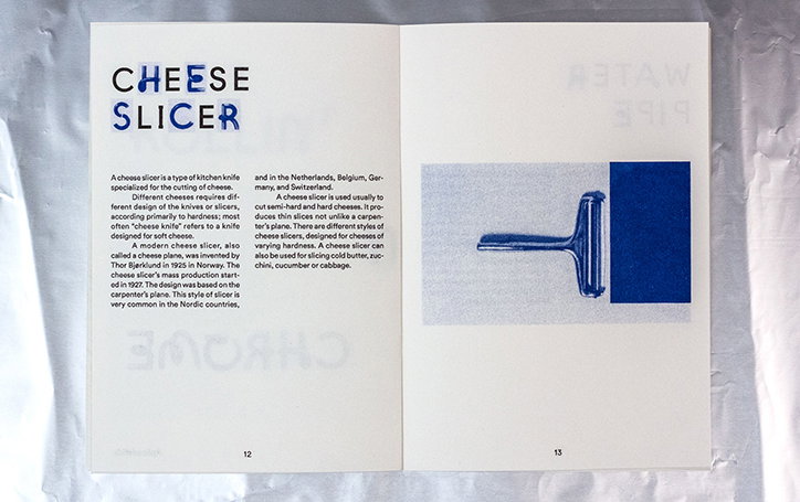
Tor Weibull: Reflective Fascination
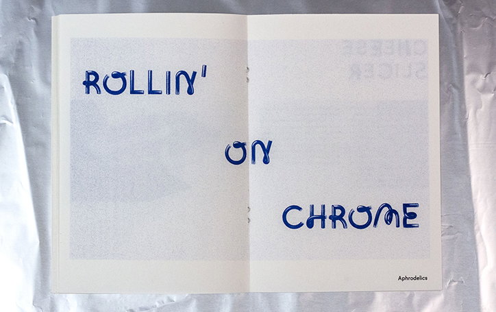
Tor Weibull: Reflective Fascination
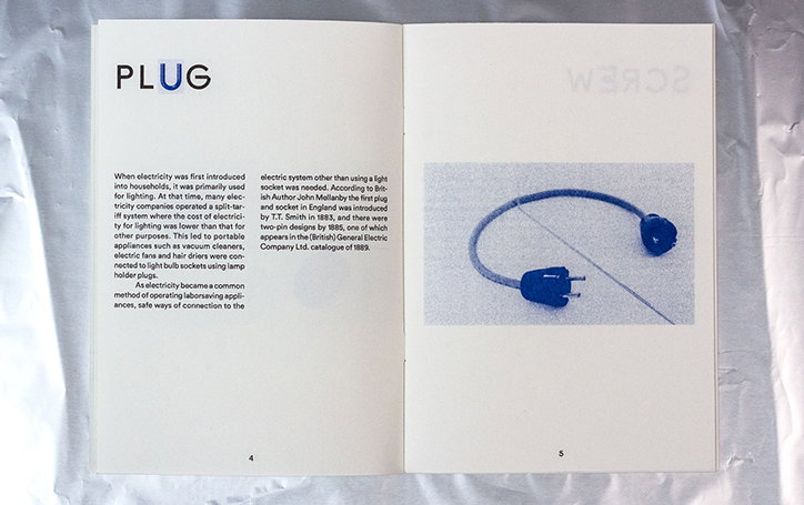
Tor Weibull: Reflective Fascination
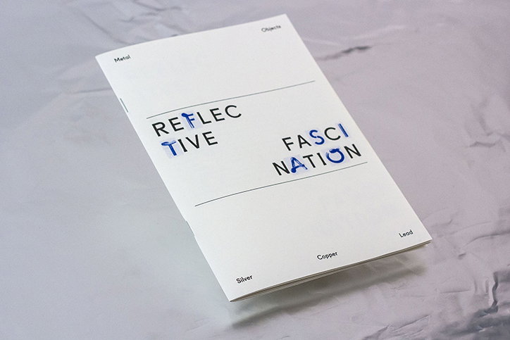
Tor Weibull: Reflective Fascination
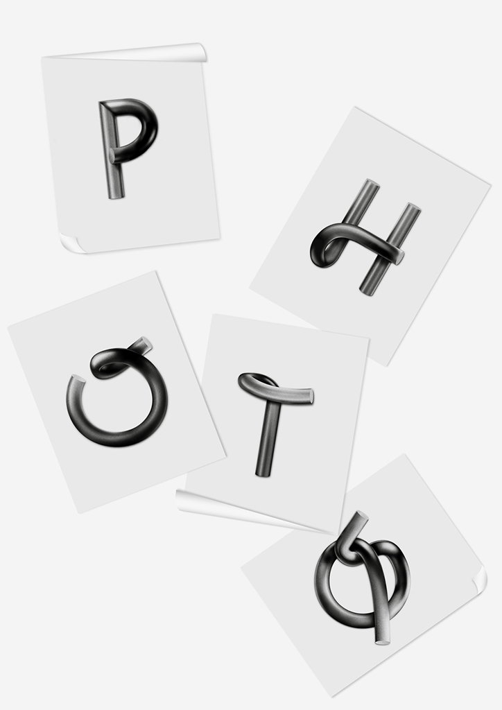
Tor Weibull: Reflective Fascination
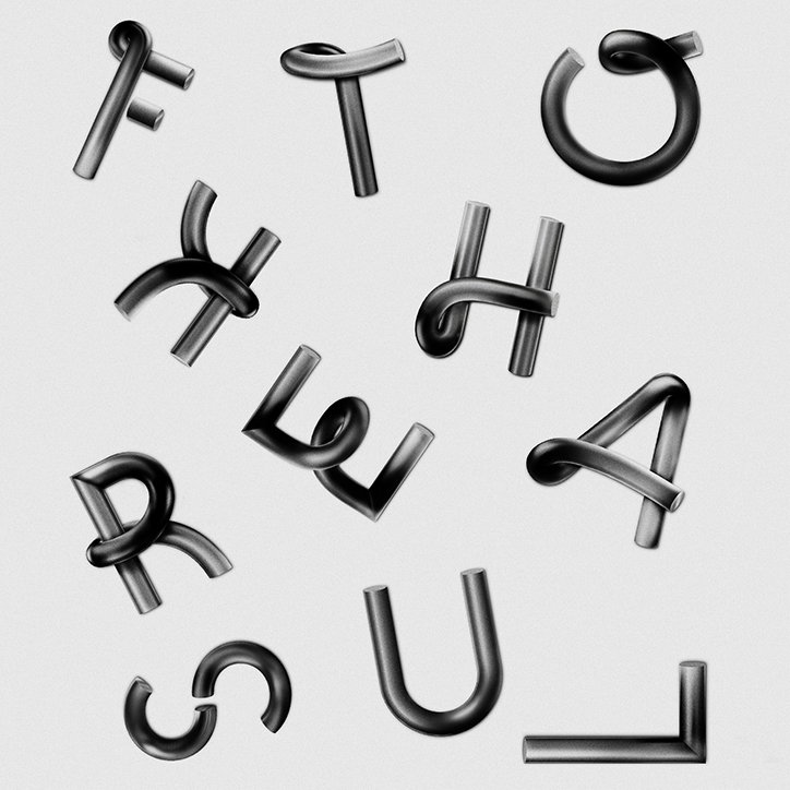
Tor Weibull: Reflective Fascination
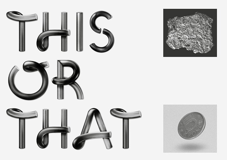
Tor Weibull: Reflective Fascination
Share Article
Further Info
About the Author
—
Lucy (she/her) was part of the It’s Nice That team from 2016–2025, first joining as a staff writer after graduating from Chelsea College of Art with a degree in Graphic Design Communication, eventually becoming a senior editor on our editorial team, and most recently at Insights, a research-driven department with It’s Nice That.

