Launch Recite Me assistive technology
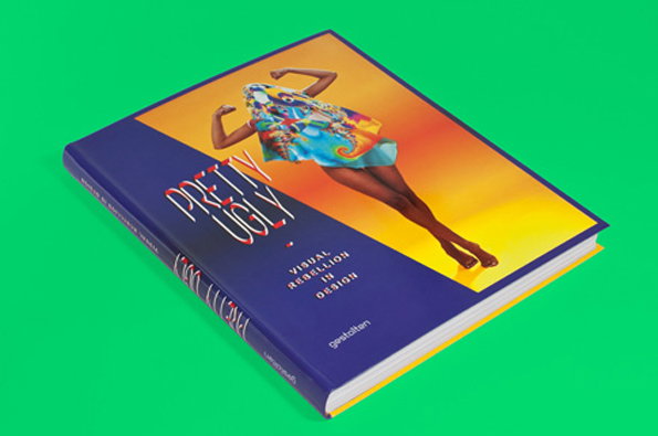
A hardcover book titled “Pretty Ugly: Visual Rebellion in Design” rests on a bright green surface. The cover features a person in a colourful outfit leaping across a yellow and orange gradient background.

Check out this "Pretty Ugly" design work from Two Points Studio

—
Date
3 July 2012

Unless you’ve had your eyes firmly closed for the past five years (in which case you may have struggled to appreciate any of the work documented on It’s Nice That) you’ll know that graphic design is undergoing a slow but purposeful metamorphosis, at least in some areas. A hardcore faction of designers are moving away from the Swiss Style rulebook and embracing increasingly more daring aesthetic and geometric arrangements, eschewing crisp white space and Grotesk type in favour of vibrant gradients and the occasional flourish of Blackletter.

Somewhere in the middle of this movement sits Two Points Studio who are both working with and documenting the “Pretty Ugly” aesthetic, recently producing a volume for Gestalten that highlights the very best of the style. Aside from a striking body of editorial work, that also includes a series dedicated to glorifying a variety of type faces, they’ve produced posters, websites, identities and illustrations for a wide variety of clients that, rather refreshingly for “Pretty Ugly” practitioners, aren’t simply limited to the creative sector.

As with all creative movements “Pretty Ugly” has its nay-sayers, but a thorough exploration of Two Points’ portfolio reveals a coherent, communicative oeuvre that, personal tastes aside, is just plain old, great design.
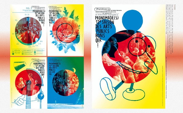
A series of colourful posters for the arts festival “Pronmade(s)”. Each design features a bold circular cutout containing a photograph of a crowd or performance, layered over bright yellow, blue and white backgrounds.
Above

Two Points Studio: Pretty Ugly

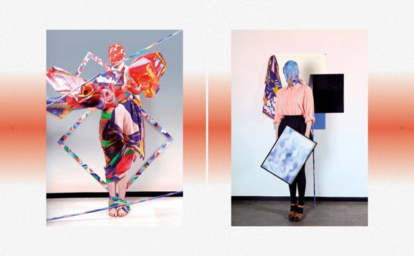
Two photographs of a person wearing avant-garde clothing. In the first, they are enveloped in vibrant, multi-coloured fabrics and geometric frames. In the second, they wear a pink shirt and black trousers, holding a framed painting of a blue sky.
Above

Two Points Studio: Pretty Ugly

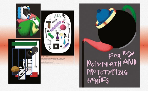
A collection of graphic artworks on a grey background. One piece features a black teapot with a red spout and a blue lid, above the hand-drawn text “For my polymath and prototyping homies”.
Above

Two Points Studio: Pretty Ugly

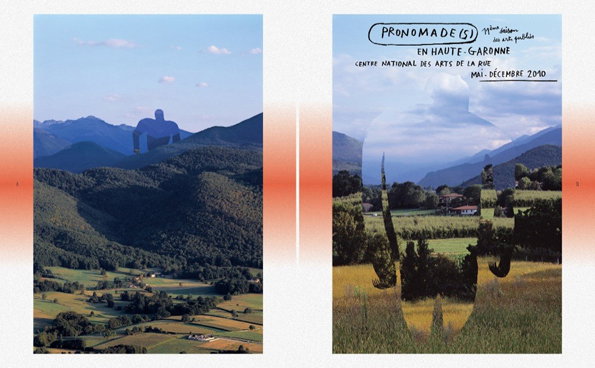
Two side-by-side images of a mountainous landscape. The first shows a giant, shadowy figure standing among the peaks, while the second is a poster featuring a similar figure and the text “Pronomade(s) en Haute-Garonne”.
Above

Two Points Studio: Pretty Ugly

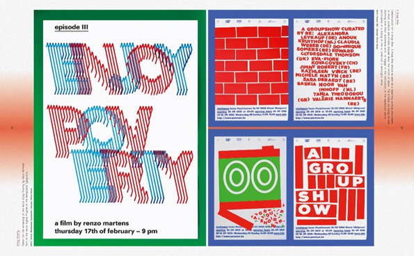
A graphic design spread featuring a film poster and exhibition flyers. The poster on the left uses distorted, vibrating red and blue typography to read “ENJOY POVERTY”, with text below stating “a film by renzo martens” and the date “thursday 17th of february – 9 pm”. To the right, four smaller flyers in red, white and green feature bold text, including one that reads “A GROUP SHOW”.
Above

Two Points Studio: Pretty Ugly

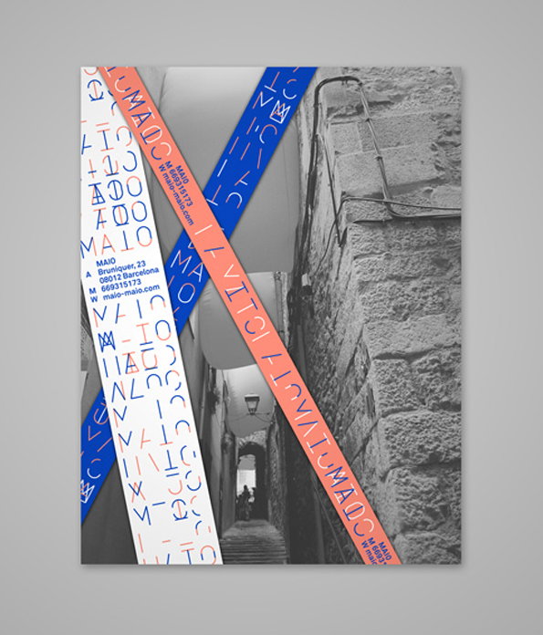
A black and white photograph of a narrow stone alleyway is overlaid with two crossing ribbons of text. One ribbon is orange and the other is blue, both featuring a mix of abstract symbols and the word “MAIO”.
Above

Two Points Studio: MAIO Identity

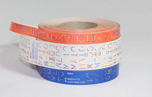
Three rolls of adhesive tape in orange, white and blue are stacked on a plain grey background. Each roll features a pattern of abstract, geometric characters and contact details including the website “maio-maio.com”.
Above

Two Points Studio: MAIO Identity

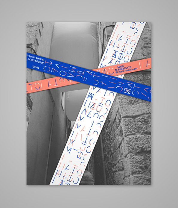
A black and white photograph of a narrow stone alleyway is overlaid with colourful graphic strips. The strips feature abstract symbols and the text “MAIO”, “M 669315173” and “W malo-malo.com”.
Above

Two Points Studio: MAIO Identity

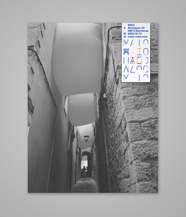
A black and white photograph of a narrow stone alleyway with large, white fabric sails stretched across the gap between buildings. A small white card in the top right corner displays the brand “Maio” and contact details for a Barcelona address.
Above

Two Points Studio: MAIO Identity

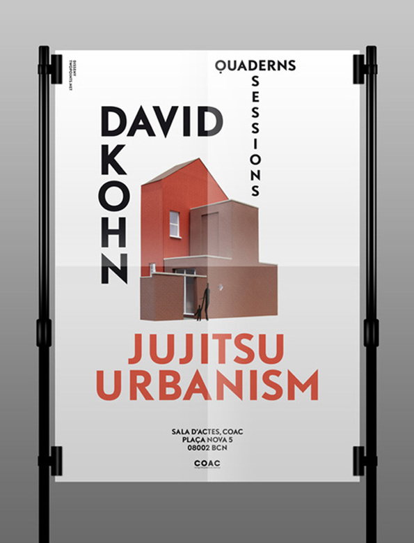
A poster for a talk by David Kohn titled “Jujitsu Urbanism”. It features a 3D render of a minimalist, red and beige building with a small figure standing at the entrance. Text at the bottom lists the venue as “Sala d’Actes, COAC” in Barcelona.
Above

Two Points Studio: Quaderns Sessions Posters
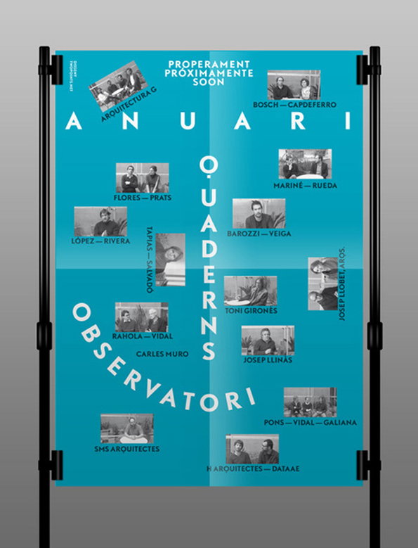
A blue poster featuring a grid of black and white portraits of people. Large white text reads “Anuari”, “Observatori” and “O.uaderns”. Smaller text at the top reads “Properament Pròximament Soon”.
Above

Two Points Studio: Quaderns Sessions Posters
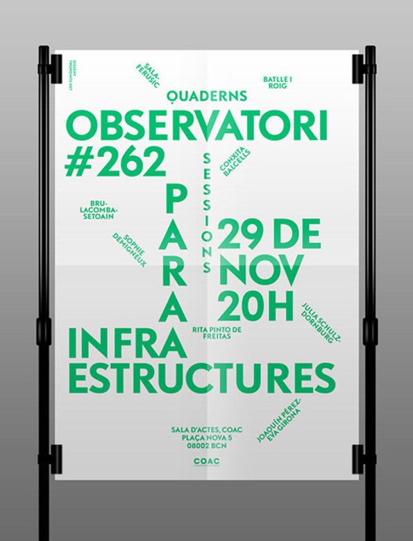
A green and white typographic poster displayed on a black stand. The bold text reads “Observatori #262 Para Infraestructures” and lists the date “29 de Nov” at “20h”. Smaller names and the location “Sala d’Actes, Coac” are scattered across the layout.
Above

Two Points Studio: Quaderns Sessions Posters
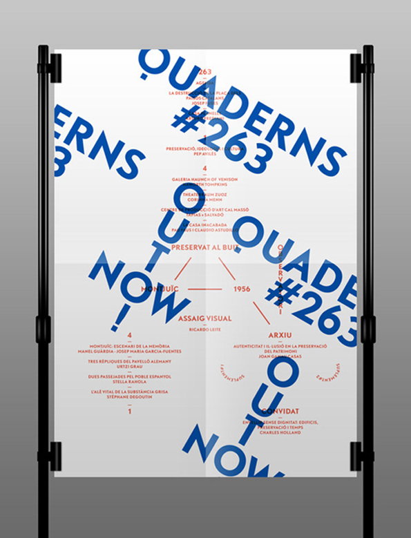
A typographic poster with blue and red text on a white background. Large blue words read “Quaderns #263” and “Now”, while smaller red text lists various names and titles.
Above

Two Points Studio: Quaderns Sessions Posters

Share Article

Further Info

About the Author

James Cartwright

—

James started out as an intern in 2011 and came back in summer of 2012 to work online and latterly as Print Editor, before leaving in May 2015.
It's Nice That Newsletters

Fancy a bit of It's Nice That in your inbox? Sign up to our newsletters and we'll keep you in the loop with everything good going on in the creative world.