




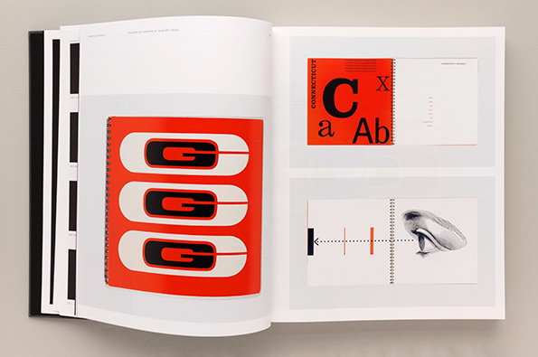
Unit Editions talks us through Manuals 2's superb identity design guidelines
Back in March, Unit Editions published Manuals 1 – a weighty tome showcasing corporate identity design manuals for the likes of NASA, Lufthansa and the NYC Transit Authority. A book you’d assume to be for a rather niche, terrifyingly geeky contingent of graphic designers. But niche or not, the book was hugely popular and quickly sold out, prompting Unit Editions to create a second volume, efficiently named Manuals 2.
But why do graphic designers salivate over these guides, which to the rest of the world may seem a little, perhaps, dry? “It’s still a bit of a mystery,” explains Adrian Shaughnessy, Unit Editions co-founder. “It was something Tony Brook spotted – we were in an archive and he saw all these amazing manuals and said, ‘I think there’s a book in there.’ Then other people kept saying how much they loved them.”
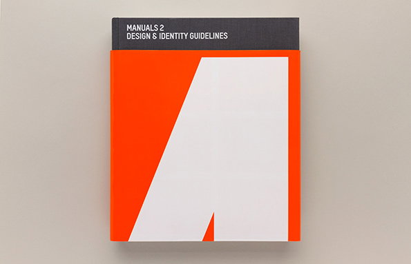
Unit Editions: Manuals 2
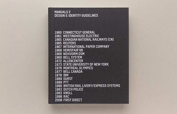
Unit Editions: Manuals 2
As Adrian points out, there’s certainly an element of nostalgia that contributes to people’s obsessions with poring over these old guidelines, which have now been almost entirely usurped by cheaper, more efficient digital brand guidelines. “[Digital versions] are terribly efficient and very cheap, but they can be a bit soulless,” says Adrian. “These old manuals are absolute marvels of information design – they’re so precise and clear, you can see what makes a brilliant instruction manual.”
The books design pulls the book even higher into the upper echelons of graphic design precision, surely delighting the most fastidious of graphic design geeks. Unit Editions spent months re-photographing and retouching each image so that every single piece of text is legible. Which also explains the hefty weight of the thing, packing in 432 pages bearing manuals including IBM, Canadian Rail, Bell, Knoll, and Dutch Police, as well as contemporary manuals for RAC and First Direct. There are some lovely interviews with the likes of Studio Dumbar and Roundel, too, giving context to the work.
It’s a book that’ll be utterly adored by many, and that will perhaps confuse many more. But Adrian says he’s been more surprised than anyone by the range of people who’ve been transfixed by the Manuals books. “We’ve been really astonished. We thought it would be geeky 40-something designers who were buying it, but but younger designers just out of college love it too,” he says. “Maybe there’s something people see in them, like a vanished world.”
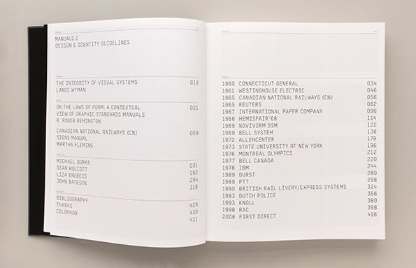
Unit Editions: Manuals 2
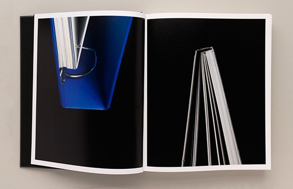
Unit Editions: Manuals 2
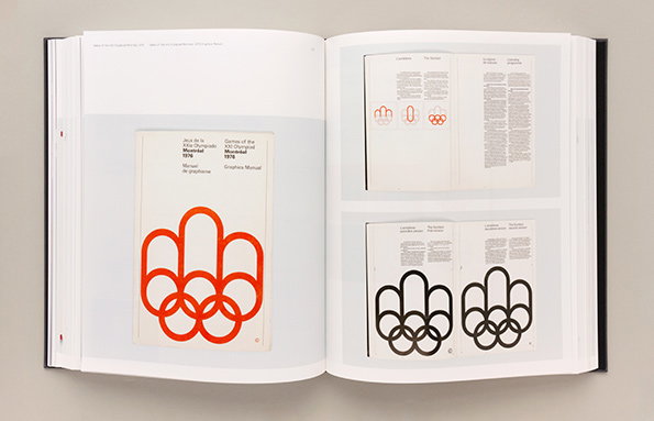
Unit Editions: Manuals 2
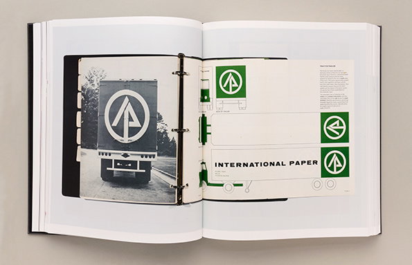
Unit Editions: Manuals 2
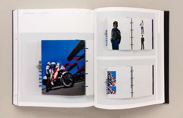
Unit Editions: Manuals 2
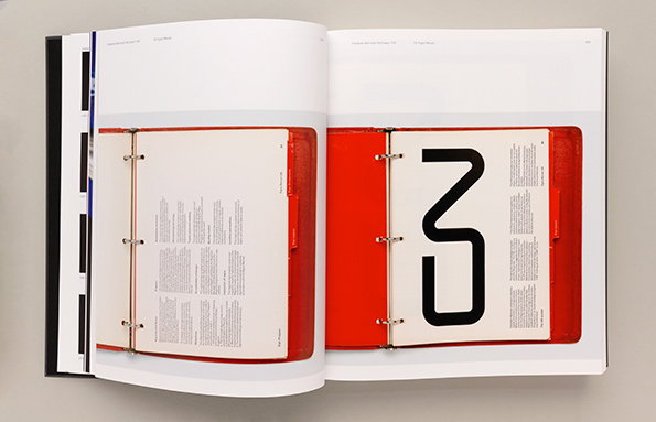
Unit Editions: Manuals 2
Share Article
Further Info
About the Author
—
Emily joined It’s Nice That as Online Editor in the summer of 2014 after four years at Design Week. She is particularly interested in graphic design, branding and music. After working It's Nice That as both Online Editor and Deputy Editor, Emily left the company in 2016.



