




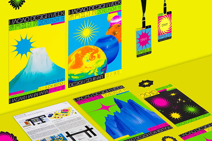
Untitled Macao exemplifies the fun side of events design
The graphic design studio Untitled Macao specialises in the design for event images, brand identities, publications, websites and apps. Founded in the South-Easterly Chinese city by Au Chon Hin, the studio is named after his native city, also known as the “Las Vegas of Asia”.
Involved in some of the most exciting happenings in the coastal region, the studio’s designs reflect the colourful and bustling environment of Macao. With several international design awards under his belt including a Tokyo TDC Annual Award and a Taiwan Golden Pin Design Award, Untitled Macao is testament to how events design can be just as bright and entertaining as graphic design in the cultural sector.
Earlier this year, the studio designed a bilingual visual identity for an exhibition and concert at the Macau Design Centre. Centred on typography, the English and Chinese identity is founded on a visual lyricism that mirrored the events taking place. Pondering several ways to translate the melody of music through visual communication, Hin’s final designs include fluidly animated posters that run across several lines as well as alternating weights of the extended type.
In another project for Macao Design Week last year, Hin along with a team of three other designers, created the identity for the Macau Designers Association. “The theme of the festival was ‘Reach out to the universe to find stories’ and the design attempted to convey this message,” explains Hin. Referencing geographical monuments such as Mount Fuji and other celestial forms, the identity aims to take the viewer on a whirlwind adventure across the universe in order to inspire new and topical ideas.
Hin also designed the identity for the last Present Future Film Festival, using jelly as the focal element within the composition. “The idea was that there are countless possibilities within filmmaking and so we used jelly as our main visual to demonstrate this,” the founding designer tells It’s Nice That. Each year, the festival screens vastly different films that reflects the lives of many different people; from the funny to the inspiring. And the jelly, in its arbitrariness and depicted in bright orange glory, was chosen to encapsulate the variety of films in its wobbly obscurity.
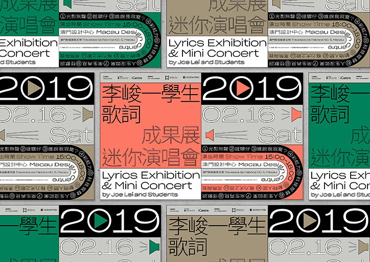
Untitled Macao: Macau Design Centre
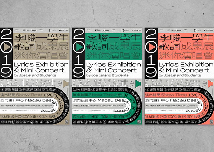
Untitled Macao: Macau Design Centre
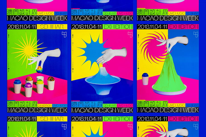
Untitled Macao: Macao Design Week
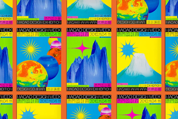
Untitled Macao: Macao Design Week
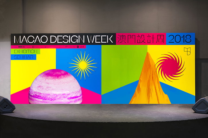
Untitled Macao: Macao Design Week
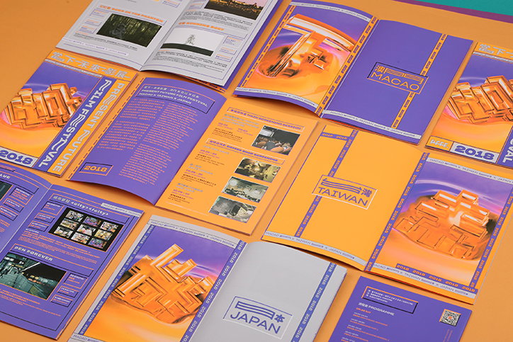
Untitled Macao: Present Future Film Festival
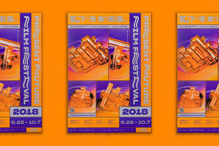
Untitled Macao: Present Future Film Festival
Share Article
Further Info
About the Author
—
Jynann joined It’s Nice That as an editorial assistant in August 2018 after graduating from The Glasgow School of Art’s Communication Design degree. In March 2019 she became a staff writer and in June 2021, she was made associate editor. She went freelance in 2022.