Warsaw-based UVMW designs a playful, hand-drawn wayfinding system for a music school in Poland
Featuring joyful characters, bold typography and lots of colour, the project proves how designing for the built environment doesn't have to be boring.
Share
Graphic design has many purposes, from conveying messages, selling a product to developing the identity of a brand or product. It can also be used in wayfinding, which involves the designing of a navigation system that will be used in a built environment. UVMW is a Warsaw-based team of designers who have just completed a project in this field for an established music school in Poland, named State Music School Complex nr. 1 (ZPSM). After it changed its headquarters, the school was in search of a new visual information system, which is exactly where UVMW came into play.
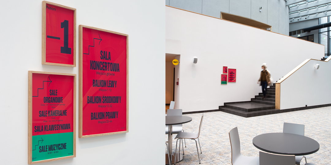
“The basis of the design process was finding forms that fit into the space and connecting two buildings of extremely different architecture,” explains Jacek Walesiak, partner and creative director of UVMW. “When designing the wayfinding system, we had to take into consideration two sides of the premise, the educational one (for students and educators) and the public one (concerts) available to guests, the audience and artists. All with the emphasis on fulfilling the needs of the youngest group of users by designing user-friendly and visually attractive signage systems.”
UVMW was co-founded by Jacek along with Robert Mendel, who’s also a parter and creative director of the studio. Jacek specialises in the field of branding and visual communications, having studied at the Warsaw Academy of Fine Arts and later producing work in the fields of graphic design, photography and urban space. Robert, on the other hand, is a designer, photographer and painter, and he’s the co-founder of UV21 Gallery. He hails from a more artistic background and studied at the Poznań University of Arts, plus Miami Ad School and Collegium Civitas. So when the two heads came together and decided to form UVMW, it was an apt pairing of disciplines and interests. To such lengths that the studio now works in creating “unusual” branding and visual communication projects, says Jack, who further notes how the team develops creative solutions for culture and business, as well as taking on small and big identity projects for advertising campaigns.
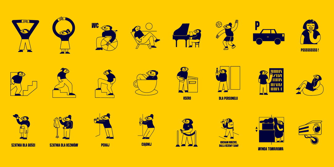
UVMW: ZPSM wayfinding system (Copyright © UVMW, 2021)
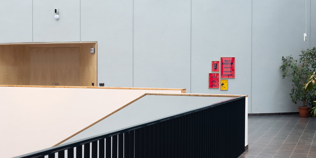
When working on the brief for ZPSM, there were a few considerations to bear in the mind. The first rests in the fact that the school’s architectural makeup is a merging of 19th century design with the modern, wherein a new-build concert hall and learning space was developed specifically fo the school. So the new system needed to incorporate both histories, in turn blending the old with the new by way of harmony and respect to the original structure. The second is that they needed to craft a system that would suit a variety of guests and purposes. “The whole facility is specific in a way that it intertwines two functions,” adds Jacek, “that being an elementary school (the main user groups are students and teachers), and a concert hall, accessible to outside guests and visitors.”
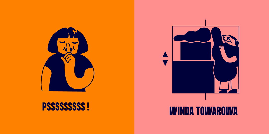
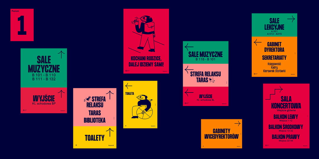
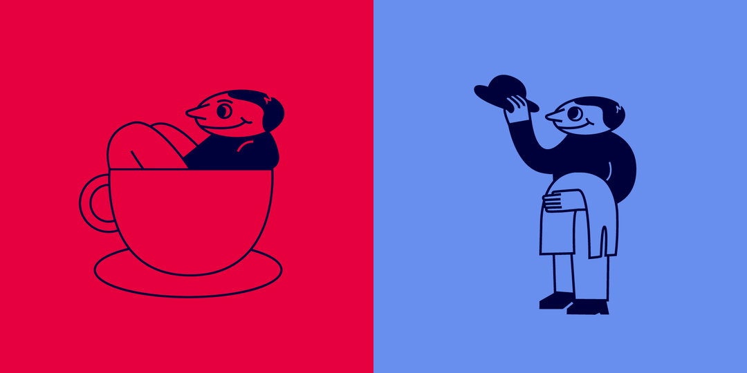
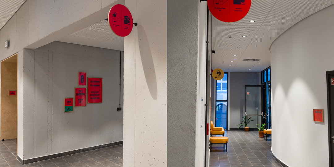
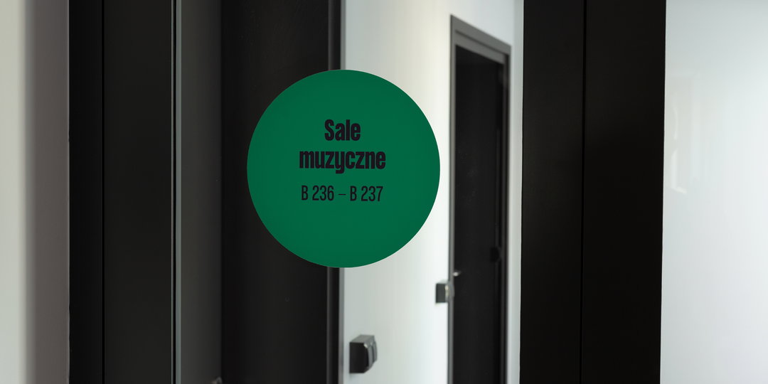
As a result, the wayfinding system has taken shape with both tradition and modernity in mind. Chunky and systematic typographies are paired with more playful hand-drawn illustrations from the studio’s intern Zuzanna Charkiewicz, the latter used to denote the various uses of the building’s facilities – things like the cafe, restrooms and whether the door is opened with ‘push’ or ‘pull’ movement. “With the students in mind, we wanted to warm up the overall message,” says Jacek, further cementing the decision to include the illustrations. “This gave us the opportunity of introducing some humour and more emotions, as seen in the smiles on faces.” Elsewhere, the team wanted to further extend the hand-drawn aesthetic to the signage, during which they “broke with corporate-style shapes" and swapped in the more user-friendly graphic messages, “emphasising who the signage system is dedicated to: the students,” continues Jacek. “By doing that, we wanted to highlight the fact that this is their space and that they are treated as a priority.”
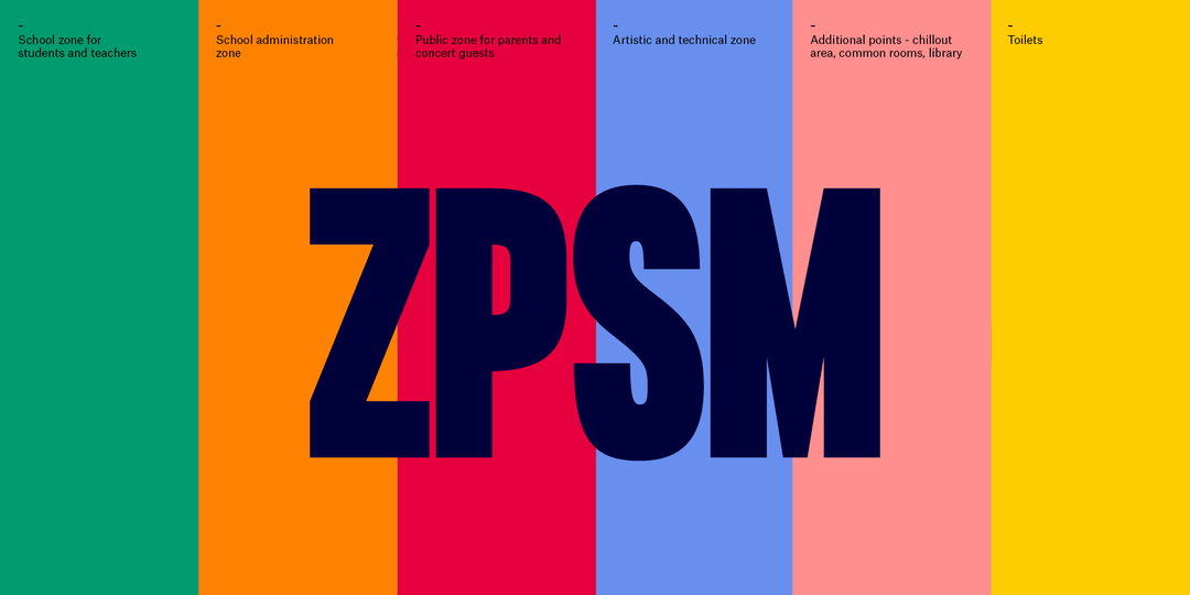
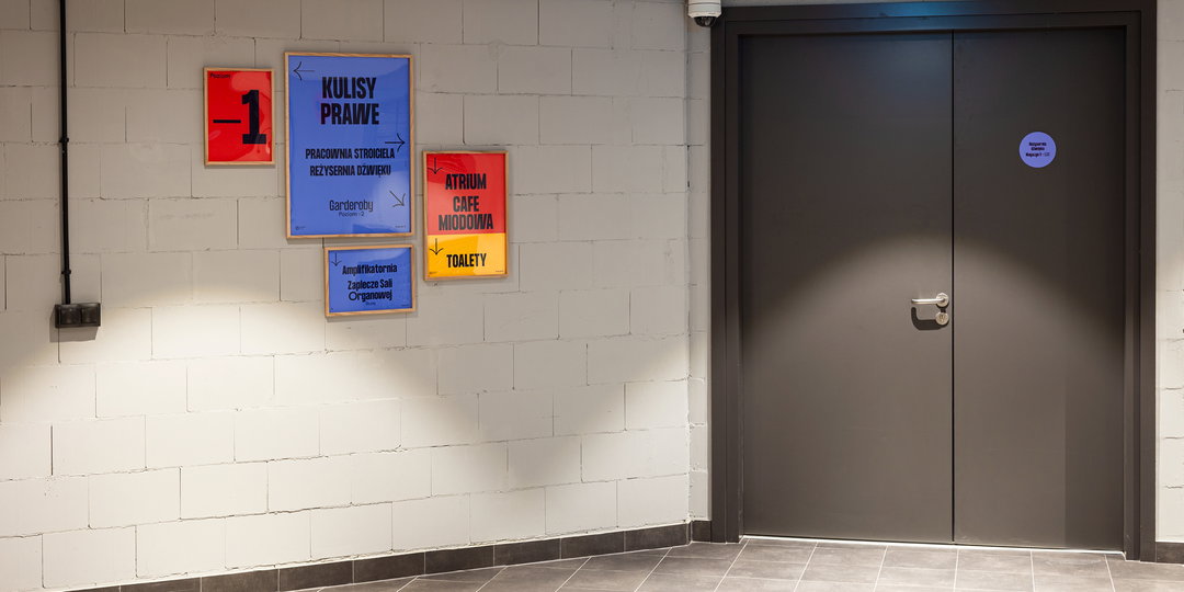
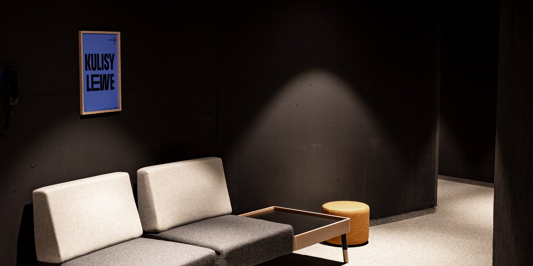
By incorporating a joyful illustrative aesthetic, this gives the system a more approachable appeal, which is certainly a win-win when it comes to designing a physical space. There’s nothing worse than coming across a piece of signage or graphic in a building, only to be confused as to what it’s telling you to do – let alone be bored by the lack of colour or humour. The ZPSM signage is simple, easy to read, and brings a smile to the face through its relatable characters and fun use of colour. “Our goal was to use colours and powerful poster typography in reference to the school’s logo,” adds Jacek. “Inspired by the concert bills, we decided to arrange [the posters] in various configurations of different intensities and size.” The typography specifically is Formula Condensed from Pangram Pangram, which is inspired by an “old poster-looking typeface” and has been condensed and decorated in modern details.
Overall, the ZPSM wayfinding system is an ideal example of how design can be used informatively and enjoyably in the physical sphere, and we’re not the only ones who think so either. The project has also won the Gold European Design Award this year, and it’s received the Polish Graphic Design Award for the best wayfinding system. We’re excited to see where the studio heads next!
GalleryUVMW: ZPSM wayfinding system (Copyright © UVMW, 2021)
Hero Header
UVMW: ZPSM wayfinding system (Copyright © UVMW, 2021)
Share Article
Further Info
About the Author
—
Ayla is a London-based freelance writer, editor and consultant specialising in art, photography, design and culture. After joining It’s Nice That in 2017 as editorial assistant, she was interim online editor in 2022/2023 and continues to work with us on a freelance basis. She has written for i-D, Dazed, AnOther, WePresent, Port, Elephant and more, and she is also the managing editor of design magazine Anima.