



Launch Recite Me assistive technology
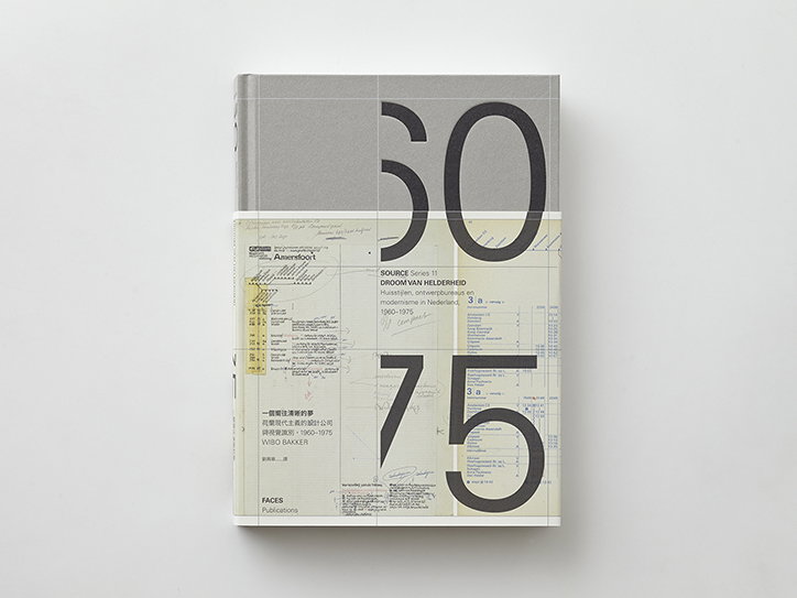
A book cover featuring a collage of architectural diagrams and technical drawings. Large, bold numerals read “50” and “75”, with text in the centre reading “Source Series 11” and “Droom van helderheid”.

Wang Zhi-Hong’s thoughtfully designed book about Dutch modernism 

—
Date
1 March 2016

One of Taiwan-born graphic designer and art director Wang Zhi-Hong’s most recent projects sees him adopt a simple, minimal approach for this artfully designed book about modernism in the Netherlands during the 60s and 70s. We featured a selection of the designer’s pared-back work in 2014 and his work has developed since then but still retains a sense of precision and purpose. 

Titled Droom van helderheid: Huisstijlen, ontwerpbureaus en modernisme in Nederland, 1960-1975 the book is a hefty tome of Dutch design and branding and shows how certain design firms started dictating house styles to companies and institutions. Wang Zhi-Hong’s design is sympathetic to the wealth and breadth of material that sits within the book’s pages. Rather than overcomplicating it, the designer sets out the book like a thoughtfully composed, grid-like sketchbook, allowing the viewer to pore over the pages and absorb the detail. The simple block lettering adds to the neatness, but the public transport timetable that’s been doodled over on the cover adds a wonderful disorder to the book. 
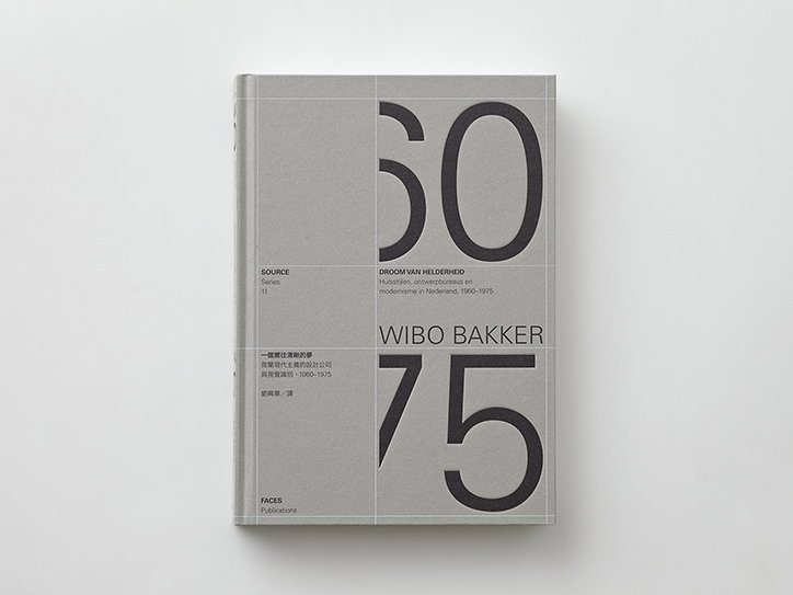
A grey book cover featuring large black numerals “60” and “75” stacked vertically. Between the numbers, text reads “Droom van Helderheid” and “Wibo Bakker”.
Above

Wang Zhi-Hong: Droom van helderheid: Huisstijlen, ontwerpbureaus en modernisme in Nederland, 1960-1975
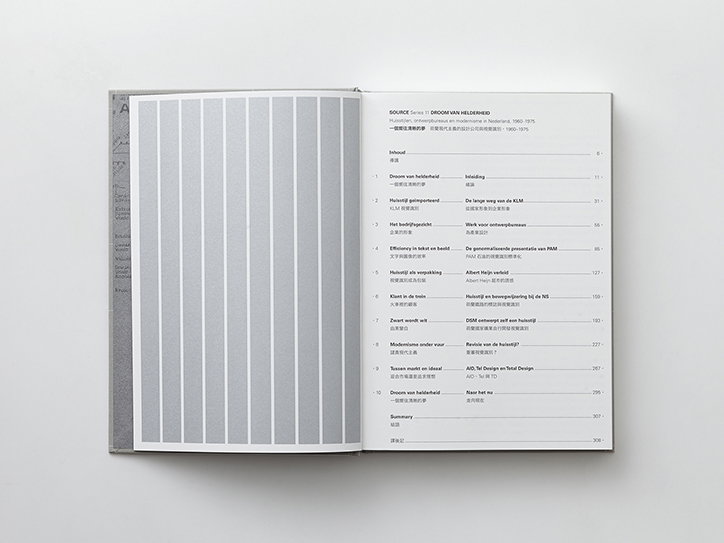
An open book showing a table of contents on the right page. The left page features a series of vertical grey and white stripes.
Above

Wang Zhi-Hong: Droom van helderheid: Huisstijlen, ontwerpbureaus en modernisme in Nederland, 1960-1975
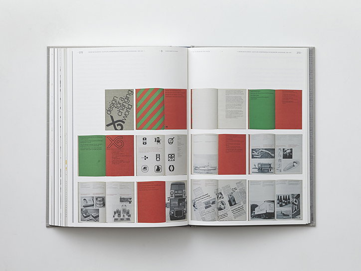
An open book displays a grid of graphic design samples across two pages. The layouts feature a palette of red, green and grey, including a logo that reads “design for a changing world”.
Above

Wang Zhi-Hong: Droom van helderheid: Huisstijlen, ontwerpbureaus en modernisme in Nederland, 1960-1975
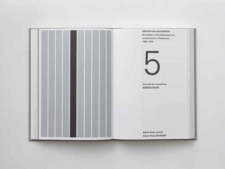
An open book shows a grey striped pattern on the left page and a white page with text on the right. The text includes a large numeral “5” and the title “Droom van Helderheid”.
Above

Wang Zhi-Hong: Droom van helderheid: Huisstijlen, ontwerpbureaus en modernisme in Nederland, 1960-1975
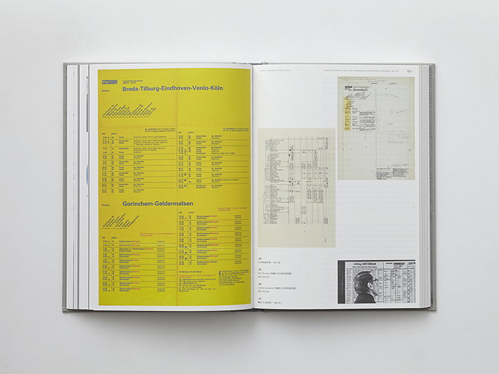
An open book displays a collection of vintage transport documents and schedules. One page is bright yellow with black text reading “Breda-Tilburg-Eindhoven-Venlo-Köln” and “Gorinchem-Geldermalsen”.
Above

Wang Zhi-Hong: Droom van helderheid: Huisstijlen, ontwerpbureaus en modernisme in Nederland, 1960-1975
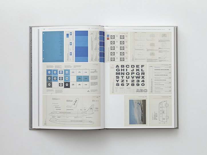
An open brand guidelines manual showing two pages of identity standards. The pages feature blue colour palettes, logo variations, a typeface specimen, and technical drawings of an aircraft.
Above

Wang Zhi-Hong: Droom van helderheid: Huisstijlen, ontwerpbureaus en modernisme in Nederland, 1960-1975
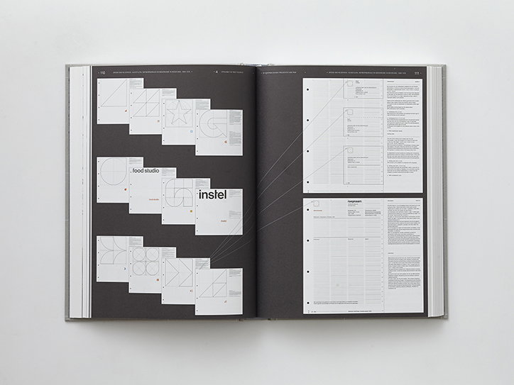
An open book shows a graphic design study on a dark grey background. The left page displays a grid of white squares containing geometric sketches and the word “instel”, while the right page contains detailed technical notes and diagrams.
Above

Wang Zhi-Hong: Droom van helderheid: Huisstijlen, ontwerpbureaus en modernisme in Nederland, 1960-1975
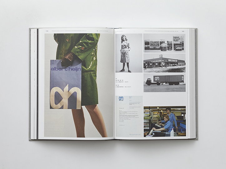
An open book shows a spread of archival branding for Albert Heijn. The left page features a person in a green vinyl coat holding a blue shopping bag with a large “ah” logo. The right page contains a collage of smaller images, including a storefront, a delivery truck, and a person in a blue uniform.
Above

Wang Zhi-Hong: Droom van helderheid: Huisstijlen, ontwerpbureaus en modernisme in Nederland, 1960-1975
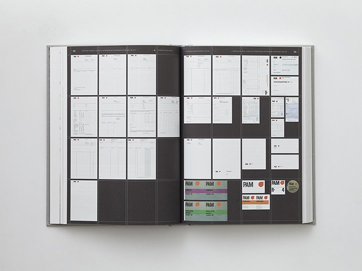
An open book displays two pages of a design system or brand manual. The pages are filled with a grid of white documents, layout templates and small colour palettes featuring the “Pam” logo.
Above

Wang Zhi-Hong: Droom van helderheid: Huisstijlen, ontwerpbureaus en modernisme in Nederland, 1960-1975
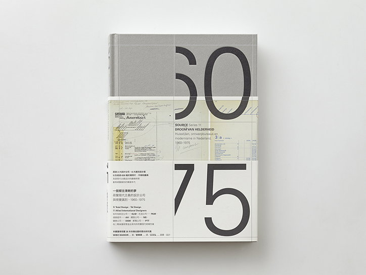
A book cover divided into three horizontal bands of grey, yellowed paper, and white. Large black numerals read “50” at the top and “75” at the bottom. The middle section contains technical drawings and text including “SOURCE Series 11” and “DROOM VAN HELDERHEID”.
Above

Wang Zhi-Hong: Droom van helderheid: Huisstijlen, ontwerpbureaus en modernisme in Nederland, 1960-1975

Share Article

About the Author

Rebecca Fulleylove

—

Rebecca Fulleylove is a freelance writer and editor specialising in art, design and culture. She is also senior writer at Creative Review, having previously worked at Elephant, Google Arts & Culture, and It’s Nice That.

It's Nice That Newsletters

Fancy a bit of It's Nice That in your inbox? Sign up to our newsletters and we'll keep you in the loop with everything good going on in the creative world.