Launch Recite Me assistive technology
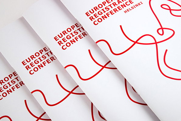
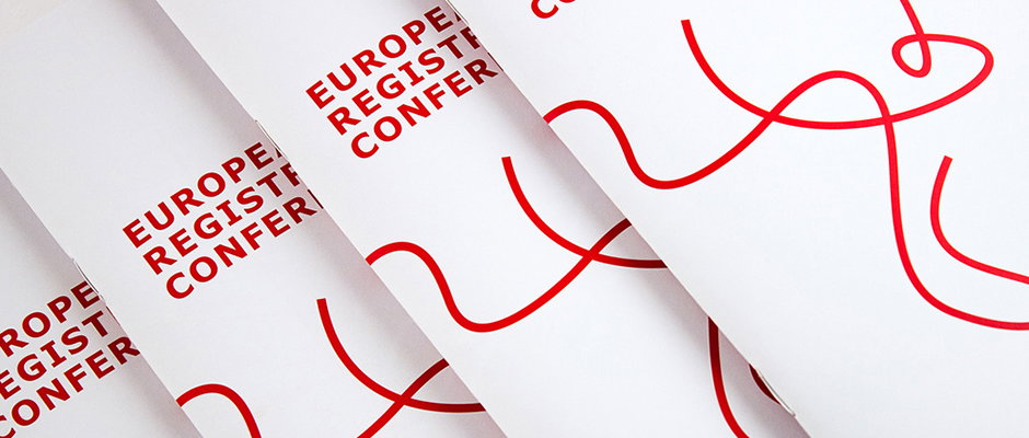
A row of white brochures are fanned out, each featuring red text that reads “European Registry Conference”. A single, continuous red line loops and curves across the pages.

Got a really dry brief and need something brilliant? Call Helsinki studio Werklig

—
Date
7 July 2014

Graphic design agencies have different specialities, and Finnish agency Werklig is no different. The Helsinki-based studio are the absolute masters when it comes to taking briefs that appear to leave little room for manoeuvre and creating something eye-catching and engaging. Put another way, they make boring stuff look brilliant. Take this work for the 2014 European Registrars Conference. You know the European Registrars Conference! It’s pretty much the continent’s most “important forum for information, discussion and networking among museum professionals.”

Anyway Werklig were commissioned way back in 2012 to provide a “a flexible, functional and distinguishable identity” for the event as it rolled into Helsinki, and they did an absolutely smashing job as you can see.

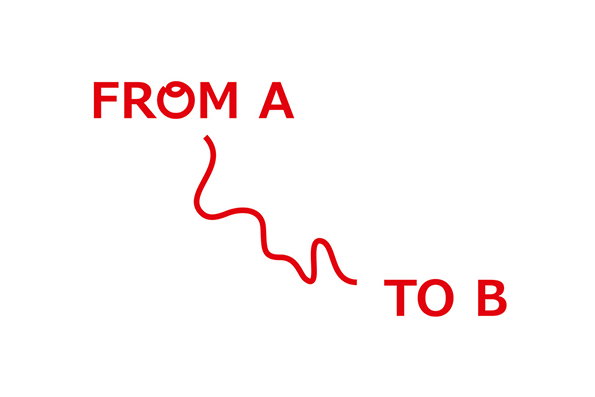
“For the main graphics we created a living identity of lines that were always circling, overlapping and moving in an unpredictable way,” they say. “The lines represented the registrars’ work: moving art and goods from A to B. These lines were used as a static elements (always different from application to another) as well as in animations during the conference.”

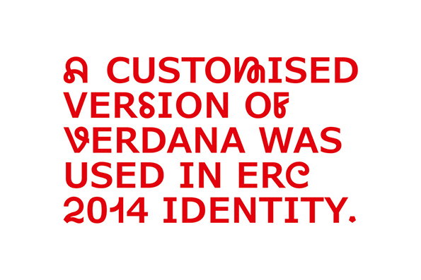
The identity works superbly across every conceivable kind of conference collateral; posters, flags, animated stings, delegate badges, programmes, display screens and signage. A really nice extra touch is the customised Verdana typeface, into which they spliced letterforms from the Lyno font.

It’s no fluke either; look through the rest of their portfolio to see that whatever you throw at this talented gang they can turn it into graphic design gold.
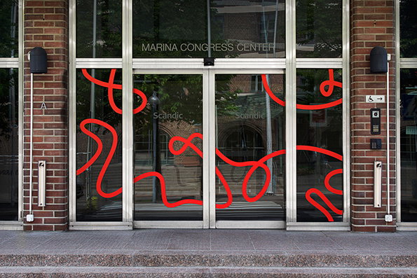
Glass double doors at the entrance of the “Marina Congress Center” are decorated with a bold, red scribbled line. The red graphic winds across the glass panels, set against a backdrop of brick walls and reflections of trees.
Above

Werklig: ERC 2014 identity

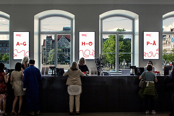
People stand at a long black reception desk in a bright room with large arched windows. Three white signs above the desk display red letters: “A–G”, “H–O” and “P–Å”.
Above

Werklig: ERC 2014 identity

A red graphic on a white background features the text “FROM A” at the top left and “TO B” at the bottom right. A squiggly red line connects the two phrases.
Above

Werklig: ERC 2014 identity

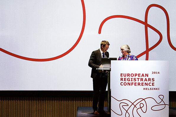
Two people stand behind a white podium on a stage. The podium reads “European Registrars Conference 2014 Helsinki” and is decorated with red scribbled lines.
Above

Werklig: ERC 2014 identity

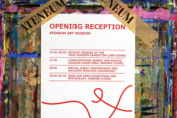
A white invitation for an “Opening Reception” at the “Ateneum Art Museum” is taped to a colourful, abstract painted background. The text lists a schedule of events, including a “Private viewing of the Tove Jansson exhibition”.
Above

Werklig: ERC 2014 identity

Red text on a white background reads “A customised version of Verdana was used in ERC 2014 identity.” Some of the letters feature decorative, swirling flourishes.
Above

Werklig: ERC 2014 identity

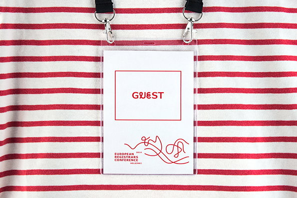
An event badge in a clear plastic holder rests on a red and white striped fabric. The white card reads “GUEST” in red type, with “European Registrars Conference Helsinki” and a red line drawing at the bottom.
Above

Werklig: ERC 2014 identity

Four white brochures are fanned across a plain surface. Each features red typographic text reading “European Registrars Conference” and a series of flowing, red abstract lines.
Above

Werklig: ERC 2014 identity

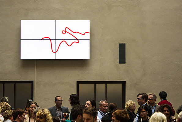
A crowd of people gather in a room beneath a large screen. The screen displays a simple red line winding across a white background.
Above

Werklig: ERC 2014 identity

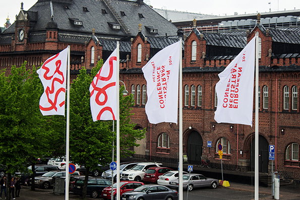
Four white flags fly in front of a red brick building with a dark grey roof. Two flags feature red abstract shapes, while the other two display red text that reads “European Registrar Conference 2017”.
Above

Werklig: ERC 2014 identity

Share Article

Further Info

About the Author

Rob Alderson

—

Rob Alderson is a freelance writer, editor and strategist. He was previously editor-in-chief of It’s Nice That and WePresent, and editor of Design Week. He publishes the newsletter Undo, which tries to make sense of how AI is changing design work, the design process and the design industry.


It's Nice That Newsletters

Fancy a bit of It's Nice That in your inbox? Sign up to our newsletters and we'll keep you in the loop with everything good going on in the creative world.