Yuna Kim wants to see graphic design become a more tactile medium
Creating exhibition scratch cards and immersive wall-to-floor designs, the Seoul-based creative has no interest in keeping things simple.
It is Yuna Kim’s desire to search for innovative ways to both visually and physically emulate the exhibitions she designs for, that truly sets her practice apart. “I try to experiment with an aspect of graphic design that is more tactile, something we keep in our hands,” the designer begins. “I think it’s a way of sustaining my design practice and making it more memorable.”
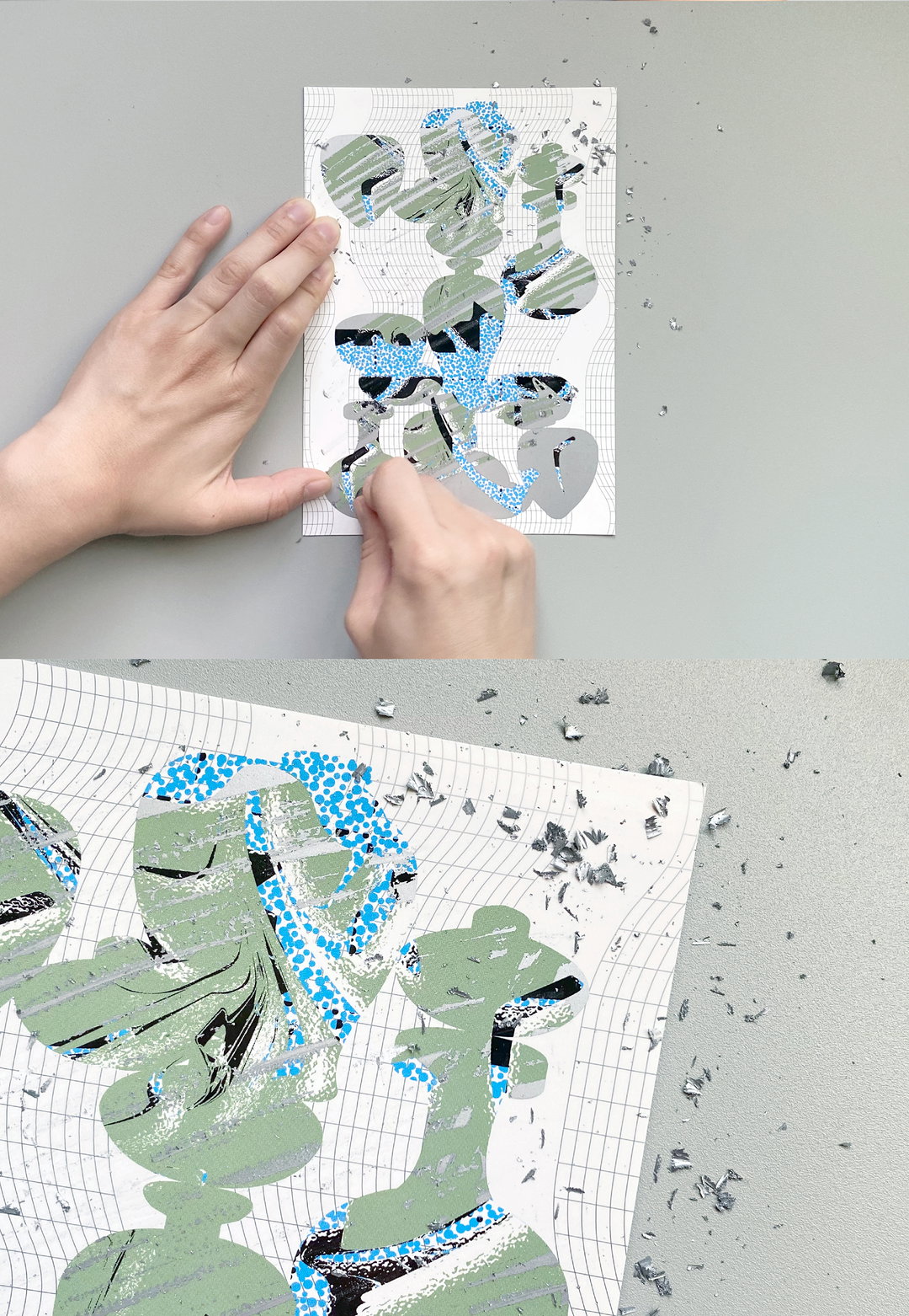
For the exhibition Beyond Heritage, Yuna expertly reimagined its exploration of Goryeo celadon – a type of traditional Korean pottery – and other historically significant artefacts that had been discovered underwater. Focussing on the bluey-green hues of cleadon glaze and the sea, merged within the “silhouette” of Goryeo pieces, the designs adorned the walls and floor of the entrance, creating a captivatingly immersive experience before attendees had even set foot into the exhibition. But, the stand-out element of the whole project was Yuna’s creation of “scratch cards”, a patterned flyer that when scratched away revealed new patterns and shapes. This, Yuna elucidates, was to make the exhibition attendees feel “as if they themselves were excavating treasures from under water”.
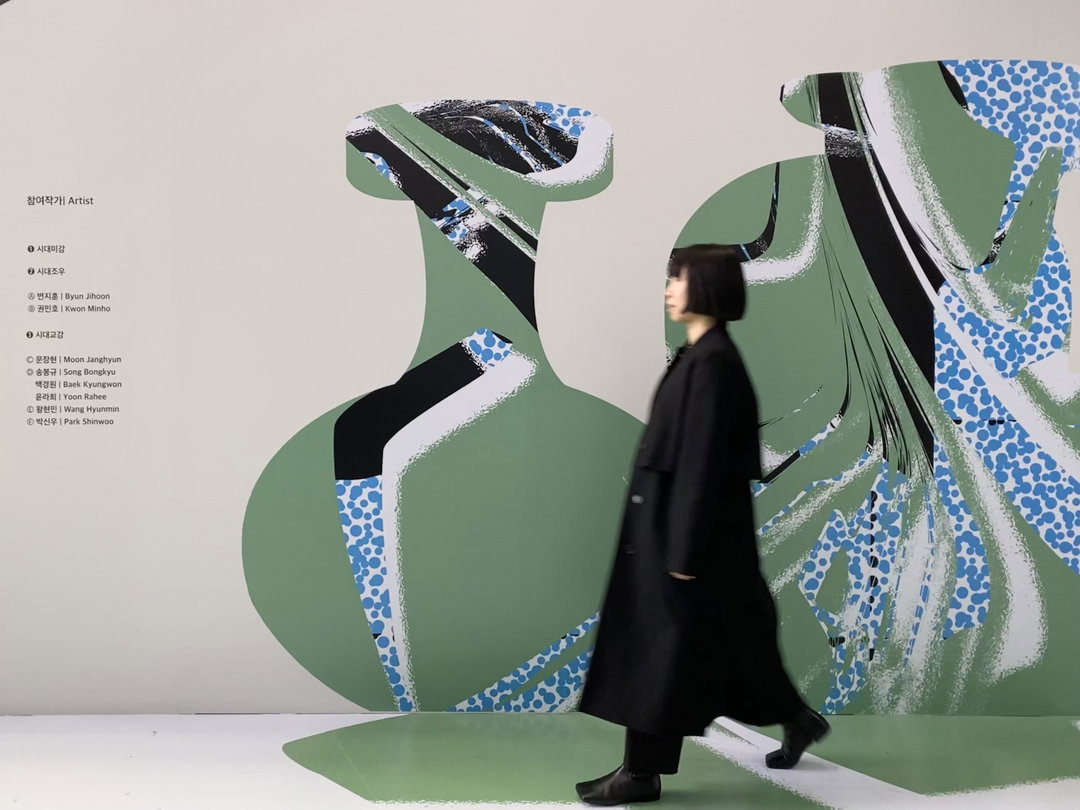
Yuna Kim: Beyond Heritage (Copyright © Yuna Kim, 2020)
Forming the basis of her design practice, Yuna sees exhibition design as so important because “exhibition posters are a way to introduce them to the public, and the exhibition space is an expansion of the artist's thoughts”. Moreover, loving to “turn what’s on the screen into objects in the real world” Yuna loves how exhibition design has the potential to exist both in the online and offline world. There is nothing more satisfying, she tells us, than “when the graphic design language and the material matches – this is where all the fun and pleasure comes from”. Before beginning any project, Yuna also tells us that she will thoroughly study the artist she is working with, which often leads to a fruitfully collaborative atmosphere. When she worked alongside botanist Jung Sung Kyu for his exhibition Negative Lines, she visited his studio and spent hours listening to his thoughts and exploring his array of plants.
Describing herself as “a curious kid who loved art and music and loved visiting museums” Yuna knew that she would go on to be involved in visual arts. Going on to study interior design at university initially felt like a “natural choice”, but, it was upon doing an assignment designing a space that she found herself “more fascinated by the visual aspects of it”. Upon this discovery, Yuna applied for a design internship at the National Museum of Modern and Contemporary Art in Korea before later being taken on as their in-house graphic designer. Working at the museum between 2014 and 2020, Yuna sees it as an important period in helping her “develop a sense of scale and space”. Now, Yuna runs her own independent graphic design studio, yunakimc.
One of the defining visual themes throughout Yuna’s work is her abstraction, often using geometric shapes and grid-like patterns. This focus on abstraction, Yuna details, is rooted in the way she wishes for people to receive her work: “When people see contemporary art, they interpret artworks in ways that are often unrelated to the purpose of the artists. Abstract graphic design is a way for people to have more thoughts and come up with their own interpretations.” This application shines through in Yuna’s recent poster for On and Around the Table. Whilst the spherical shapes are composed of round tables stacked on their sides, Yuna explains many people have told her they initially thought they were depictions of the moon, or lunar cycles.
Ever inspired and always on the pursuit of innovation, Yuna shares with us that she recently happened upon a crumpled handkerchief on her desk, which was “crying for discovery”. Having now created a collective, HituruMaturu, alongside her friend, inspired by the encounter, Yuna is looking to start creating physical objects and designs inspired by the visual physicality of “crumpled”. “Who knows”, she concludes, “this might be another start for me as a different kind of creator”.
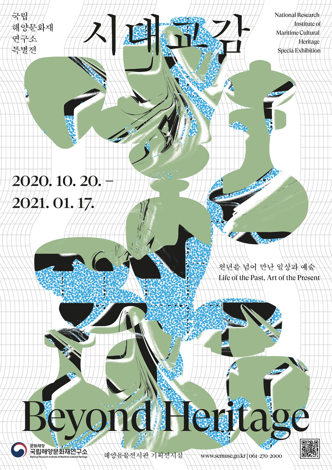
Yuna Kim: Beyond Heritage (Copyright © Yuna Kim, 2020)
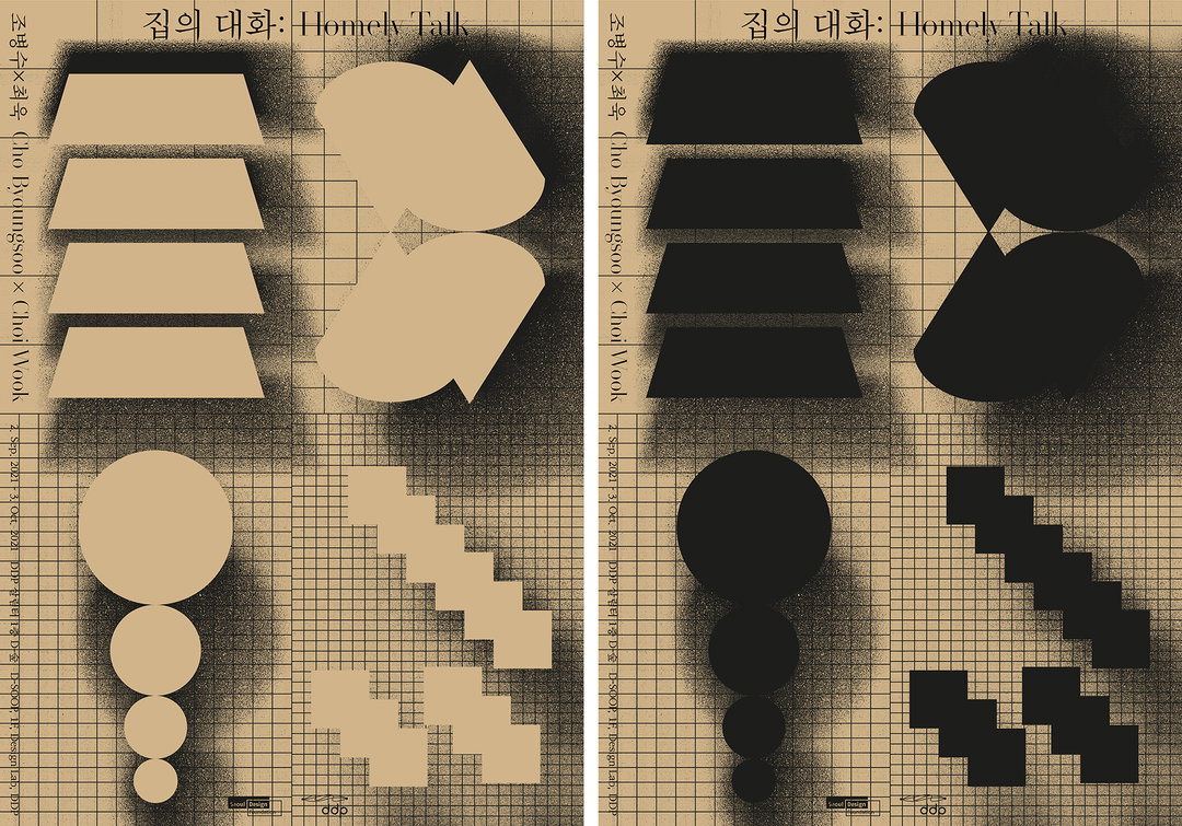
Yuna Kim: Homely Talk (Copyright © Yuna Kim, 2021)
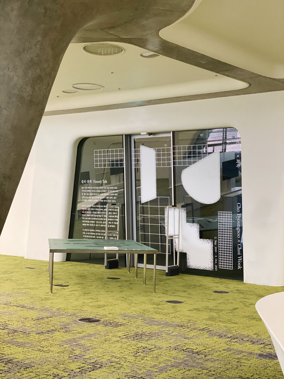
Yuna Kim: Homely Talk (Copyright © Yuna Kim, 2021)
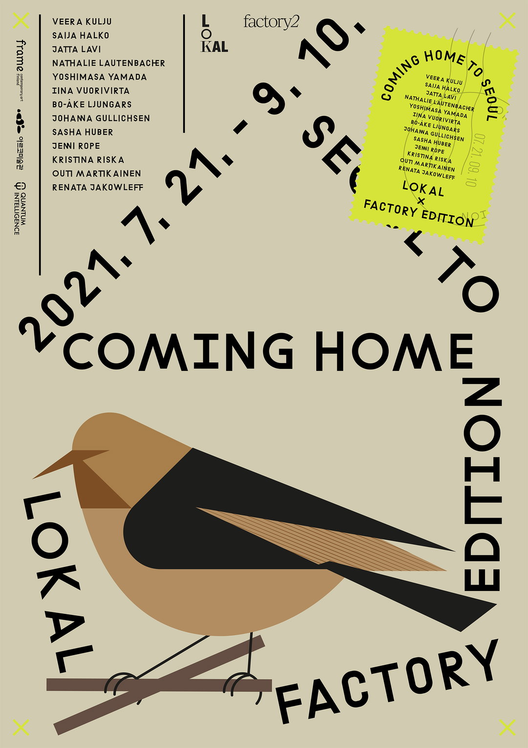
Yuna Kim: Coming Home to Seoul (Copyright © Yuna Kim, 2021)
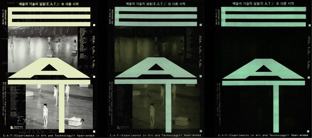
Yuna Kim: Experiments in Art and Technology (Copyright © Yuna Kim, 2021)
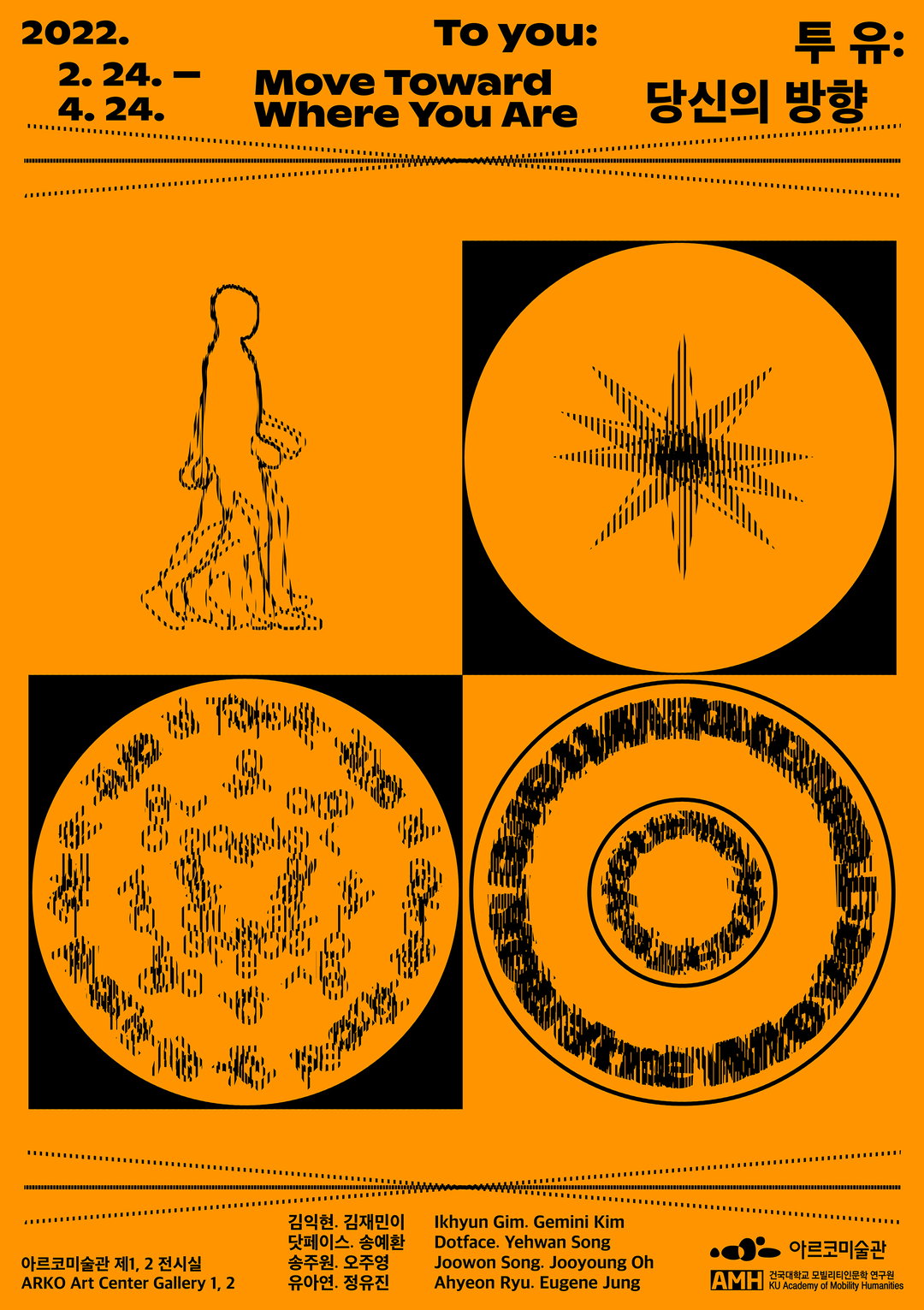
Yuna Kim: To You, Move Toward Where You Are (Copyright © Yuna Kim, 2021)
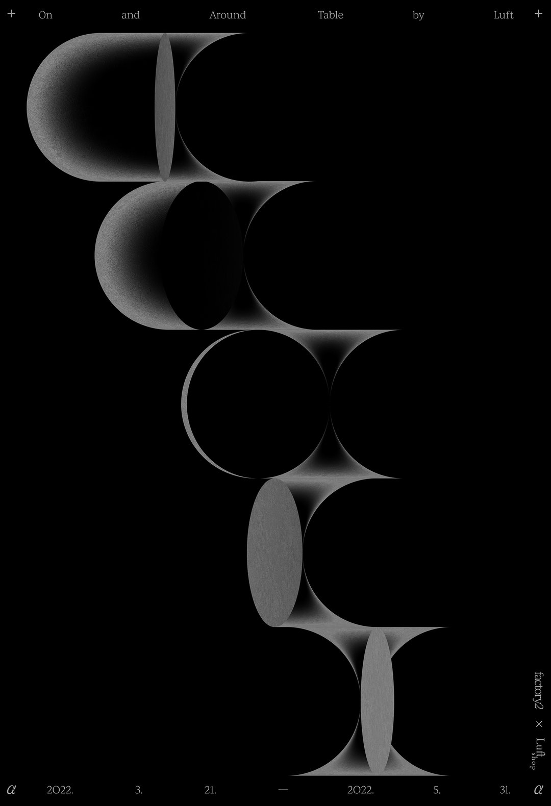
Yuna Kim: On and Around Table (Copyright © Yuna Kim, 2022)
Yuna Kim: Project Limited (Copyright © Yuna Kim, 2021)
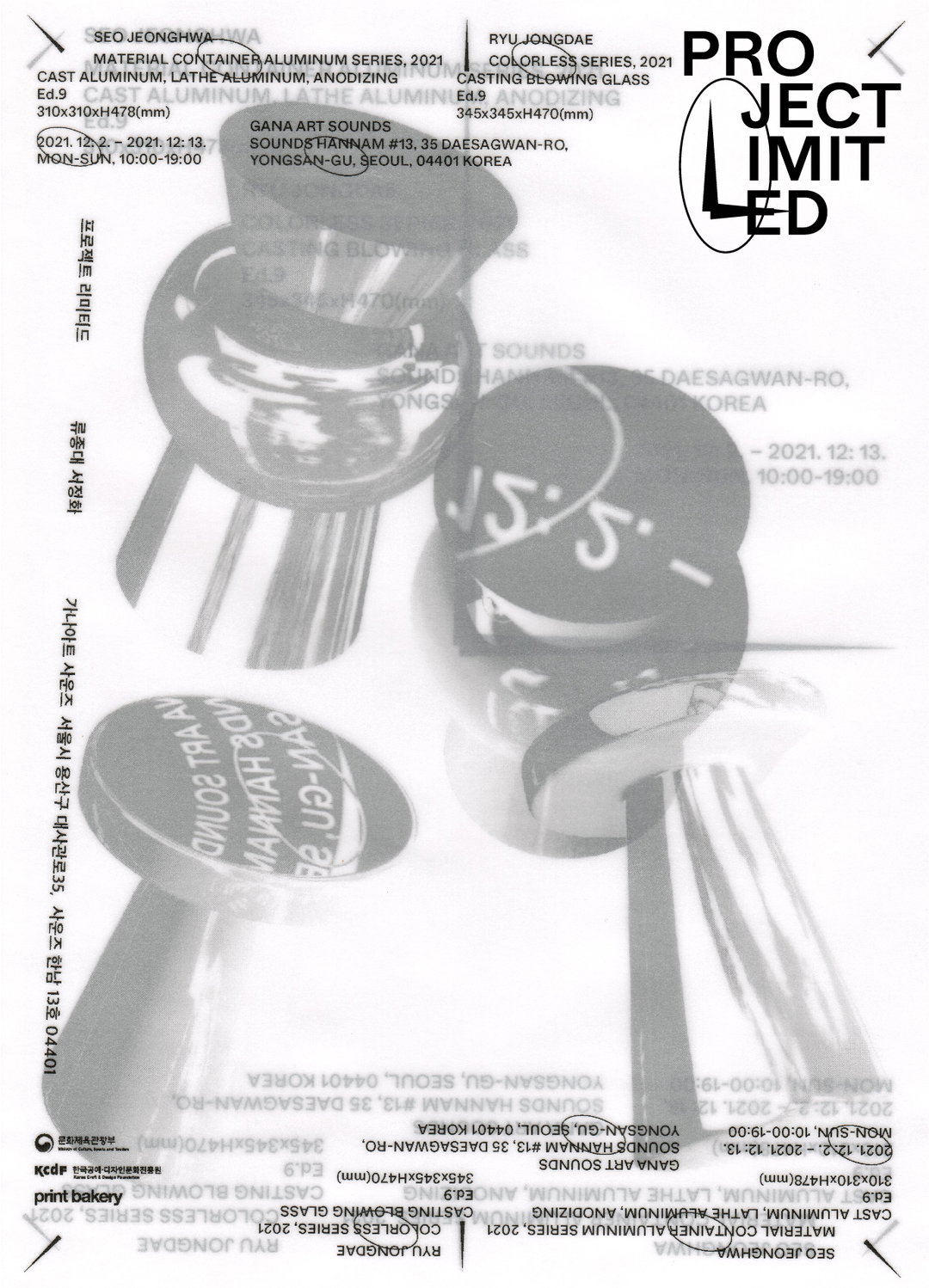
Yuna Kim: Project Limited (Copyright © Yuna Kim, 2021)
Hero Header
Yuna Kim: Beyond Heritage (Copyright © Yuna Kim, 2020)
Share Article
Further Info
About the Author
—
Olivia (she/her) is associate editor of the website, overseeing the day-to-day editorial projects as well as Nicer Tuesdays events. She joined the It’s Nice That team in 2021. ofh@itsnicethat.com
To submit your work to be featured on the site, see our Submissions Guide.