Launch Recite Me assistive technology
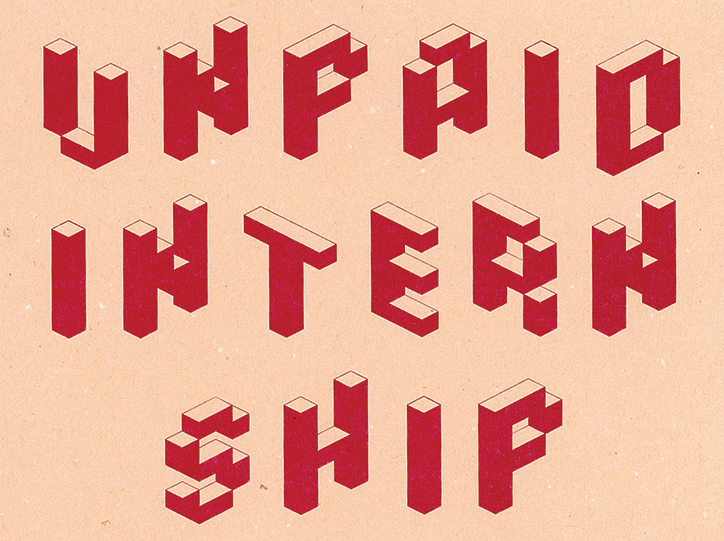
A graphic illustration of the words “UNPAID INTERN SHIP” in bold, red 3D lettering. The blocky text is set against a plain, pale pink background.

Yunus Ak explores and expands the form of the book through typography

—
Date
12 June 2017

MA Communication Design student Yunus Ak’s current work is driven “by my own personal memory” he tells It’s Nice That. “It’s structured consciously or unconsciously from everywhere I travel and see, everything I read and taste.”

As a result the designer’s projects contain a plethora of interests, anecdotes and design styles. However typography is a constant element, which attracts his attention most. Currently working on his final thesis on the “format of the book,” Yunuk’s project 16×12 plays with composition and layouts outside of the typical grids of a graphic design portfolio.

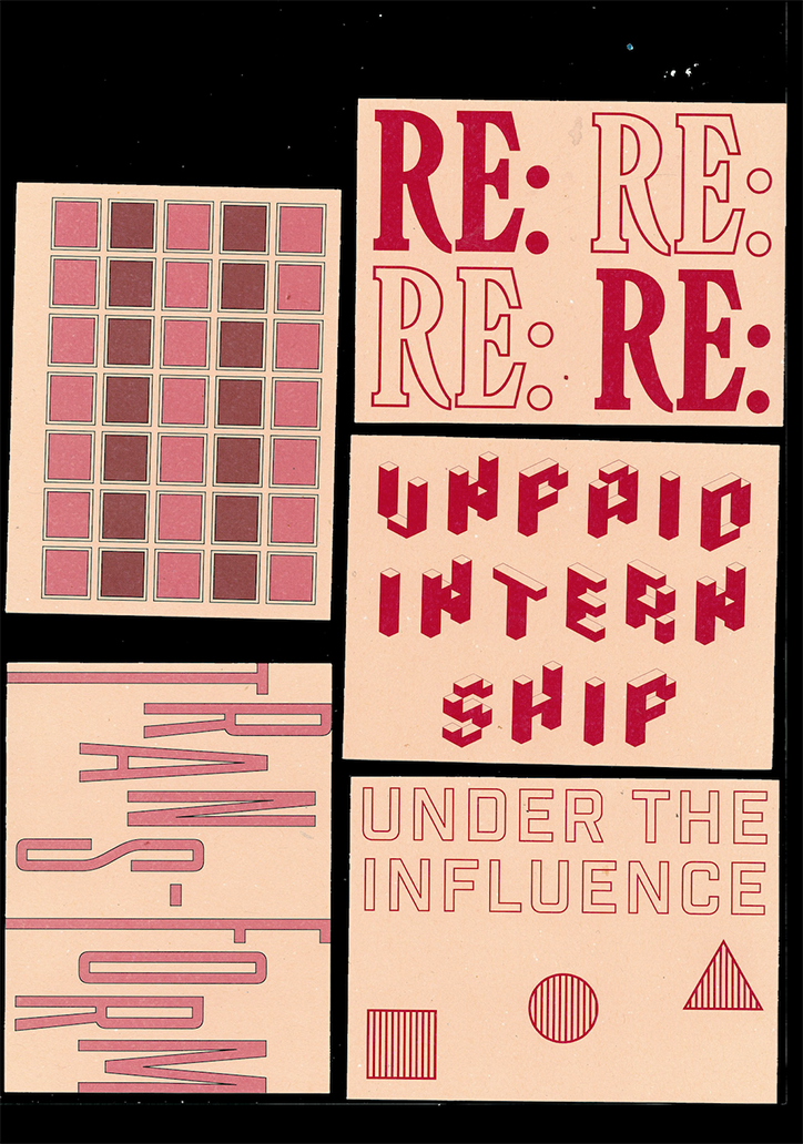
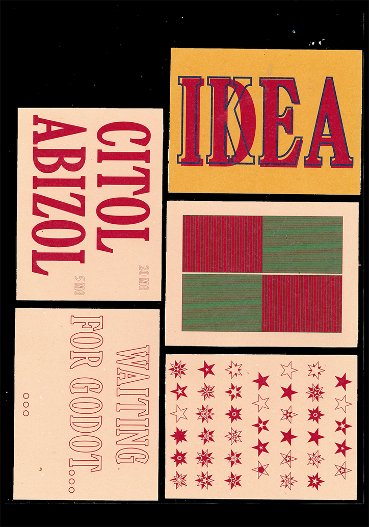
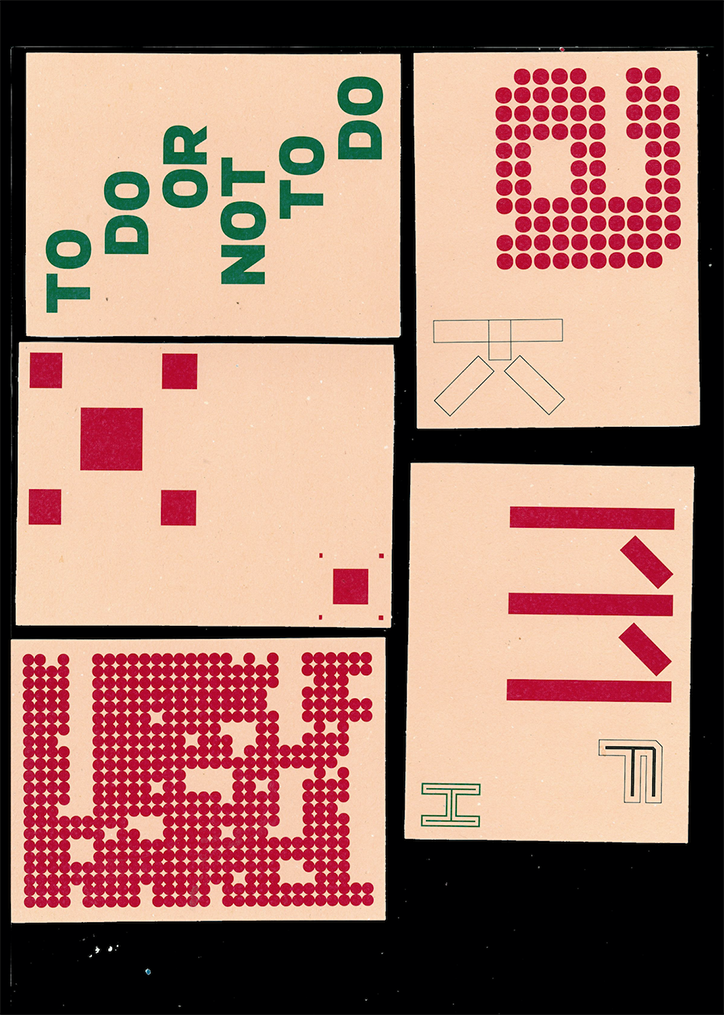
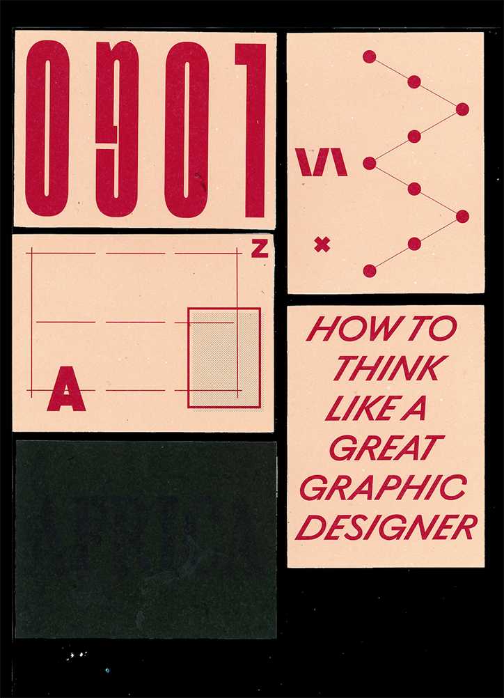
The project is an amalgamation of what looks like calling cards with various sayings and quotes related to the design industry such as, “unpaid internship,” “how to think like a great graphic designer,” or a suggestion of a never ending e-mail thread in, “re: re: re: re:”.

As Yunus completes his masters at ESAD Matasinhos, Portugal, we look forward to seeing the results of exploring and manipulating the form of a book in full.
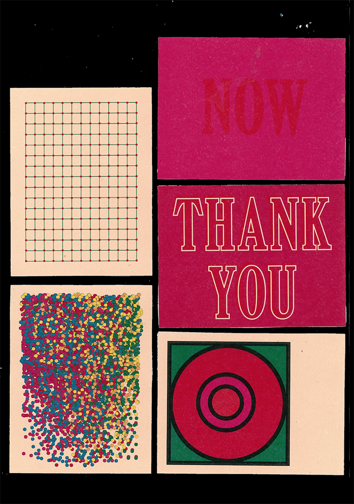
A collection of five graphic cards arranged on a black background. The cards feature a green grid, a red circle on a green square, a dense spray of multicoloured dots, and two pink cards reading “NOW” and “THANK YOU”.
Above

Yunus Ak: 16×12

A collection of four graphic prints on a pale pink background. The designs feature bold red typography and geometric patterns, including the phrases “RE:”, “UNPAID INTERNSHIP” and “UNDER THE INFLUENCE”.
Above
Left

Yunus Ak: 16×12

Right

Yunus Ak: 16×12

A collection of five graphic cards against a black background. One reads “IDEA” in bold red letters on yellow, while another reads “CITOL ABIZOL” in red. A third card reads “WAITING FOR GODOT...”, and the others feature a red and green grid and a pattern of red stars.
Above

Yunus Ak: 16×12

A collection of four cream-coloured cards featuring red and green graphic elements. One card contains the text “TO DO OR NOT TO DO” arranged in a circle.
Above
Left

Yunus Ak: 16×12

Right

Yunus Ak: 16×12

A collage of graphic design studies in red and cream. One panel features the word “LOGO” written in a bold, mirrored typeface, while another reads “HOW TO THINK LIKE A GREAT GRAPHIC DESIGNER”.
Above

Yunus Ak: 16×12

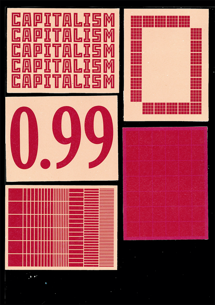
A graphic collage in red and cream. One panel repeats the word “CAPITALISM” five times in a bold, blocky font, while another displays the number “0.99”. The remaining panels feature abstract grids and linear patterns.
Above
Left

Yunus Ak: 16×12

Right

Yunus Ak: 16×12

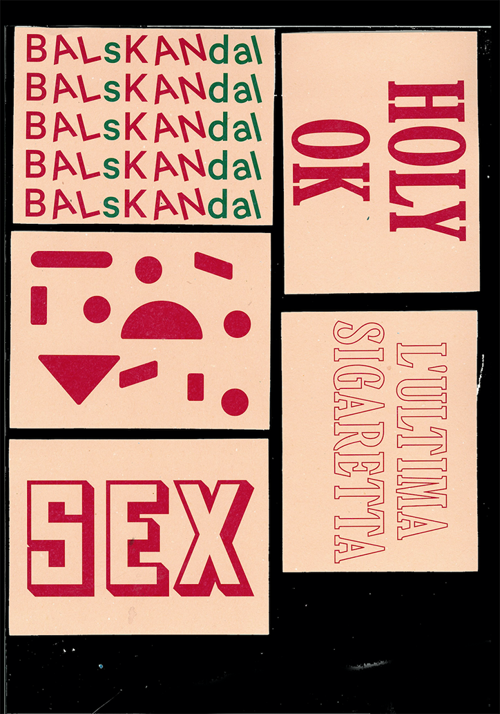
A collection of five graphic cards in red and cream. The cards feature bold typography and abstract shapes, including the words “BalsKandal”, “Holy OK”, “Sex” and “L’ultima sigaretta”.
Above

Yunus Ak: 16×12

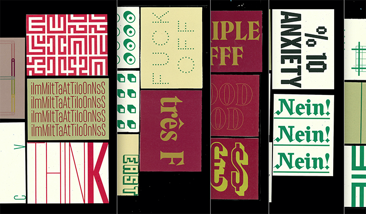
A collage of graphic panels featuring bold typography and abstract patterns. Legible text includes “FUCK OFF”, “très F”, “ANXIETY”, and “Nein!” repeated three times.
Above

Yunus Ak: 16×12

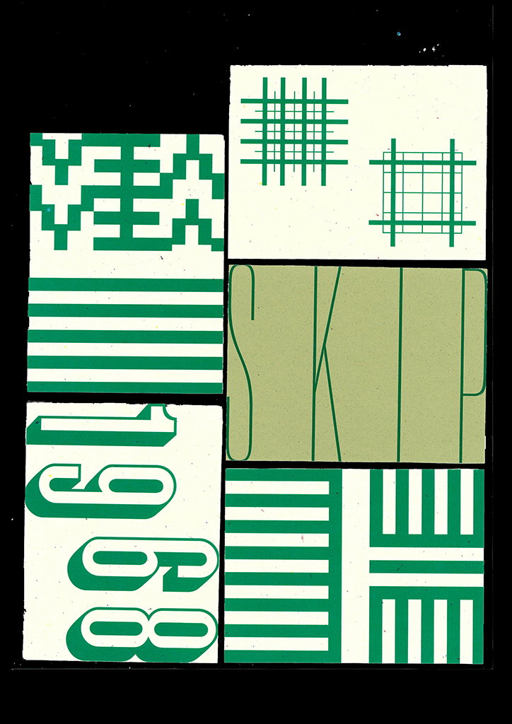
A green and white collage of abstract shapes and typography. One section features the word “SKIP” in a tall, thin font, while another shows the year “1968” in a bold, 3D style.
Above
Left

Yunus Ak: 16×12

Right

Yunus Ak: 16×12

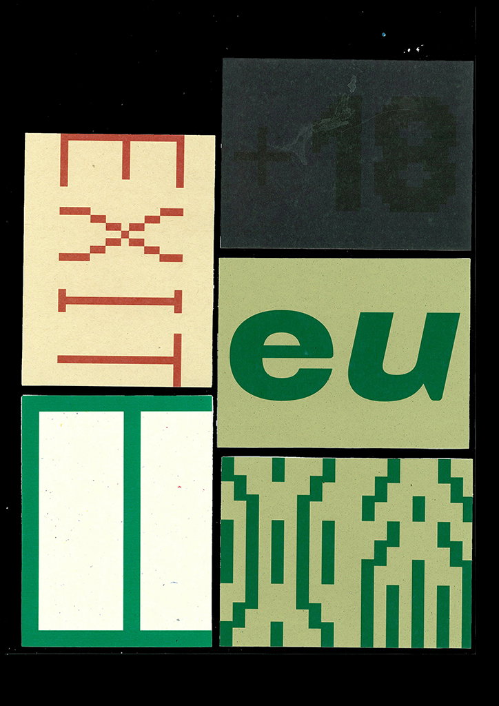
A collage of four graphic cards against a black background. One card features the word “EXIT” written vertically in red, while another shows the lowercase letters “eu” in green.
Above

Yunus Ak: 16×12

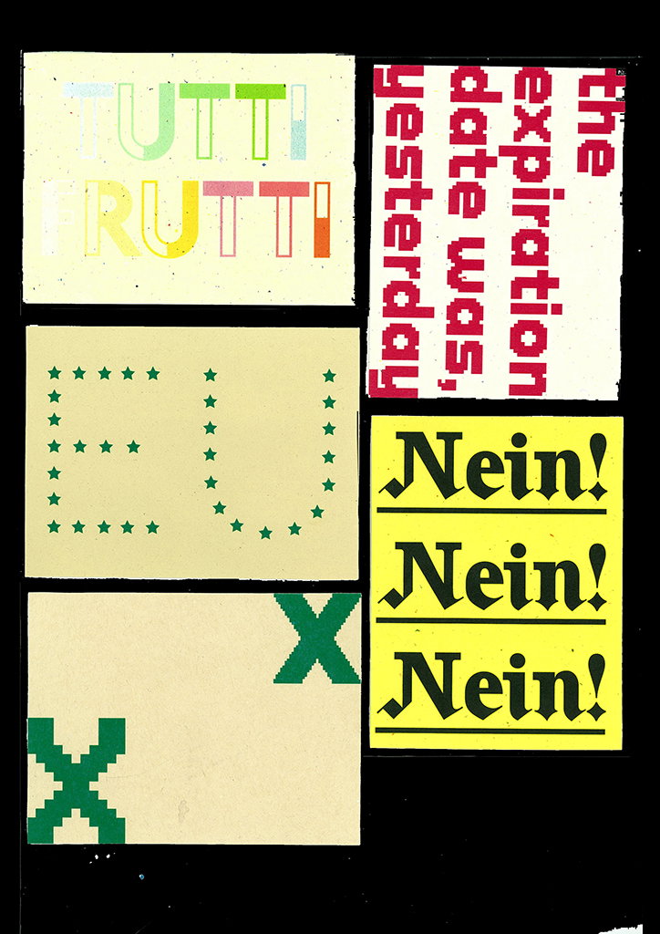
A collage of five graphic panels on a black background. The panels feature bold typography and symbols, including the words “Tutti Frutti”, “the expiration date was, yesterday”, and “Nein!” repeated three times. One panel shows the letters “EU” formed by small green stars.
Above
Left

Yunus Ak: 16×12

Right

Yunus Ak: 16×12

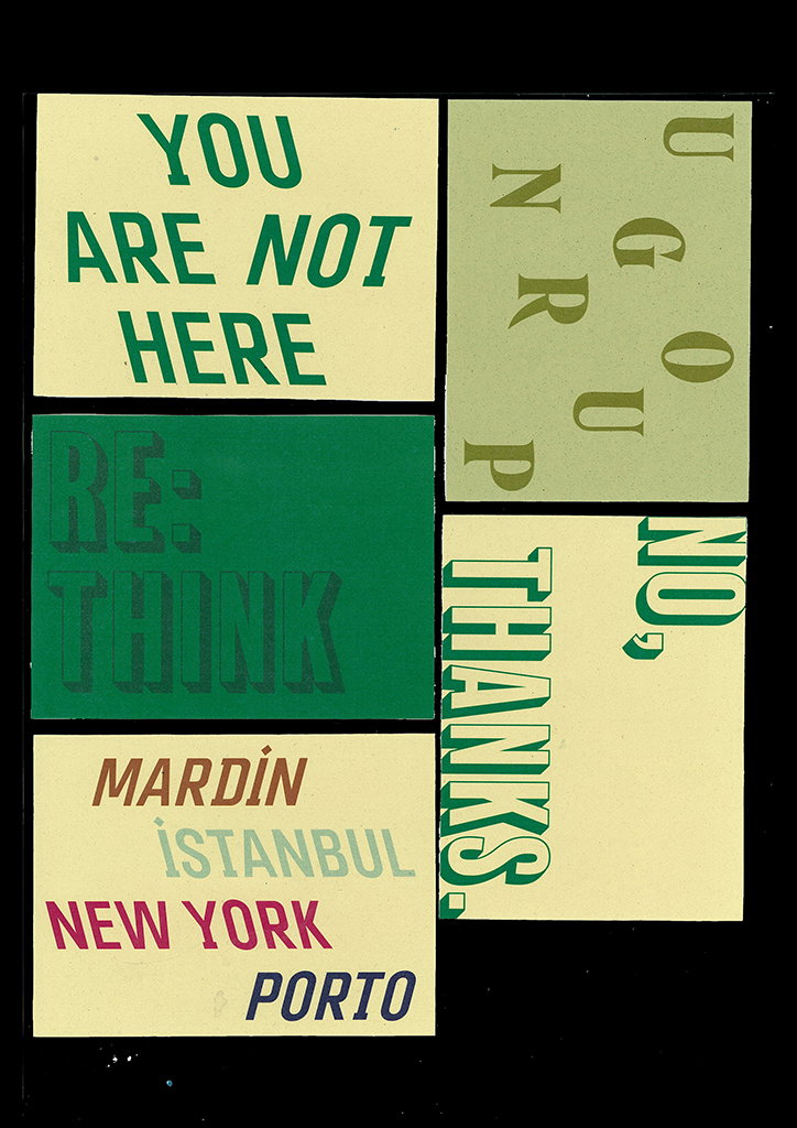
A collage of five graphic cards with bold typography on pale yellow and green backgrounds. The cards feature phrases including “YOU ARE NOT HERE”, “RE:THINK”, “NO, THANKS.” and a list of cities: “MARDİN”, “İSTANBUL”, “NEW YORK” and “PORTO”.
Above

Yunus Ak: 16×12

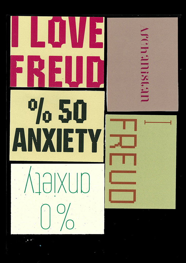
A collage of four typographic cards on a black background. The cards feature bold text including “I LOVE FREUD”, “50% ANXIETY”, “0% anxiety” and “Afghanistan”.
Above
Left

Yunus Ak: 16×12

Right

Yunus Ak: 16×12

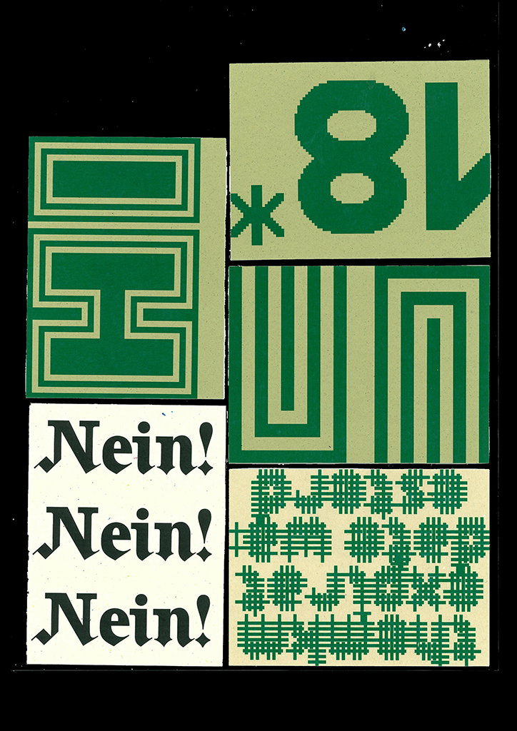
A collage of five green and white graphic panels. One panel repeats the word “Nein!” three times in a black gothic typeface, while others feature abstract geometric shapes and the number “18”.
Above

Yunus Ak: 16×12

Share Article

About the Author

Lucy Bourton

—

Lucy (she/her) was part of the It’s Nice That team from 2016–2025, first joining as a staff writer after graduating from Chelsea College of Art with a degree in Graphic Design Communication, eventually becoming a senior editor on our editorial team, and most recently at Insights, a research-driven department with It’s Nice That.


It's Nice That Newsletters

Fancy a bit of It's Nice That in your inbox? Sign up to our newsletters and we'll keep you in the loop with everything good going on in the creative world.