- Words
- Elaine Ramos
- —
- Date
- 14 September 2026
- Tags
How retro branding is bringing warmth and fun to São Paulo’s bars and restaurants
Our São Paulo correspondent outlines the references, details and techniques being deployed by Brazilian design studios to bring playfulness and nostalgia to the city’s streets.
Share
Share
São Paulo is a city in constant flux. New bars, cafes, and restaurants open every day, partly driven by the aggressive densification brought on by the real estate boom reshaping many neighbourhoods. This creates fertile ground for designers, though working conditions are far from ideal: low-budget commissions, often among friends, and projects that are not always properly implemented. Bar identities, however, offer greater freedom. Less bound by the conventions of branding, they often seek to convey spontaneity and improvisation, leaving more room for experimentation.
For a long time, minimalist, “elegant” identities defined São Paulo’s visual landscape: clean, geometric lettering, patterns made from fragments of letterforms, dots, arcs, hatching, and so on. Designers would open their toolbox: simplify, geometrise, fragment and… voilà, a new identity. More recently, however, this pursuit of sophistication seems to have given way to playful, warm, colourful, illustrated identities that embrace handcraft and emotional appeal, extending well beyond the logo and storefront sign.
Estúdio Caxa: Bar Exquisito identity (Copyright © Studio Caxa, 2021)
Estúdio Caxa: Bar Exquisito identity (Copyright © Studio Caxa, 2021)
Estúdio Caxa: Bar Exquisito identity (Copyright © Studio Caxa, 2021)
Estúdio Caxa: Bar Exquisito identity (Copyright © Studio Caxa, 2021)
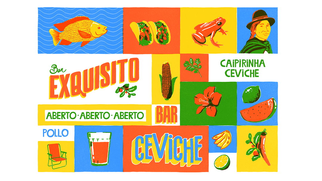
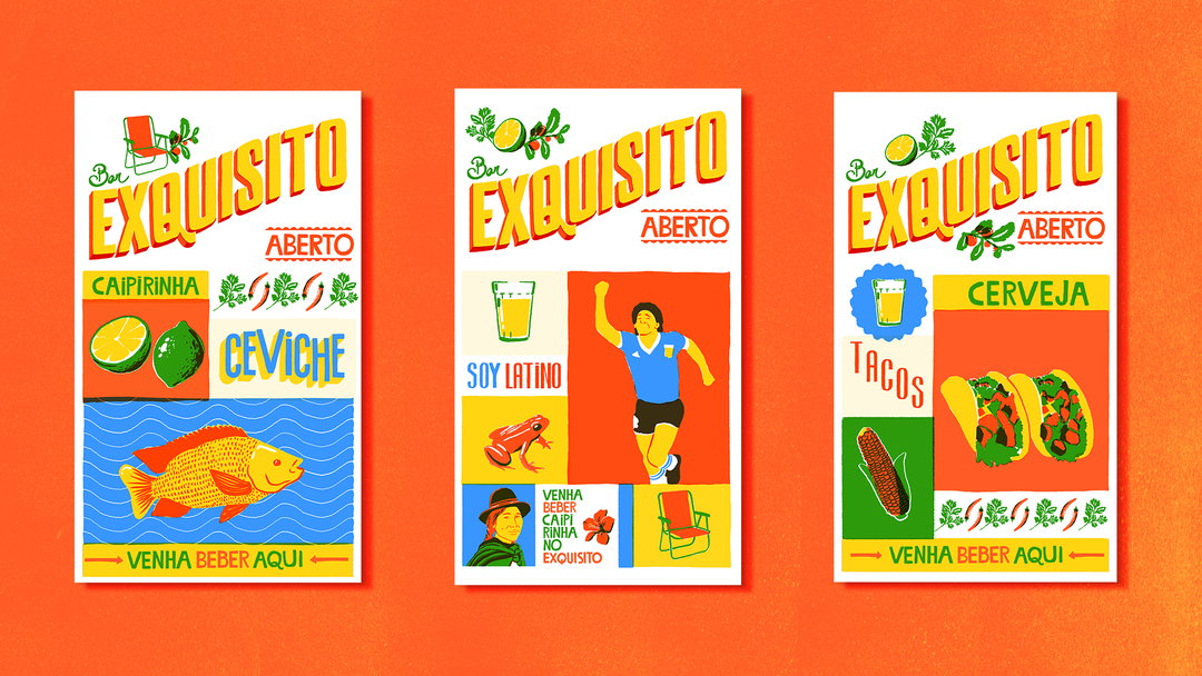
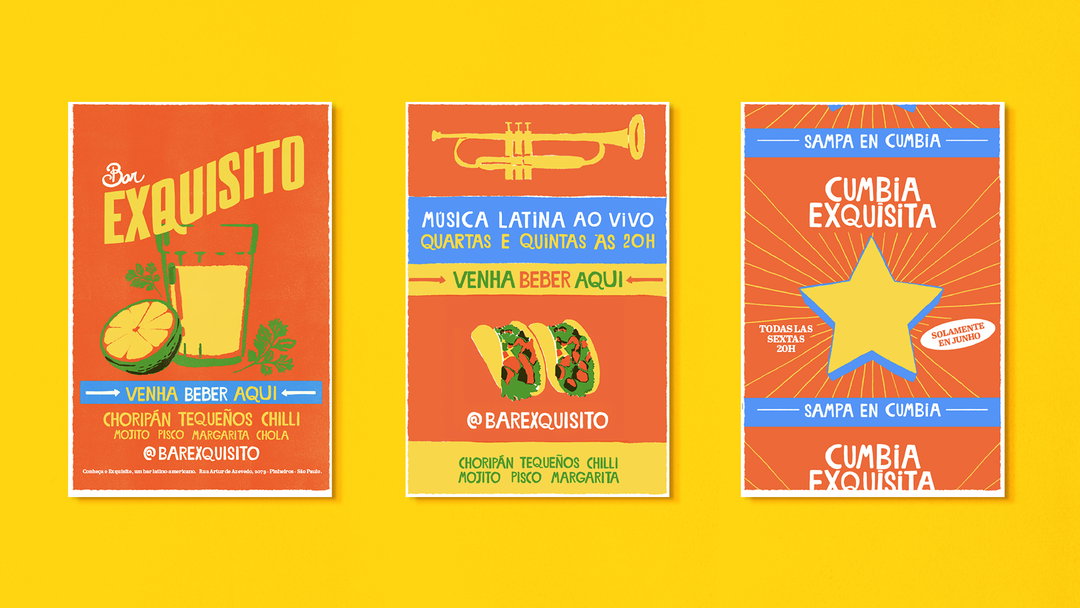
The identity created by Caxa in 2020 for Exquisito, a bar serving a syncretic menu drawn from across Latin America, was one that particularly caught my attention. At first glance, the approach is hardly surprising: it follows a path well worn by Latin-themed bars, but I always admire those who can tread familiar ground and still make it feel fresh.
The project grew out of research into Latin American vernacular culture, from cheaply printed street-food packaging and flexographic fruit boxes, with their simplified blocks of colour, overlaps, and misregistration, to the tradition of hand-painted signs and lettering. It also included a custom typeface inspired by vernacular lettering found in markets and small businesses, and a varied set of illustrations drawing on iconic and playful elements of Latin American culture.
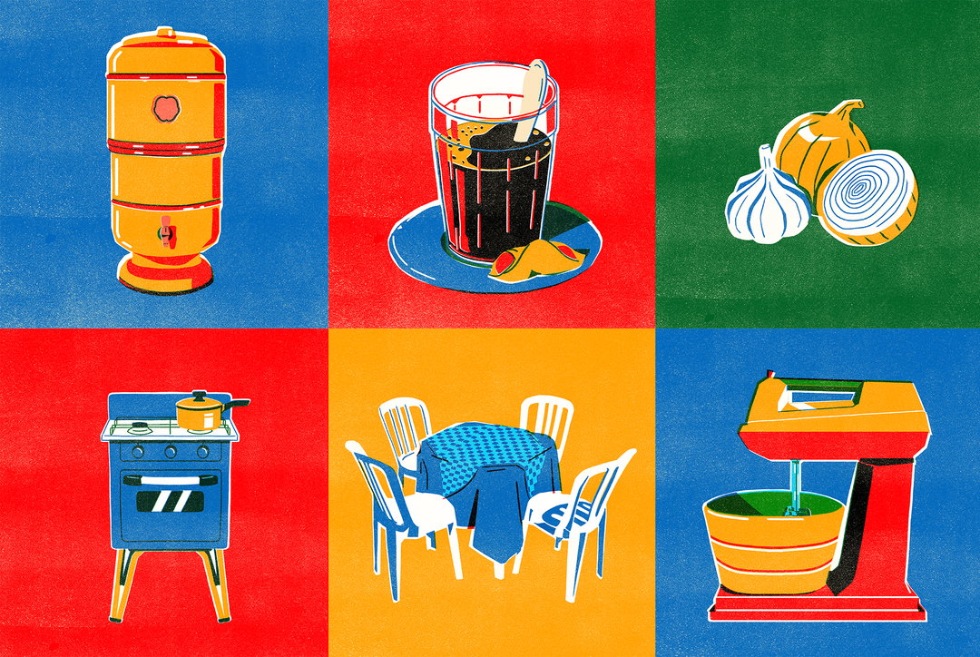
Estúdio Caxa: A later set of beautiful illustrations for a food brand from northeastern Brazil similarly draws on everyday vernacular objects and analog printing techniques. (Copyright © Estúdio Caxa, 2025)
Arado is a design studio that has played an important role in researching and promoting traditional graphic imagery still found, though increasingly rarely, outside Brazil’s major urban centres. Founded in 2018 by two designers from Minas Gerais, Arado describes itself as a “studio dedicated to researching and promoting the Brazilian rural imaginary” and develops projects and products that revisit this universe.
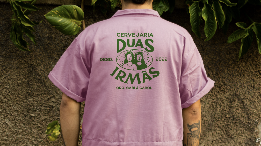
Estúdio Arado: Cervejaria Duas Irmãs identity (Copyright © Estúdio Arado, 2023)
Estúdio Arado: Cervejaria Duas Irmãs identity (Copyright © Estúdio Arado, 2023)
Estúdio Arado: Cervejaria Duas Irmãs identity (Copyright © Estúdio Arado, 2023)
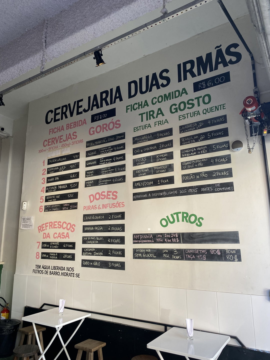
Estúdio Arado: Cervejaria Duas Irmãs identity (Copyright © Estúdio Arado, 2023)
Estúdio Arado: Cervejaria Duas Irmãs identity (Copyright © Estúdio Arado, 2023)
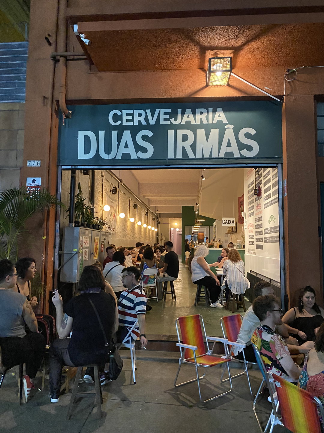
Estúdio Arado: Cervejaria Duas Irmãs identity (Copyright © Estúdio Arado, 2023)
For São Paulo’s bar scene, Arado designed the identity of Duas Irmãs brewery in 2022: a portrait of the two sisters framed by a central oval and hand-drawn lettering that embraces distortions and inconsistencies. The composition quite literally references early 20th-century commercial graphics, but the illustration’s stylisation recalls comic-book characters.
The bar features not only a hand-painted storefront sign but also the entire menu painted directly on the wall. The identity’s retro feel is reinforced by the commercial language of another era, for example, “Since 2022”, the owners’ names, and the classic Brazilian “agradecemos a preferência” (“thank you for your patronage”).
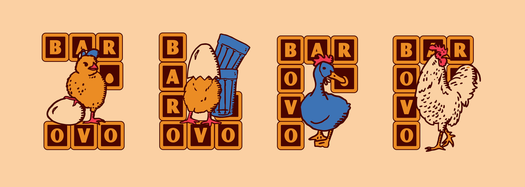
Estúdio Sarau: Bar Ovo identity. Design: Manoel Neto, illustration: Dudu Azevedo, creative direction: Pedro Almeida. (Copyright Estúdio Sarau © 2024)
Estúdio Sarau: Bar Ovo identity. Design: Manoel Neto, illustration: Dudu Azevedo, creative direction: Pedro Almeida. (Copyright Estúdio Sarau © 2024)
Estúdio Sarau: Bar Ovo identity. Design: Manoel Neto, illustration: Dudu Azevedo, creative direction: Pedro Almeida. (Copyright Estúdio Sarau © 2024)
Estúdio Sarau: Bar Ovo identity. Design: Manoel Neto, illustration: Dudu Azevedo, creative direction: Pedro Almeida. (Copyright Estúdio Sarau © 2024)
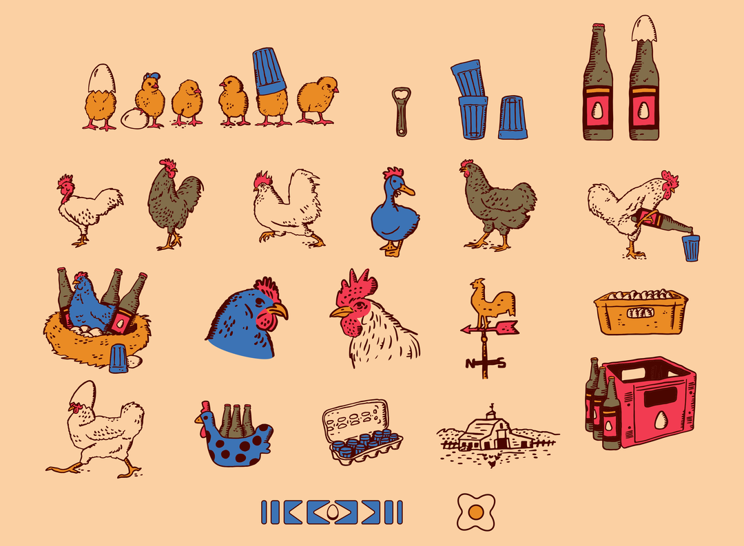
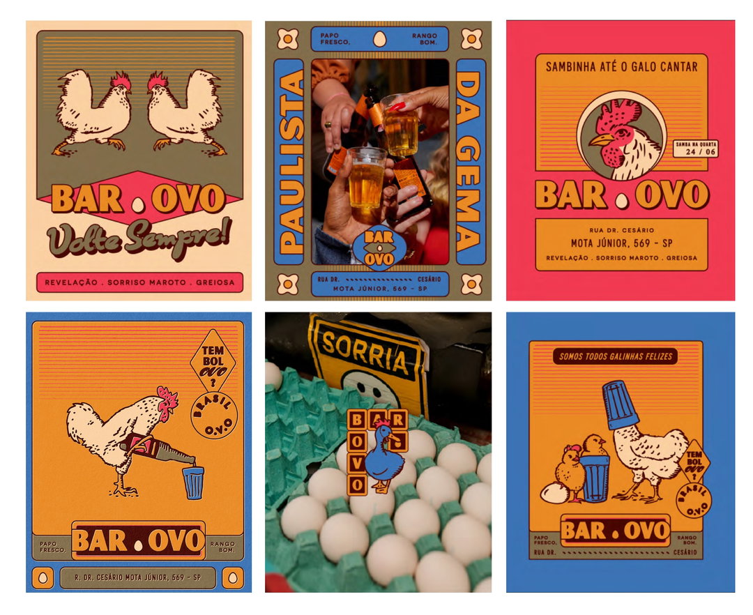
Along similar lines, the identity created by Sarau for Bar Ovo in 2024 draws directly on lithographic labels – especially cachaça labels – matchboxes and other packaging, and advertising from the first half of the 20th century, with its profusion of frames, shadows, and line gradients. Pedro Almeida, one of Sarau’s partners, tells me about the reference in the original brief – the collection of chickens that inspired the owners to name the bar – and their concern with giving it the feel of a Brazilian boteco, an unpretentious neighbourhood bar (hipsterism by the book…!).
As with Exquisito, the identity extends beyond the logo. A set of illustrations revolving around eggs, chickens, and Brazilian rural imagery is combined with a typographic medley in a calculated emulation of the vernacular. The bar’s name appears in playful variations, always paired with illustrations and frames, and the project suggests using analogue photography, with flash and a certain sense of improvisation.
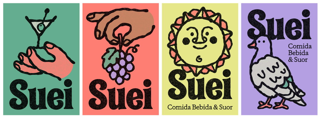
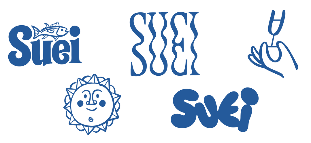
Flora Carvalho: Suei identity (Copyright © Flora Carvalho, 2025)
Flora de Carvalho’s identity for Suei, a bar and dance floor in the trendy Barra Funda neighbourhood, draws on a different history. Here, heavy, irregular outlines, anthropomorphism, disproportionate elements, brush-like typography, flat fills in slightly faded colours, and patchy blacks emulating Xerox prints echo the delightful naïveté of 1970s advertising.
The São Paulo-based designer and typographer drew on the idea of heat implicit in the bar’s name – Suei, Portuguese for “I sweated” – to develop a style she described to me as “melted”. Curiously, defying conventional branding rules, the project introduced three completely different ways of writing the bar’s name, sacrificing immediate recognition in favour of playfulness.
This retro wave is by no means confined to São Paulo. In Rio de Janeiro, another project that caught my attention within this trend of nostalgic, illustrated identities was Biabum’s 2024 identity for Salva Bar. The restaurant serves food from Bahia, combining specialties from the sertão, sea, and mangroves. In the designers’ words, “the brand brings together bold colours, textures, and phrases that capture the essence of Bahia, while drawing on the chef’s emotional connection to his home state.”
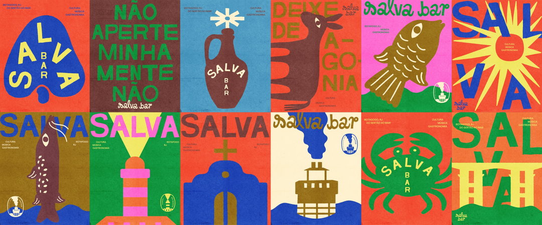
Biabum: Salva Bar identity (Copyright © Biabum, 2025)
Biabum, a studio with illustration in its DNA, uses the texture and colour palette of Risograph printing – a device that, by now, feels somewhat overused as a shorthand for an analogue, retro look – precisely to steer clear of the more obvious visual language associated with northeastern Brazil, strongly identified with woodcut imagery. Here, nostalgia appears not only in the texture, but also in the combination of hand lettering and a set of stamps, as well as in the subjects of the illustrations: the carranca, the steamboat that once connected towns across Bahia’s Recôncavo region, the Farol da Barra lighthouse, a clay water jug, and a small chapel. All appear as flat-colour silhouettes.
The lowercase wordmark, one of the project’s strongest elements, was based on a 1968 edition of the complete works of Jorge Amado, one of the most important figures in 20th-century Brazilian literature and a central figure in shaping Brazil’s imaginary of Bahia (the design, unfortunately, is uncredited). To preserve the identity’s playful character, the bar’s name also appears set in the “handwritten” typeface Ywft Hllvtka, as do other texts drawing on local expressions. The combination of lettering, multicoloured illustrations, and stamps results in a beautiful series of posters.
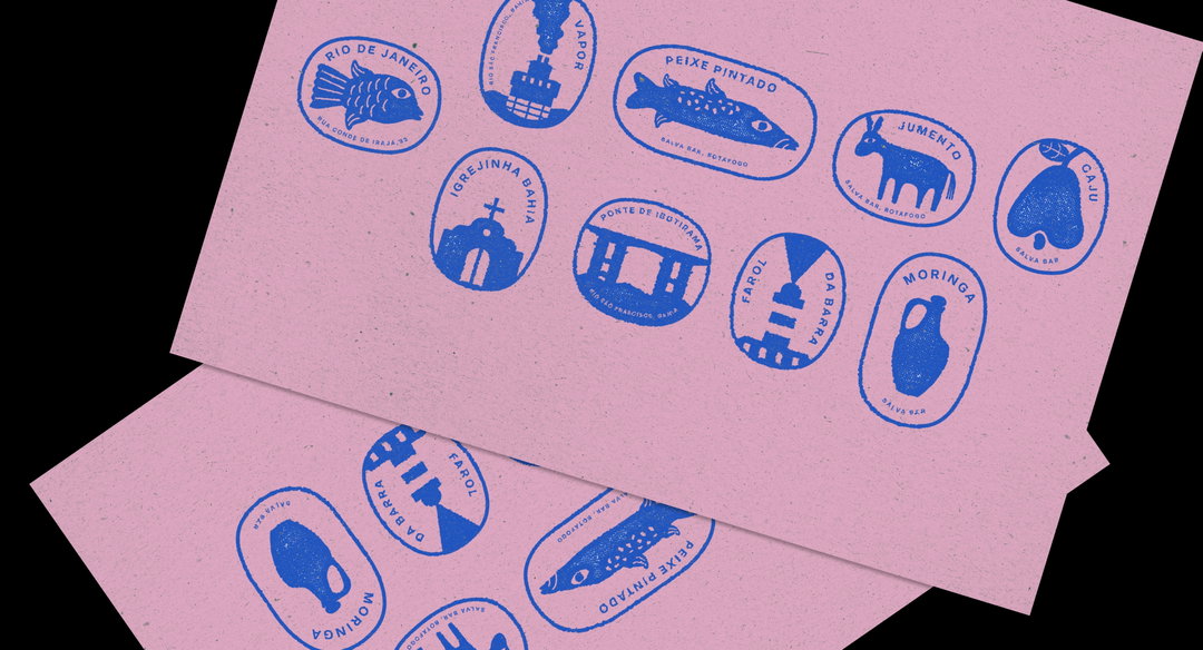
Biabum: Salva Bar identity (Copyright © Biabum, 2025)
Biabum: Salva Bar identity (Copyright © Biabum, 2025)
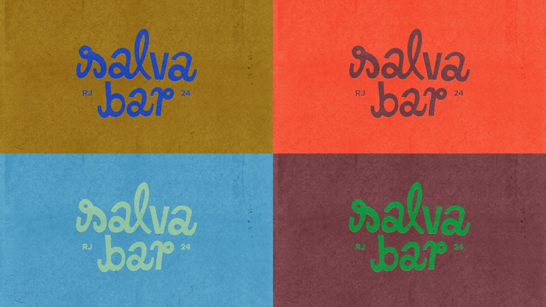
Biabum: Salva Bar identity (Copyright © Biabum, 2025)
Also working within the logic of the poster, the identity developed by PS2 for Bar Aperitivo, which has just opened in São Paulo, takes on a retro feel. This time, however, the reference comes from elsewhere: 1970s Italian summers and their colourful drinks. For a bar where DJs spin vinyl, the São Paulo design duo, now based in Hamburg, translated the record’s circular forms into simplified, geometric illustrations combining flat colours and gradients; in the wordmark, the O’s become olives.
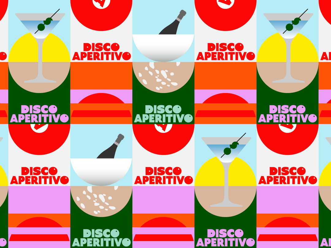
PS2 arquitetura + design: Bar Aperitivo identity (Copyright © PS2, 2026)
This pursuit of authenticity in graphic design has always intrigued me. The outcome seems to depend, on the one hand, on the quality and depth of the research behind the references – which, regrettably, is increasingly reduced to Pinterest’s algorithmic suggestions – and, on the other, on something far less tangible: the ability to process those references and create something original that goes beyond historical quotation. This requires a certain balance between consistency and boldness, and the projects discussed here occupy different points along that spectrum.
This nostalgic wave is neither new nor unique to São Paulo. Much has already been said about hipsterism and its endless pursuit of the genuine, the local, and the organic, only to be quickly absorbed into the mainstream. But in a city averse to any notion of preservation, shaped not only by rampant real estate speculation but also by a deeply rooted culture of constant renovation, where only a handful of bars have survived for decades largely unchanged – the truly authentic ones – this emulation of tradition takes on an ironic edge.
Graphic designers are left with the difficult task of manufacturing the signs of authenticity and symbolically reconstructing the memory erased by this constant transformation, giving each new bar a distinctive character that can attract its audience and restore something of the affective life and sense of belonging the city has swallowed up. Luckily, some designers are finding inventive ways to do that.
Closer Look
Elaine shares local tips for where to spend your time and cash in São Paulo, including a design studio’s merch store, a type foundry and an art gallery, plus (aptly) where to find the best bars.
- Arado Studio has an online store selling products connected to its research on Brazilian rural imagery, including t-shirts, pins, notebooks, posters, and the now-famous calendar, which led to the studio designing Brazilian pop star Anitta’s latest album.
- Suei and Cervejaria Duas Irmãs are very close to each other, in an area packed with great bars. My favourite these days is Laska.
- Flora Carvalho is launching Familiar Faces, an independent type foundry that “sells retail fonts, engages in custom projects for brands, and sparks conversation”. There are still only a few typefaces available, but it’s well worth a look.
- Galeria Superfície, an art gallery representing artists whose work often takes a strongly graphic approach, has just opened a new space in the Vila Madalena neighbourhood, with a beautiful group exhibition on view until 17 October.
Share Article
Further Info
About the Author
—
Elaine Ramos is a graphic designer based in São Paulo, Brazil. She runs a design studio primarily focused on the cultural market and is a founding partner of Ubu, a publishing house created in 2016. She is It’s Nice That’s São Paulo correspondent.