Huge entertainment ‘city’ in Tokyo transformed with variable typographic identity
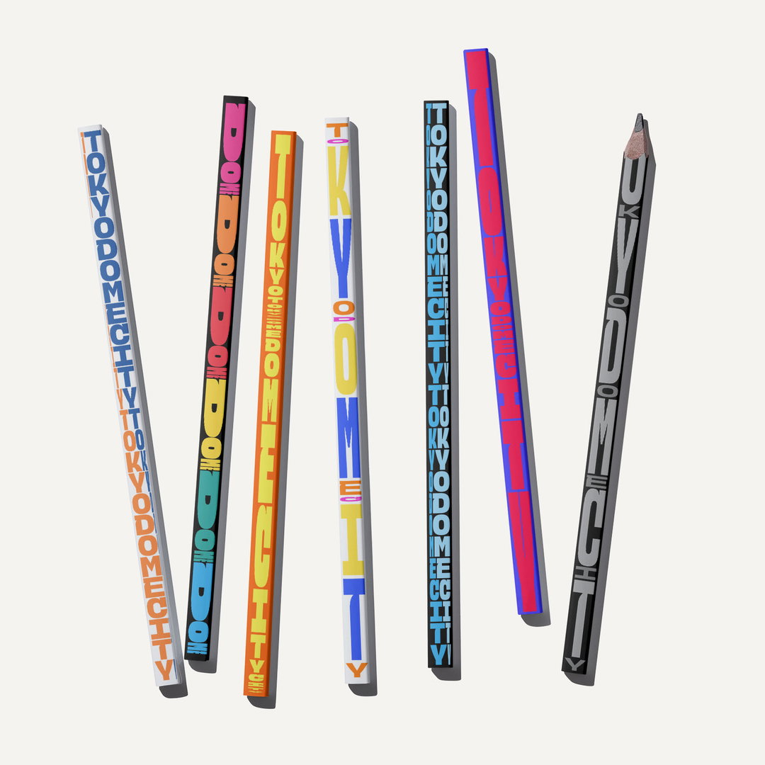
Tokyo design studio &Form developed a font that varies dramatically in thickness and motion behaviour with type designer Toshi Omagari.
Share
Tokyo Dome City opened in 1988 – back then its nickname was The Big Egg. Situated in Bunkyō, it is a large entertainment complex or mini ‘city’, with an amusement park, shopping complex, baseball stadium, hotel and about 40 million annual visitors. But, the Dome had run into a few difficulties, namely that it didn’t look enough like one united place with an original presence.
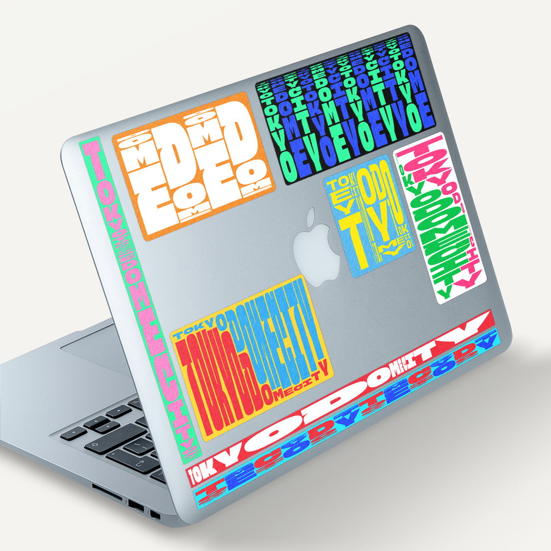
This month, Tokyo design studio &Form will unveil a brand new, adaptive visual identity for Tokyo Dome City. It will live on socials, merchandising and across towering screens in the complex – one of them being Japan’s largest, at over 120 metres in length. As such, the work needed to be highly scalable as well as compelling for all visitors entering the space, no matter their age.
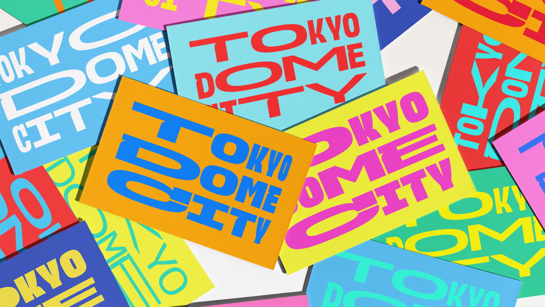
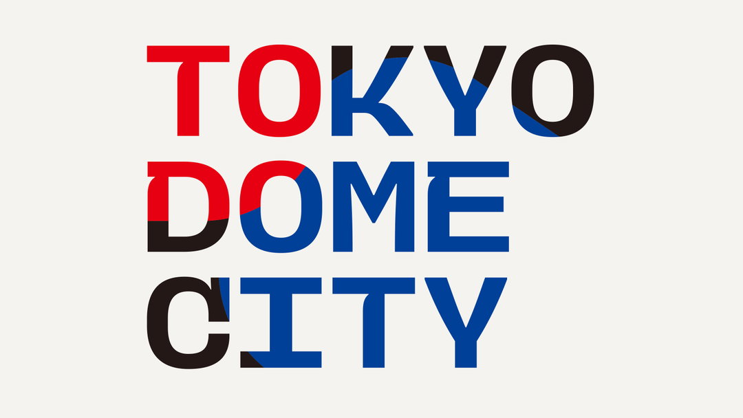
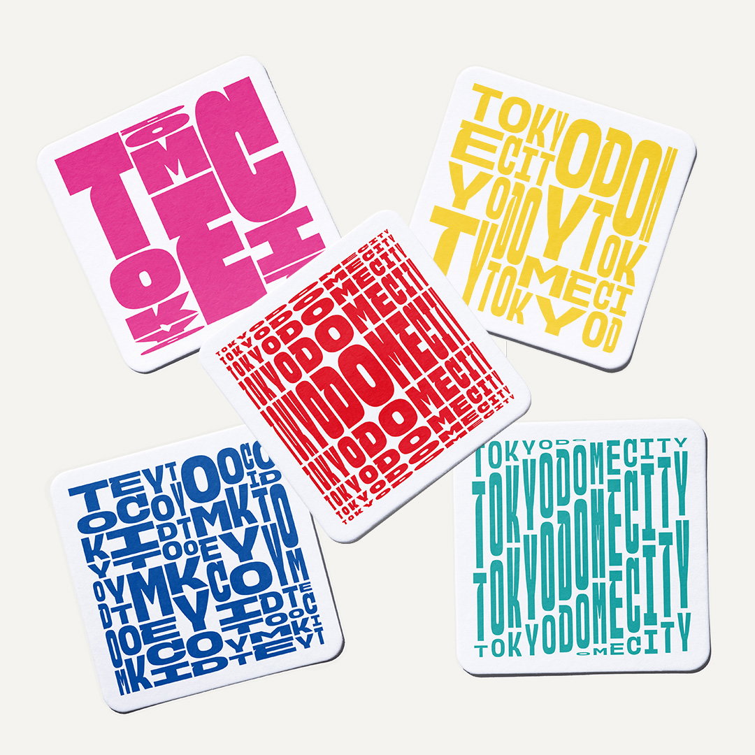
A key component is the variable sans serif, which oscillates between pin thin and stretched. The typeface was developed in collaboration with designer Toshi Omagari and features “a broad range of movement along each of the three variable axes of width and height,” says &Form. The various motion behaviours give each asset a distinct personality – similar to Demo’s identity for 2022. Meanwhile, a new sound logo layers together voices of people at various ages, to show the broad appeal of Tokyo Dome City.
&Form has also developed in-house software with a variable grid that allows future iterations of the identity to be freely assembled. By creating a user-friendly UI with Aircord, &Form has enabled the Dome staff to update signage or produce generative assets for new seasons of events without any prior technical know-how.
The Tokyo Dome City is part of a large-scale renewal project at the facility which finishes up in 2024.
Gallery&Form: Tokyo Dome City (Copyright © &Form, 2023)
Hero Header
&Form: Tokyo Dome City (Copyright © &Form, 2023)
Share Article
Further Info
About the Author
—
Liz (she/they) is the senior editor at Insights, a research-driven department within It’s Nice That. They previously ran the news section of the website. Get in contact with them for potential Insights collaborations or to discuss Insights’ public-facing reports.