Launch Recite Me assistive technology

Base Design Studio launches five minute design advice series
—
Date
3 March 2016
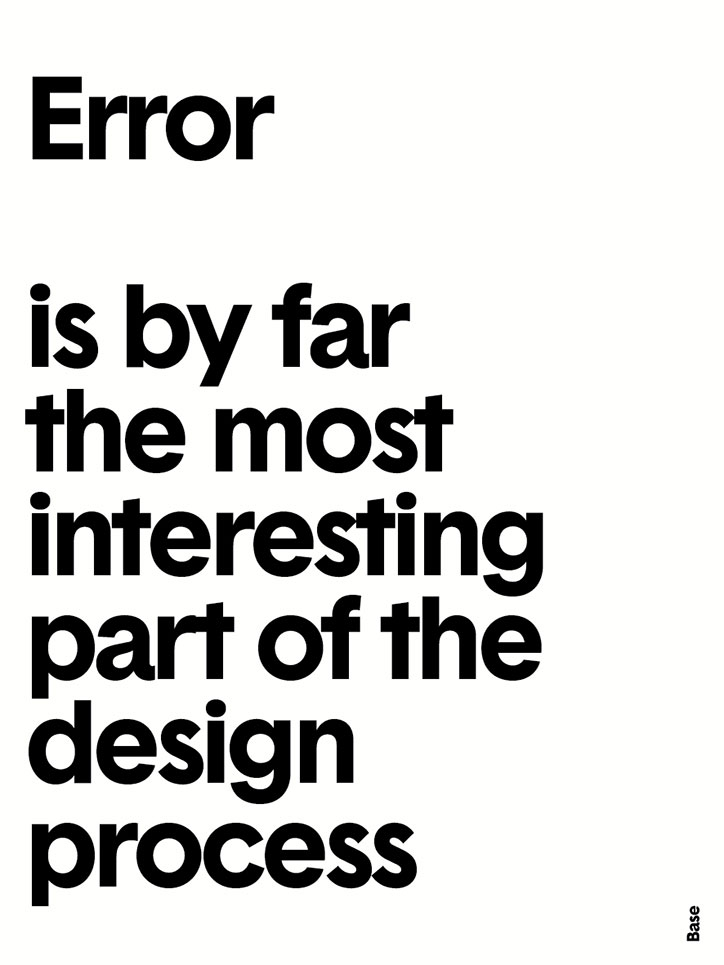
A typographic poster with bold black text on a white background. It reads “Error is by far the most interesting part of the design process”, with the word “Base” printed vertically in the bottom right corner.
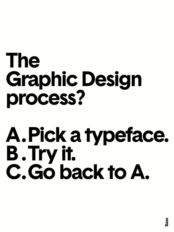
A typographic poster on a white background reads “The Graphic Design process?”. Below, a list reads “A. Pick a typeface. B. Try it. C. Go back to A.”

Base Design Studio’s Thierry Brunfaut has released a series of typographic design advice posters, each of which was created in no more than five minutes.

Thierry says he found inspiration for the series in his “poor Belgian brain.” Each piece uses the agency’s bespoke sans serif Basetica typeface. “We wanted to get to some kind of neutrality, but of course you don’t find neutrality,” he says.

The 20 posters form the third series of five-minute posters launched by Base Design Studio, with previous batches launched in 2012 and 2014.
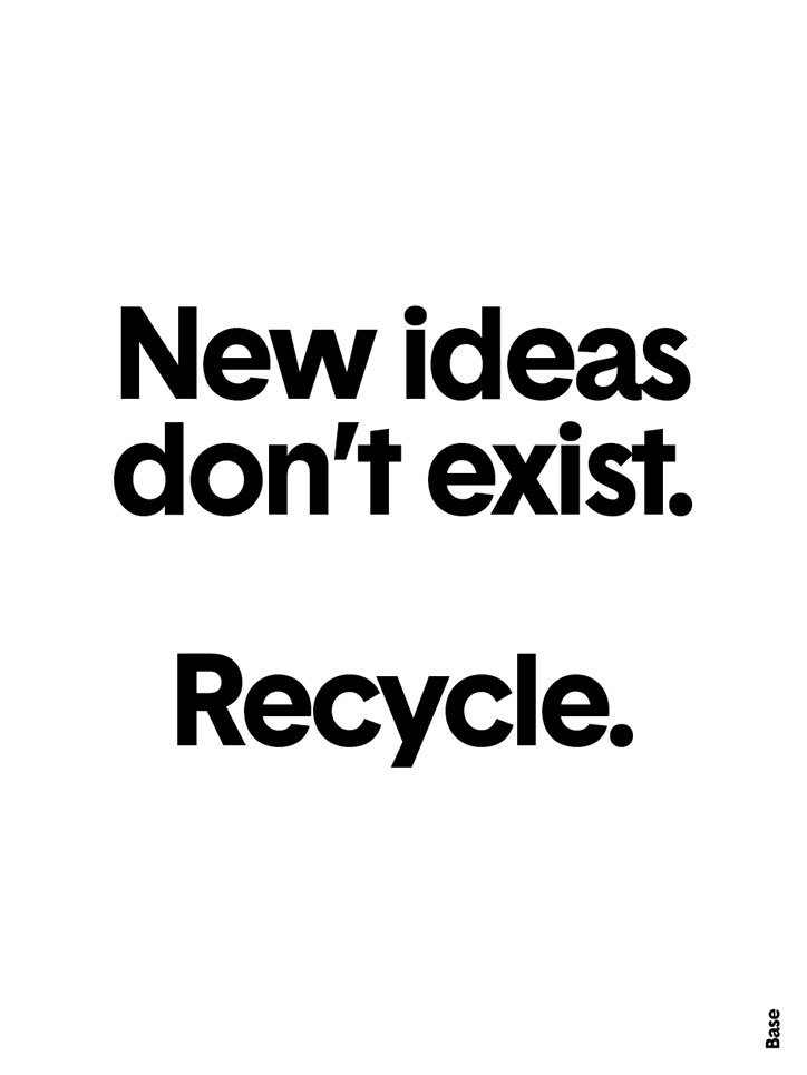
A minimalist typographic poster with bold black text on a white background. It reads “New ideas don’t exist. Recycle.” with the word “Base” printed vertically in the bottom right corner.
Above
Left

Thierry Brunfat, Base Design Studio: Typographic advice posters
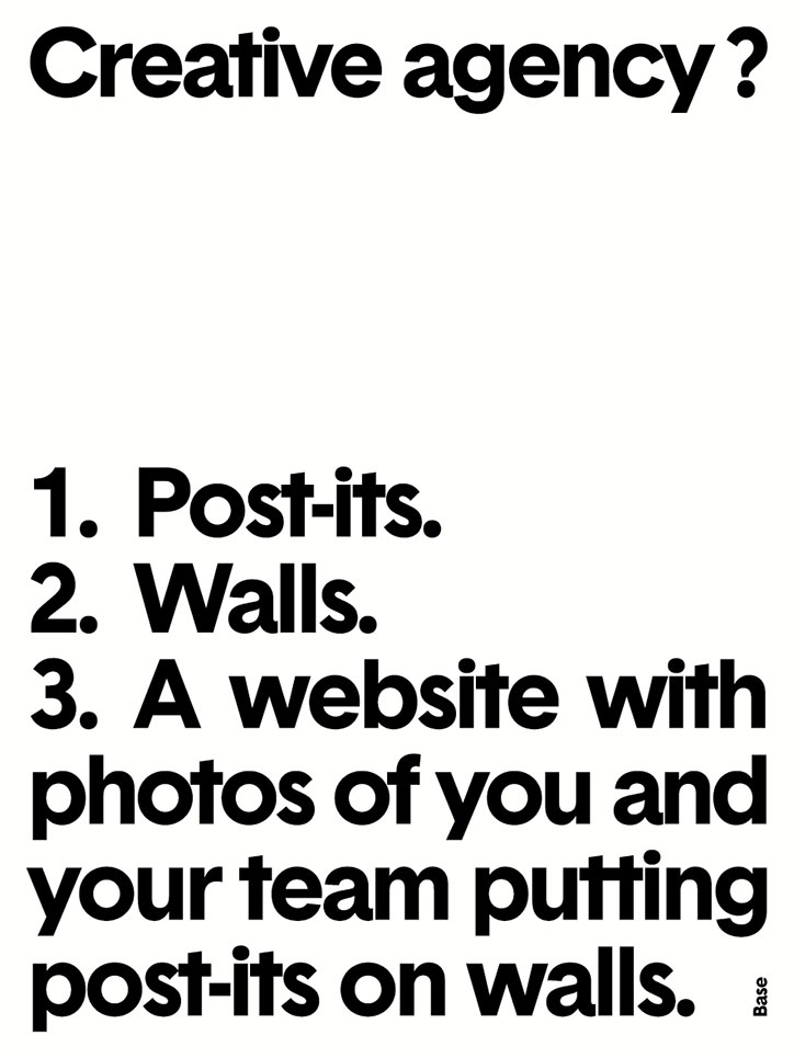
A typographic image on a white background reads “Creative agency?”. Below this, a numbered list reads “1. Post-its. 2. Walls. 3. A website with photos of you and your team putting post-its on walls.”
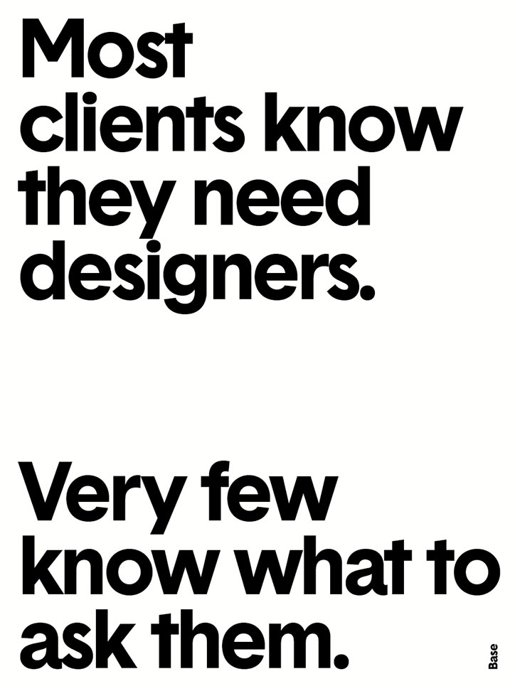
A typographic poster with bold black text on a white background. It reads “Most clients know they need designers. Very few know what to ask them.”
Above
Left

Thierry Brunfat, Base Design Studio: Typographic advice posters
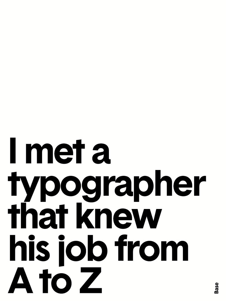
A typographic poster on a white background reads “I met a typographer that knew his job from A to Z”. The word “Base” appears vertically in the bottom right corner.
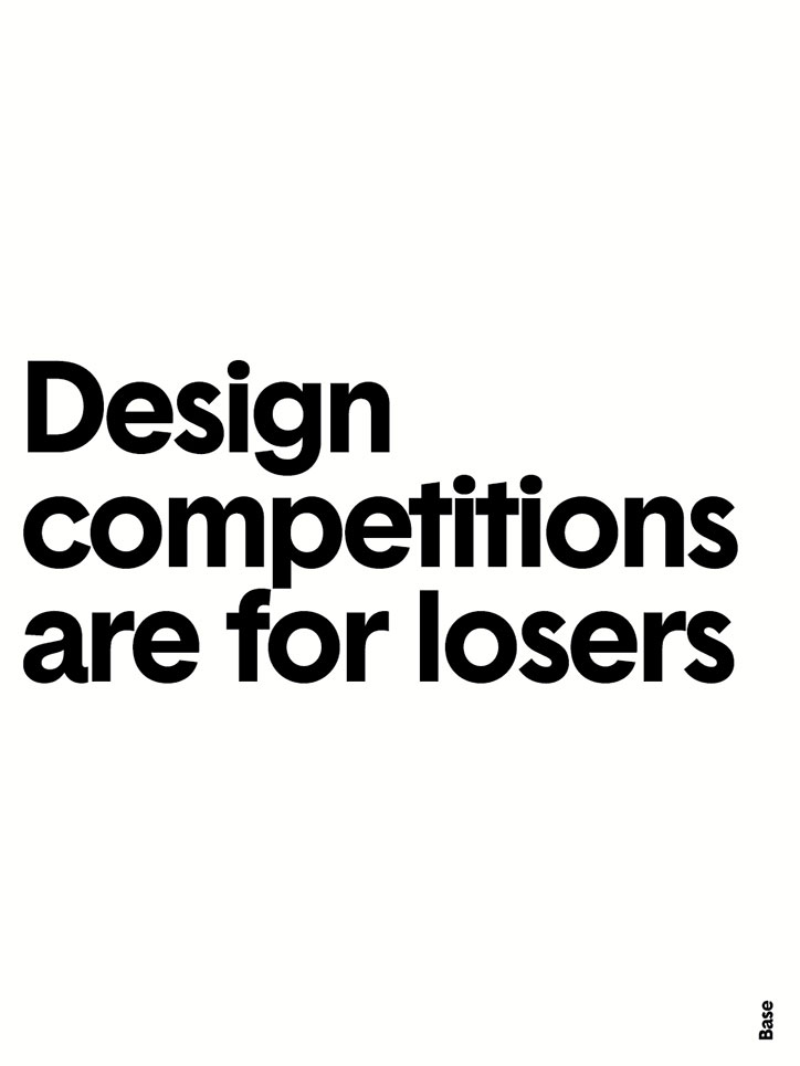
A bold typographic poster with black text on a white background reads “Design competitions are for losers”. The word “Base” appears vertically in the bottom right corner.
Above
Left

Thierry Brunfat, Base Design Studio: Typographic advice posters
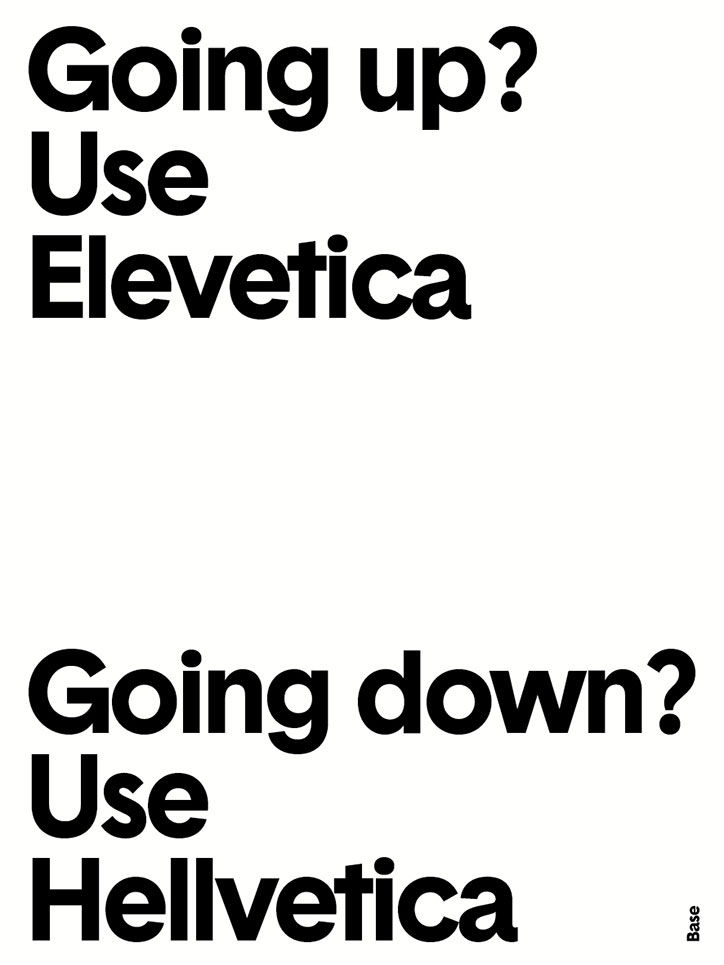
A typographic poster with black text on a white background. The top half reads “Going up? Use Elevetica” and the bottom half reads “Going down? Use Hellvetica”.

Share Article

Further Info

About the Author

Emily Gosling

—

Emily joined It’s Nice That as Online Editor in the summer of 2014 after four years at Design Week. She is particularly interested in graphic design, branding and music. After working It's Nice That as both Online Editor and Deputy Editor, Emily left the company in 2016.
It's Nice That Newsletters

Fancy a bit of It's Nice That in your inbox? Sign up to our newsletters and we'll keep you in the loop with everything good going on in the creative world.