“Evolve or die”: Bloomberg Businessweek creative director Rob Vargas on the magazine’s redesign
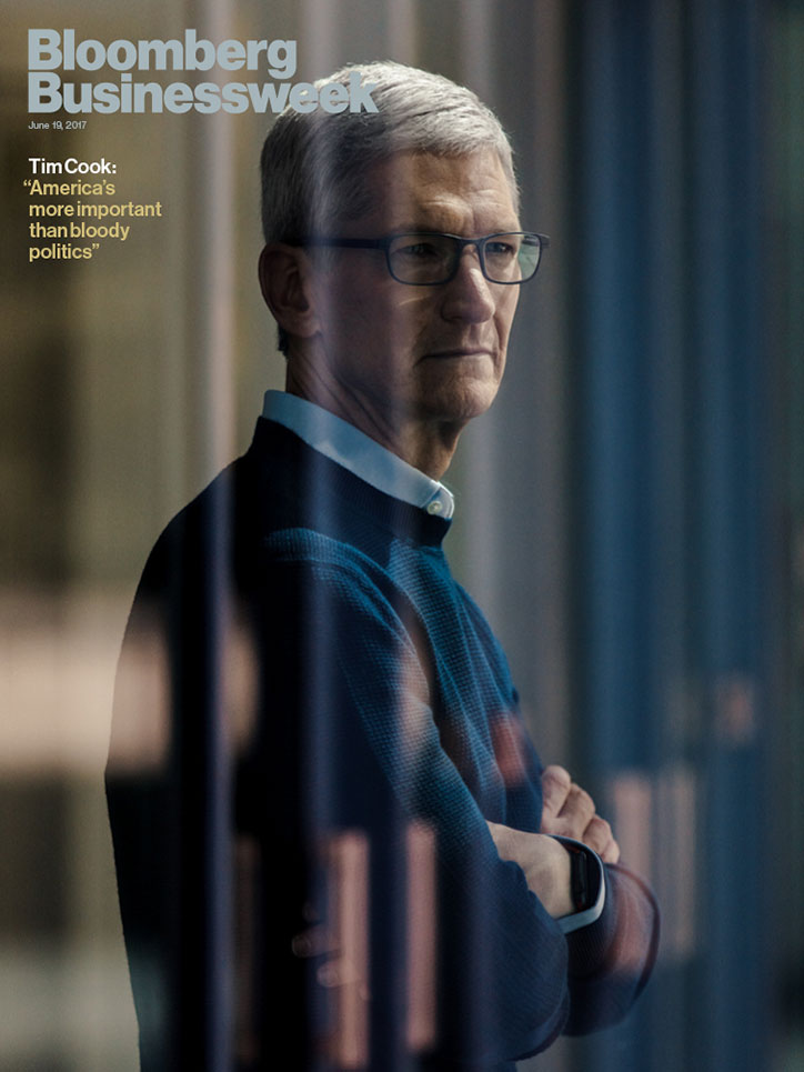
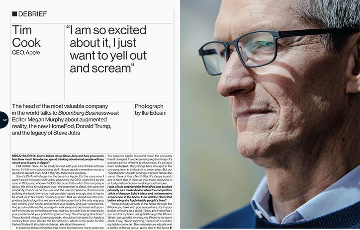
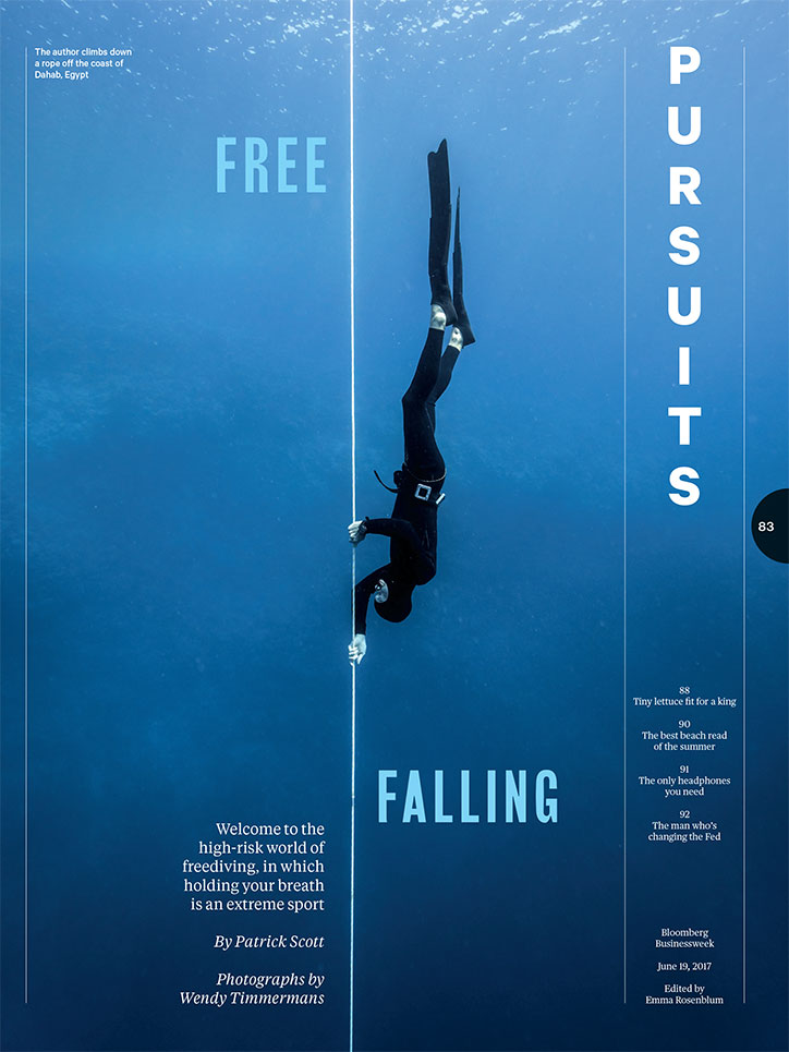
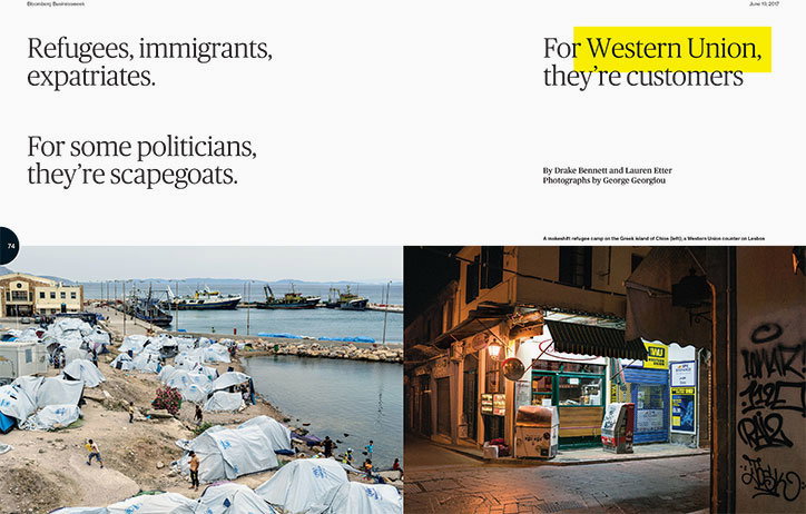
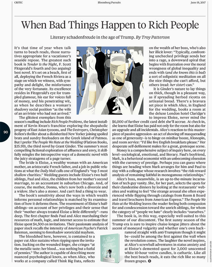
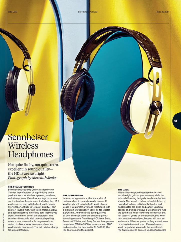
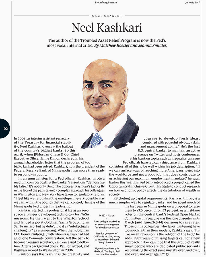
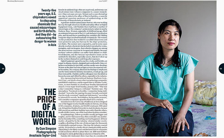
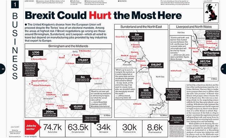
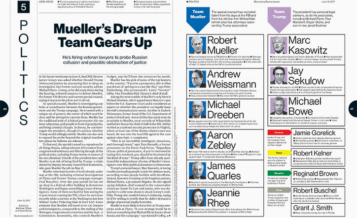
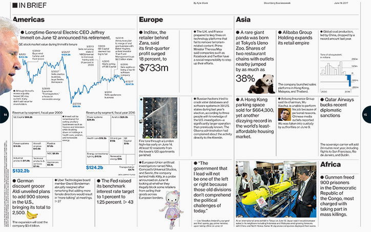
Bloomberg Businessweek magazine has relaunched, revealing a starkly different design to its previously “wacky” aesthetic. Reaffirming its focus on a business and finance audience, the magazine appears to have ditched the outlandish approach to art direction developed under the tenure of Richard Turley in favour of a more serious look and feel. In her editor’s letter, Megan Murphy describes the new design as “cleaner”, “more consistent” and “easier to navigate”. We spoke to creative director Rob Vargas to find out more.
“I think there is almost an equal number of similarities and differences between the new and previous look, and I think some readers may find the change very dramatic and some less so," Rob tells It’s Nice That. “Businessweek’s design was built on a very rigorous type and grid system, to accommodate different forms, lengths, and sizes of stories, graphics, and photography. It’s a very dense magazine, and we had to have enough rules in place so that we could work fast and not reinvent the wheel every time. “Gradually, we developed our visual style over this system. We became known for embracing irony, ‘ugliness’, imperfection. A lot of what we did was a reaction against what the normal impulses of magazine making were. If other magazines were making grandiose conceptual illustrations about the Trump administration, then our approach would be to put a lo-res reappropriation of a meme on the cover. The underlying discipline was always there, but it was mostly drowned out by the loudness of our sensibility.
“Everyone who works in media knows that you have to evolve or die. The more you settle into a way of doing things the more likely you are to fall behind. For us, seven years is a pretty good point to hit the reset button. That meant keeping a lot of the typography and architecture that was already in place, and adjusting it based on the lessons we learned from making hundreds of issues of the magazine. We set out to present stories and information in a way that would serve us, the editors, and readers better than we did before. Clarity was a priority. We wanted to showcase stories and photography in a way that let them breath while eliminating graphic devices that started to feel like space fillers and distractions.
“We rethought our previous belief that every inch of the page had to be covered with something.
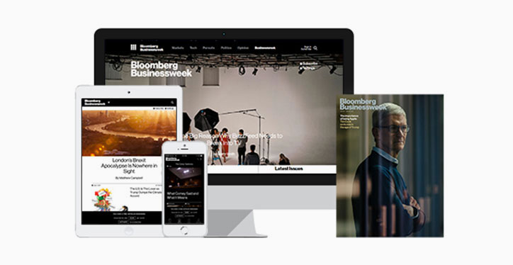
“What I think a print reading experience means now, more than ever, is an opportunity to connect with a story with as little surrounding noise as possible. And our new approach allows us to finally have a level of consistency on other platforms like our website and app. We developed everything concurrently, constantly assessing whether something we were trying for print would work digitally. It informed a lot of decisions, and it was great to finally be able to approach the entire brand this way.
“In terms of the irony, ‘ugliness’, and imperfection, we’ve wiped that slate clean.
“We’re back to embracing the fundamental architecture of the magazine, and we’ll start to build on that slowly like we did before. We want to be more photography-forward, and have more rigorous standards of quality. In terms of purely graphic design, our development plan will work the same as before – we’ll figure it out as we go along, with the guiding constraint being that it has to be unique to Businessweek.”
The relaunch issue is out today.
Bloomberg Businessweek
Bloomberg Businessweek
Bloomberg Businessweek
Bloomberg Businessweek
Bloomberg Businessweek
Bloomberg Businessweek
Bloomberg Businessweek
Bloomberg Businessweek
Bloomberg Businessweek
Bloomberg Businessweek

Bloomberg Businessweek
Bloomberg Businessweek
Share Article
Further Info
About the Author
—
Jenny oversees editorial output across It’s Nice That. Get in touch with writing pitches for features or opinion pieces, big creative story tips, or questions about all things editorial. jb@itsnicethat.com
To submit your work to be featured on the site, please see our Submissions Guide.