




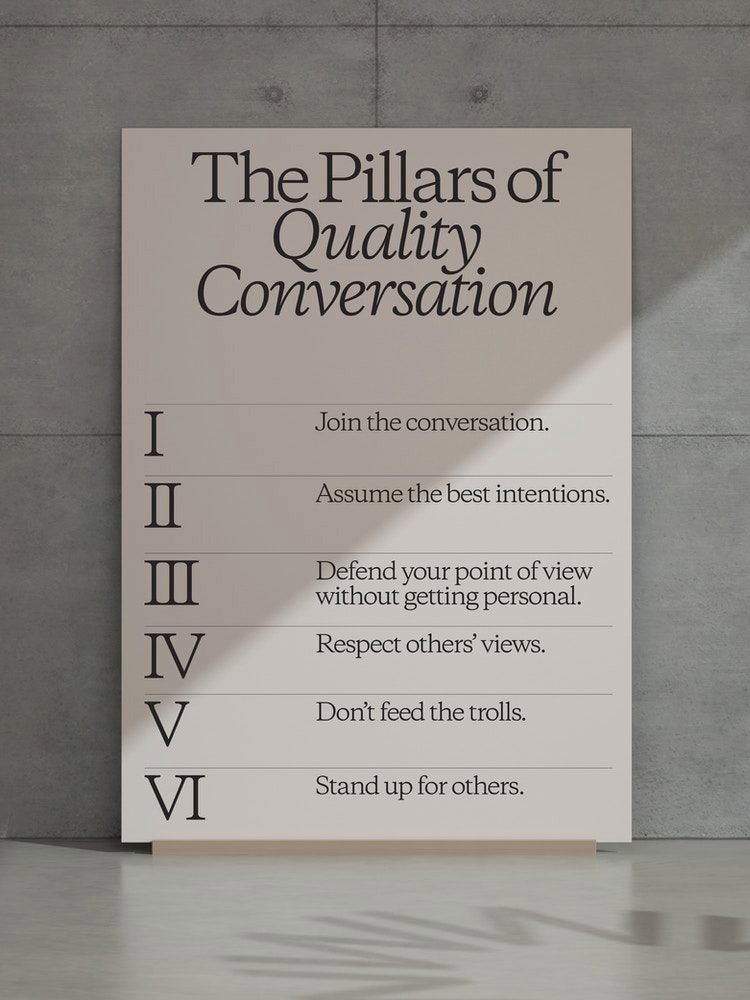
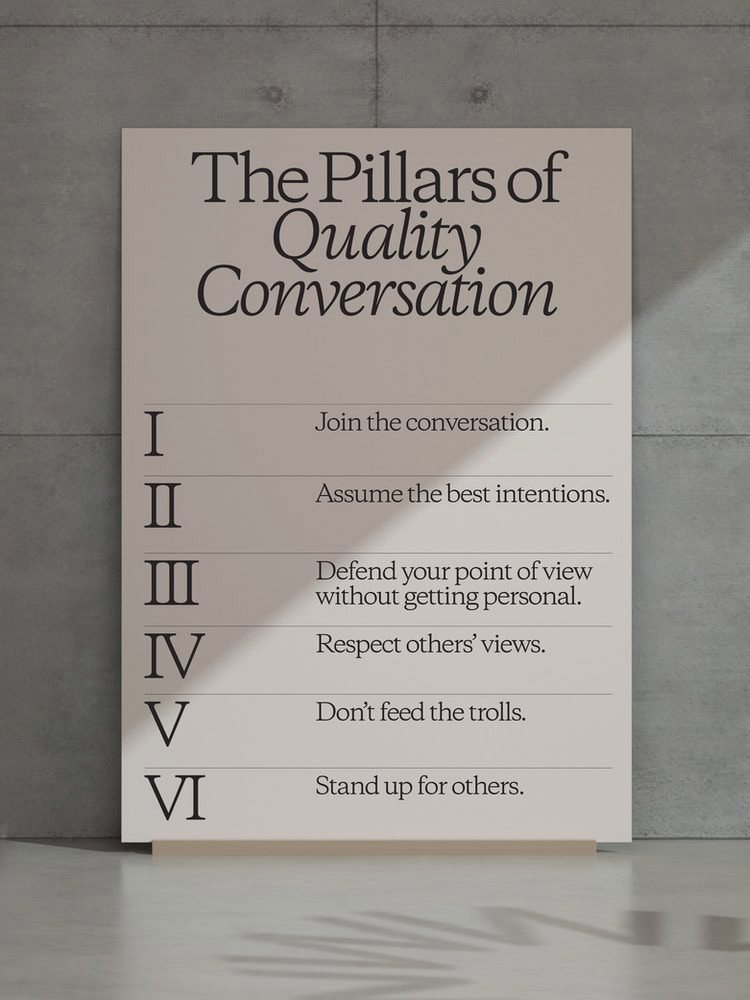
“De-trolling the digital discourse” was one of the key focal points for design studio Collins in a recent re-imagination of OpenWeb, an audience relationship platform building online communities around digital content. Steering the brand as it repositioned from Spot.Im to OpenWeb, Collins has centred the platform’s mission to fuel relationships between publishers, audiences and advertisers. Crucially, it does this through healthy online conversation, which is no mean feat in today’s digital landscape.
“The internet is filled with environments that tolerate, or often, incentivise and amplify awful behaviour,” Collins design director Megan Bowker explains. “OpenWeb identified this issue as one they could take on with their product. Eliminating trolls is the baseline. But even beyond that, how could OpenWeb implement new tools that foster and promote thoughtful, quality content?” For Collins, this also meant asking: “What role could design play in empowering publishers to be good and better hosts for important conversations?”
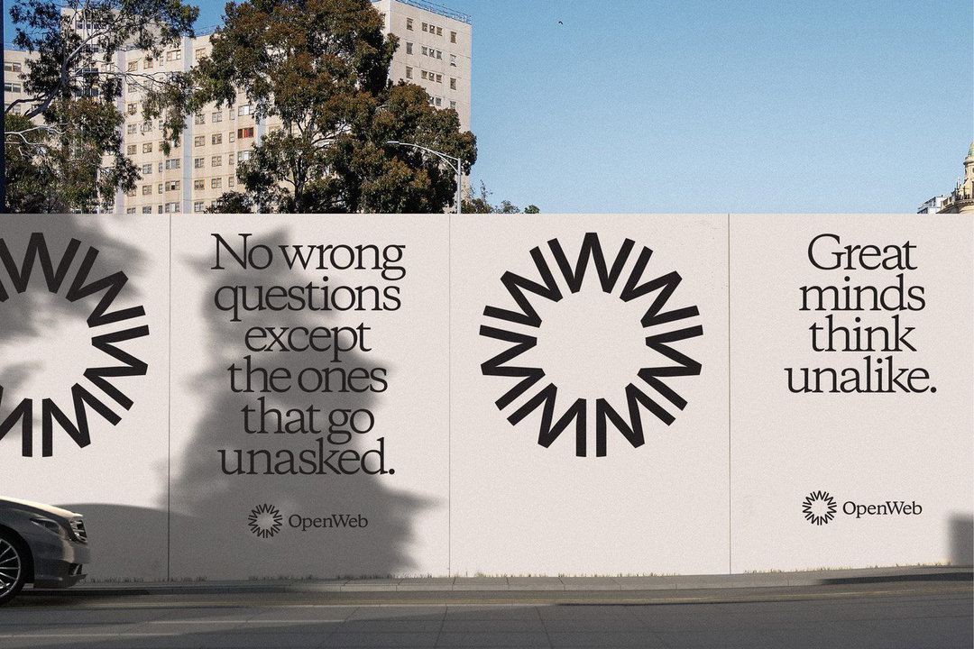
Moving away from Spot.Im, a name that solely referenced chatrooms, OpenWeb’s new visual identity references “timeless virtues of quality and trust”. 19th and 20th-century print – from newspapers to literature – was used as inspiration. In doing so, Collins hoped to imply “considered attention” by hinting at “a time when it took manual labour to put words into existence (carefully setting type with metal and ink)”, Megan tells It’s Nice That.
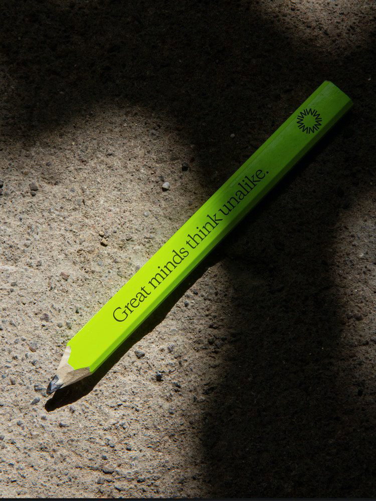
For a brand symbol, Collins says they looked to “enduring symbols of key movements in history”, such as the extinction symbol, nuclear disarmament symbol and the creative commons symbol. Collins created an alternative for OpenWeb, hoping to capture the spirit of these marks for the platform’s own visions for the future. The logo takes the shape of seven W’s that form an O, symbolising “harmony and exchange”.
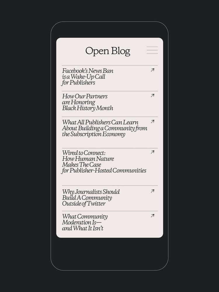
Departing from the visual tendencies of most internet brands, Collins’ identity pays tribute to contemporary tech through motion design and swift animated infographics, while still incorporating classic imagery. Bowker states: “It’s something that we hope serves as a breath of fresh air in a noisy, eye-popping digital landscape.”
GalleryCollins: OpenWeb rebrand (Copyright © OpenWeb, 2022)
Hero Header
Collins: OpenWeb rebrand (Copyright © OpenWeb, 2022)
Share Article
Further Info
About the Author
—
Liz (she/they) is the senior editor at Insights, a research-driven department within It’s Nice That. They previously ran the news section of the website. Get in contact with them for potential Insights collaborations or to discuss Insights’ public-facing reports.





