Swiss design practice Dinamo develops new visual identity for Tumblr
Dinamo/Tubmlr
Tumblr, the inexhaustible online depository for some of the most deliciously niche material on the internet, has been given a visual rerub by Swiss design practice Dinamo, as part of the studio’s ongoing creative partnership with the content platform.
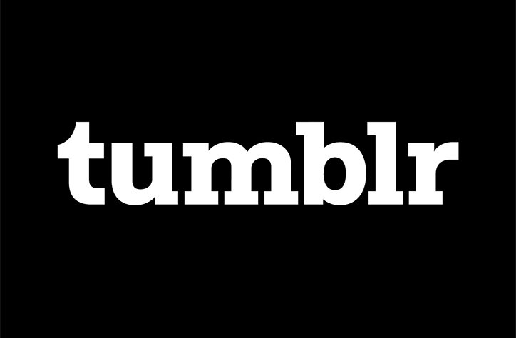
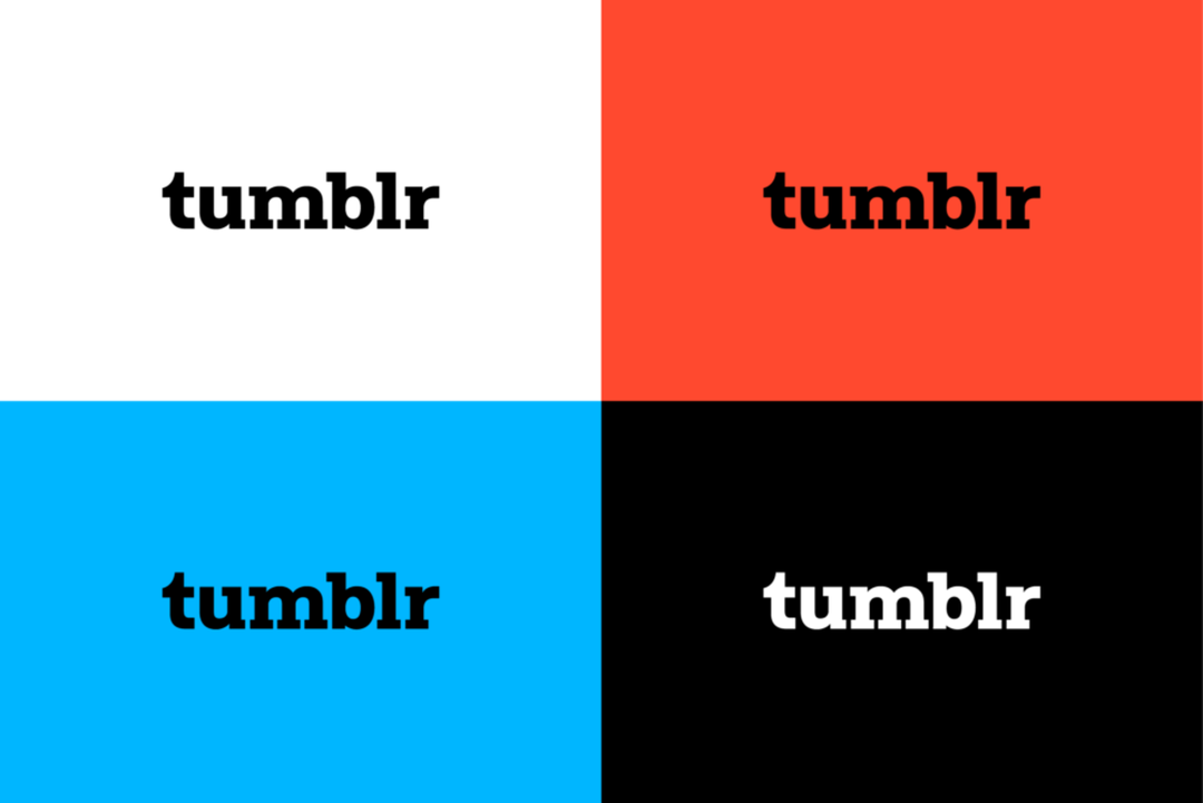
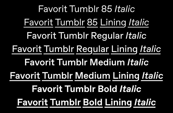
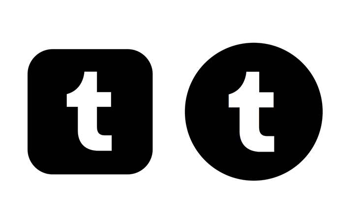
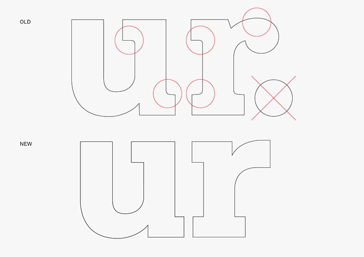
The typeface specialists have zhuzhed up the Tumblr logo and put together a custom typeface, Favorit. The result sees the logo have its “t” and “r” characters recut to align stylistically with Favorit’s defining attributes. Which is all well and good – and it looks well and good, too – but the big news is that Dinamo has made one massive, previously unthinkable change to a logo that’s familiar with pretty much anyone who’s spent more than five minutes on the internet in the past decade: they’ve removed the full stop.
This, Dinamo says, “allows the logo and typeface to seamlessly integrate across all naming conventions.” Which, you’ll agree, is a good thing.
On the typeface itself, Tumblr’s creative director, Doug Richard, is keen to praise how important having a “flexible personality across brand materials” is, and that Favorit possesses a “friendly yet commanding presence that successfully balances foundational sans serif attributes with assertive, contemporary geometry. It was a tall order, but Favorit-Tumblr delivered on all of our needs.”
Dinamo/Tubmlr
Dinamo/Tubmlr
Dinamo/Tubmlr
Dinamo/Tubmlr
Share Article
Further Info
About the Author
—
Josh Baines joined It's Nice That from July 2018 to July 2019 as News Editor, covering new high-profile projects, awards announcements, and everything else in between.