




Top Gear gets its own font, courtesy of DixonBaxi and Fort Foundry
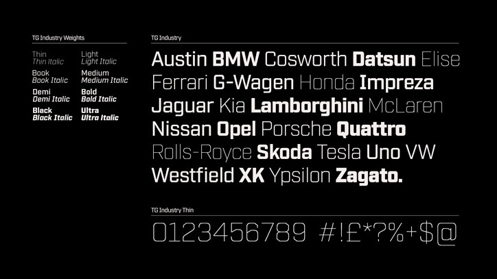
London-based design studio DixonBaxi has created a typeface for Top Gear, which will be used across the TV show, magazine and digital output. Working closely with Mattox Shuler from Fort Foundry, TG Industry is inspired by the cog in the brand’s logo and, in turn, conveys a “mechanical” aesthetic in tune with its content.
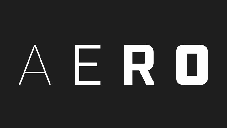
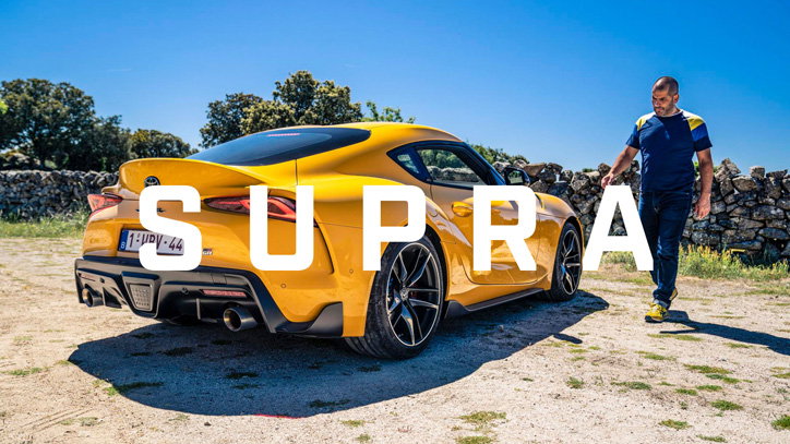
“From the outset the ambition was to create a typeface that would be unmistakably Top Gear in its aesthetic and attitude,” explains studio co-founder Aporva Baxi. The brief was to drive (ahem…) brand recognition and give the Top Gear team something “ownable” and consistent across all the different outputs, while still giving designers versatility. It comes in a range of weights from thin to ultra, with corresponding italics, and simultaneously considers magazine headlines, title sequences and mobile screens. “[It] has been designed to offer a wide range of creative expression from sleek and reductive to bold and expressive,” Baxi continues. “It signals a new dawn for the Top Gear brand as it embraces a true digital-first approach.” This is something DixonBaxi is well versed in, having previously worked on branding for Formula E, Eurosport and Channel 4.
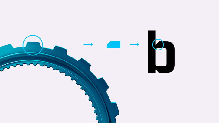
TG Industry is inspired by the angular cuts of the Top Gear cog, with, Baxi says, “aggressive terminals taking influence from the sculpted metallic body surfaces that adorn the modern Hyper-car. The blunt end of the uppercase ‘A’ is a good example, or where the curved part of the lowercase ‘b’ meets the upright stroke – this has been given an aggressive angular edge that is inspired by the shape of the teeth on the cog icon.”
Previously Top Gear didn’t have its own font, instead it used a range of different typefaces that Baxi says varied massively based on the application and location in the world; as the show has a huge international audience. The new typeface won’t be affecting the Top Gear word marque, but, Baxi says, it has been crafted to complement it, giving the brand a visual voice.
DixonBaxi: TG Industry
DixonBaxi: TG Industry
DixonBaxi: TG Industry
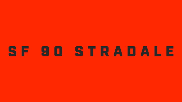
DixonBaxi: TG Industry
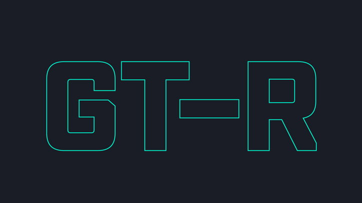
DixonBaxi: TG Industry
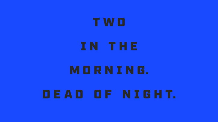
DixonBaxi: TG Industry
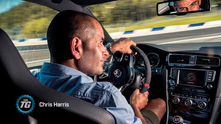
DixonBaxi: TG Industry
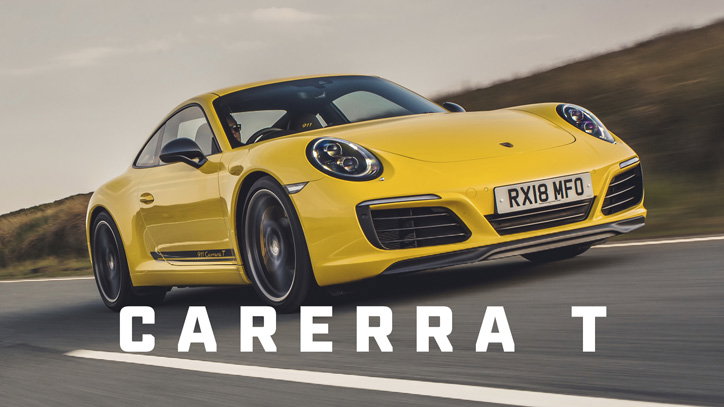
DixonBaxi: TG Industry
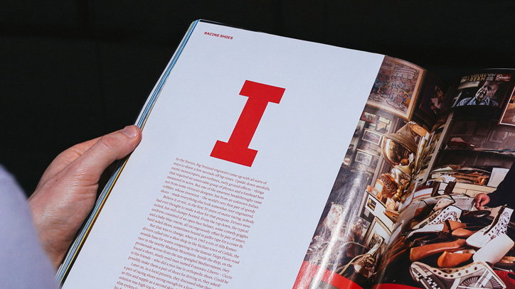
DixonBaxi: TG Industry
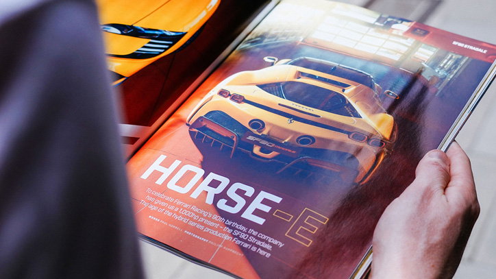
DixonBaxi: TG Industry
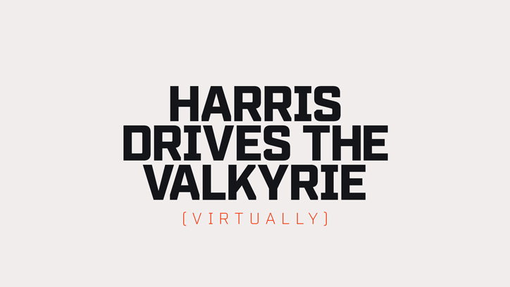
DixonBaxi: TG Industry
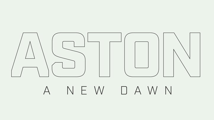
DixonBaxi: TG Industry
Share Article
Further Info
About the Author
—
Jenny oversees editorial output across It’s Nice That. Get in touch with writing pitches for features or opinion pieces, big creative story tips, or questions about all things editorial. [email protected]
To submit your work to be featured on the site, please see our Submissions Guide.