To rebrand Everton F.C. DixonBaxi overcomes the responsibility of doing the fans justice
For the project, the agency set themselves the task of becoming honorary Evertonians – with one DixonBaxi designer even tattooing the tower on his leg.
Share
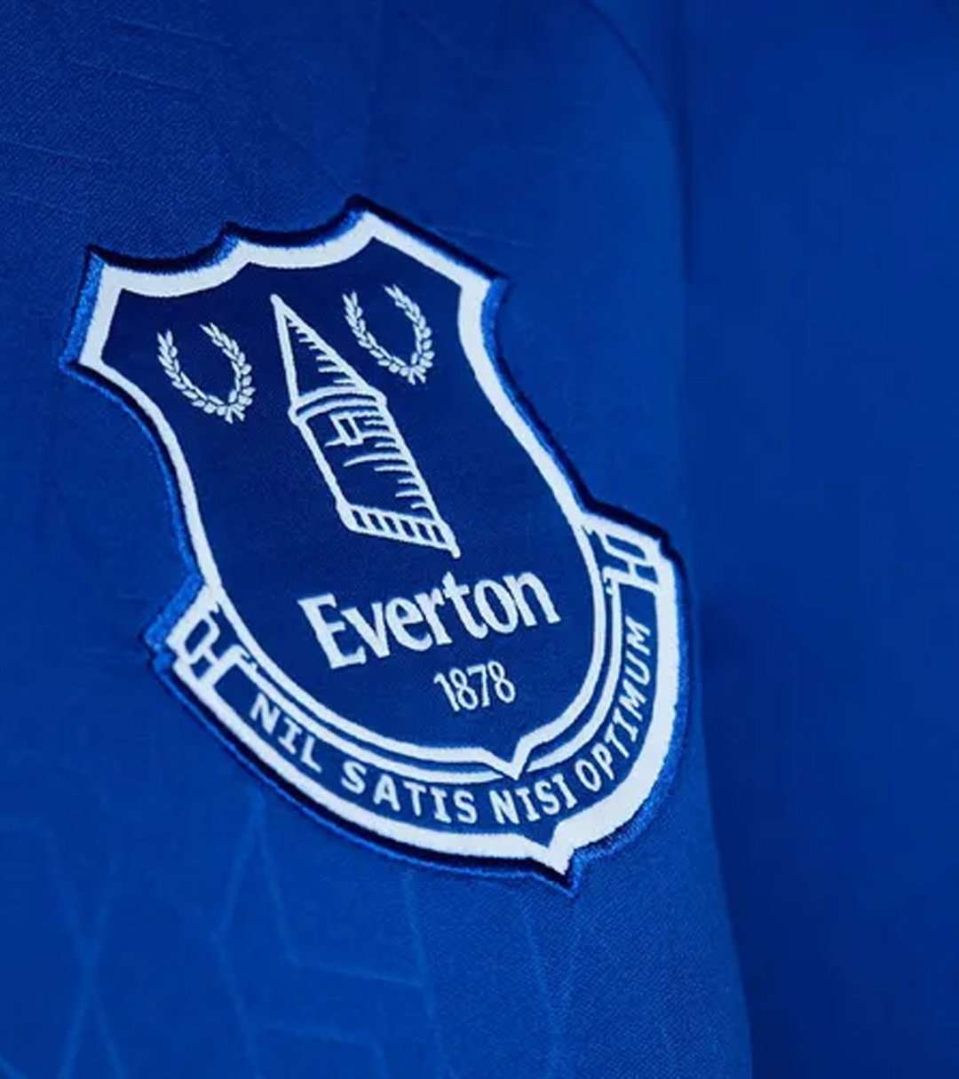
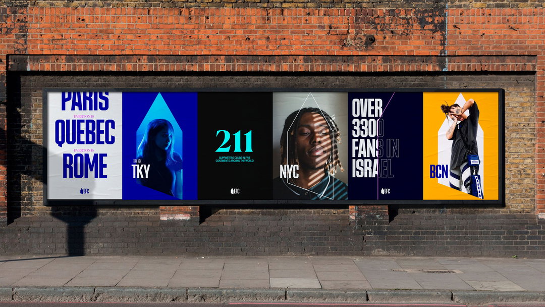
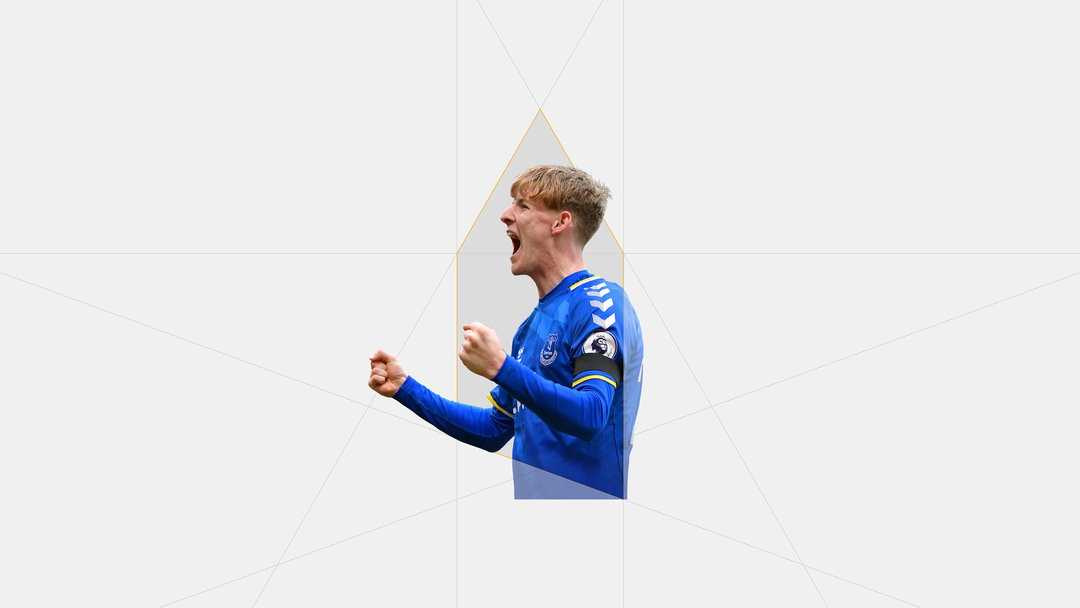
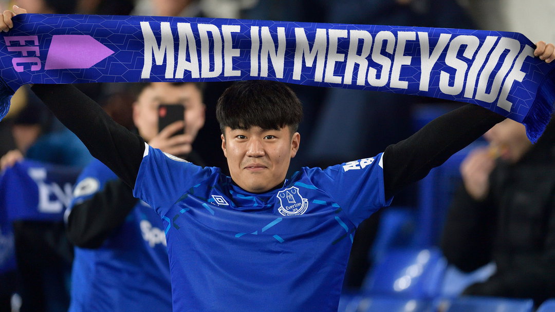
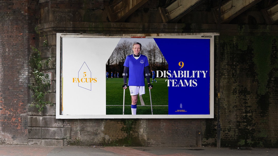
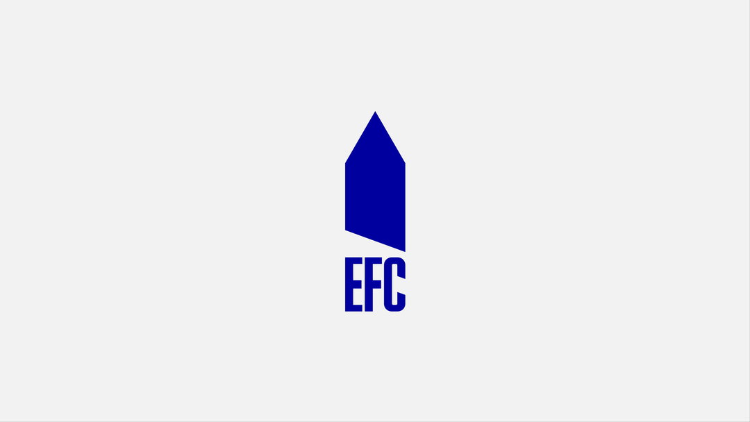
With the Prince Rupert Tower sitting at the heart of Everton Football Club’s crest since 1938, DixonBaxi has recently faced the considerable challenge of deciding how to remake it. Called on board to carry out a full rebrand for the club, the London design agency has rooted the fresh look in the club’s visual history. Fans glancing through the renewed branding are likely to spot a whole range of motifs plucked from its heritage. Plus, fans will be pleased to know that DixonBaxi’s approach to the tower channels a refreshing ‘if it ain’t broke’ mentality. “We felt that the version displayed on the shirt, which is loved by fans, need not be touched for the sake of creating a brand,” says senior designer Matt Caldwell.
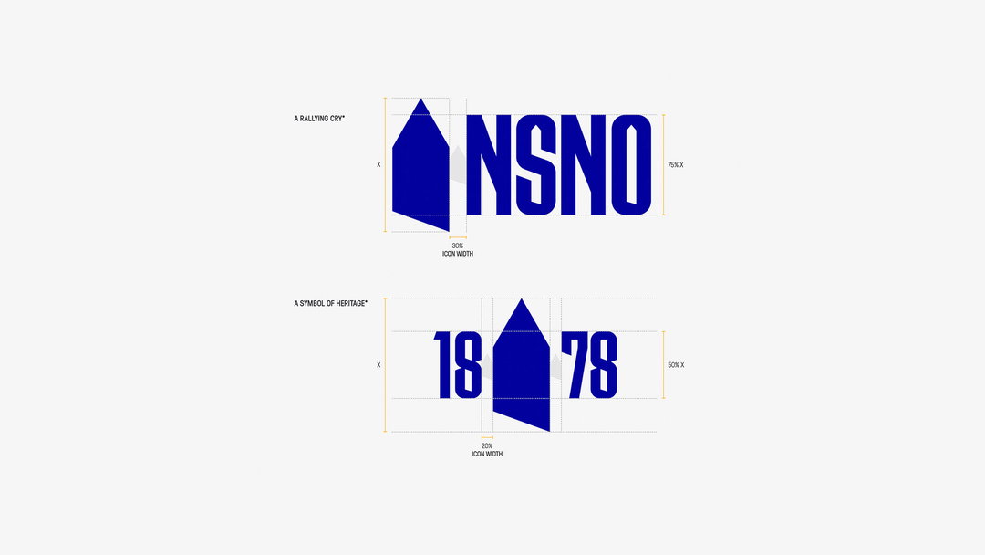
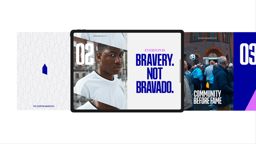
The new look features a simplified version of the symbol, paying homage to the Prince Rupert original with a crisp silhouette form. In the new brand iteration, the tower coexists with the crest, “serving different purposes but under one story and shape,” adds Matt. While the tower continues to function as the pulse of the brand ecosystem, it seems the fever around the mark has caught on at DixonBaxi too. “We are all a little obsessed with the ‘Tower’, Matt explains. “We turned it into an emoji on Slack and it’s one of the most used reactions at DixonBaxi. One of our designers even got the ‘Tower’ tattooed on his leg.”
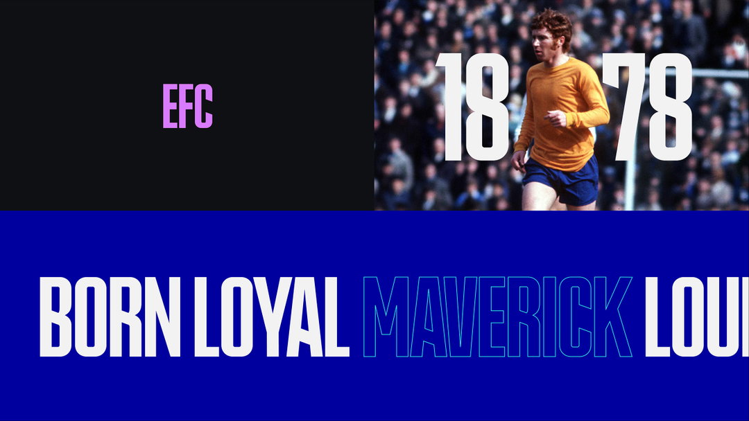
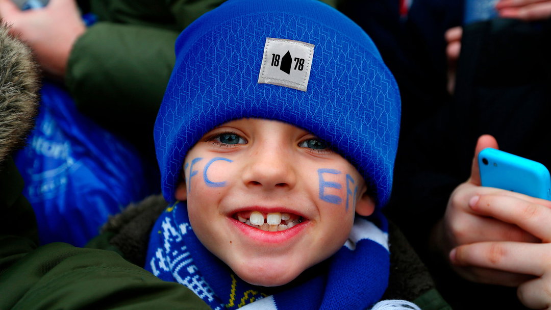
The tower form extends even further across the work; the custom typeface, Rupert Condensed, is in fact, cut from the same cloth, featuring similarly dynamic angles and pointed tips. DixonBaxi has also developed a series of patterns which sees the symbol repeated across various touchpoints. According to Matt, the addition provides “a sophisticated edge to the brand toolkit which allows us to stitch detail into physical items”; it will also appear in the home kits for the 2022/23 season.
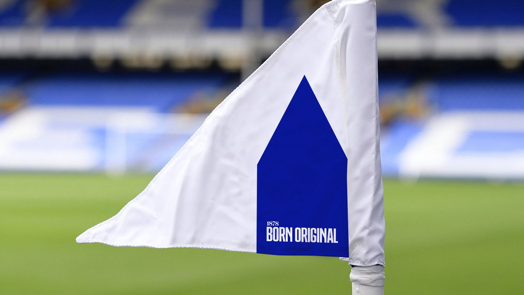
DixonBaxi: Everton F.C. identity (Copyright © DixonBaxi, 2022)
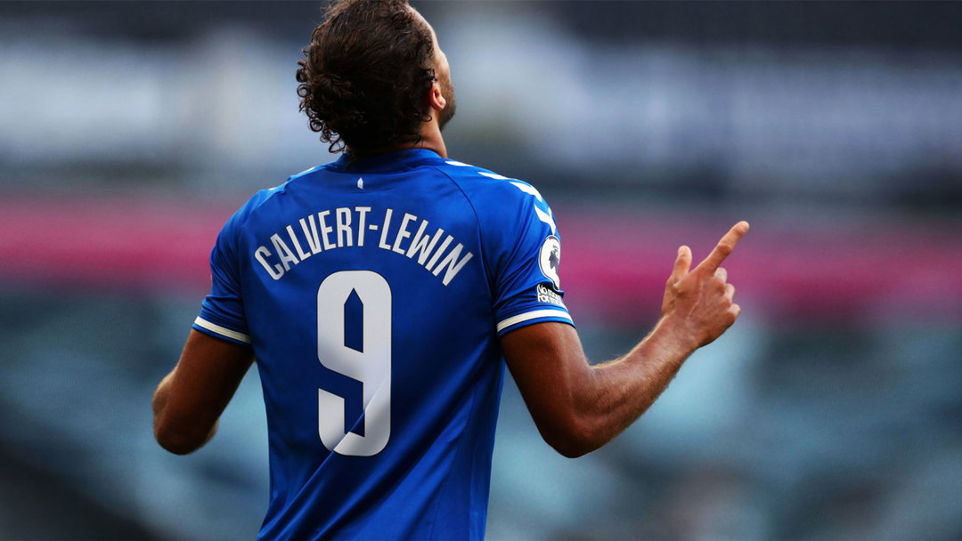
The refreshed Everton colour palette continues the theme of looking back. While Everton Blue has become Mersey Blue, “dialled up to be fit for a digital world, rich and vibrant yet grounded”, DixonBaxi introduces a pink that harks back to one of the club’s first kits in 1882. In another excellent easter egg moment, amber has been introduced as an accent colour, “a nod to the away shirt worn by the Holy Trinity Axis’ of Howard Kendall, Colin Harvey and Alan Ball”, says Matt.
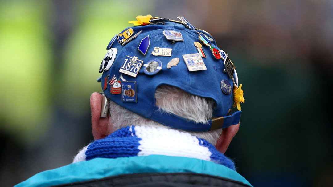
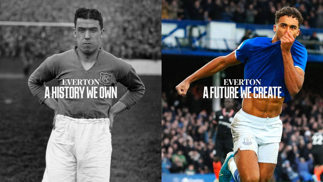
Fusing more than 140 years of visual tradition with sleek additions, DixonBaxi hopes the latest work will unite fans everywhere, while future-proofing the club. Although, ultimately, Matt explains that the main goal was simply to do the fans justice. “Being football fans ourselves, our greatest challenge was overcoming the responsibility of rebranding a club.”
To pull it off, Matt describes that the only way forward was to become “honorary Evertonians” themselves – “living like a fan, watching every game, keeping up with every Toffee news outlet. Quickly we began to understand the core values of the club and who we were really designing for — and soon the weight of rebranding a football club became an instinctive design process. We even did a little fist pump when the club maintained Premier League status last season!”
GalleryDixonBaxi: Everton F.C. identity (Copyright © DixonBaxi, 2022)
Hero Header
DixonBaxi: Everton (Copyright © DixonBaxi, 2022)
Share Article
Further Info
About the Author
—
Liz (she/they) is the senior editor at Insights, a research-driven department within It’s Nice That. They previously ran the news section of the website. Get in contact with them for potential Insights collaborations or to discuss Insights’ public-facing reports.