Type foundry Emigre donates significant back catalogue to Letterform Archive
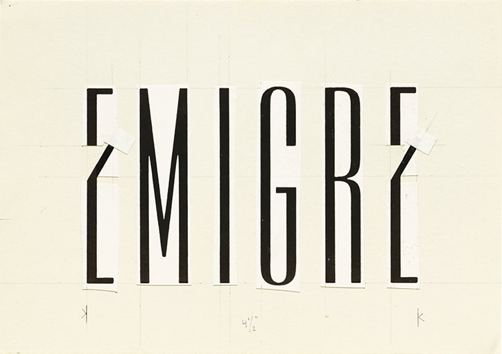
Emigre logo on paste-up board, 1983
Berkeley-based type foundry and publisher Emigre has donated a large trove of rare archival materials to Letterform Archive, the San Francisco-based non-profit library and museum for students and practitioners.
The sizeable donation includes original designs for the foundry’s typeface, the complete run of Emigre magazine which was published between 1984 and 2005, as well as a vast array of printed materials, posters, paste-ups and even a collection of unedited audiotaped interviews conducted by the magazine, with noted designers and contributors, which the archive says: “offer an oral history of the design community.”
Emigre’s so-called oral history is a particular boon to Letterform Archive’s efforts of preservation and documentation, not only due to their considerable output but their influence at a transitional time between analogue creative processes and the birth of digital, as Rob Saunders explains: “the physical Emigre collection is a significant addition…providing critical material from a period that was a major catalyst for change in the letter arts.”
Explaining the decision behind their donation Rudy VanderLans and Zuzana Licko, co-founders of Emigre say: “Letterform Archive is easily accessible to the public, it actively promotes itself to the design community…Moreover, Letterform Archive is a local, Bay Area institution. We felt strongly about having our work remain in the Bay Area, where our roots are.”
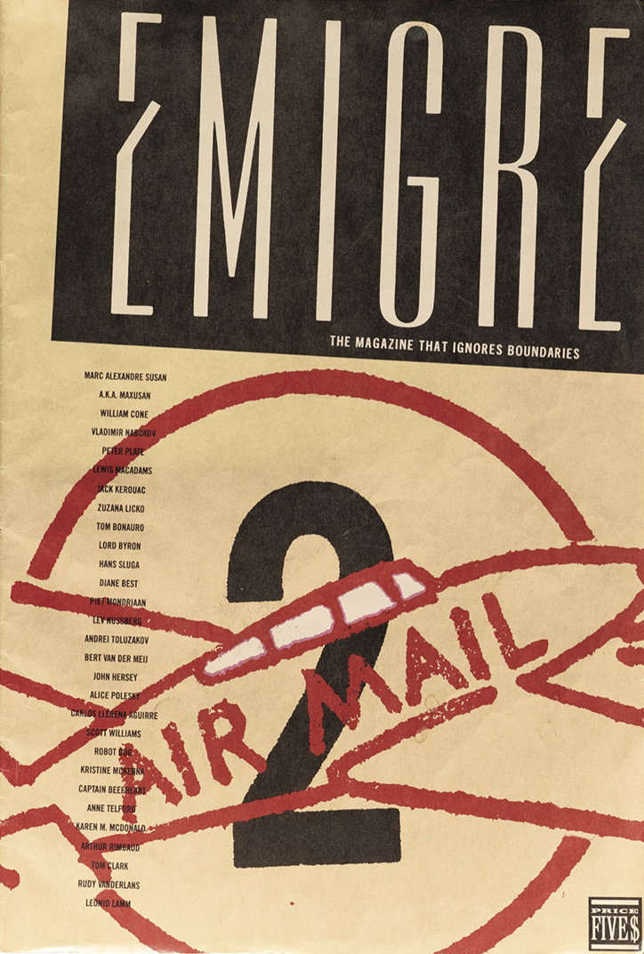
Emigre magazine #2, 1984
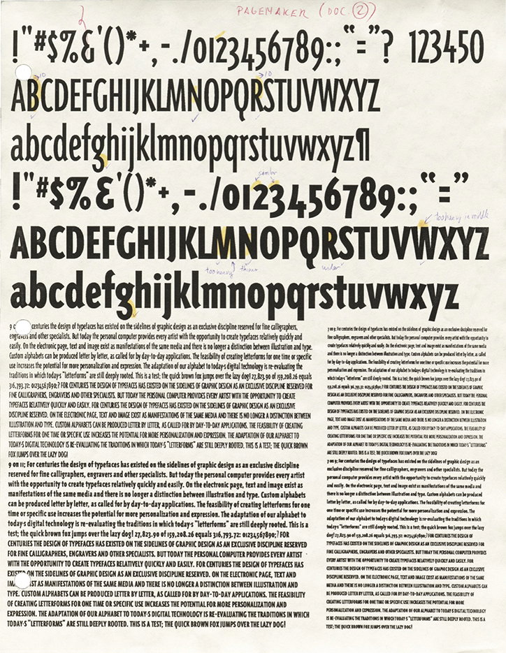
Marked-up trial proofs of Triplex typeface by Zuzana Licko, 1990
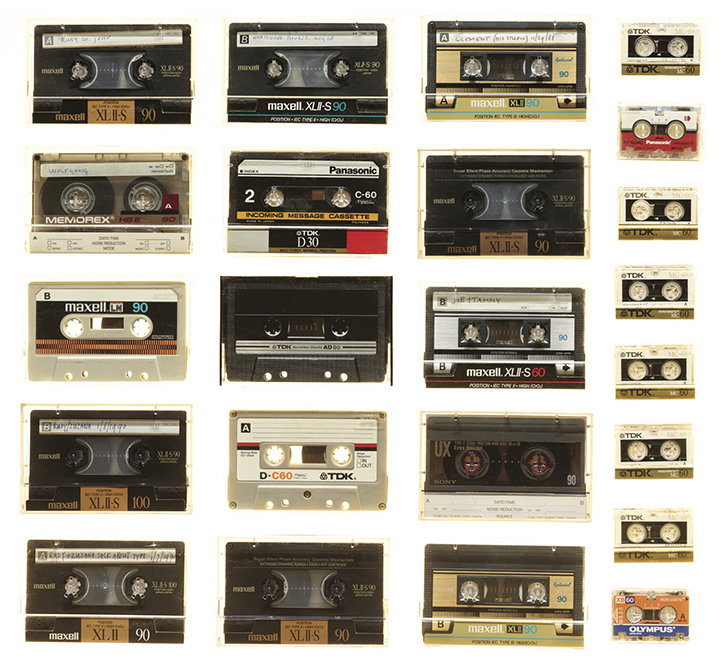
Cassette tapes containing interviews for Emigre magazine, 1988-1998
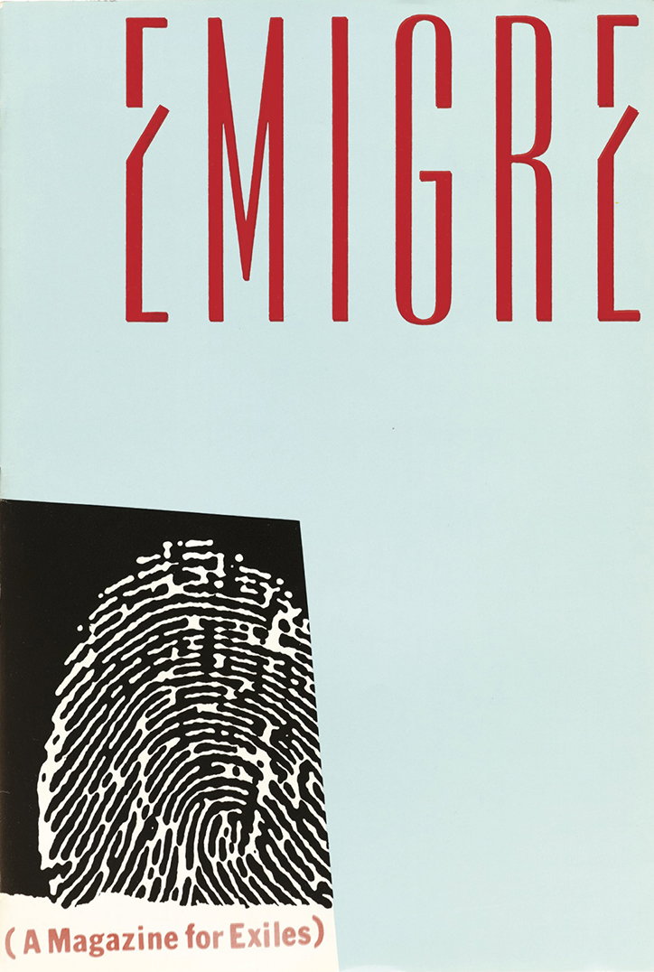
Emigre magazine #1, 1984
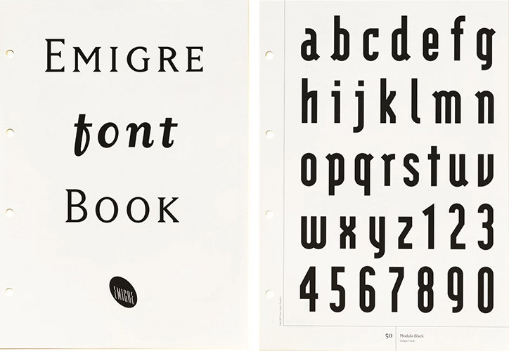
Clip-art font book published by Hakuo Publishing, Japan, 1993
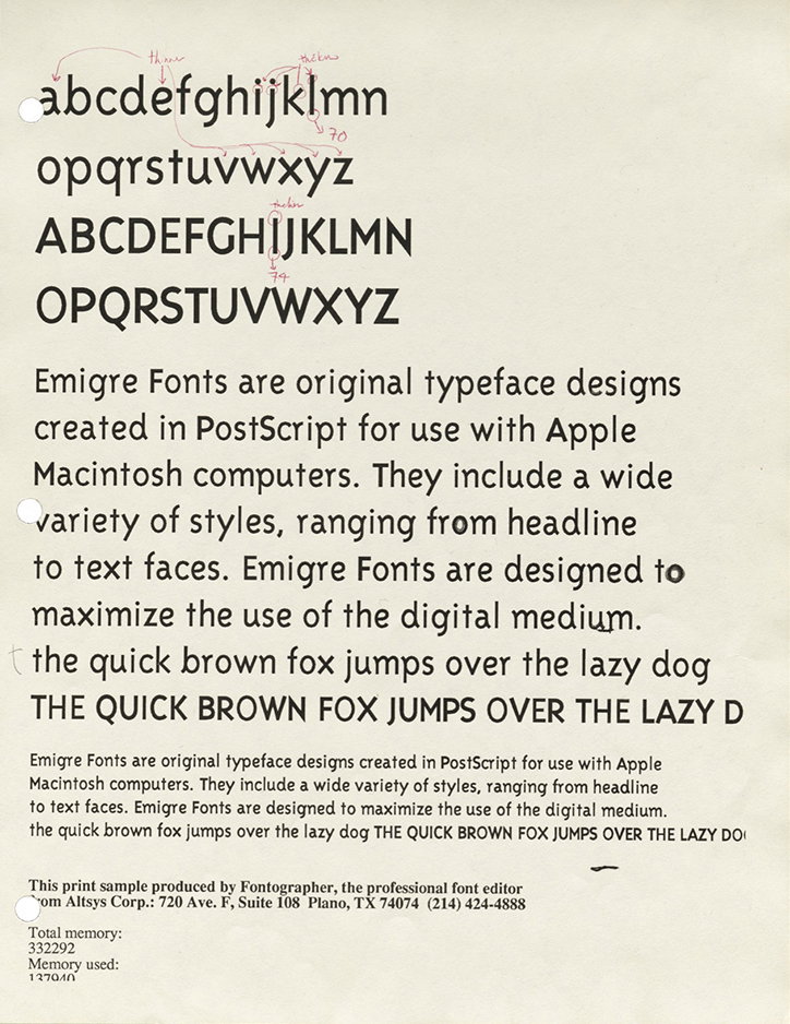
Marked-up trial proofs of Triplex typeface by Zuzana Licko, 1990
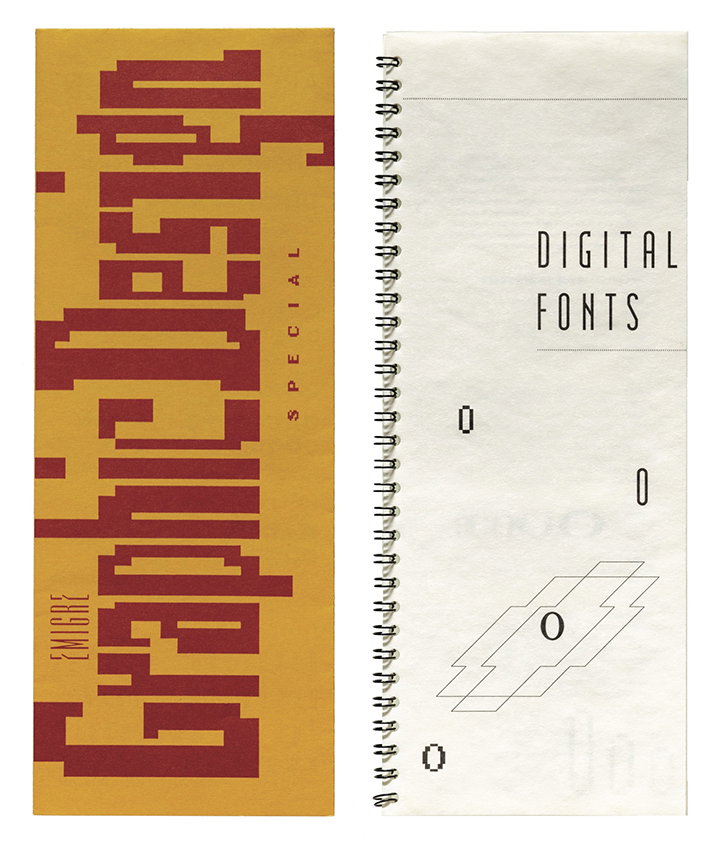
Flyer announcing Emigre magazine #10, 1988
Digital fonts catalog, 1986
Share Article
Further Info
About the Author
—
Jamie joined It’s Nice That back in May 2016 as an editorial assistant. And, after a seven-year sojourn away planning advertising campaigns for the likes of The LEGO Group and Converse, he came back to look after New Business & Partnerships here at It’s Nice That until September 2024.