Launch Recite Me assistive technology

London’s first crisp restaurant, Hipchips, launches with branding by Ragged Edge
—
Date
28 November 2016
A white logo on a black background reads “HIPCHIPS” in a bold, blocky typeface. Smaller text to the left reads “FRESH CRISPS” and to the right reads “FRESH DIPS”.

Ragged Edge has designed the brand identity for Hipchips, London’s first restaurant dedicated entirely to crisps. From the brand mark, signage and tone of voice to the menus, packaging and uniforms, the studio created the restaurant’s entire visual output including guidelines for its roll out in print, digital and interiors.

The identity references the origins of crisps, which first rose to popularity in the 1830s, by using two “traditional” British typefaces Thorowgood Sans and Kings Caslon, studio co-founder Max Ottignon explains. It aims to combine this tradition with a fresh, contemporary feel.

“The colour palette features a classic red combined with a modern set of supporting colours,” Max says, “and a very British pinstripe given a 45-degree twist."
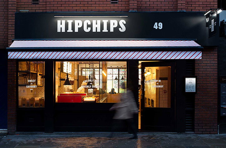
The storefront of a chip shop called “Hipchips”, numbered “49”, set into a red brick wall. A red and white striped awning hangs over the window, where a person is visible working inside.
Above

Ragged Edge: Hipchips

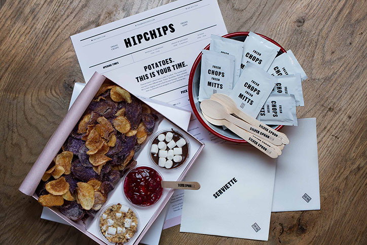
A branding kit for “Hipchips” laid out on a wooden surface. The set includes a box of purple and gold crisps, small pots of dips, a bowl of bagged snacks, and a printed menu that reads “Potatoes. This is your time.”
Above

Ragged Edge: Hipchips

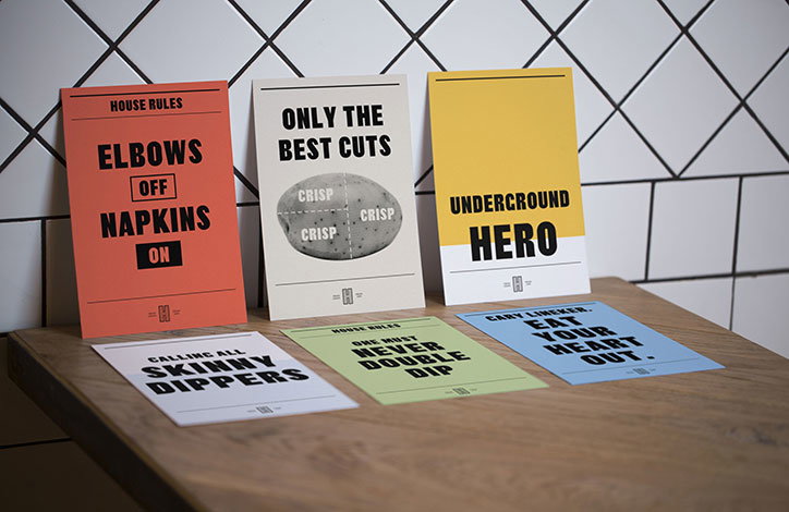
Six colourful posters with bold typography lean against a white tiled wall on a wooden table. The posters feature phrases such as “Elbows off napkins on”, “Only the best cuts” and “Underground hero”.
Above

Ragged Edge: Hipchips

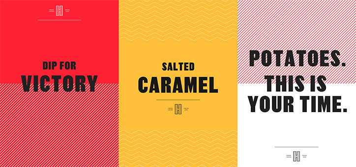
Three graphic posters side by side in red, yellow and white. They read “Dip for Victory”, “Salted Caramel” and “Potatoes. This is your time.”
Above

Ragged Edge: Hipchips

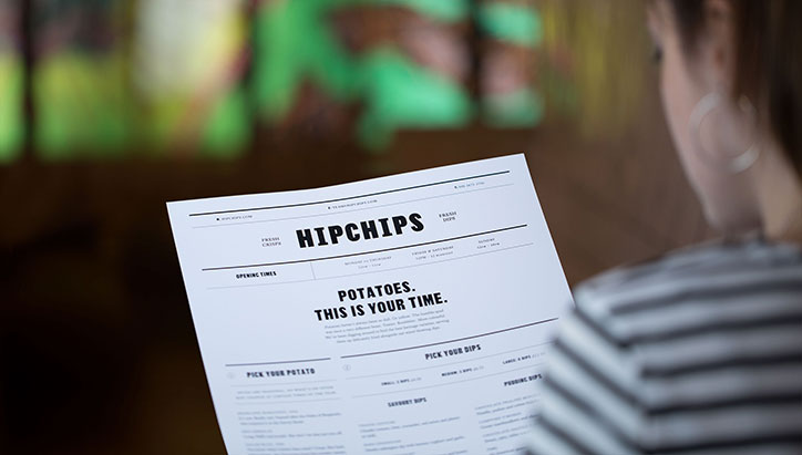
A person in a striped top holds a menu for “Hipchips”. The page features bold typography and the headline “Potatoes. This is your time.”
Above

Ragged Edge: Hipchips

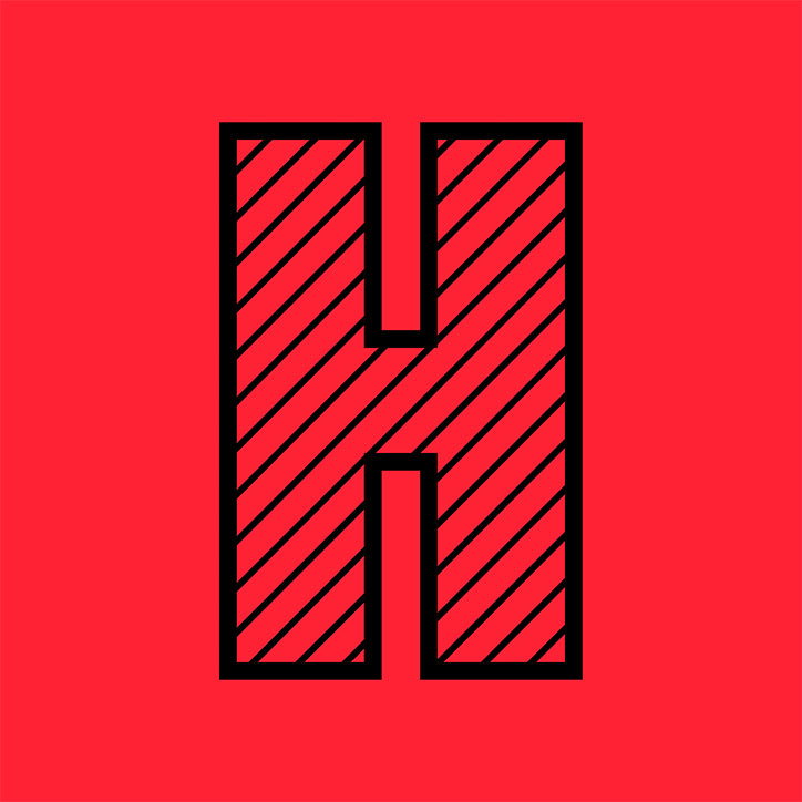
A bold, black-outlined capital “H” centered on a bright red background. The letter is filled with diagonal black stripes.
Above

Ragged Edge: Hipchips

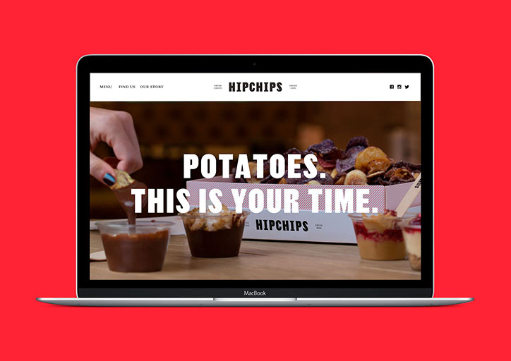
A laptop displays the website for “Hipchips” against a bright red background. The homepage features a close-up of loaded fries and dips with the bold headline “POTATOES. THIS IS YOUR TIME.”
Above

Ragged Edge: Hipchips

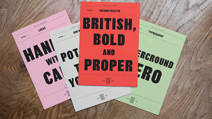
Four brand guideline booklets in pink, white, red and green are fanned out on a wooden surface. The red booklet on top reads “British, Bold and Proper” in large, black block capitals.
Above

Ragged Edge: Hipchips

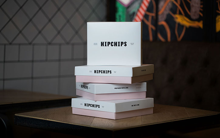
A stack of white and pale pink cardboard boxes sits on a wooden table. The boxes feature the brand name “Hipchips” in a bold, black sans-serif typeface.
Above

Ragged Edge: Hipchips

Share Article

Further Info

About the Author

Jenny Brewer

—

Jenny oversees editorial output across It’s Nice That. Get in touch with writing pitches for features or opinion pieces, big creative story tips, or questions about all things editorial. [email protected]

To submit your work to be featured on the site, please see our Submissions Guide.
It's Nice That Newsletters

Fancy a bit of It's Nice That in your inbox? Sign up to our newsletters and we'll keep you in the loop with everything good going on in the creative world.