




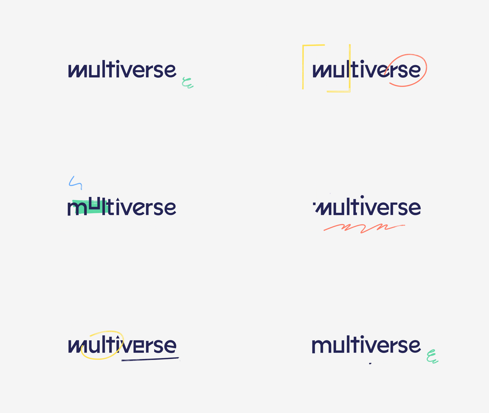
Koto’s identity for apprenticeship startup Multiverse injects personality into the samey education sector
Having just raised $44 million in funding, Euan Blair’s firm has renamed and rebranded to reflect its alternative views on the routes to work, and focus on individuals versus institutions.
Share
One of the major blockers to diversifying workforces is a pervasively old-fashioned view of what the route to work looks like. Increasingly, industry gatekeepers are questioning those views, and as a result many large companies are ditching their university degree requirements for jobs and instead looking to professional apprenticeships and work-based learning programmes to find their new starters. This might go some way to explaining why Multiverse, formerly named Whitehat, the apprenticeship startup co-founded by Euan Blair (Tony Blair’s son) and Sophie Adelman has recently raised $44 million in funding and already boasts clients including Google, Sky, Ogilvy, Wavemaker, Facebook and Microsoft. In tandem with the cash injection came the rename and rebrand by design studio Koto, both of which are apparently inspired by “endless possibilities”.
The key factor in rebranding was to better embody Multiverse’s alternative attitude to education, and stand apart in the education and edtech worlds. The old name “didn’t really capture the energy or make the company stand out from the competition,” says James Greenfield, founder and creative director of Koto. The new brand identity instead aims to first make people take notice “through its power” and then keep their attention through its visual contrast to the rest of the sector. “To build an alternative you have to show you’re an alternative to something,” Greenfield says. “In the long run the brand’s actions will be associated with its visual brand and so it will become a shorthand.”
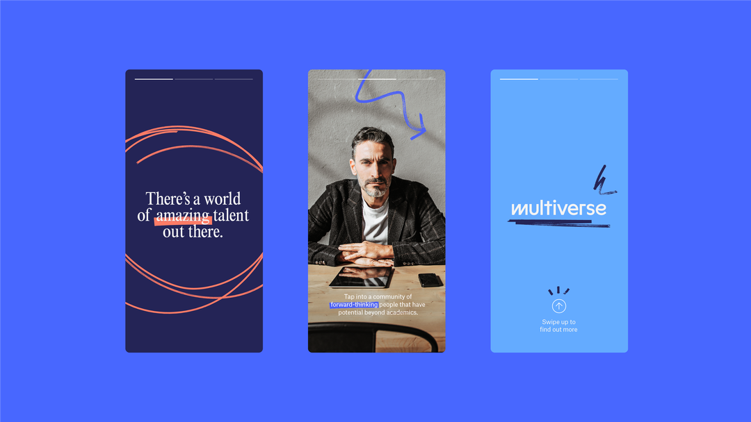
At the core of the identity is the idea that Multiverse is an alternative to university, and aims to “create a more diverse group of future leaders”. Greenfield adds: “We wanted to signify the brand’s intent to change thinking around the world of education and work." The brand’s personality comes through, he explains, in the amalgamation of different elements to the design: “Optimism in the colour, graphic style and tone, inclusivity in the photography and tone of voice, resolute in the power of the brand as a whole,” he says.
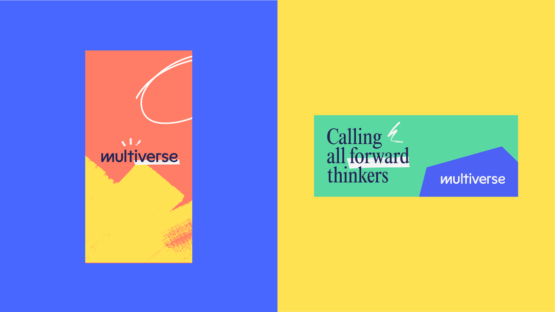
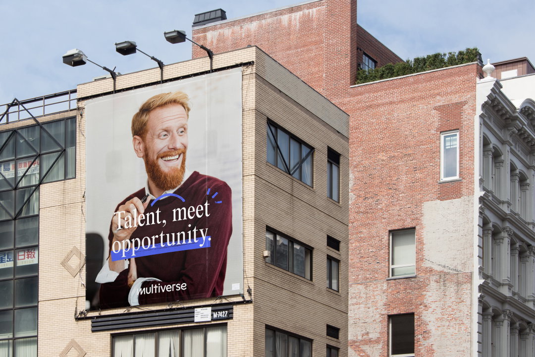
Koto: Multiverse brand identity (Copyright © Multiverse, 2021)
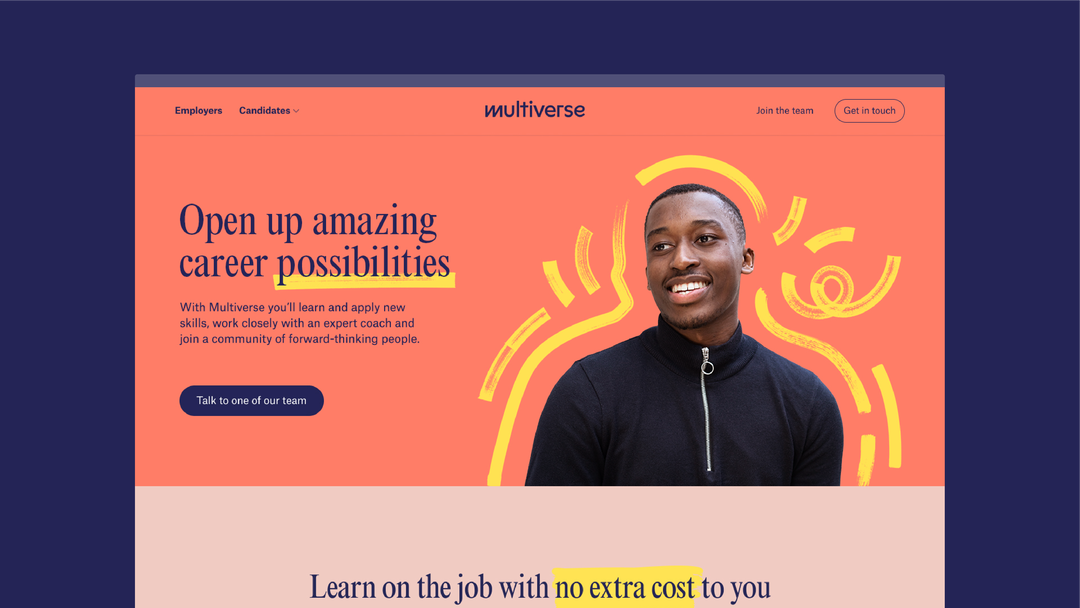
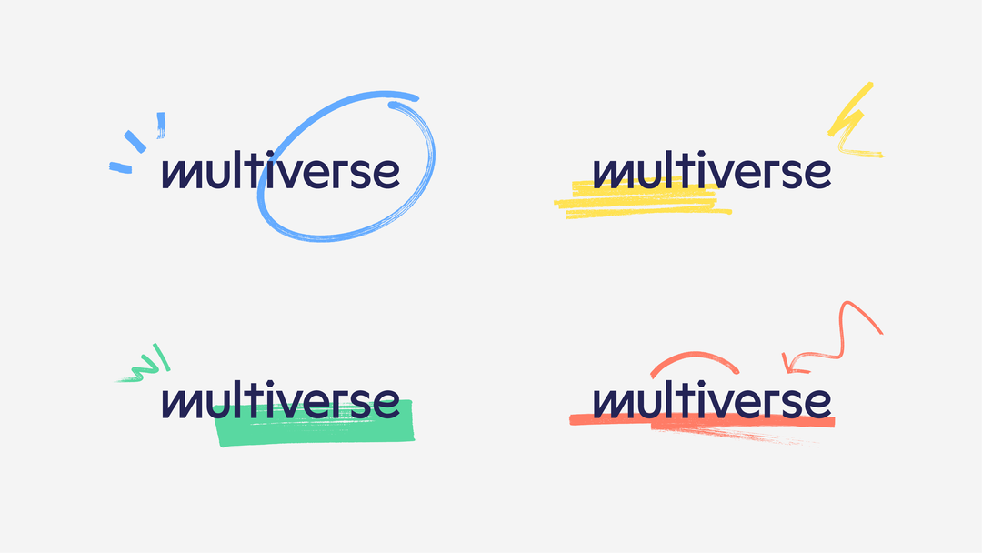
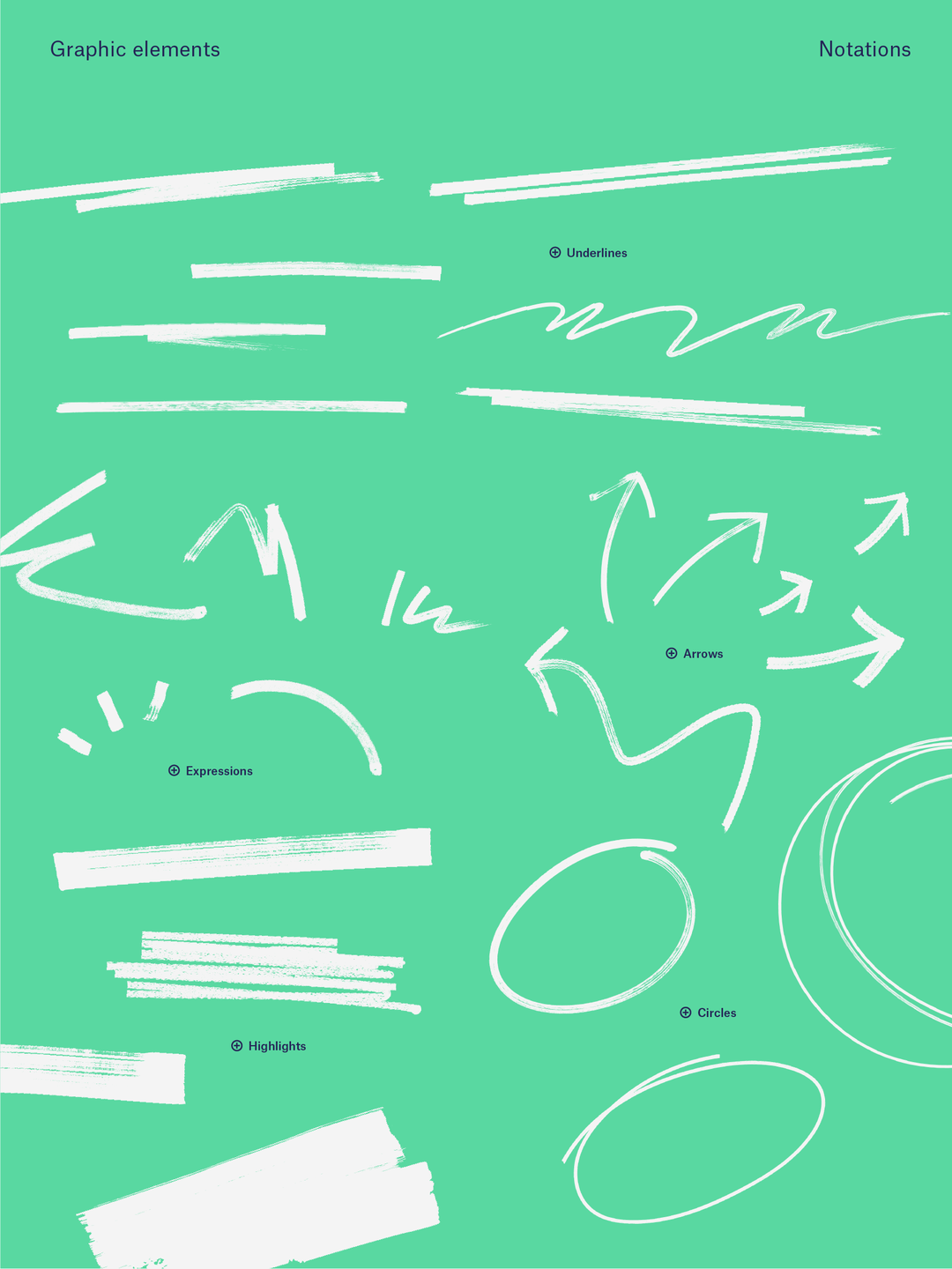
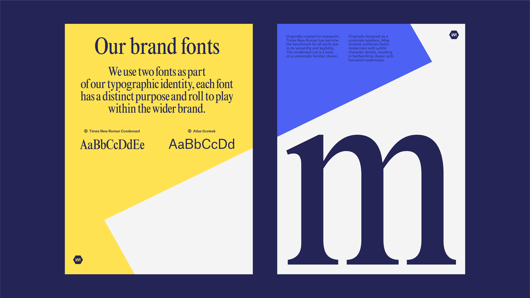
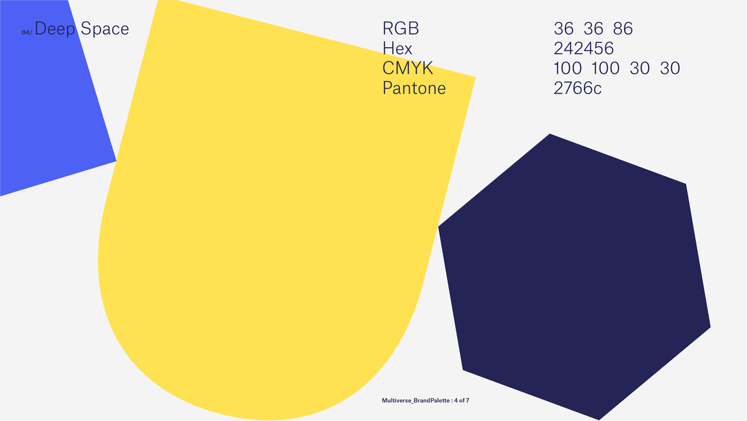
The identity uses fresh, vibrant colours to jump out “against a sea of blue and sameness,” Greenfield describes of the visual tropes of its competitors, together with a set of hand drawn graphic elements. These are expressive, colourful doodles that add a flourish of energy and personality, and can be used to emphasise important information – “the new brand is intentionally more personal,” he adds. The design system uses two typefaces, Times New Roman Condensed and Atlas Grotesk, the former adding a subtle serious, corporate facet, and the latter balancing that out with something more modern and humanist.
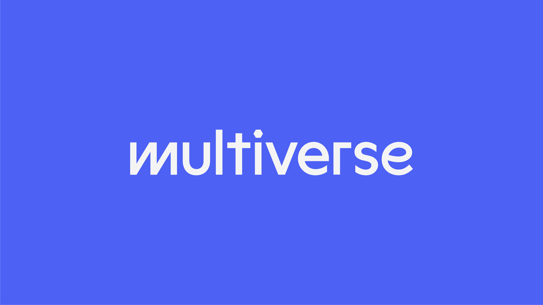
The wordmark is made up of multiple different characters from various typefaces, feeling eclectic but still coherent. “A multiverse is defined as ‘a space or realm consisting of a number of universes, of which our own universe is only one," says Greenfield. Koto not only wanted to capture this in the photography and tone of voice but also the lynchpin of the brand, the logo – a symbol of its overriding ethos. “[It] is multi-state and animated by nature, feeling pretty diverse and made up of many styles intentionally,” Greenfield adds, “reflecting,” the brand concludes, “Multiverse’s focus on individuals – rather than uniform academic achievements”.
GalleryKoto: Multiverse brand identity (Copyright © Multiverse, 2021)




Share Article
Further Info
About the Author
—
Jenny oversees editorial output across It’s Nice That. Get in touch with writing pitches for features or opinion pieces, big creative story tips, or questions about all things editorial. [email protected]
To submit your work to be featured on the site, please see our Submissions Guide.

