Publishing platform Medium launches its new identity
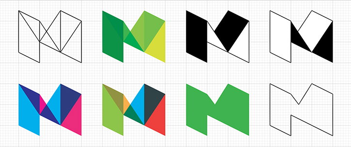
Long-form publishing platform Medium has just launched its new identity, which was created in-house with type designer Rod Cavazos from type foundry PSY/OPS. Spotted over on Design Week’s site today, the new logo sees an overlapping, geometric and adaptable “M”. It’s a stark contrast to the black and white “M” logo set in Stag font that they’ve had since 2012.
Medium art director Erich Nagler and designer Karen Jaimes say: “With Rod, we pursued the concept that our logo could be made of a series of interconnected ideas or shapes that, when joined together, would form a new thought… A logo that flows, unfurls, and builds like a great and memorable conversation.
“We began to see the four planes of the logo as overlapping strains of a conversation. A conversation whose tone and direction shift as the planes come into contact with each other.”
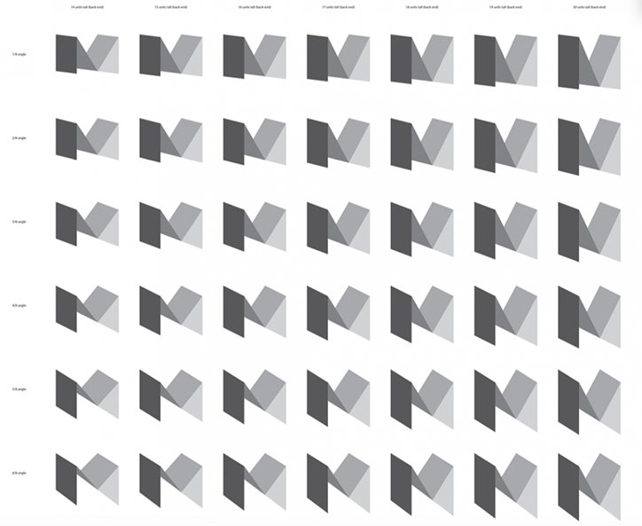
Medium new logo development sketches

Medium new logo development sketches

Medium new logo development sketches
Share Article
Further Info
Found via: www.designweek.co.uk
About the Author
—
Rebecca Fulleylove is a freelance writer and editor specialising in art, design and culture. She is also senior writer at Creative Review, having previously worked at Elephant, Google Arts & Culture, and It’s Nice That.