




Pentagram’s Paula Scher reveals powerful “anti-sanitarium” identity for the Mental Health Coalition
The designer says she hopes the “square peg in a round hole” icon will become a global symbol for mental health, inspired by Act Up’s Silence=Death AIDS campaign in the 1980s.
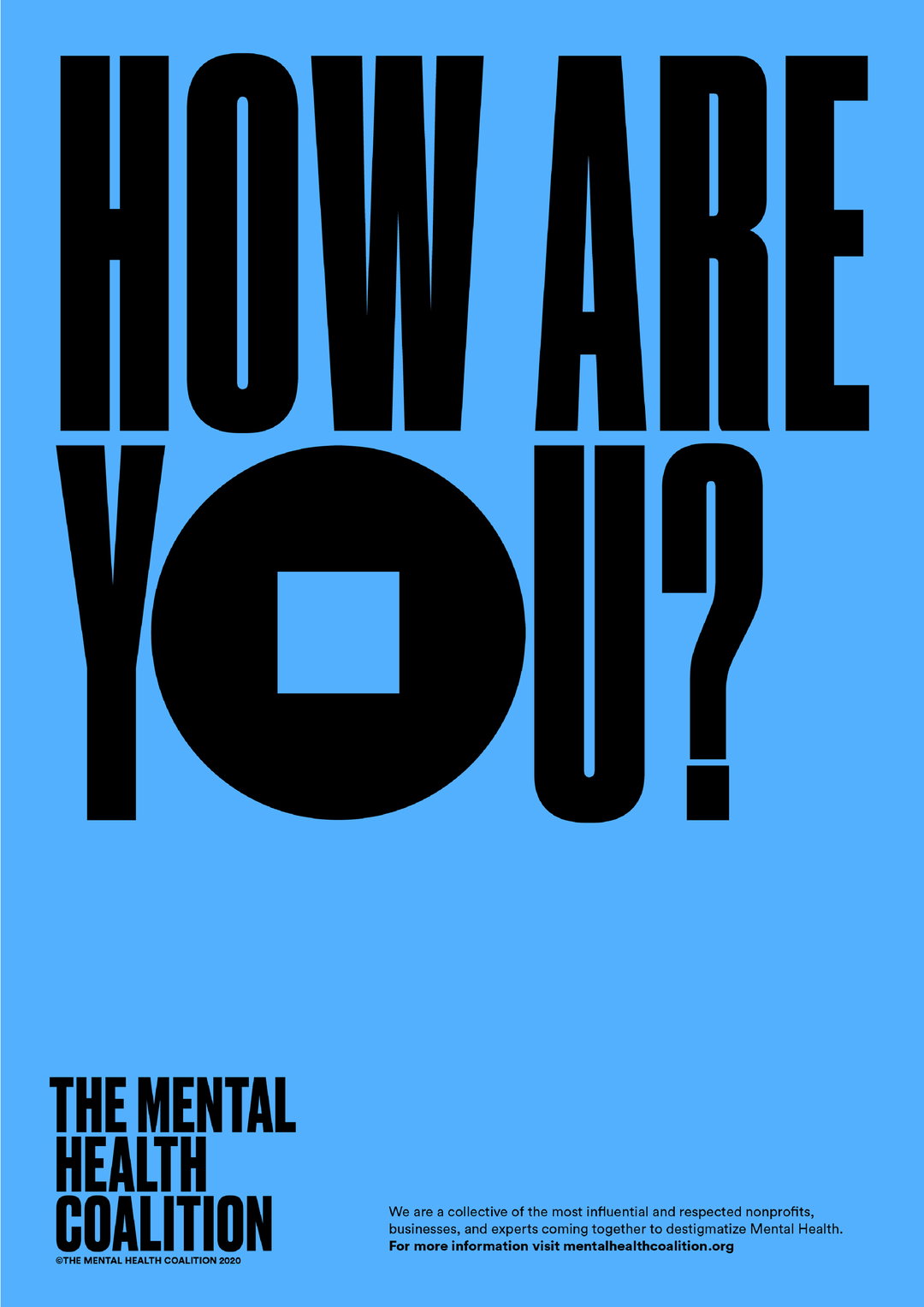
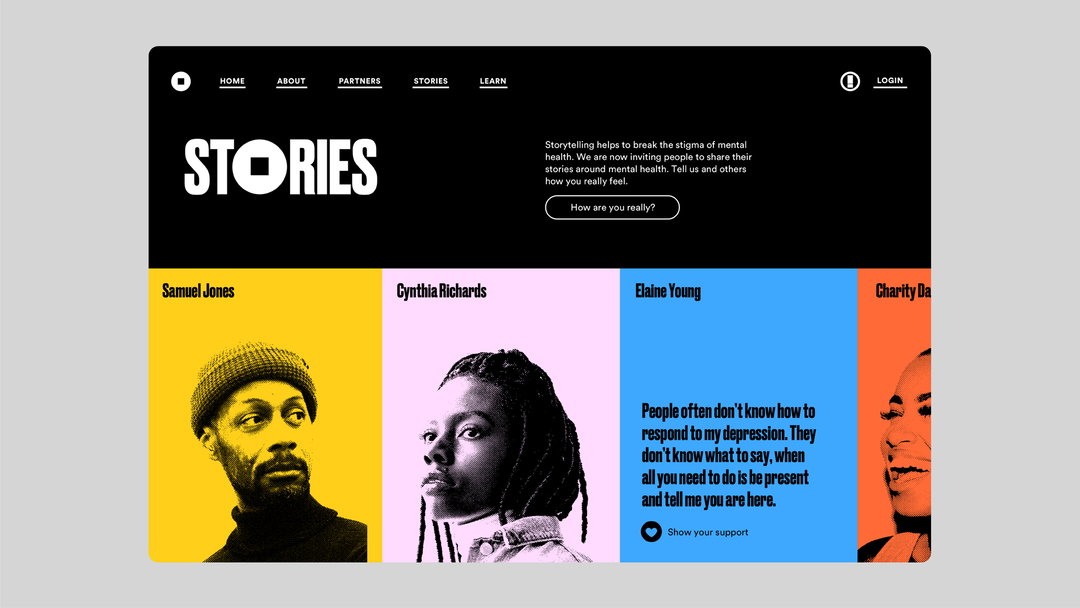
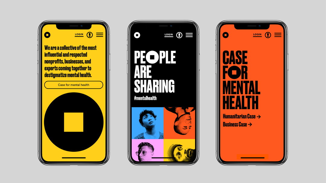
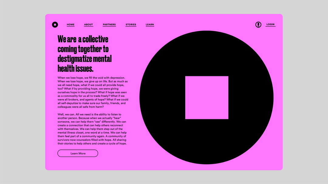
Pentagram partner Paula Scher is known for her bold and attention-grabbing graphic design, so her arrival in the mental health sphere is not only unexpected, it’s an exciting and powerful call to action. In contrast to its peers in the sector – largely summed up by soft tones and a gentler visual approach – new charitable initiative the Mental Health Coalition has gone for a striking identity by Scher, that features an icon she hopes will become a global symbol for mental health, plus unapologetically shouty typography and a vivid colour scheme. “It’s an anti-sanitarium design,” she tells It’s Nice That.
Launched during Mental Health Awareness Week by social activist and fashion designer Kenneth Cole, the coalition’s core aim is to destigmatise mental health conditions and get people talking, which is key to Scher’s empowering and confident identity. According to the World Health Organisation, one in four of us will experience a mental health condition at some point in our lives, and the problem is now more urgent as the pandemic threatens to exacerbate issues.
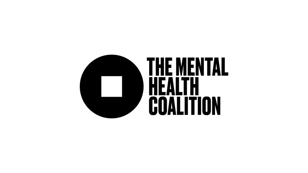
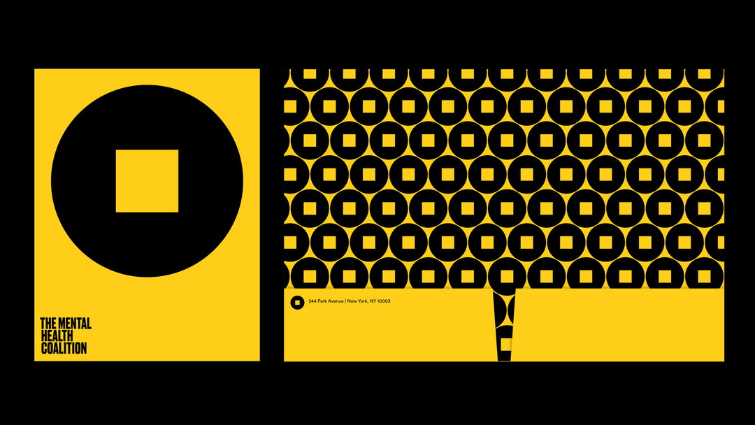
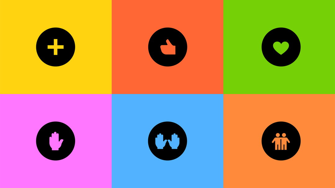
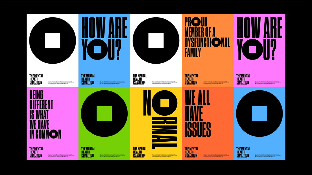
Scher’s icon for the MHC is a square peg in a round hole, “because that’s how you feel,” the graphic designer explains. Appearing in black on white or a variance of “bright, lively and strong” colours, and dotted among text replacing the ‘O’, the designer and coalition hopes the impactful logo has the potential to come to represent mental health issues as a whole. In her research, Scher says she was particularly influenced by Act Up’s AIDS campaign in the 1980s, Silence=Death. “It had a simple pink triangle on a black background,” she describes. “It had a great effect on me because of its simplicity and power. It put AIDS awareness on the map. I hope to do the same with this site and campaign.”
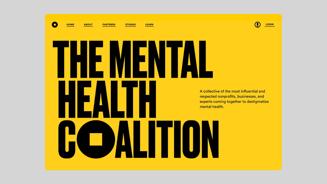
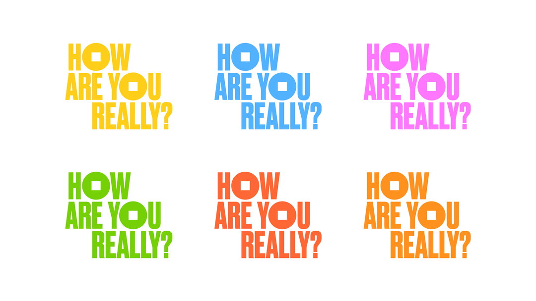
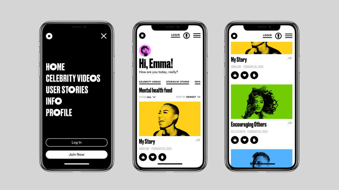
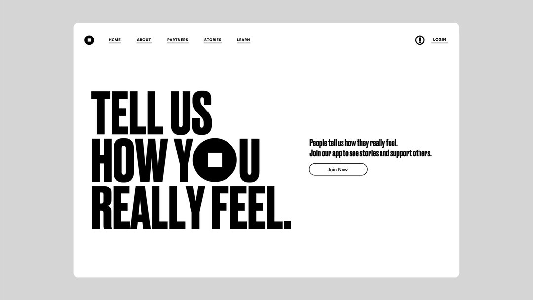
The typography is a tall, bold, condensed Druk in all caps, “exactly what you wouldn’t expect from a mental health site,” the designer continues. Pentagram also worked closely with Cole to develop the tone of voice used in language across the organisation, aiming to promote a cultural shift in how mental health is spoken about. An important facet of this is the coalition’s digital storytelling platform How Are You Really? wherein members of the public are invited to share their experiences alongside well-known advocates such as Whoopi Goldberg, Kendall Jenner and Kesha. On How Are You Really? there is a noticeable aesthetic shift, the colour background gradating to white to “give people space to communicate,” Scher says. Cole adds that this identity is “distinct from but still cohesive” with the wider MHC branding, “interwoven with pops of colour and fun to lighten the mood and increase engagement.”
As part of its launch, the Mental Health Coalition is inviting people to share their feelings via the How Are You Really challenge. Read more about its work and explore its resources here.
Paula Scher will be speaking at this month’s Nicer Tuesdays online, taking place next Tuesday 26 May from 6pm (BST). Get tickets here.
GalleryPaula Scher / Pentagram: Mental Health Coalition
Share Article
About the Author
—
Jenny oversees editorial output across It’s Nice That. Get in touch with writing pitches for features or opinion pieces, big creative story tips, or questions about all things editorial. jb@itsnicethat.com
To submit your work to be featured on the site, please see our Submissions Guide.


