Michael Johnson: Branding in five and a half steps
In the spirit of transparency seen in his studio’s ongoing Mozilla rebrand, Michael Johnson, founder of johnson banks, explains why he’s written a no-nonsense book on branding design.
Why write a book on branding? Don’t the world’s bookshelves already sag with dozens of tomes on brand strategy and hundreds of books on logos and symbols? Well, yes, they do.
But the ones on strategy often have that ‘buy it at the airport and be an expert by the time you land’ feel. Long on words, short on pictures. The design tomes are vast, encyclopaedic, but rarely talk about the process, offer up only ‘solutions’ and avoid words as much as possible.
This is often echoed in the industry itself. In one corner, the strategists wielding 140-page PowerPoint decks. In the other, the designers, often struggling to unpick what has been agreed so they can start ‘being creative’. And yes, it does often turn into a fight.
A few years ago, I started to work on something different. Something that would open up the business’s carefully protected and proprietary ‘black boxes’, look hard at all that Branding Hubble BubbleTM and aim to clarify, not confuse.
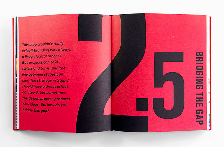
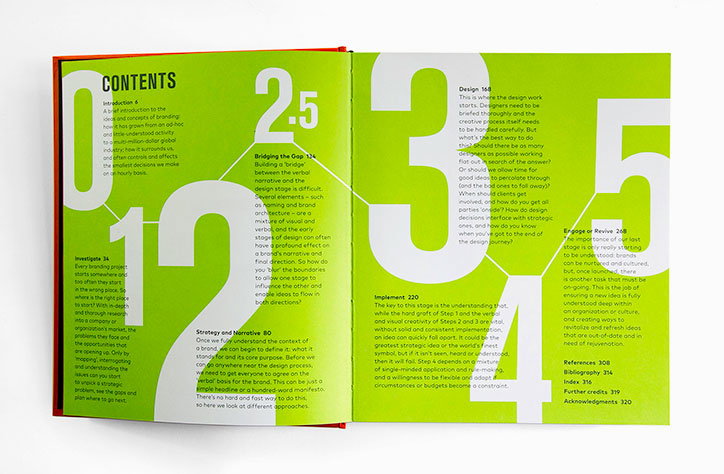
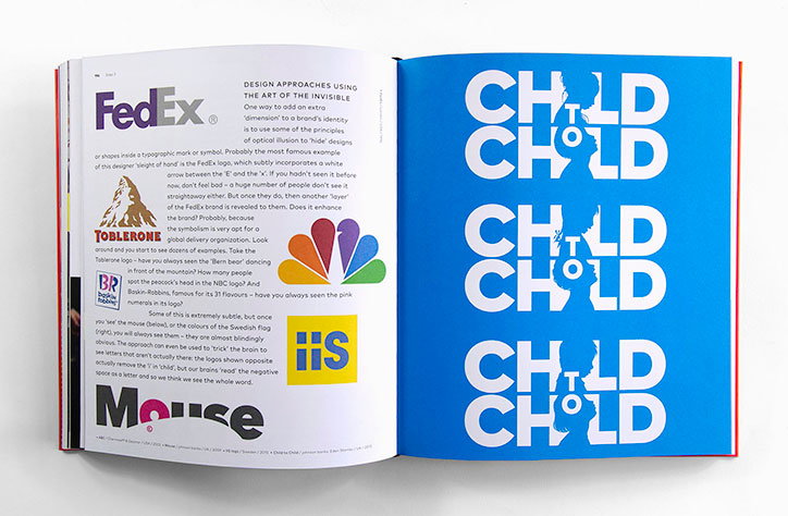
A book that would be genuinely useful, a ‘how to’ guide. That would identify the five key steps in the process (Investigation, Strategy and Narrative, Design, Implementation and Engagement) – but also acknowledge that key half-step between Strategy and Design, where the translation of one into another is crucial.
Much of it has been driven and informed by my working life – for two decades johnson banks has been branding companies, campaigns, products, people and organisations. But many of our day-to-day discussions haven’t been with Ivy League MBA’s but with real, normal, human beings. People who find the go-to lingua franca of branding baffling, for whom an “essence” is what you put in a cake mix, not in your brand.
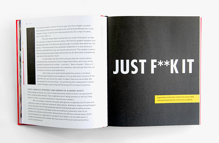
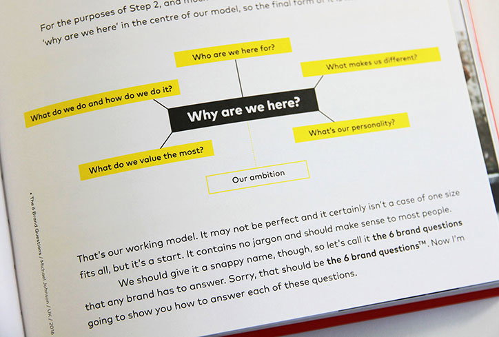
Many years ago we started stripping out all the jargon and just asking simple questions – “what do you do?” “what makes you different?” and “why are you here?” – this became the six-question model that forms the backbone of the first half of the book. The second half forensically examines the design part of the process, for good and for bad, with hundreds of examples from all across the globe.
By lifting the lid on what I do, have I just made myself redundant? Maybe. But, as our Mozilla project is demonstrating, opening up more about the design process can only help more people understand. Now you can finally read a book about it too.
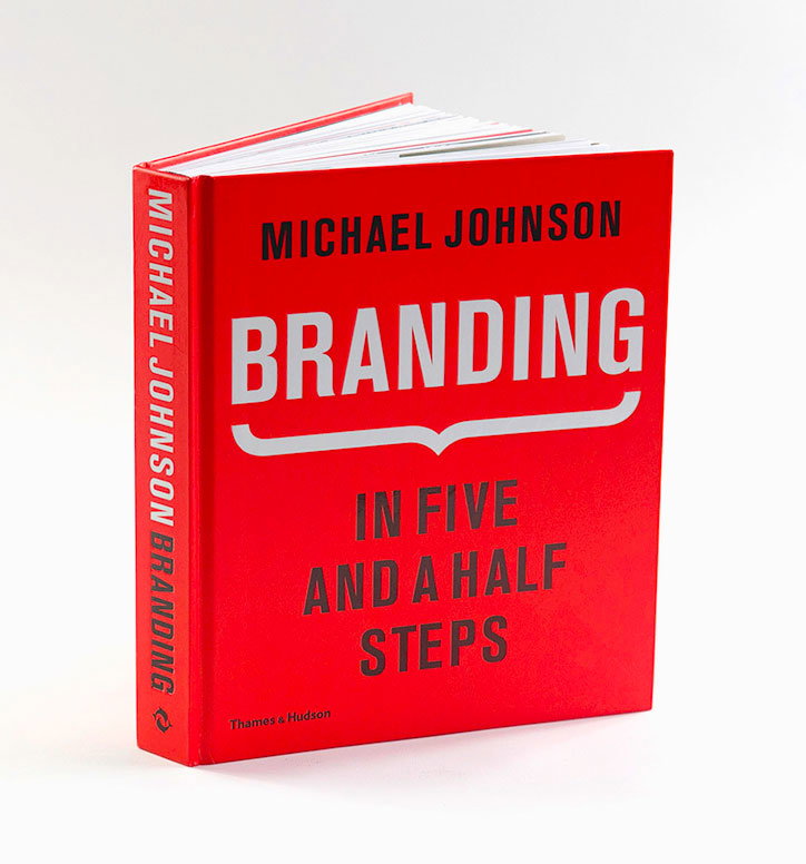
Branding in Five and a Half Steps: The Definitive Guide to Strategy and Design of Brand Identities is published 29 September by Thames & Hudson.
Michael Johnson: Branding in five and a half steps
Michael Johnson: Branding in five and a half steps
Michael Johnson: Branding in five and a half steps
Michael Johnson: Branding in five and a half steps
Michael Johnson: Branding in five and a half steps