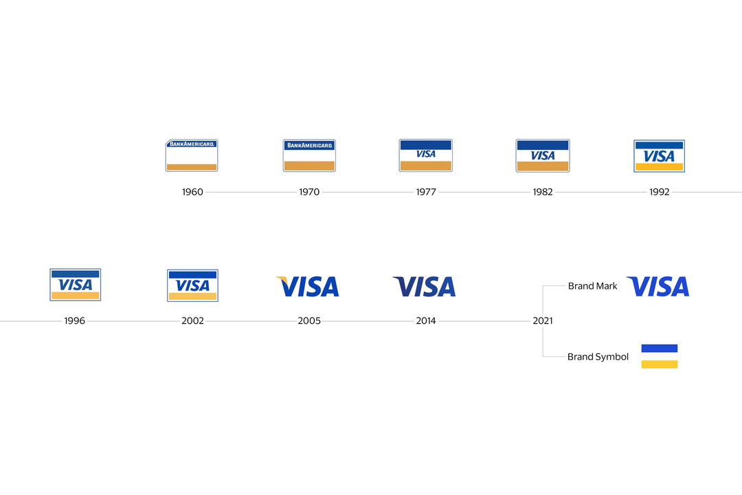
Global design studio Mucho launched the new brand identity for Visa today in its first facelift since 2014. Aiming to shift perceptions of Visa as “just a credit card company,” Mucho was tasked with repositioning the brand as a trusted “infrastructure that moves a payment from point A to point B.” The work was a year-long project for Mucho, where “everything was up for grabs, apart from the Visa brand mark – the four letters VISA and the Visa tagline.”
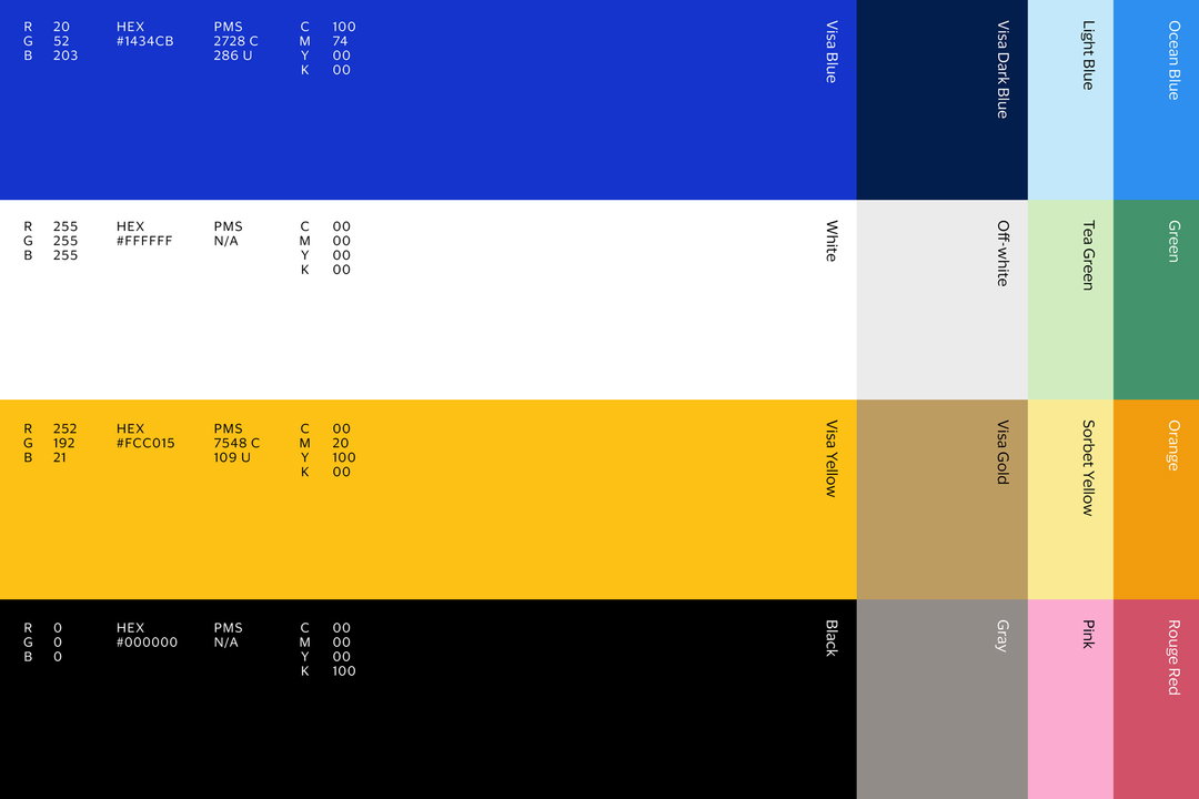
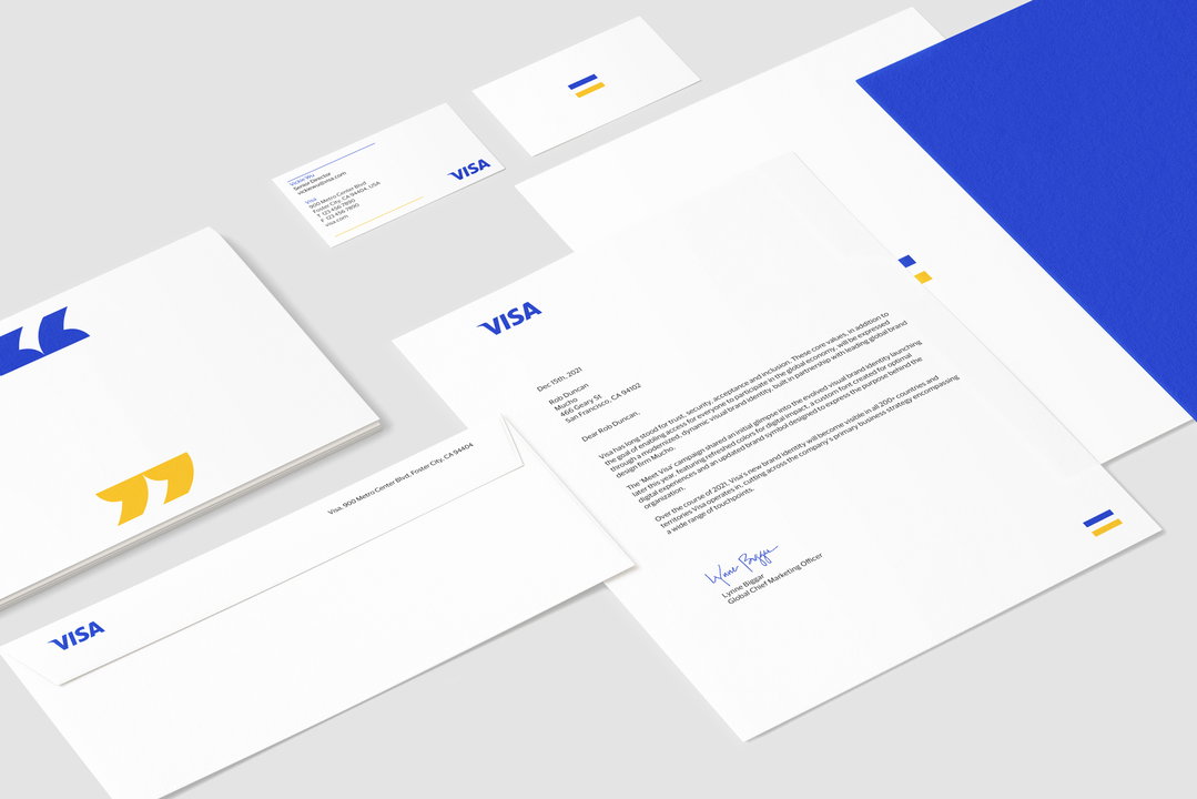
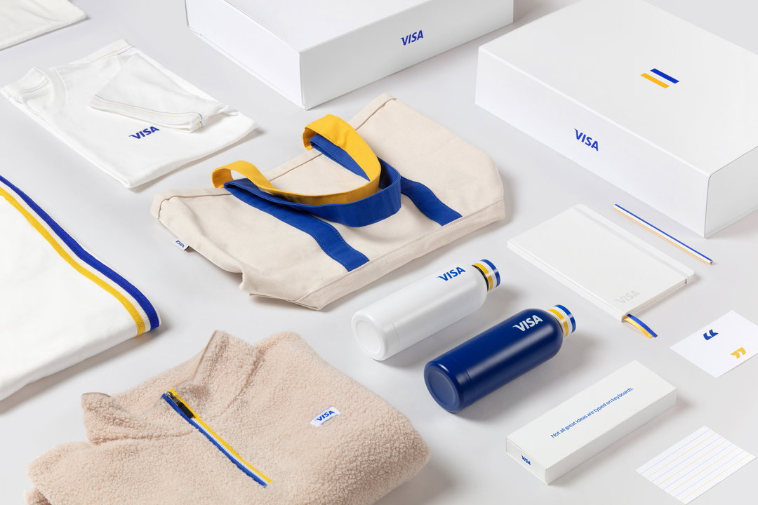
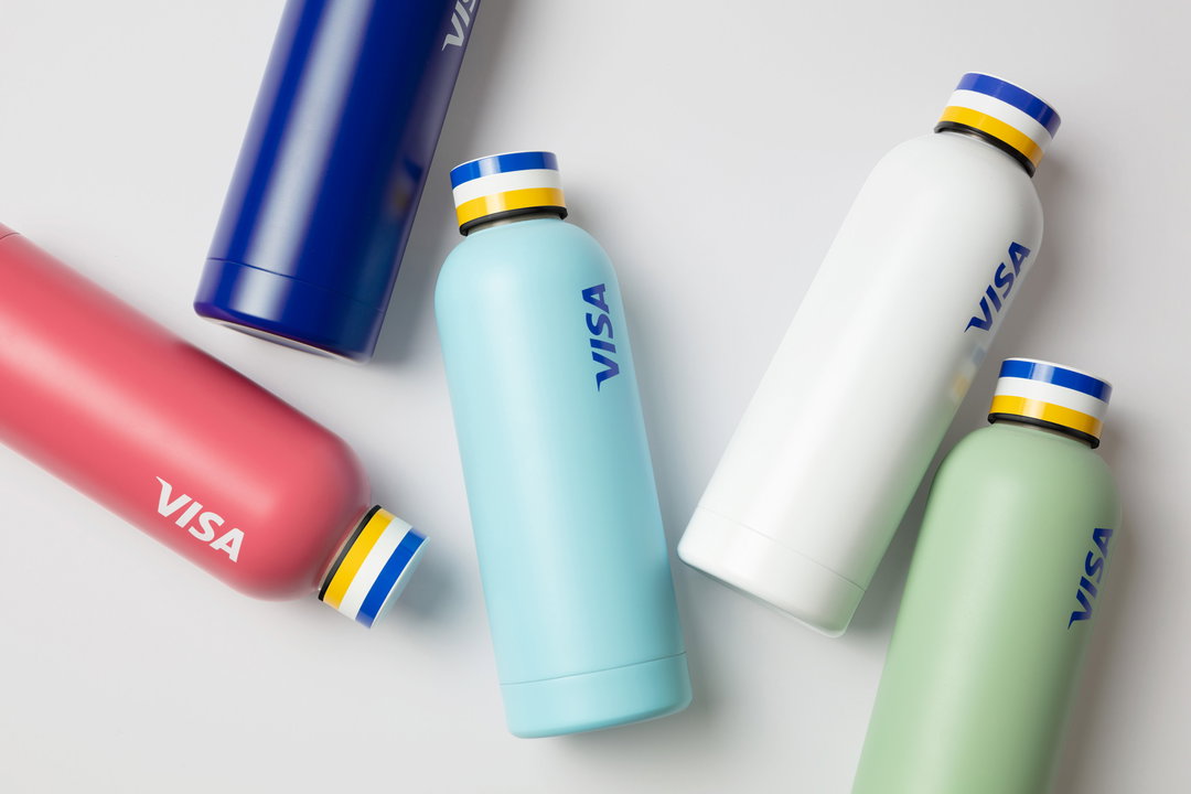
Creating worldwide consistency while maintaining the 60-year-old company’s recognisability was vital; Mucho also emphasised the importance of modernising its look for a digital-first world. For example: “The Visa ‘Acceptance Mark’ – the version of the brand mark contained within a blue and yellow bar,” Rob Duncan, Mucho creative director explains to It’s Nice That, “although highly recognisable, wasn’t working at point of sale, especially within digital scenarios.” While the design of the brand mark was kept the same, Mucho updated the colour to tell a new story about the brand — “evolved, brighter, and more dynamic.” The intent was also to be more visible in a digital world with increasingly smaller mobile environments.
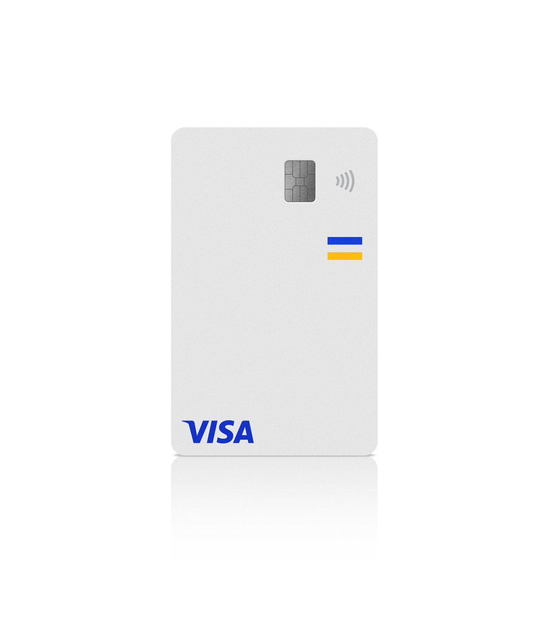
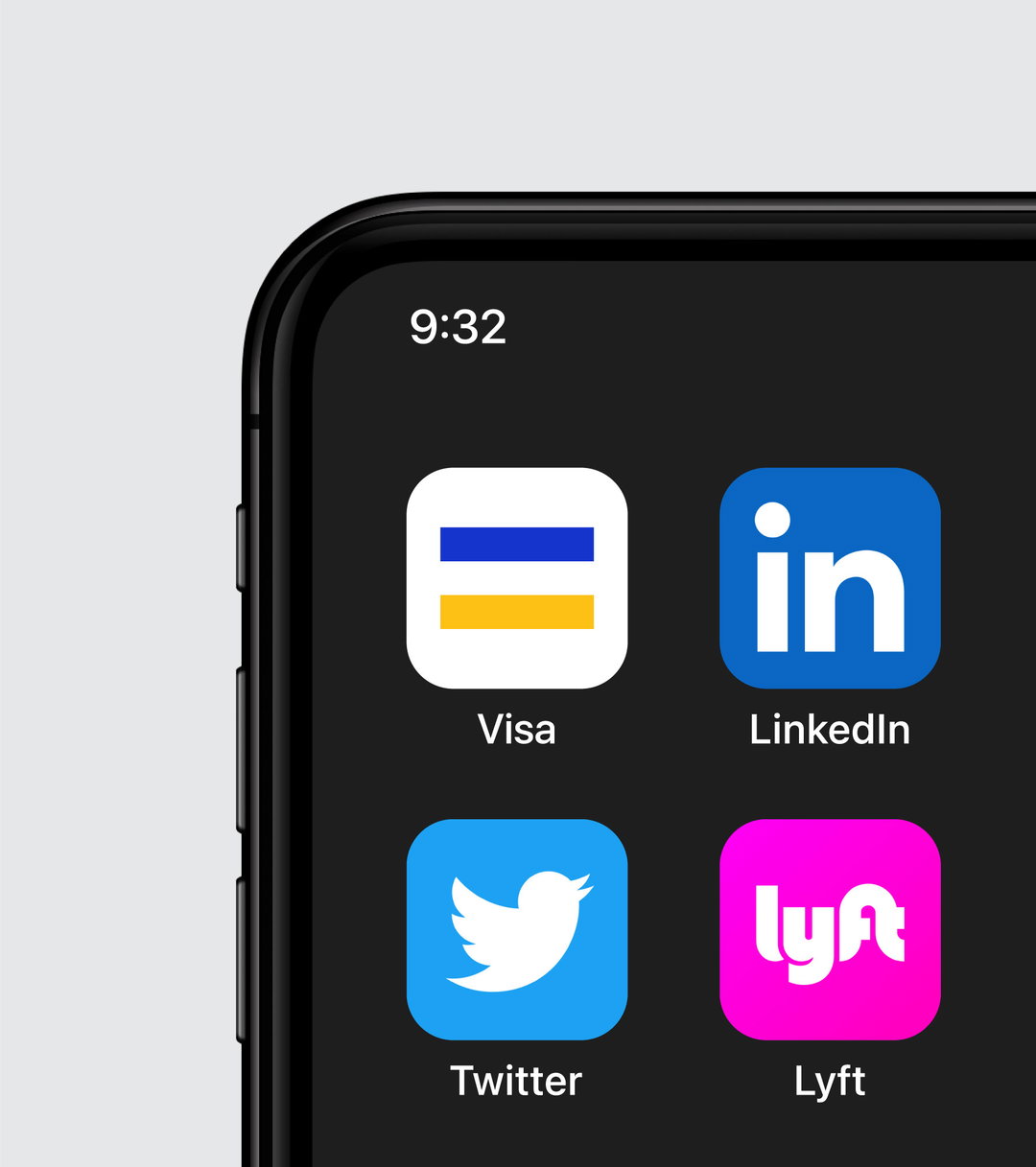
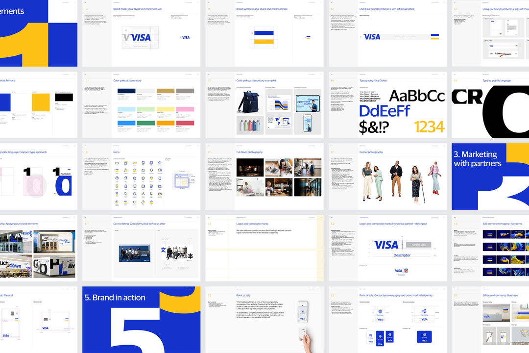
For the most novel twist, Mucho has created a brand symbol using elements that have always been there: “By separating the Visa brand mark from within the bars, we created an ‘equals symbol’, therefore reinforcing Visa’s purpose-driven message of access, inclusivity, equality and diversity. The rest of the system is really built from those simple three bands of blue, white, and yellow as well as the ratio of thirds,” says Rob. Using this refreshed brand symbol as a foundation, Mucho extended the colour ratio across a new modular icon and illustration system to tell engaging stories through illustration.
GalleryMucho: Visa rebrand (Copyright © Visa, 2021)
“Working with corporations is always a challenge as they are such a large entity,” says Rob. “It’s easy for the design process to end up in a ‘design by committee’ scenario and many times, big ideas get watered down in order to please everyone everywhere. It’s inevitable that this rebrand will be compared to the recent, exceptional Mastercard rebrand. While Mastercard did a great job at simplifying their symbol down to work much better at smaller sizes and across digital platforms, we believe the new Visa symbol achieves this and much more.”
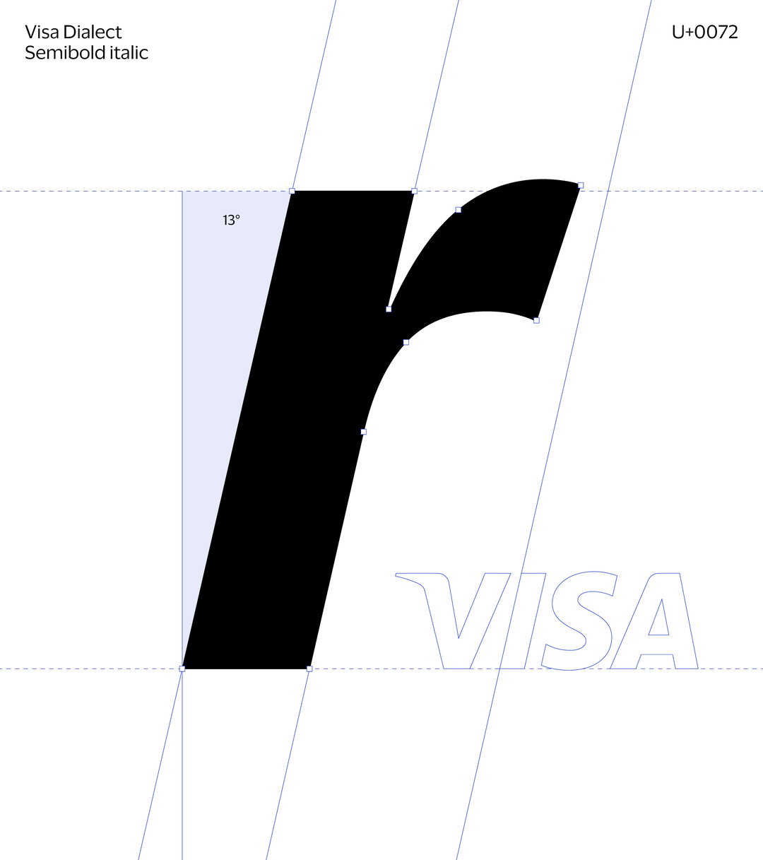
Elsewhere in the new identity, Mucho created a new humanistic typeface, called Visa Dialect, designed specifically to drive brand awareness. Rather than adding a superfluous graphic language to the identity system, Mucho focused on creatively using the new typeface, showing Visa Dialect very large and cropping into the letterforms. Finally, in a bid to centre customers in all areas of Visa communication, an existing cutout style of portrait photography was augmented with full bleed editorial-style images.
A new set of visual assets, including photography styles, illustrations and immersive B2B motion graphics, will allow Visa “a palette of elements that they can use across all media to tell their story,” concludes Rob.
GalleryMucho: Visa rebrand (Copyright © Visa, 2021)

Hero Header
Mucho: Visa rebrand (Copyright © Visa, 2021)
Share Article
Further Info
About the Author
—
Liz (she/they) is the senior editor at Insights, a research-driven department within It’s Nice That. They previously ran the news section of the website. Get in contact with them for potential Insights collaborations or to discuss Insights’ public-facing reports.