




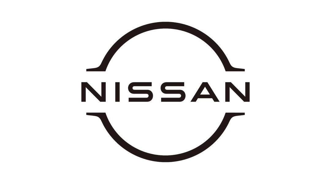
Nissan may be following BMW with a redesigned flat logo
The car manufacturer has applied for a trademark on a new, flat circular icon with a slimmed and stretched logotype.
Nissan might be about to follow BMW in redesigning its 3D, 90s-era logo to become flat, as the Japanese car brand has applied for trademarks on a new logo. The could-be redesign shows the brand’s chunky chrome badge eschewed in favour of a pair of arches in horizontal mirror image. These forms have been taken from the existing logo to suggest its shape akin to a steering wheel, a circular disc with a rectangle cut across the centre. In the redesign, the rectangle is no more than negative space, with the new logotype stretched across it in slimmed down type. The whole logo and type is only black, with no silver in sight.
The Nissan logo in fact began in the 1930s as a red circle with a blue rectangle across it, symbolising a rising sun and a way for exported cars to carry the message of its Japanese makings. In the late 80s the logo became grey and silver however, and then, when the brand was bought by Renault the logo became the 3D version we know now.
In the new logo, the original typeface appears to have been redrawn in a thinner weight, and stretches across the whole logo (in contrast to the existing one, which has an indent) with wider kerning.
Though there’s no official news or statement from the brand yet, we can assume the brand is following a similar thought process to BMW, which earlier this month revealed a new flat and transparent logo (though it kept its blue and white coloured quadrants). In a statement, a senior BMW representative Jens Thiemer said the redesign was to gear the brand to “the challenges and opportunities for digitisation”.
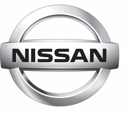
Existing Nissan logo
Existing Nissan logo
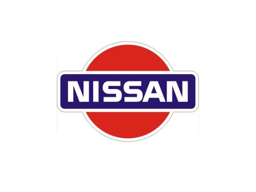
Original Nissan logo
Share Article
Further Info
About the Author
—
Jenny oversees editorial output across It’s Nice That. Get in touch with writing pitches for features or opinion pieces, big creative story tips, or questions about all things editorial. jb@itsnicethat.com
To submit your work to be featured on the site, please see our Submissions Guide.


