Launch Recite Me assistive technology

North reveals full Science Museum rebrand, and reacts to online criticism

—
Date
11 October 2017
An animation in which the words “Science Museum” appear in white sans-serif typography against a black background. The letters subtly flicker and shift in opacity.

Design studio North has unveiled its full visual identity for the Science Museum Group, after the new logo was revealed last week. The rebrand incorporates all the museums in the group, aiming to give them a visual cohesion and convey a “shared vision”.

This newly unified approach includes treating all its collections as one single group collection, instigating shared programming between the museums, and revamping the web estate and logo to “better reflect the development of the brand in recent years”. North was commissioned in summer 2016 to develop a visual language to articulate this, and “ignite curiosity among people of all ages and backgrounds,” the studio says.

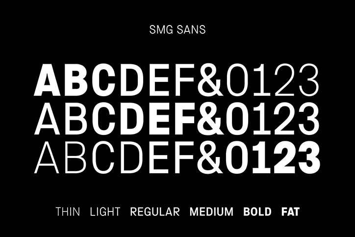
The design is therefore based on the concept of illumination, depicted through a gradated font weight in the logo and the use of a colour spectrum across the identity. North worked with type foundry Fontseek to create a customised font, SMG Sans, which is uniwidth (the same width across weights). The studio says this allows typography to retain a consistent shape and position when the font weight changes and animates in different applications.

“For the Science Museum this typographic expression suggests moments of inspiration, change and progress,” explains North. “At the National Science and Media Museum, Bradford, it evokes the rise of light and sound technologies such as photography and film; and at the National Railway Museum, York, and Locomotion in Shildon, the font could convey notions of steam, motion and speed.” The studio also worked with photographer Lee Mawdsley on a library of imagery for the group and digital agency Numiko on the web design.

When the logo was unveiled last week, Johnson Banks – the designers behind the museum’s previous identity – reacted strongly on social media, calling it “a bit of a clunker” and sharing numerous negative tweets about the work. The studio has since said it was “a bit hasty with its critique” and published a lengthier reaction on its blog.

In reaction to the onslaught, North’s Louis Mikolay sent us the following comment:

“For me it is a compliment to the work that the public are widely discussing the project and that it has divided opinion so strongly. I believe that the best work pisses some people off – I’m not interested in creating mediocre work that everyone agrees on, I’ll leave that for other studios.”

The quotes in this article were changed on 11/10/17.
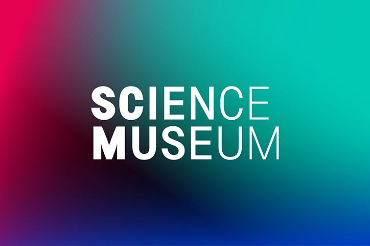
The Science Museum logo in white text is centred against a vibrant gradient background. The colours shift from deep pink and purple on the left to bright teal and blue on the right.
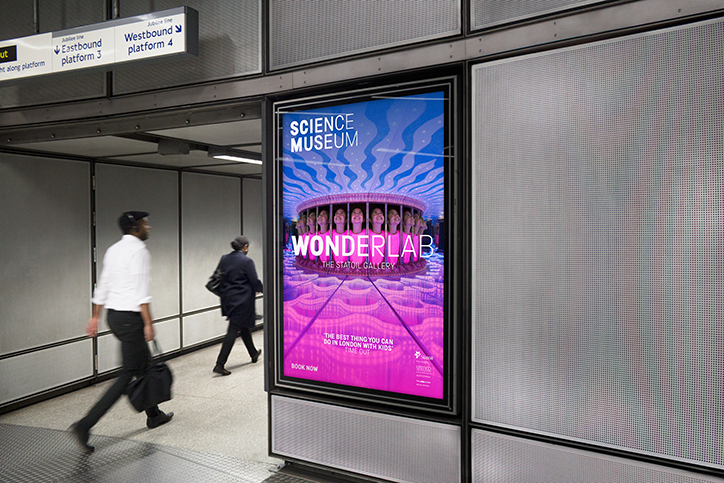
A digital advertisement for the Science Museum’s “Wonderlab” exhibition hangs in a London Underground station. Two people walk past the glowing screen, which shows a group of children looking through a mirrored tunnel.
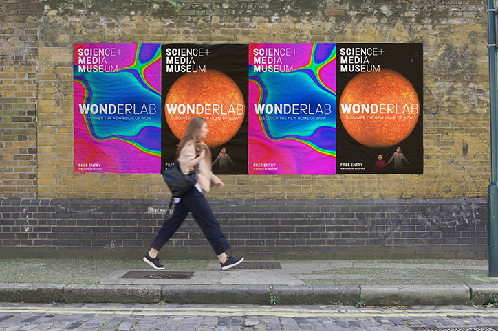
Four posters for the “Science+Media Museum” are pasted onto a brick wall. They feature the word “Wonderlab” and the phrase “Discover the new home of wow”. A person walks past the posters along a city pavement.
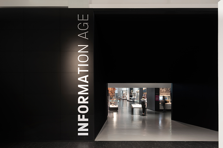
A black wall features the words “INFORMATION AGE” written vertically in white. A rectangular opening leads into a brightly lit gallery where a person stands looking at an exhibit.
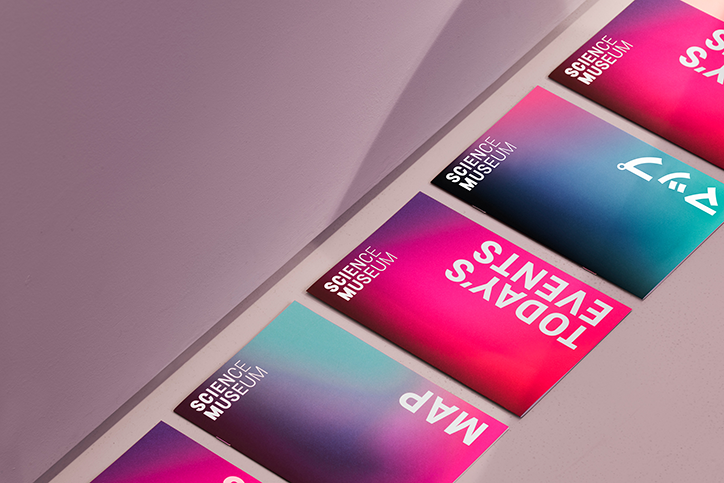
A row of colourful Science Museum brochures with vibrant pink, purple and blue gradients. The covers feature bold white text including “Map” and “Today’s Events”.
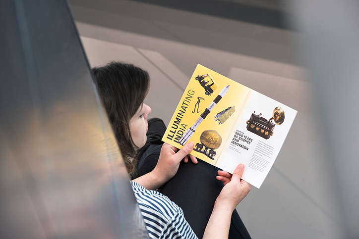
A person in a striped T-shirt holds an open brochure. The yellow cover reads “ILLUMINATING INDIA” and features illustrations of scientific instruments.
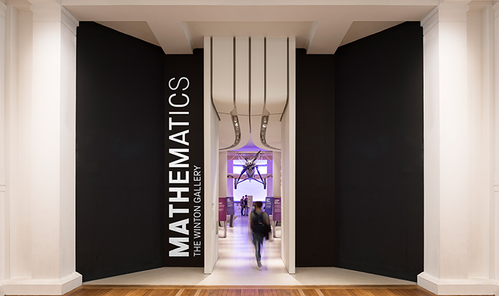
The entrance to a gallery features a white architectural archway flanked by two large black walls. Vertical white text on the left reads “MATHEMATICS” and “THE WINTON GALLERY”. A blurred figure walks through the doorway towards a brightly lit exhibit.
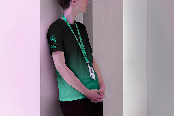
A person leans against a white wall, wearing a T-shirt that gradients from black to bright green. The sleeve features the “Science Museum” wordmark, and a matching green lanyard hangs around their neck.
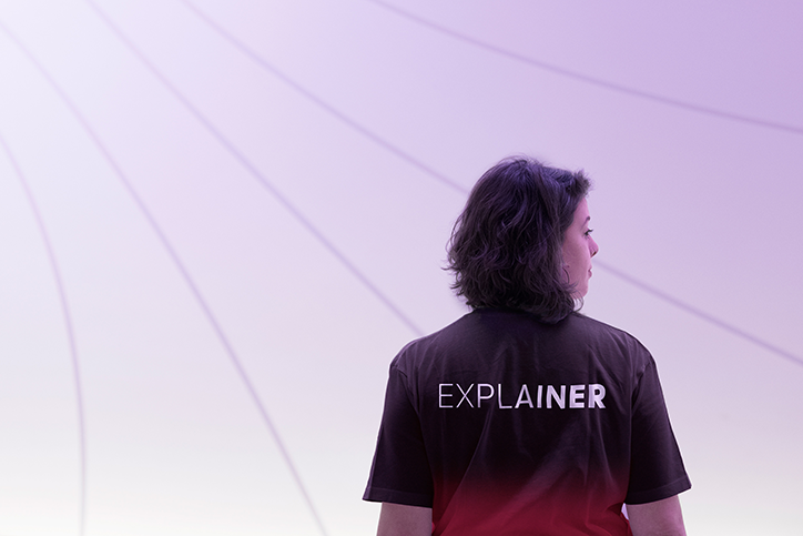
A person stands with their back to the camera, looking over their shoulder. They wear a dark T-shirt with the word “EXPLAINER” printed across the back in white.
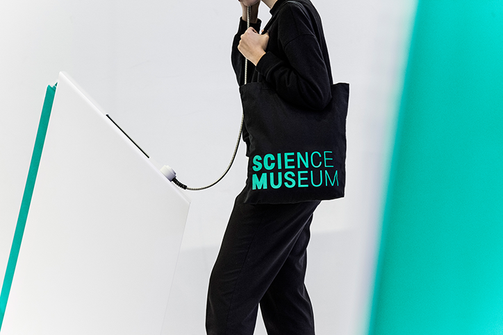
A person in black clothing carries a black tote bag with the words “Science Museum” in teal. A thin cable runs from the bag to a white tilted surface.
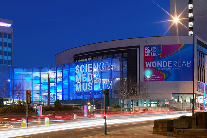
The Science and Media Museum at night, its glass facade glowing with blue light. A large colourful banner on the building reads “Wonderlab: The New Home of Wow”.
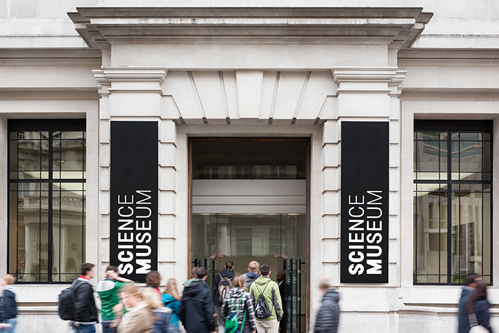
The stone entrance of the Science Museum, flanked by two tall black banners that read “SCIENCE MUSEUM”. A group of people gather and walk through the open doorway.
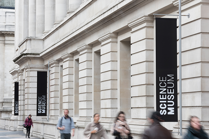
Black banners hanging from the exterior of a pale stone building read “Science Museum”. Several people walk past the building, their figures blurred by motion.
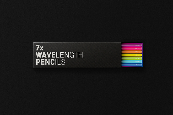
A black box of pencils reads “7x WAVELENGTH PENCILS”. Seven coloured pencil tips in a spectrum from purple to red peek out from the right side.
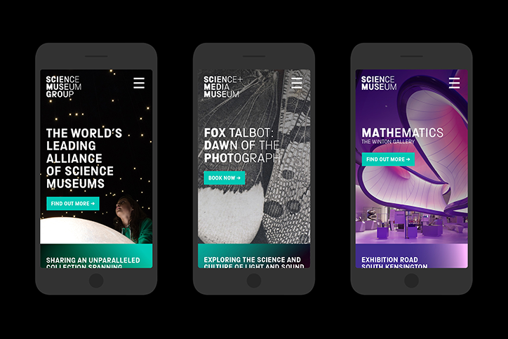
Three smartphone screens display different mobile website designs for the Science Museum Group. The layouts feature bold typography, call-to-action buttons and high-contrast imagery.
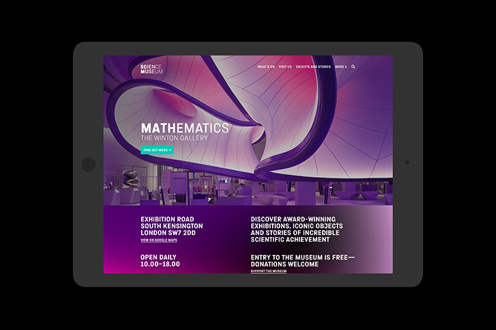
A tablet displays the Science Museum website, featuring a purple-toned 3D render of flowing, architectural curves. Large text reads “MATHEMATICS THE WINTON GALLERY” above a “FIND OUT MORE” button.
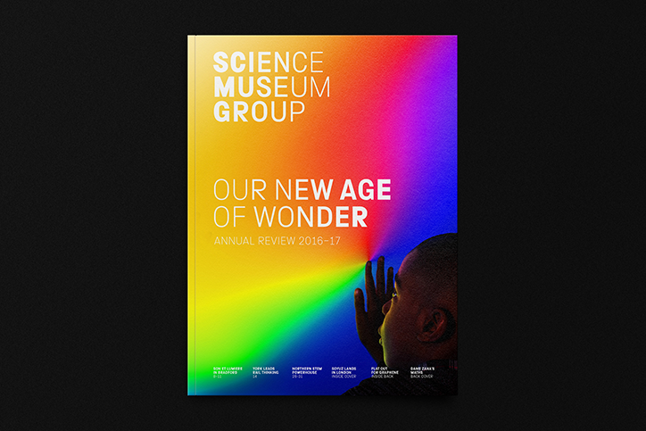
The cover of a report for the Science Museum Group features a vibrant, multi-coloured gradient background. It reads “SCIENCE MUSEUM GROUP” and “OUR NEW AGE OF WONDER”, with “ANNUAL REVIEW 2016–17” below. In the bottom right, a person looks up towards a bright light.
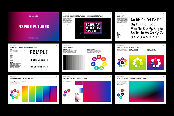
A grid of nine brand guideline pages for the Science Museum Group. The pages detail the mission “Inspire Futures”, logo spacing, typography, and a vibrant colour palette of gradients.
A typographic specimen for a typeface called “Smg Sans” on a black background. Three rows of white letters and numbers show the font in different weights, from thin to fat.
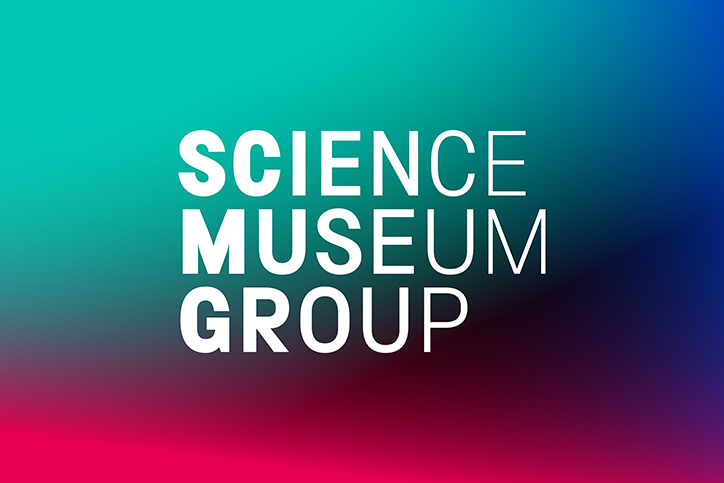
The words “Science Museum Group” appear in white, bold, sans-serif typography. They are set against a vibrant gradient background that shifts from teal to deep blue and magenta.

Share Article

About the Author

Jenny Brewer

—

Jenny oversees editorial output across It’s Nice That. Get in touch with writing pitches for features or opinion pieces, big creative story tips, or questions about all things editorial. [email protected]

To submit your work to be featured on the site, please see our Submissions Guide.

It's Nice That Newsletters

Fancy a bit of It's Nice That in your inbox? Sign up to our newsletters and we'll keep you in the loop with everything good going on in the creative world.