Thomas Hedger and a band of illustrators help Omse create a “growing” rebrand for Sproutl
Alongside an impressive team of illustrators, Omse has created an identity which revolves around “design elements that grow”.
Share
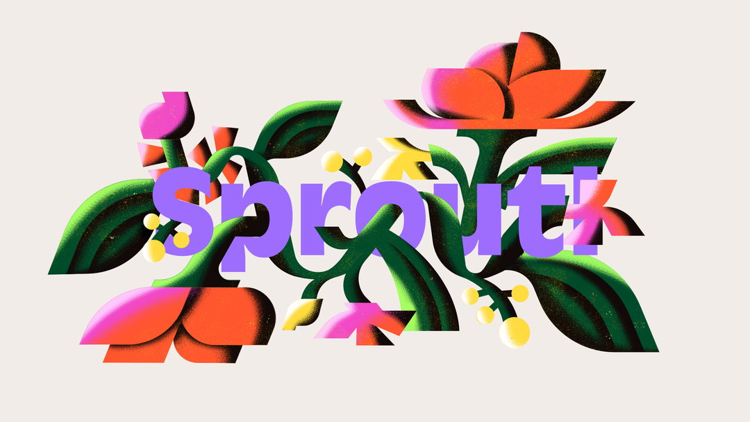
Sproutl is on a mission to make gardening accessible for all. So when design studio Omse took the reins on the company’s rebrand, they wanted to create “an identity that could grow, just like its plants”, says the studio in a release. To do this, a particularly talented team of illustrators was enlisted. Branding and packaging has been colourfully energised with illustrations from the likes of Thomas Hedger, An Chen, Cha, Micke Lindebergh and Milena Bucholz. The full scope of the project saw the reimagining of logos, posters, packaging and website design with a new range of user avatars.
“The idea of growth is the glue that lets us bring the brand to life”, James Kape, Omse creative director tells It’s Nice That. While the web design is simple and user-friendly, the illustrative work on packaging and posters runs wild. You’ll see a range of unruly plants stamped with the unique style of each illustrator entangling the colourful type across the advertising. In one case, “a Swiss cheese plant that’s grown out of control takes over an outdoor advertising space”, says Kape.
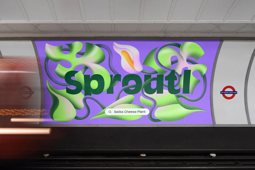
Omse and Milena Bucholz: Sproutl rebrand (Copyright © Sproutl, 2022)
Omse wanted to revolve the identity around “design elements that grow”. So at the core of the project is a simple, versatile symbol – a little sprout. Across the web design this symbol grows and flourishes to showcase the wide range of products offered by Sproutl. In this way, James explains, the rebrand helps to encapsulate all the exciting possibilities that can come from one seed, communicating “that sense of wonder” throughout.
Aiming to match the un-intimidating and accessible approach to gardening offered by Sproutl’s products, Omse created an identity that “would remove barriers, feel fun, and get people planting”, reflects James. So the new face of Sproutl is colourful and approachable throughout its multiple layers, often bursting into floral details which produces its overarching sense of playfulness.
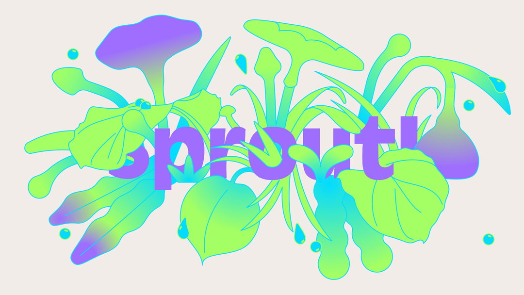
Omse and Thomas Hedger: Sproutl (Copyright © Sproutl, 2022)
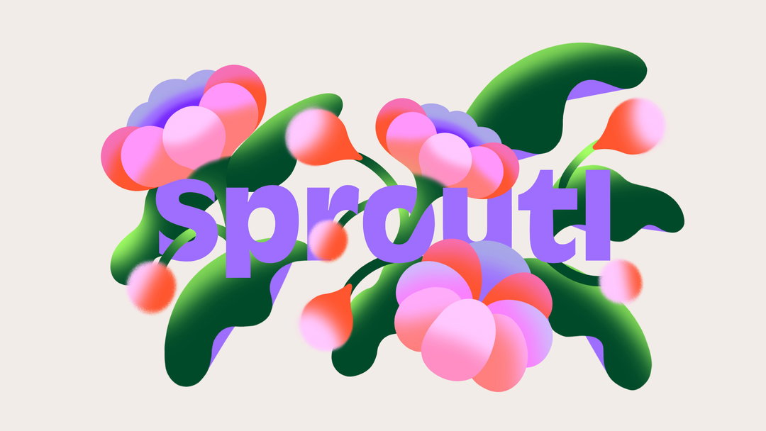
Omse and Cha: Sproutl (Copyright © Sproutl, 2022)
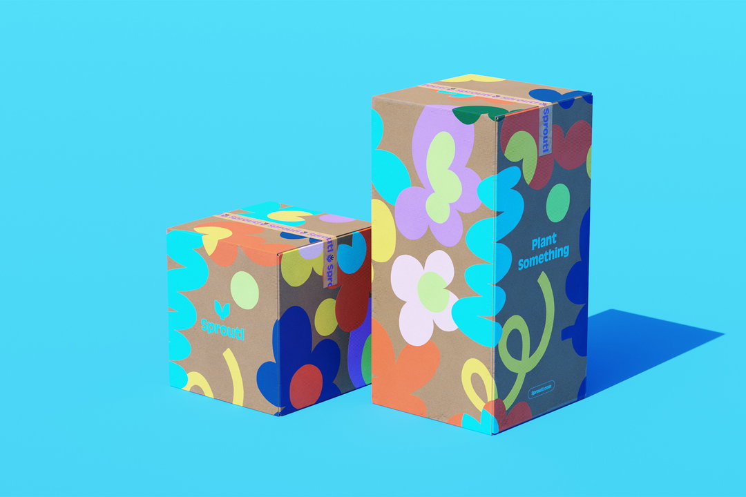
Omse and Micke Lindebergh: Sproutl rebrand (Copyright © Sproutl, 2022)
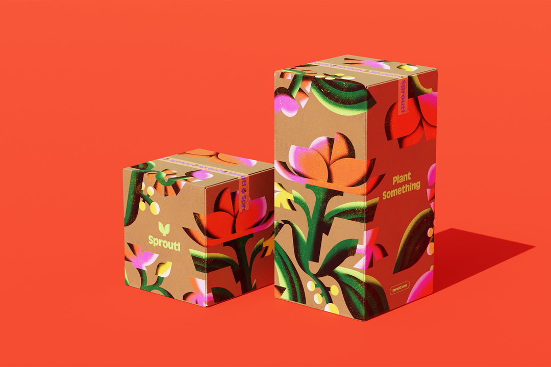
Omse and An Chen: Sproutl rebrand (Copyright © Sproutl, 2022)
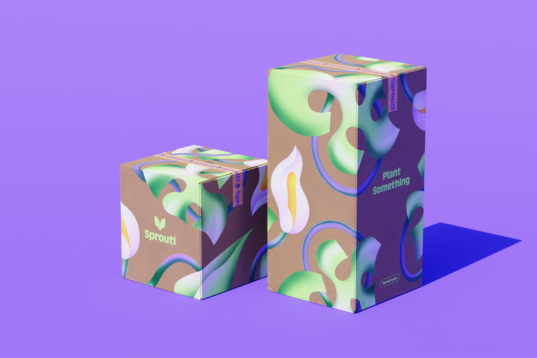
Omse and Milena Bucholz: Sproutl rebrand (Copyright © Sproutl, 2022)
Omse: Sproutl rebrand (Copyright © Sproutl, 2022)
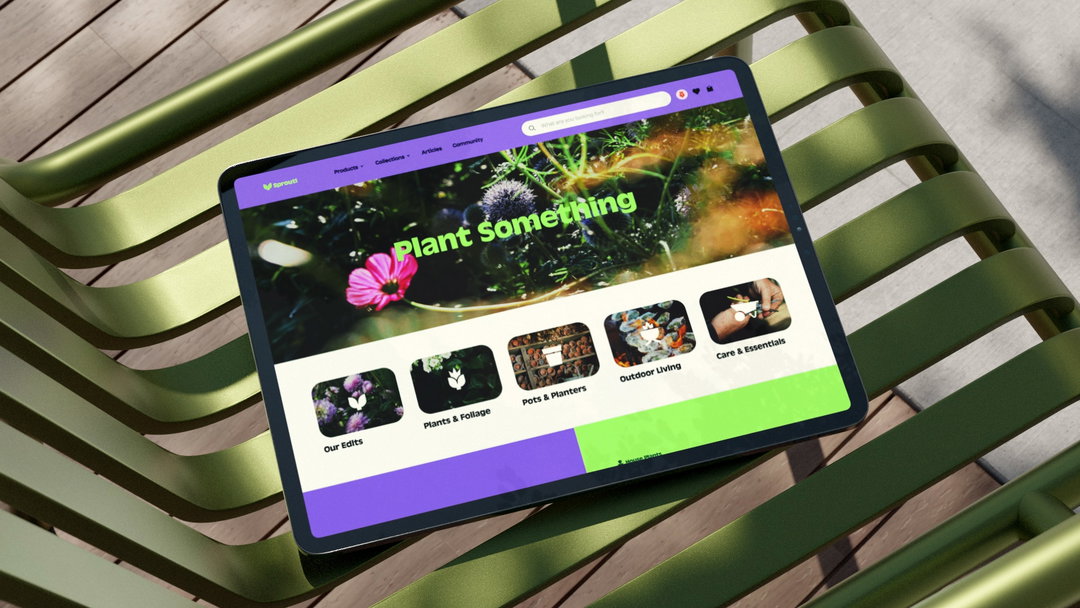
Omse: Sproutl rebrand (Copyright © Sproutl, 2022)
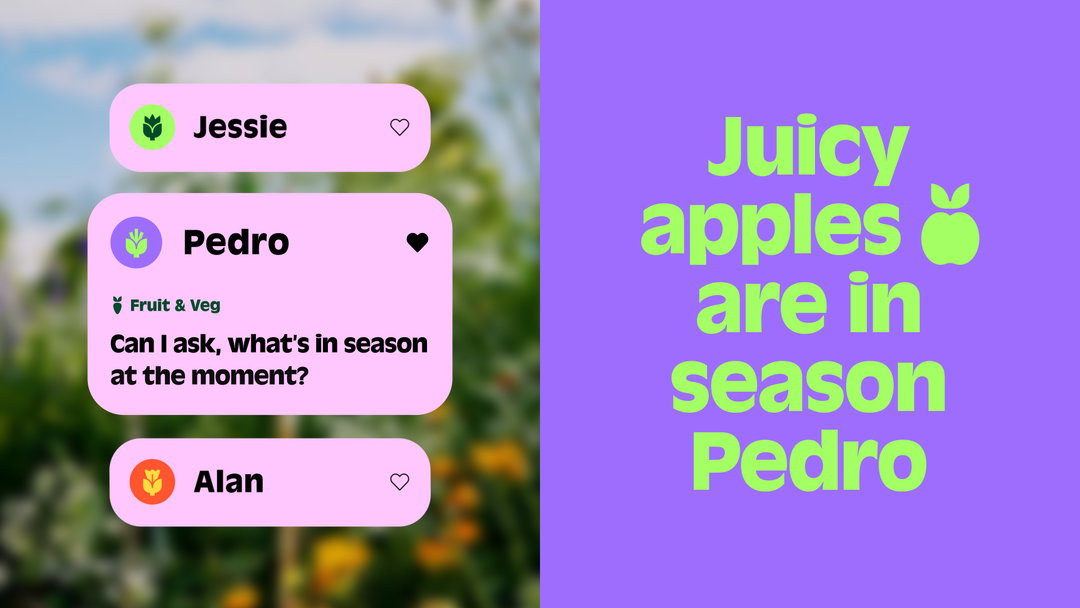
Omse: Sproutl rebrand (Copyright © Sproutl, 2022)
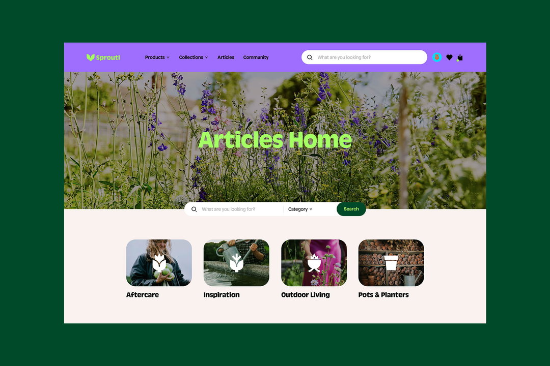
Omse: Sproutl rebrand (Copyright © Sproutl, 2022)
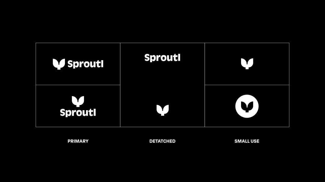
Omse: Sproutl rebrand (Copyright © Sproutl, 2022)
Hero Header
OMSE and An Chen: Sproutl (Copyright © Sproutl, 2022)
Share Article
Further Info
About the Author
—
Elfie joined It’s Nice That as an editorial assistant in November 2021 after finishing an art history degree at Sussex University. She is particularly interested in creative projects which shed light on histories that have been traditionally overlooked or misrepresented.