Penguin Random House reveals student Design Award winners
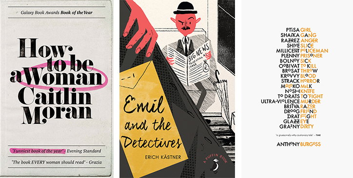
Penguin Random House has announced the winners of its annual Design Award, selecting a winner for each of its three cover design categories from a pool of 1,639 entries.
This year saw a strong showing for typographic design, front and centre, as well as hand drawn illustration.
Students across the world, were invited to respond to the open brief set by Penguin Random House. Now in its tenth year, the winners of each category, Adult Non-Fiction, Children’s and Adult Fiction, will receive a work placement with the publisher’s design studios alongside a £1,000 cash prize.
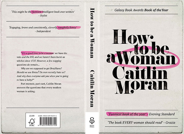
Zachary Wieland: Adult Non-fiction winner, Caitlin Moran’s How to be a Woman
Zachary Wieland
Zachary Wieland from University of Texas picked up the Adult Non-Fiction prize for his strikingly simple typographical cover to Caitlin Moran’s How to be a Woman. “This new cover pulls design elements from feminist non-fiction novels of the 1970s and ’80s but looks as though Moran took her own pen to it and pulled out everything we didn’t know that we needed to know about it.”
In response, author Caitlin Moran calls the design, “simple, iconic, and so goddamn classy that, for one minute, I actually presumed it was a cover for a US edition I hadn’t seen. A deserving winner for its confidence, simplicity, and effectual reminder of how incredibly pleasing a pink highlighter pen is. Everyone loves a pink highlighter pen, AM I RIGHT? Well done darling.’
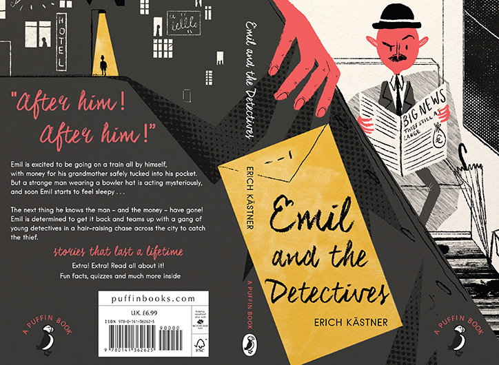
Ailsa Johnson: Children’s winner, Erich Kästner’s Emil and the Detectives
Ailsa Johnson
Edinburgh College of Art student Ailsa Johnson picked up the Children’s Prize for her illustrated cover design to Erich Kästner’s Emil and the Detectives. Inspired by a tense train sequence in the novel, set in 1930s Germany, Alisa explains: “The train scene is quite tense…I wanted to use this scene because it’s where the story really kicks off, but it doesn’t give much away to the reader, either.” Further drawing on what she calls “the sharp contrast between town life and the lights of Berlin,” for the integrated back cover design.
Penguin Random House Children’s art director Anna Billson called the entry: “the stand-out winner – a very accomplished illustration, with fabulous detail, combined with great design.”
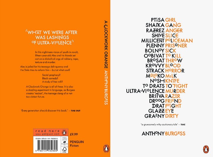
Zack Crook: Adult Fiction winner, Anthony Burgess’ A Clockwork Orange
Zack Crook
University of Central Lancashire student Zack Crook won the hotly contested Adult Fiction prize for his interpretation of Anthony Burgess’ A Clockwork Orange. “I decided to focus on the language famously used by Anthony Burgess in his novel. I picked out words from the language I thought related to the themes in the book and illustrated this on the cover,” he says.
Joanna Prior, Penguin Random House General Books managing director said: “It’s a clever, intellectual solution and that seems right for this book. Also a fantastic piece of design.”
Share Article
About the Author
—
Jamie joined It’s Nice That back in May 2016 as an editorial assistant. And, after a seven-year sojourn away planning advertising campaigns for the likes of The LEGO Group and Converse, he came back to look after New Business & Partnerships here at It’s Nice That until September 2024.