Pentagram’s Harry Pearce gives Camden Art Centre a respectful modernist rebrand
Understated and balanced, the new typographic identity is designed – much like the gallery itself – to support and complement art.
Share
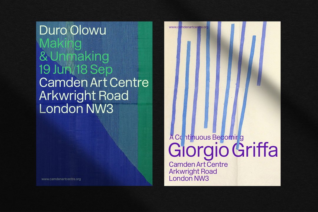
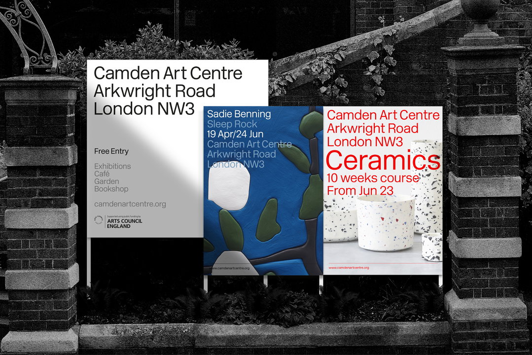
Camden Art Centre was founded in 1965 in West Hampstead – which, for anyone who knows London, will realise isn’t anywhere near Camden. This was one of a few aspects of the brand identity Pentagram partner Harry Pearce looked to clear up in his rebrand of the gallery, a typographically focused and fittingly modernist redesign that visually conveys the institution’s unique voice. Using an iconic typeface by Margaret Calvert and Jock Kinneir in just one weight, the core idea behind the identity is balance.
“A modernist approach felt appropriate,” Pearce tells It’s Nice That, “as this is a contemporary gallery which often introduces new art and artists.” The design team’s concept was borne from beautiful design and typographic references found in the gallery’s archive, mainly from the 60s and 70s. Eventually, the typeface they chose was apt in many ways: it uses the New Rail Alphabet typeface by Margaret Calvert, Jock Kinneir and A2 Type Foundry, which Design Research Unit used to rebrand British Rail in the same year Camden Art Centre was established.
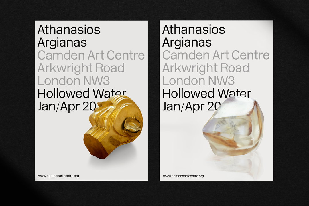
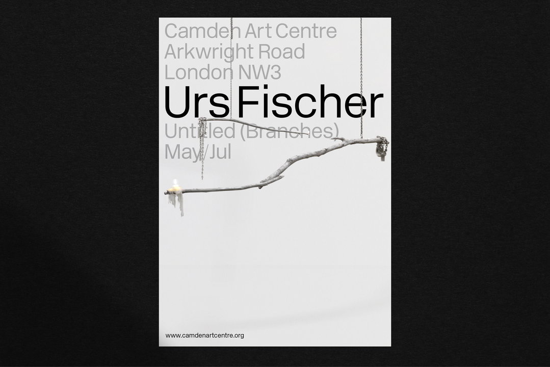
“Its singular form (in one font weight), allows breathing space for imagery as well as being beautiful in its own right,” Pearce adds.
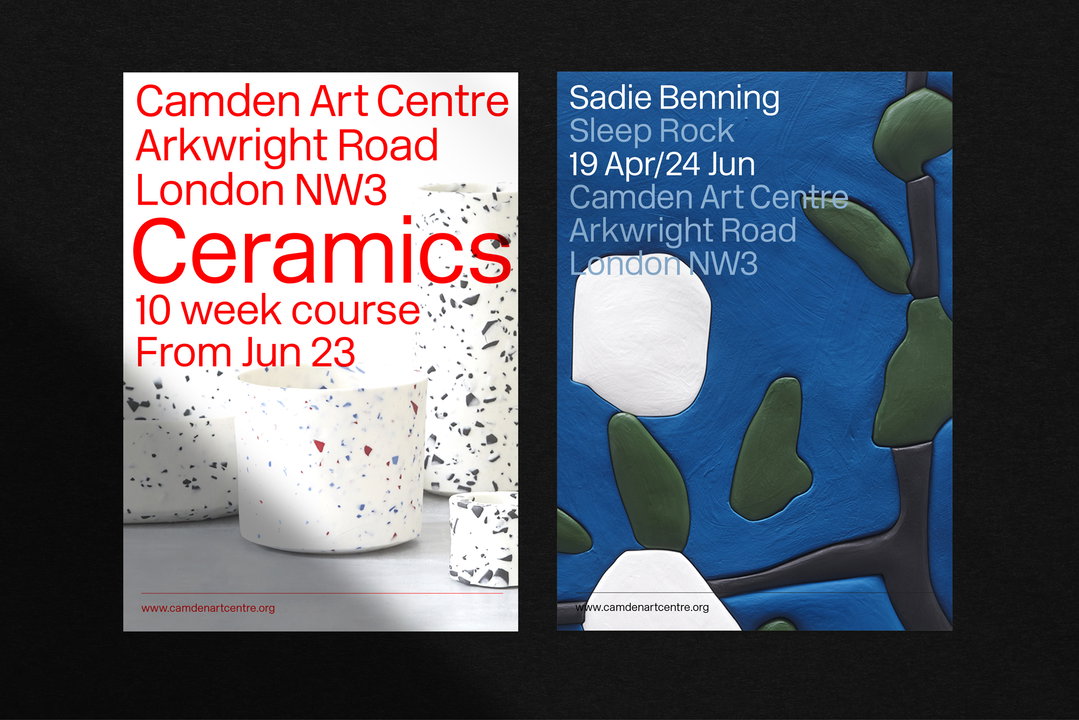
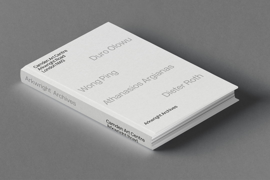
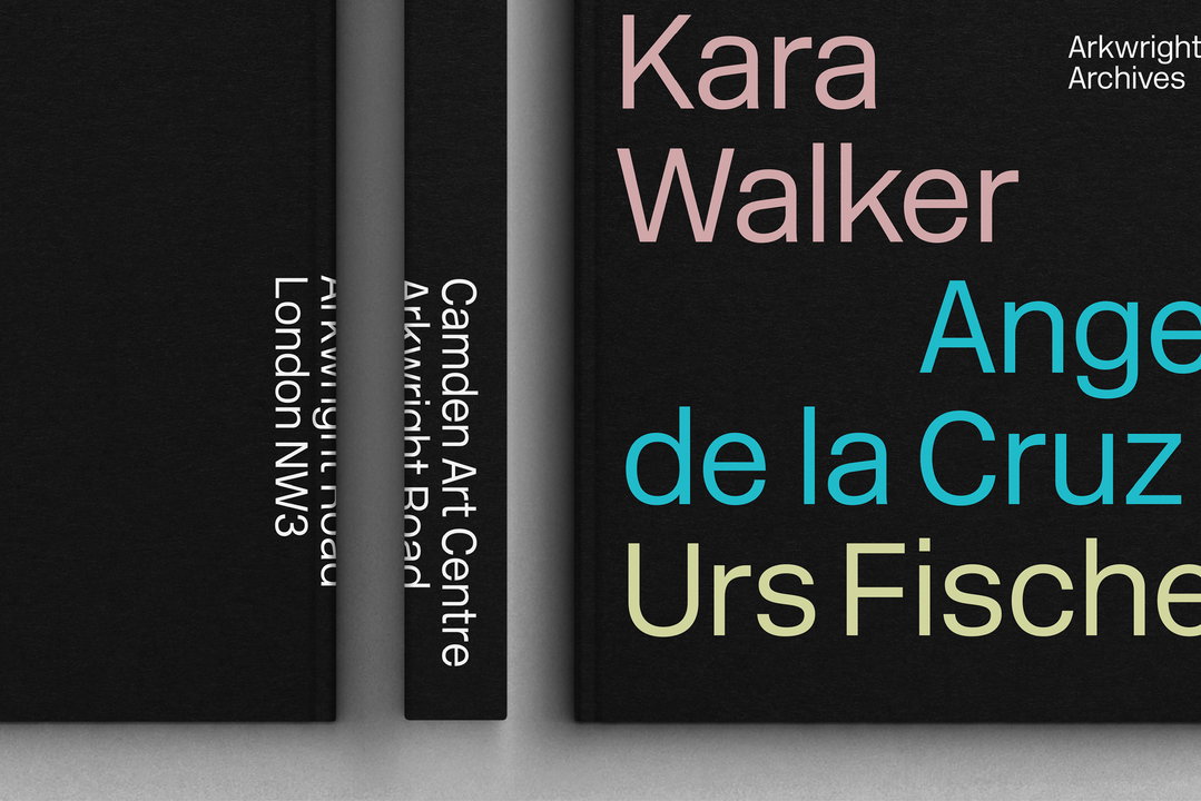
The gallery was originally built as a public library and has maintained that community spirit to this day. It is known for its progressive programming, and for introducing a broad range of artists as well as supporting them through their careers, while also placing focus on underrepresented artists. This reputation has been channelled through the identity with non-hierarchical typography, with text given equal weight (light and light italic) across the board – even the logotype – and designed to complement the artwork in marketing material.
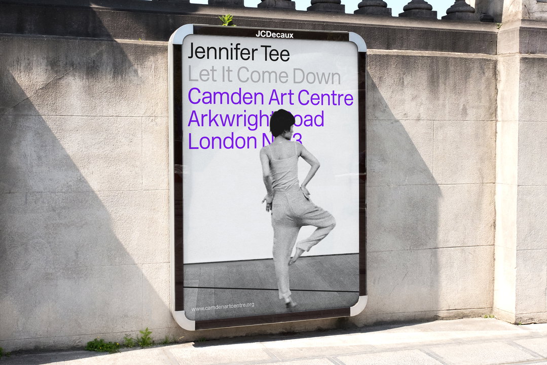
“Most other galleries follow the approach of a standalone logotype as the centrepiece of their brand identities, Pearce explains. “In contrast, the new Camden Art Centre identity has no heroic ‘mark’, but rather a complete visual system where the logotype is treated as equal to all the other elements. Its restraint as a visual system allows the brand to support and complement its subject without dominating it."
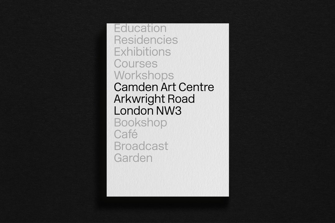
Harry Pearce / Pentagram: Camden Art Centre rebrand
“[The gallery] is loved in the art world for the support, closeness and benevolence towards its artists,” he continues. “Hence the logo is part of an equally balanced typographic system, where the content and events have parity with the brand. One united, equal platform.”
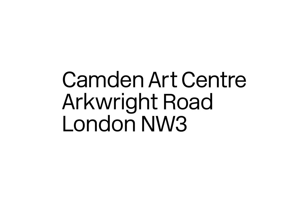
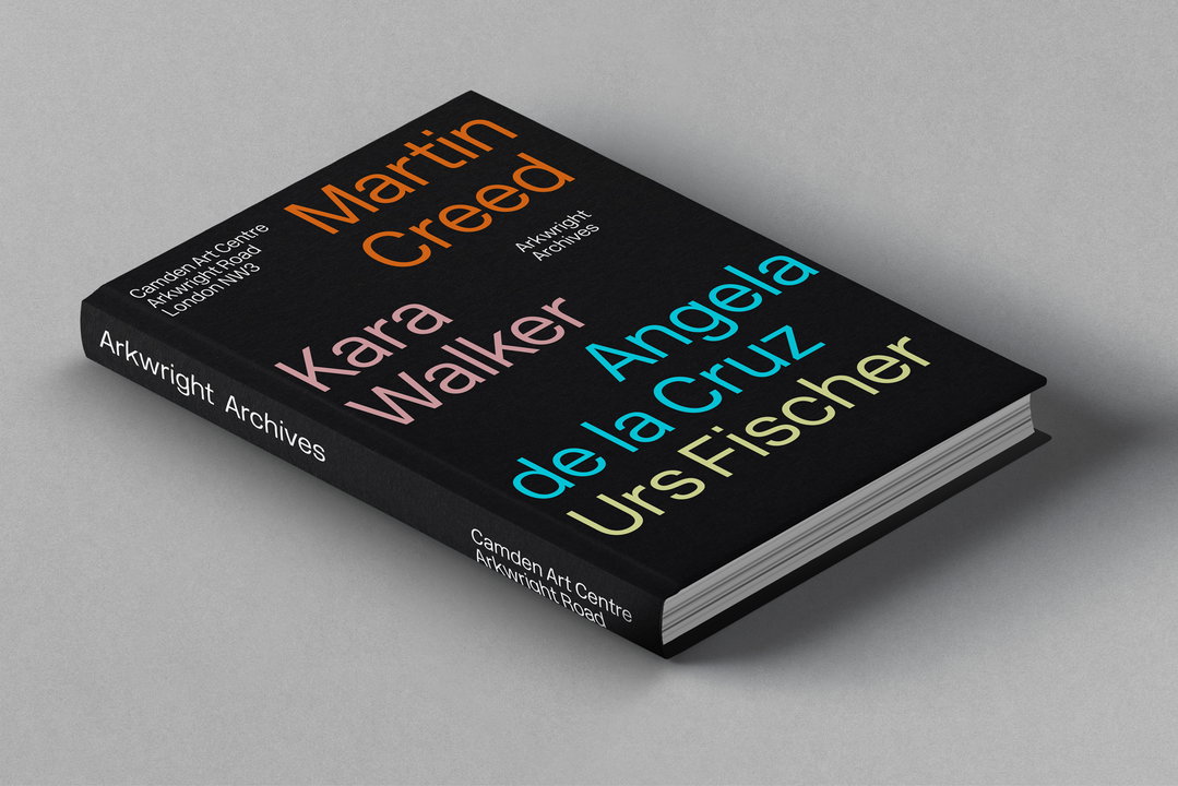
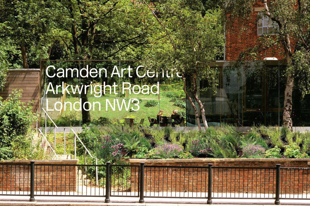
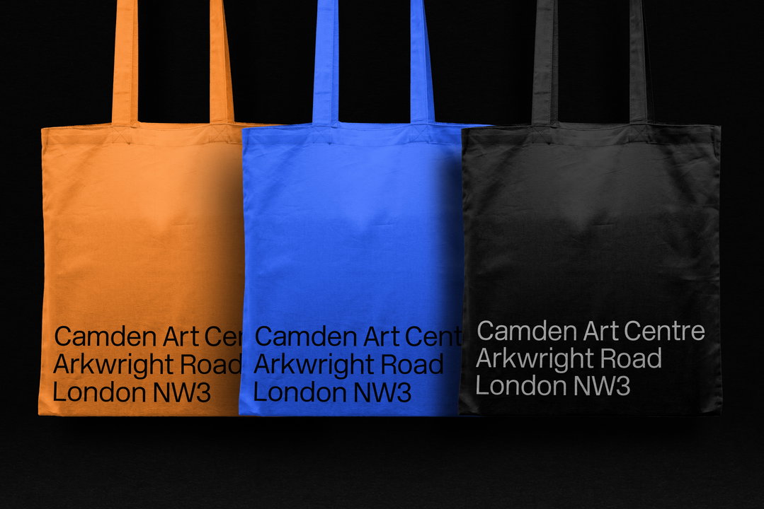
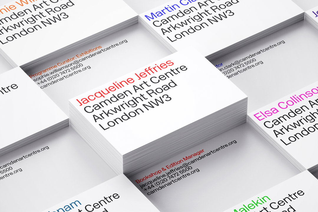
Now to clarify its name, which has confused visitors for decades. First, a single letter ’s’ has been dropped – Arts becomes Art – to define its focus on visual art rather than performing arts. Second, the new logotype includes its full address: Camden Art Centre, Arkwright Road, London NW3. Removing any chance of art fans getting lost, and making best use of the identity’s newly type-centred design, this logotype can be found everywhere from posters to book covers.
Importantly, given what the designers are professing, the design process was undertaken as a collaboration with the Centre’s staff, trustees, artists and patrons. Pearce describes the final outcome as “an empathetic identity, which seeks to present the brand on an equal and shared footing with its artists and programmes.”
GalleryHarry Pearce / Pentagram: Camden Art Centre rebrand
Share Article
Further Info
About the Author
—
Jenny oversees editorial output across It’s Nice That. Get in touch with writing pitches for features or opinion pieces, big creative story tips, or questions about all things editorial. jb@itsnicethat.com
To submit your work to be featured on the site, please see our Submissions Guide.