Launch Recite Me assistive technology
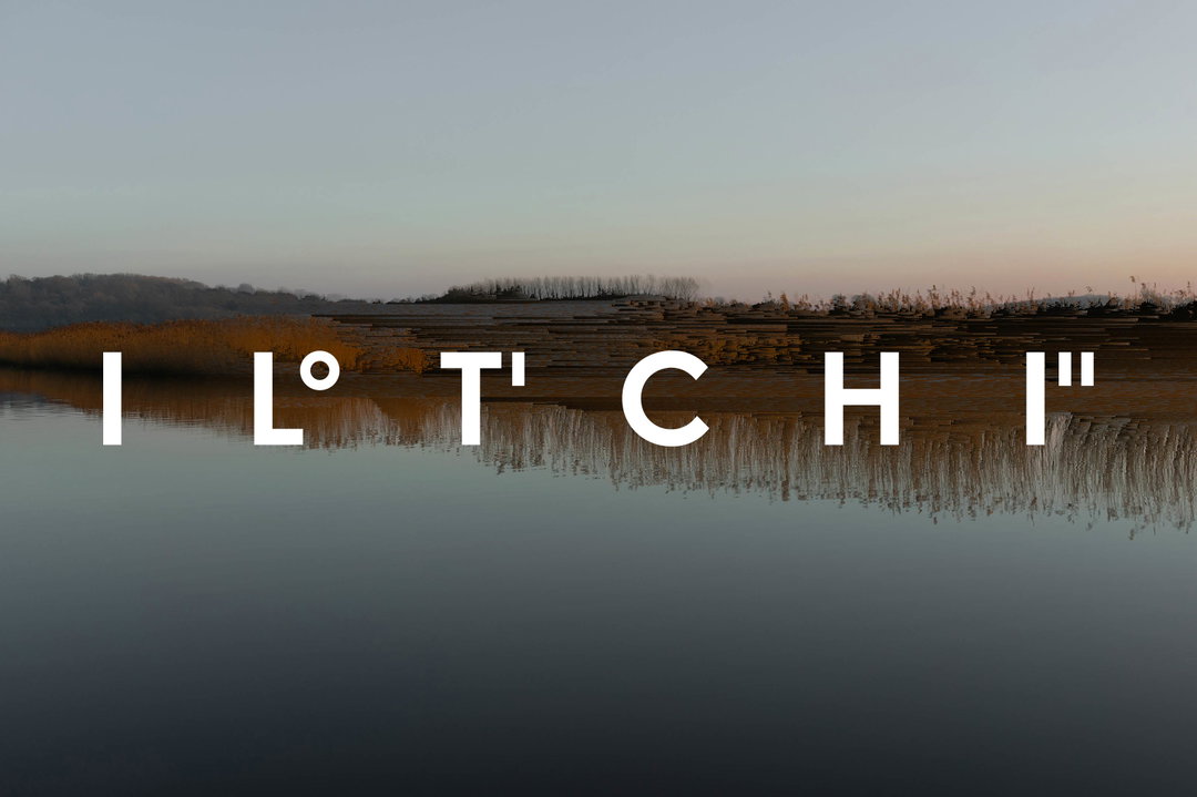
Large white letters reading “IL TCHI” are laid over a landscape of a still lake. The water reflects a line of golden reeds and a distant treeline under a pale sky.

Pentagram partner Sascha Lobe rebrands a yachting company, accentuating elements of nautical navigation

The designer made direct references to geographic coordinates and compass systems to invoke a motif of wind throughout the design language of yacht company Iltchi’s branding.

—
Date
14 September 2021

Share

“Azure oceans, sun-drenched summer days and the momentary sluice of shadows enjoyed underneath billowing palm fronds.” That’s not only what we’ve been dreaming of during this somewhat disappointing British summer, but also where the colour palette for Iltchi’s branding is plucked from. Pentagram partner Sascha Lobe helped the yacht company emanate its brand ethos and environment through various design elements.

Pentagram didn’t receive a design brief for this project so “we worked with branding strategist Kimberly Lloyd who was the first touchpoint in delivering a coherent and on-point brand strategy for Iltchi,” Lobe tells It’s Nice That.

Lobe took direct cues from nautical navigation in an interestingly harmonious design: the word mark is a bespoke sans serif grotesque font accentuated by latitude and longitude glyphs depicted in degrees, minutes and seconds. Creative direction and visual identity from branding strategist Lloyd depicts natural imagery which is distorted through the mechanics of satellites on boats: they scan the Earth and patch fragments into coherent but pixelated perspectives for navigation. Therefore, the visual identity of the brand is “underscored by pixelated photography alluding to satellites.”

Lobe was passionate that he took a holistic approach when rebranding: “Many are under the impression that creating a logo on its own will completely transform a brand, but that just isn’t the case, ever,” he tells It’s Nice That. “We look at the bigger picture and communicate the unseen as well. Every atom matters – not just the logo and visual identity.”

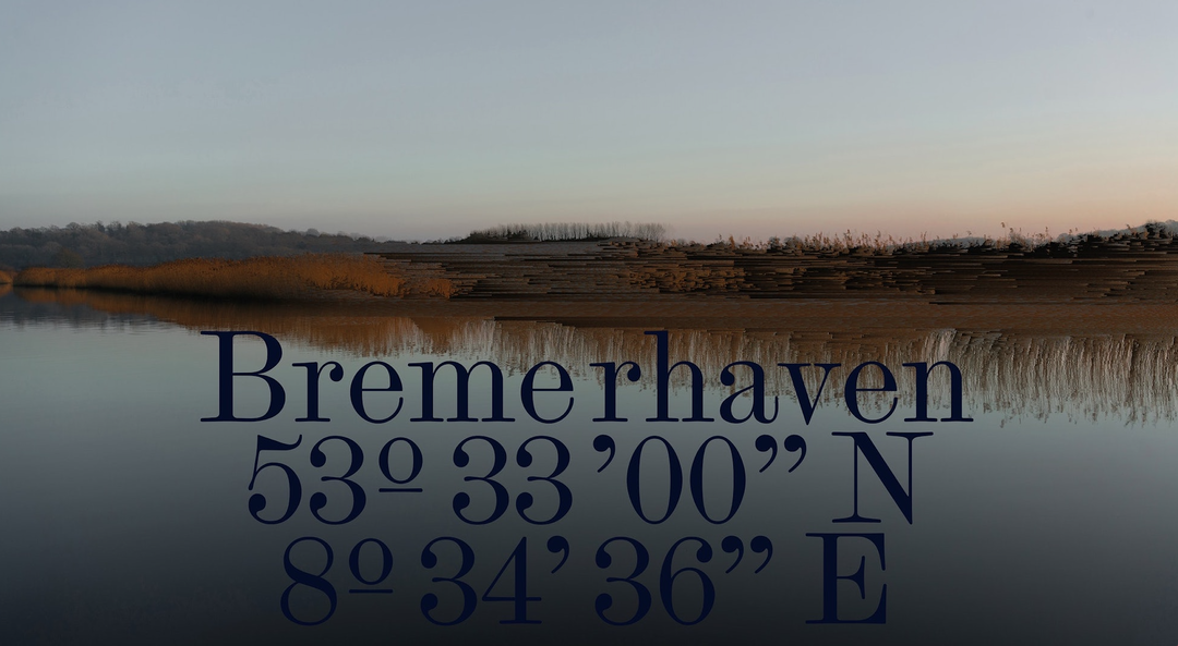
According to Pentagram, these concepts illustrate sea travel, “charting far-off destinations and nautical culture while de-emphasising traditional travel photography”. Whereas Iltchi’s print items bring the word mark to life through typography, colour palette and visual identity. Iltchi’s printed tabloid explores the North Sea’s Bremerhaven – a port city on Germany’s North Sea coast that lies at the co-ordinates 53°33'00"N, 8°34'36"E. It ranks amongst the top 30 busiest seaports in the North Sea and aims to be a nod to the European roots of Iltchi.

For “collateral and editorial use,” Iltchi’s modern serif typeface attempted to contrast the sans serif grotesque logo mark in an elegant way through placement that is both “bold and central,” says Pentagram. For the visual language of the yacht brand, Pentagram wanted the reality of sea travel – its stormy and turbulent weather – to come through as well as the beauty of the sea.

GalleryPentagram / Sascha Lobe and Kimberly Lloyd: Iltchi visual identity (Copyright © Iltchi Yachting, 2021)
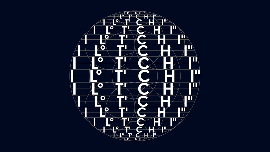
A graphic illustration of a white circular grid on a dark blue background. The word “ITCHI” is repeated in a distorted, warped typographic pattern across the centre.
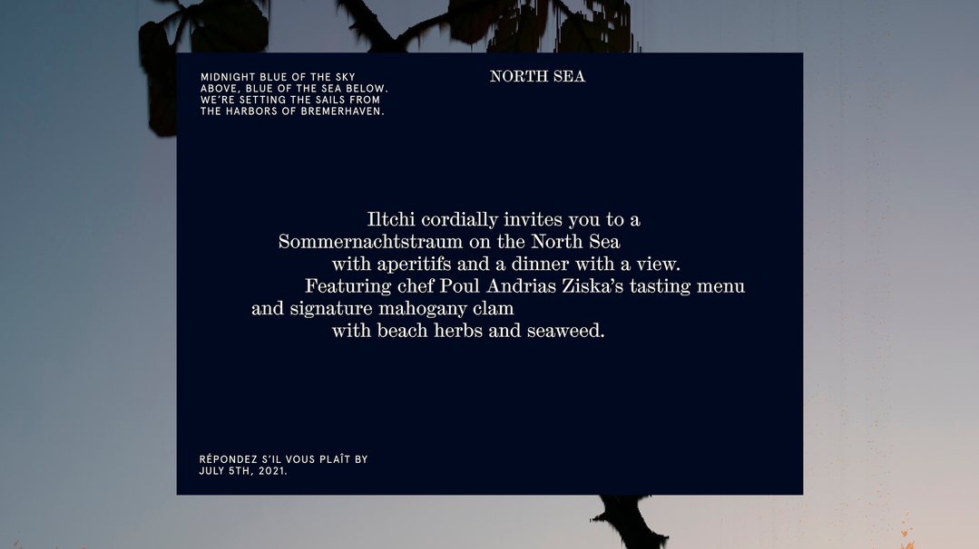
An invitation on a dark blue background. The central text reads “Iltchi cordially invites you to a Sommernachtstraum on the North Sea” and mentions a tasting menu by chef Poul Andrias Ziska.
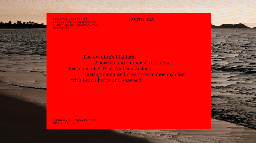
A bright red invitation card laid over a photo of a dark, choppy sea. The card reads “NORTH SEA” and describes a dinner featuring chef Poul Andrias Ziska’s tasting menu.
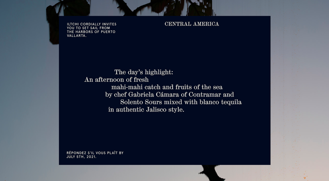
A dark blue invitation card with white serif text. It reads “Central America” at the top and invites guests to “set sail from the harbors of Puerto Vallarta”. The central text highlights an afternoon of “mahi-mahi catch and fruits of the sea by chef Gabriela Cámara of Contramar” and “Solento Sours”.
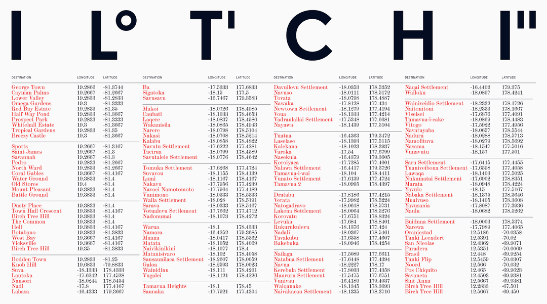
A minimalist typographic poster featuring the word “LITCHI” in large, bold, black letters across the top. Below the title, four columns of text list various destinations alongside their longitude and latitude coordinates.
A wide landscape of a calm river reflecting a pale sky and golden reeds. Dark blue text laid over the centre reads “Bremerhaven” above the coordinates “53º 33’00” N” and “8º 34’36” E”.
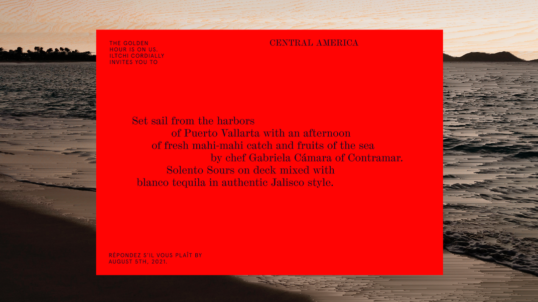
A bright red invitation card laid over a photo of a beach at dusk. The card reads “Central America” and invites guests to an afternoon of fresh seafood by chef Gabriela Cámara of Contramar in Puerto Vallarta.
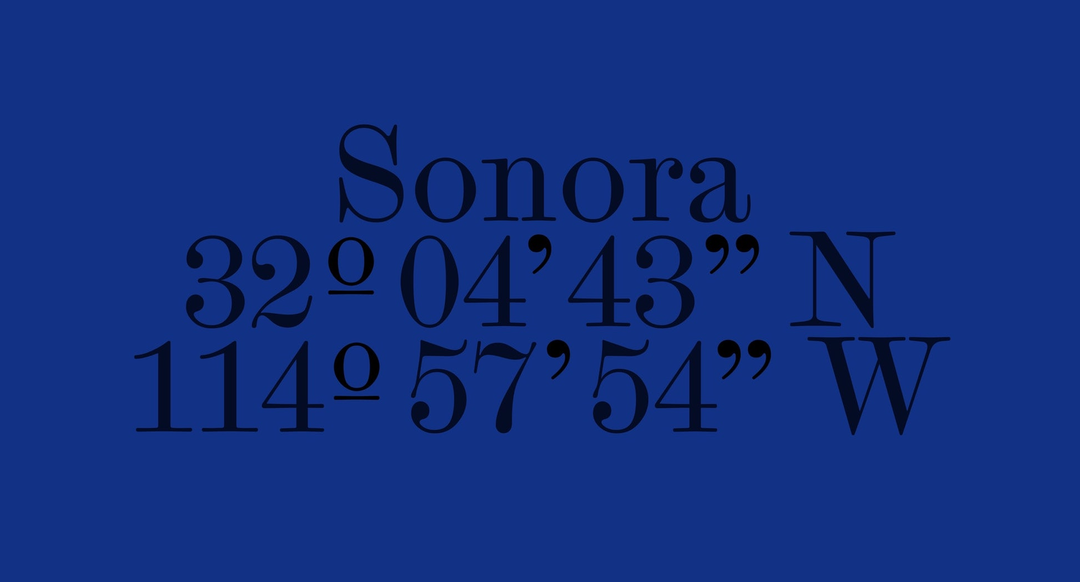
Dark blue text on a brighter blue background reads “Sonora”. Below this, geographic coordinates are listed as “32º 04’ 43” N” and “114º 57’ 54” W”.
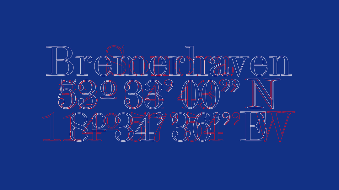
A typographic image on a deep blue background. White outlined text reads “Bremerhaven” above the coordinates “53° 33’ 00” N” and “18° 34’ 36” E”. Red outlined text is layered behind the white, slightly offset to create a blurred effect.
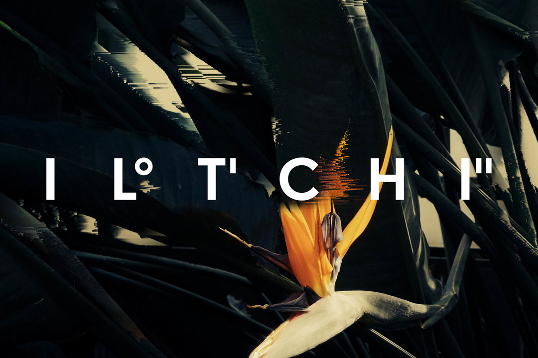
A distorted image of a bird of paradise flower, its orange and blue petals fragmented by digital glitches. The word “I L° T' C H I” is laid over the centre in bold white capital letters.
Large white letters reading “IL TCHI” are laid over a landscape of a still lake. The water reflects a line of golden reeds and a distant treeline under a pale sky.
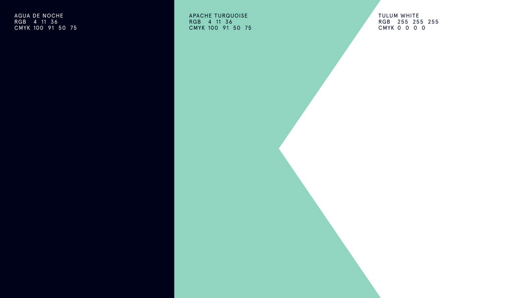
A colour palette featuring three blocks of colour: deep navy, mint green and white. Each section includes the colour name and its RGB and CMYK values, such as “Agua de Noche” and “Apache Turquoise”.
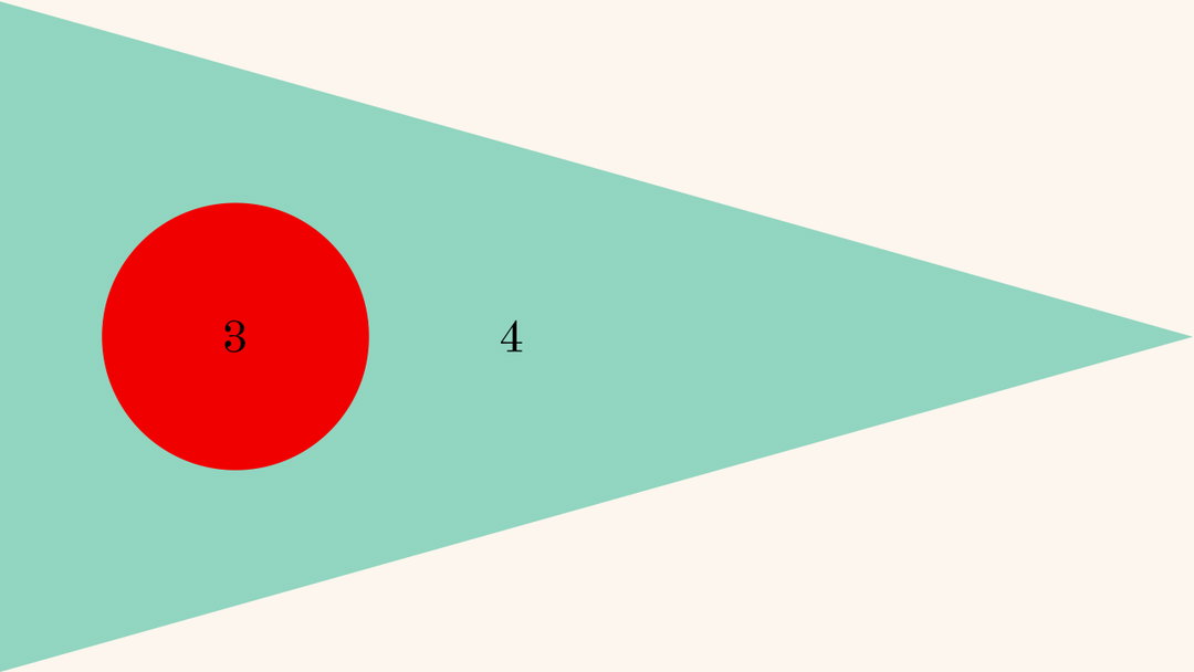
A graphic illustration of a mint green triangle pointing to the right against a cream background. A red circle containing the number “3” sits inside the triangle, next to a standalone number “4”.
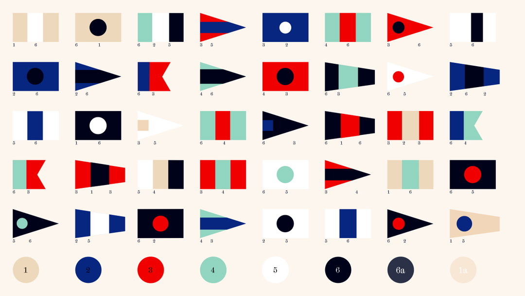
A grid of 48 colourful nautical signal flags in various shapes, including rectangles, triangles and swallowtails. Below the grid, eight circular colour swatches are numbered from one to “6a” and “1a”.
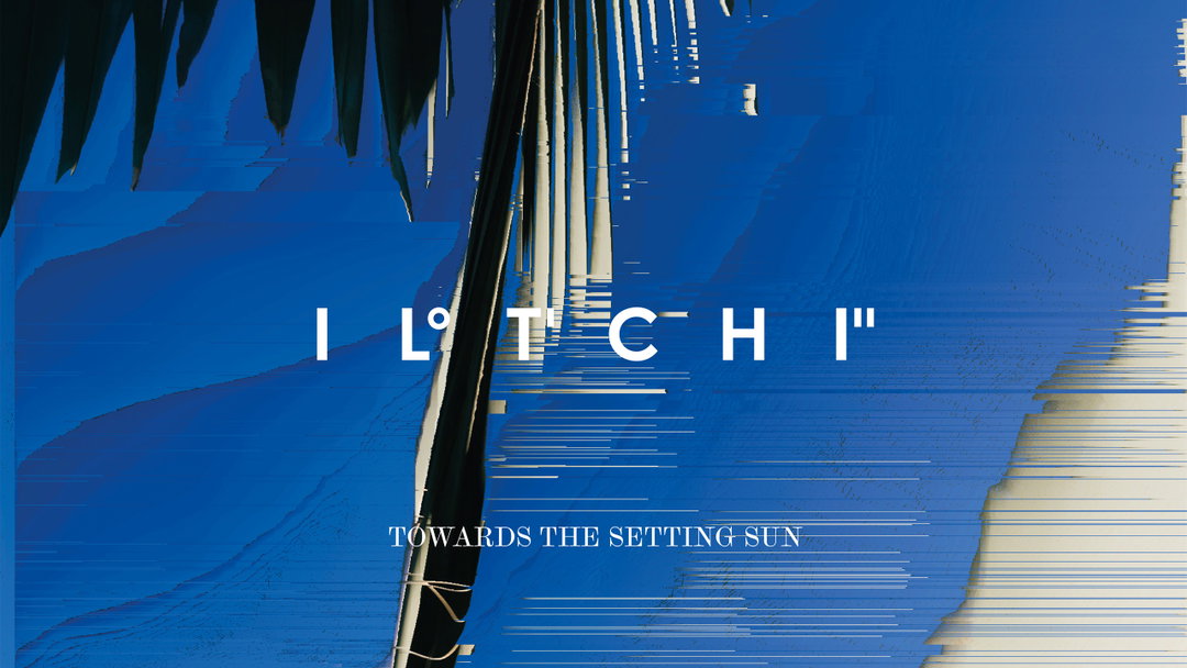
A digital collage in deep blue features distorted, glitched imagery of palm fronds. White text in the centre reads “GLITCHI”, with a smaller line below that reads “TOWARDS THE SETTING SUN”.
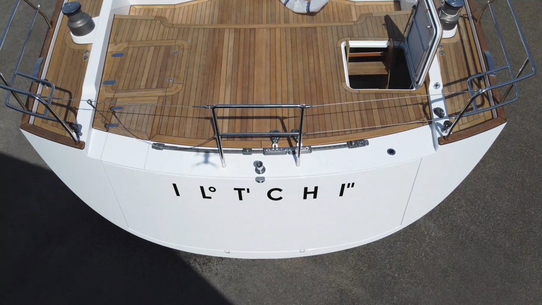
A high-angle view of the white stern of a boat with a polished wooden deck. The word “IL TCHI” is written in black capital letters across the back.
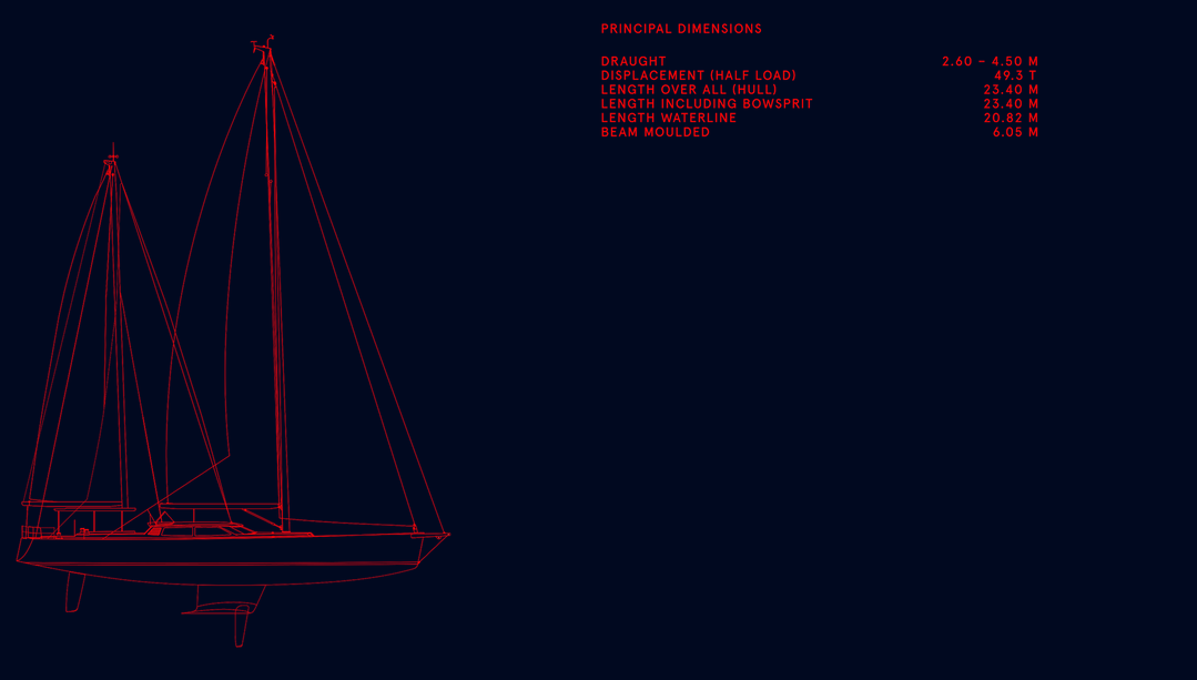
A red line drawing of a sailboat on a dark blue background. To the right, a list of “Principal Dimensions” includes measurements for draught, displacement, length and beam.
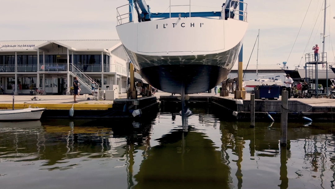
The bow of a large white boat, named “IL TOTCHI”, looms over a harbour. It is propped up on supports above the water, with a white building and a dock in the background.

Hero Header

Pentagram: Iltchi Rebrand, Sascha Lobe and Kimberly Lloyd (Copyright © Iltchi Yachting, 2021)
Share Article

About the Author

Dalia Al-Dujaili

—

Dalia is a freelance writer, producer and editor based in London. She’s currently the digital editor of Azeema, and the editor-in-chief of The Road to Nowhere Magazine. Previously, she was news writer at It’s Nice That, after graduating in English Literature from The University of Edinburgh.
It's Nice That Newsletters

Fancy a bit of It's Nice That in your inbox? Sign up to our newsletters and we'll keep you in the loop with everything good going on in the creative world.