How graphic design changed the architecture in Soho’s Boulevard Theatre
In charge of the visual identity as well as the building design and interiors, Soda Studio drew from the sordid history of London’s newest theatre for its all-encompassing design.
Share
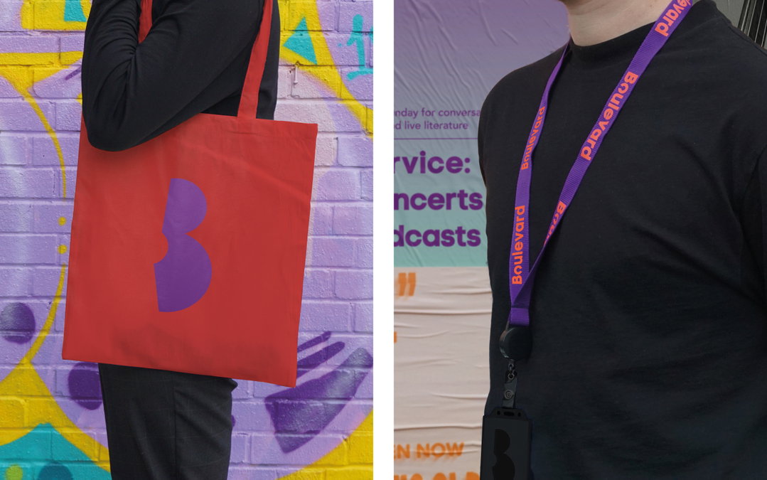
It’s not often a studio is handed a building’s entire design, from architecture to branding, including interiors and even furniture, but Soda Studio have made the most of the opportunity for the Boulevard Theatre. The newest venue to arrive in London’s Soho has been created inside and out by the multi-disciplinary practice and the result is cohesive, the branding even affecting the design of one of the key elements of the theatre’s interior.
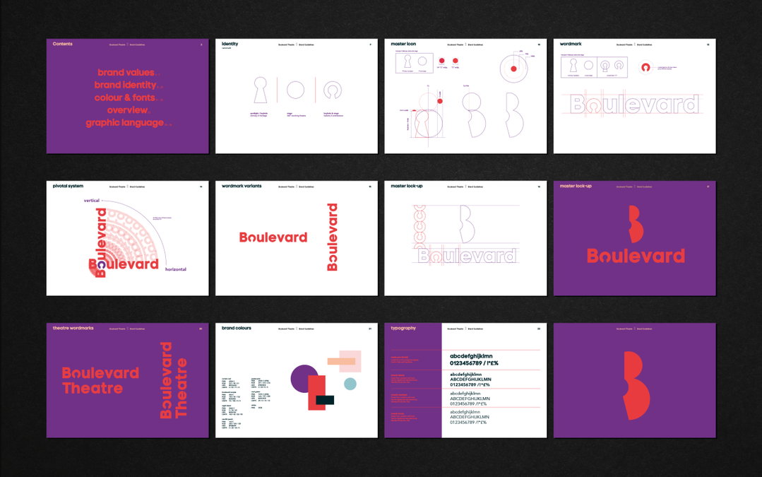
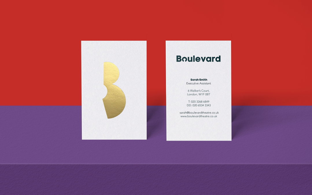
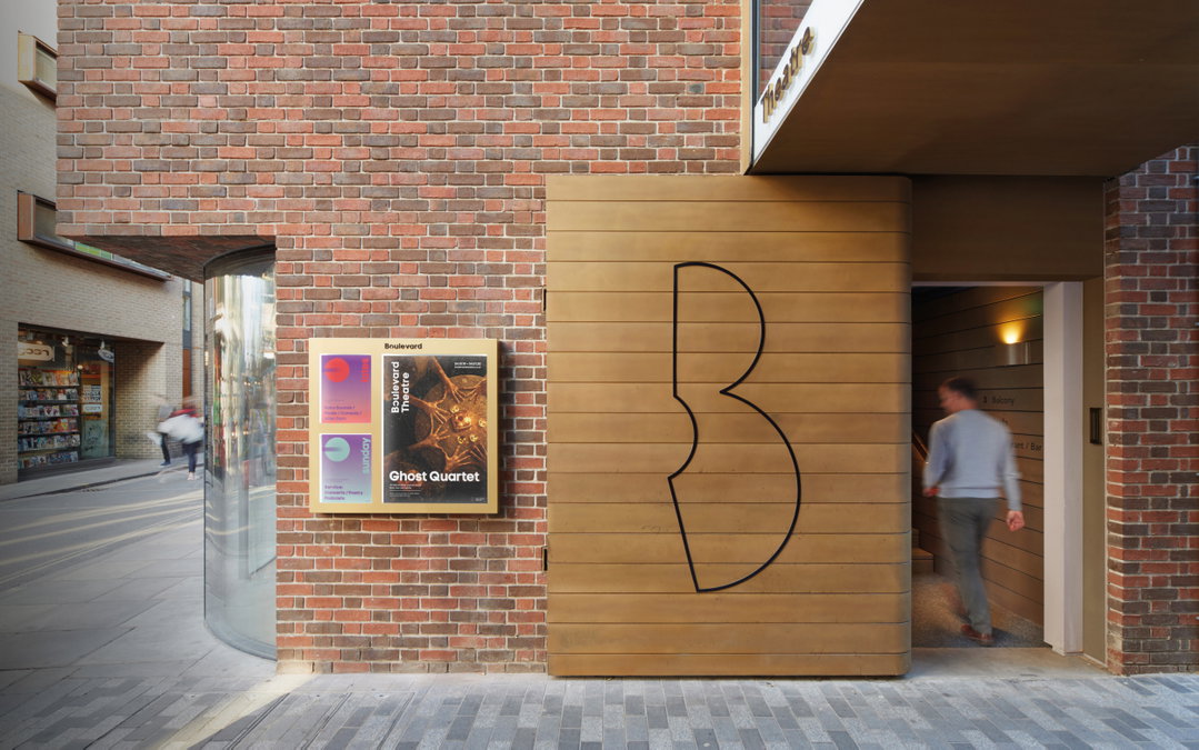
Built in a room of the once infamous Raymond Revuebar, a strip club and brothel (now also occupied by controversial cabaret club The Box), the branding for the Boulevard draws from the building’s past, as well as its stage design. “We were certain the brand needed to be built from circles, to represent the 360-degree revolving stage, [Boulevard’s] most unique feature,” explains Soda’s head of graphics, Katie Stamp. “The keyhole was developed through simple geometric shapes – it represented intimacy, a nod toward the Raymond Revuebar site history. Although a strong symbol that embodied the past and present, we didn’t want it to be the dominant graphic. Instead we explored stacking circles to form the ‘B’ and played with intersecting the keyhole, creating the custom mark.”
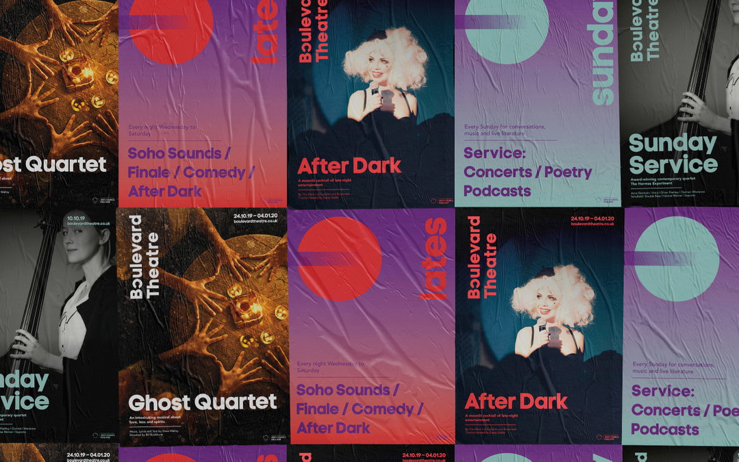
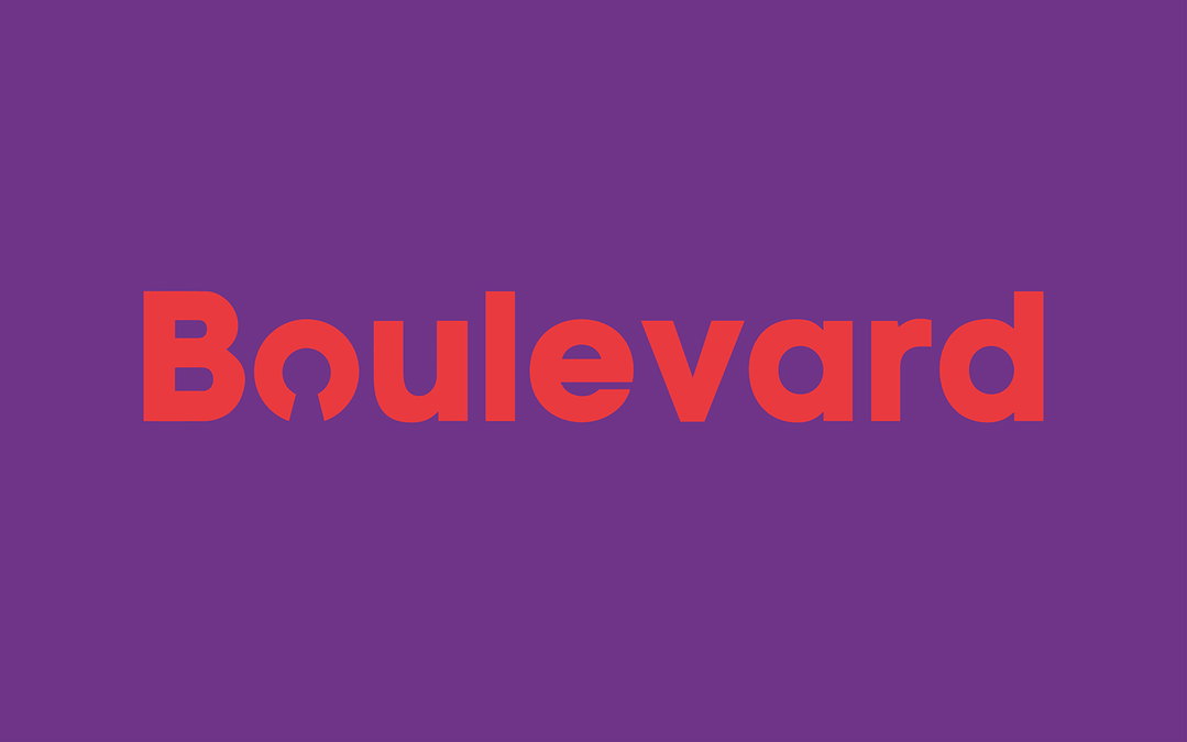
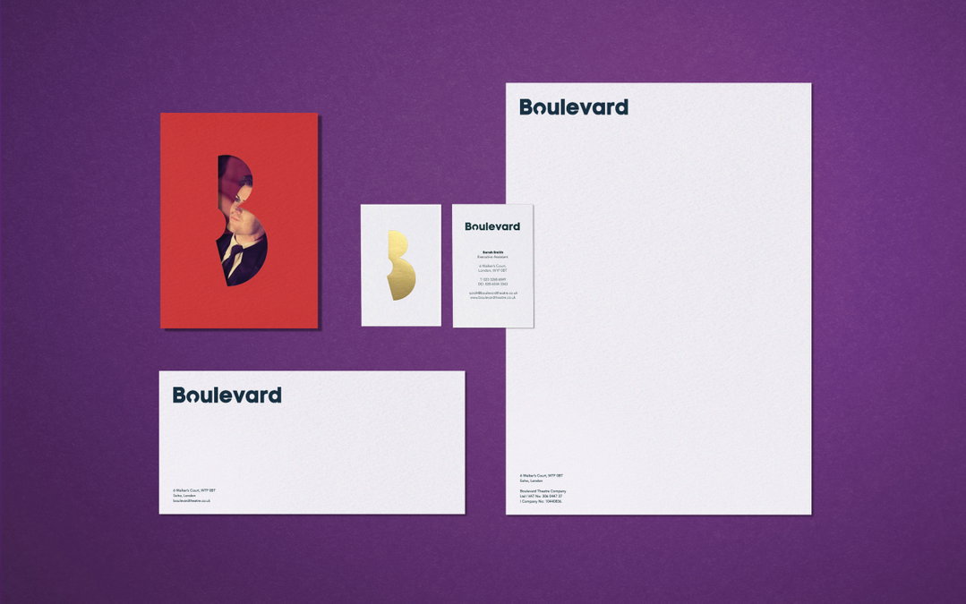
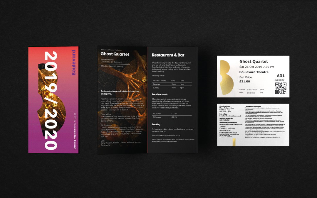
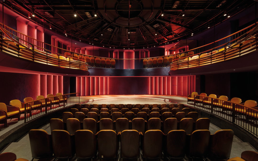
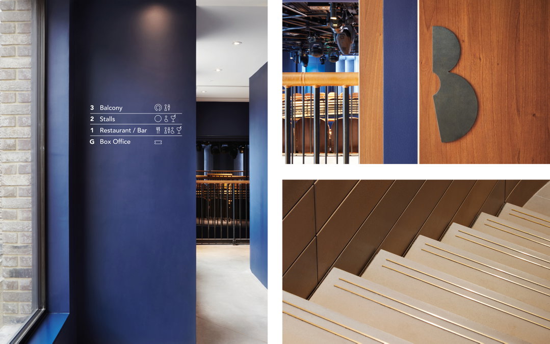
This, in turn, fed into the interior design. The 270-degree rotating balcony was developed based on an early icon lock-up design, which manifests in the ‘o’ of the Boulevard wordmark. A section of the letterform is cut out, making an incomplete circle, and this shape is mirrored by a plan view of the balcony. In the visual identity, this ‘o’ stays in position whether the wordmark is positioned vertically or horizontally, allowing the branding to adapt to poster designs and other outlets.
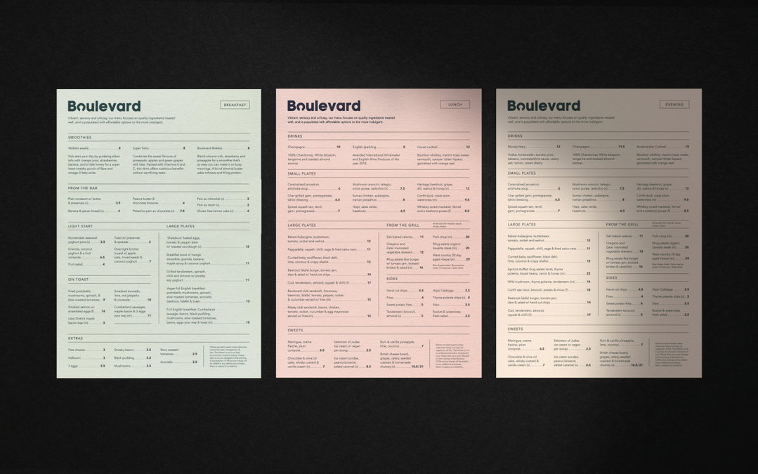
Wanting to maintain a “circular language” within the typography, Soda employed Code Pro bold as the primary typeface for its “clean geometric forms”, inspired by Avant Garde and Swiss design, and adapted it for the wordmark. Three versions of Avenir are used as supporting typefaces.
Soda Studio: Boulevard Theatre
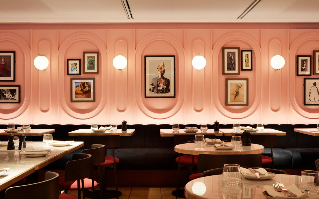
Another benefit of designing everything on this project was making sure the colour palette worked for the interior materials as well as it did for the graphics. “The colour palette was actually one of the first things we developed,” Stamp says. “We wanted the environment to have a distinct pace change throughout the day... a colour concept that altered between night and day. Night, capturing the spirit of Soho, through surrounding neon. Day, soft pastels in homage to the previous Art Deco interior. These colours heavily influenced the material palette and are laced throughout the building and branding.”
When asked what it adds to the project to have the entire design under one roof, Stamp explains it makes for an altogether stronger vision. “[The different design teams] are able to design together, creating natural cross-pollination of ideas. Usually these two disciplines are separated; however, we feel there are similarities in the creative process and benefit from sharing knowledge. We believe a building is as much part of the brand as the identity itself.”
GallerySoda Studio: Boulevard Theatre
Hero Header
Soda Studio: Boulevard Theatre
Share Article
Further Info
About the Author
—
Jenny oversees editorial output across It’s Nice That. Get in touch with writing pitches for features or opinion pieces, big creative story tips, or questions about all things editorial. jb@itsnicethat.com
To submit your work to be featured on the site, please see our Submissions Guide.