Launch Recite Me assistive technology

Studio Moross creates new illustration-led identity for Manchester's Parklife festival
—
Date
12 February 2016
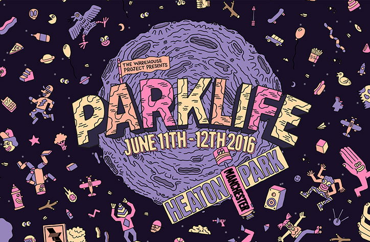
An illustration for a music festival featuring a large, purple, cratered moon against a dark starry sky. Bold, stylised text across the centre reads “Parklife”, with “The Warehouse Project presents” above and “June 11th–12th 2016” below. A banner at the bottom reads “Heaton Park Manchester”. The scene is filled with small, colourful doodles of characters, objects and animals.

Studio Moross has rebranded Manchester festival Parklife, creating a new illustration-led identity to launch its 2016 line-up.

“The festival has been going for a while now and was in need of a big refresh, so we took it into space!”, explains Studio Moross designer Guy Field. “We created a mad illustrated Parklike universe, of crazy characters and wonky gravity.”

The studio worked with animator Andy Baker to create a promo video for the festival, which gradually reveals the line-up as a rocket ship travels through space. The new designs are shown across all touchpoints including on and offline advertisements and printed collateral, as well as a new website built by Project Simply.
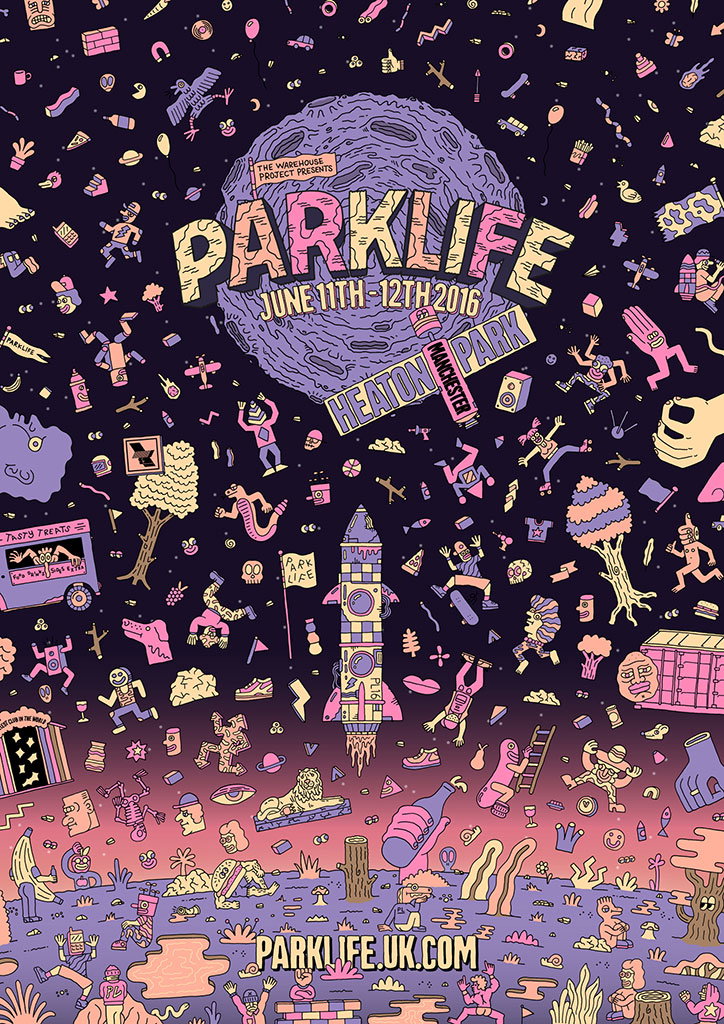
A colourful illustration for the “Parklife” festival, featuring a chaotic scene of surreal characters and objects floating in a purple space. A large, textured moon in the centre reads “Parklife”, “June 11th–12th 2016” and “Heaton Park, Manchester”. A rocket ship launches from a pink landscape at the bottom, where the website “parklife.uk.com” is displayed.
Above
Left

Studio Moross: Parklife identity

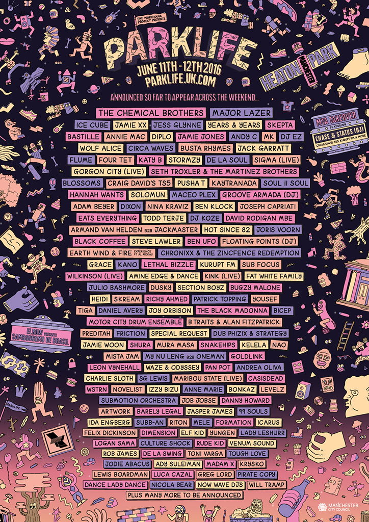
A detailed illustration for the “Parklife” festival, dated 11–12 June 2016. A dense list of performing artists is displayed in the centre, including “The Chemical Brothers”, “Major Lazer” and “Ice Cube”. The text is surrounded by a chaotic, colourful scene of dancing figures, musical instruments and floating objects.
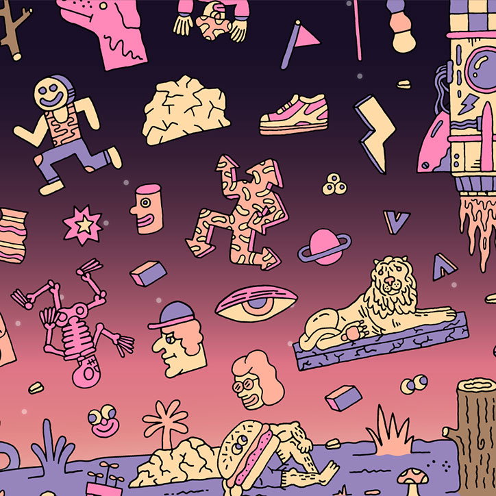
An illustration of a surreal, cosmic landscape in shades of purple, pink and yellow. Various floating figures and objects drift through the space, including a robot, a lion on a floating platform and a burger-headed person.
Above
Left

Studio Moross: Parklife identity

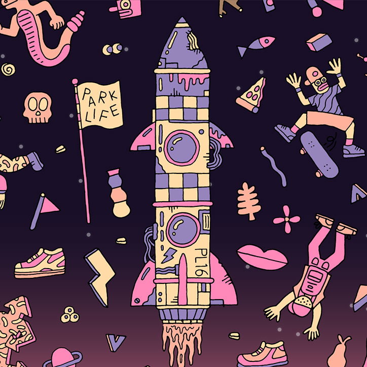
An illustration of a stylised rocket ship in purple, yellow and pink, set against a dark purple background. The rocket is surrounded by a chaotic array of floating objects, including a skateboarder, a slice of pizza, a skull and a flag that reads “PARK LIFE”.
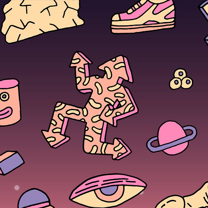
An illustration of various surreal shapes and objects floating against a dark purple background. A central, jagged figure is covered in a yellow and pink pattern, surrounded by a ringed planet, a large eye and a sneaker.
Above

Studio Moross: Parklife identity

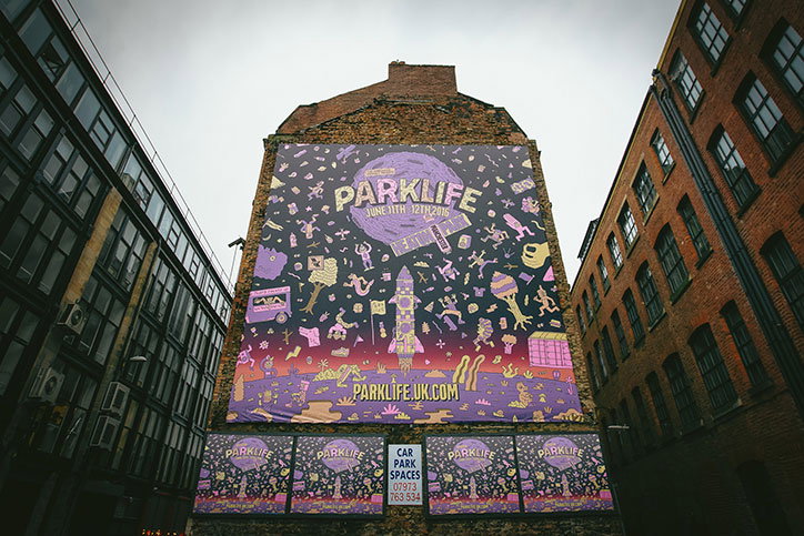
A large purple banner for the “Parklife” festival hangs from the side of a brick building. The illustration features whimsical characters and a rocket ship, with the dates “June 11th 12th 2016” and the website “parklife.uk.com”.
Above

Studio Moross: Parklife identity

Share Article

About the Author

Emily Gosling

—

Emily joined It’s Nice That as Online Editor in the summer of 2014 after four years at Design Week. She is particularly interested in graphic design, branding and music. After working It's Nice That as both Online Editor and Deputy Editor, Emily left the company in 2016.
It's Nice That Newsletters

Fancy a bit of It's Nice That in your inbox? Sign up to our newsletters and we'll keep you in the loop with everything good going on in the creative world.