Making a kids clothing rental brand feel simple and stress-free with Studio Parallel
Studio Parallel tells us about building a sense of ease into a brand via direct communication and a simplified design approach.
Share
Or (On Rotation) is a brand built on a straightforward premise: a subscription-based rental service for kids’ clothing. But, when Studio Parallel was called in to develop its identity, site and packaging, the design studio had to break down some audience preconceptions around the legwork associated with such services. “In the UK, clothing rental is still in its infancy,” Paul Fox, creative director at Parallel, tells us. This meant a large part of the project hinged upon making sure the rental aspect came across simply, “without feeling too overwhelming for the consumer to understand”, Paul adds.
In the case of Or, part of this work was made easier for Parallel. As a brand that utilises a subscription-based model, it already taps into the audience’s familiarity with this idea – “it’s become the norm in how we watch TV or listen to music,” Paul says. Plus, Or targets sustainably conscious buyers who are aware of its circular model from places like Facebook Marketplace, where they might “sell their baby’s clothes once they’ve grown out of them, or pass on to friends and family”, Paul explains. However, Parallel’s challenge was making OR’s brand feel like an easier, faster and more enjoyable way of taking part in this system.
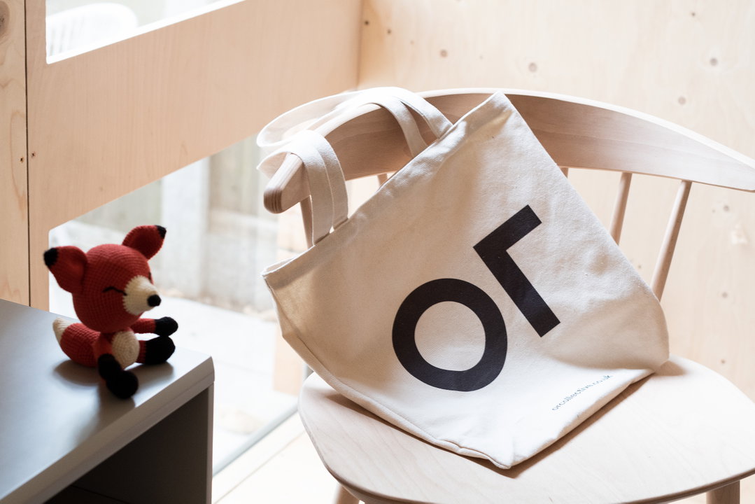
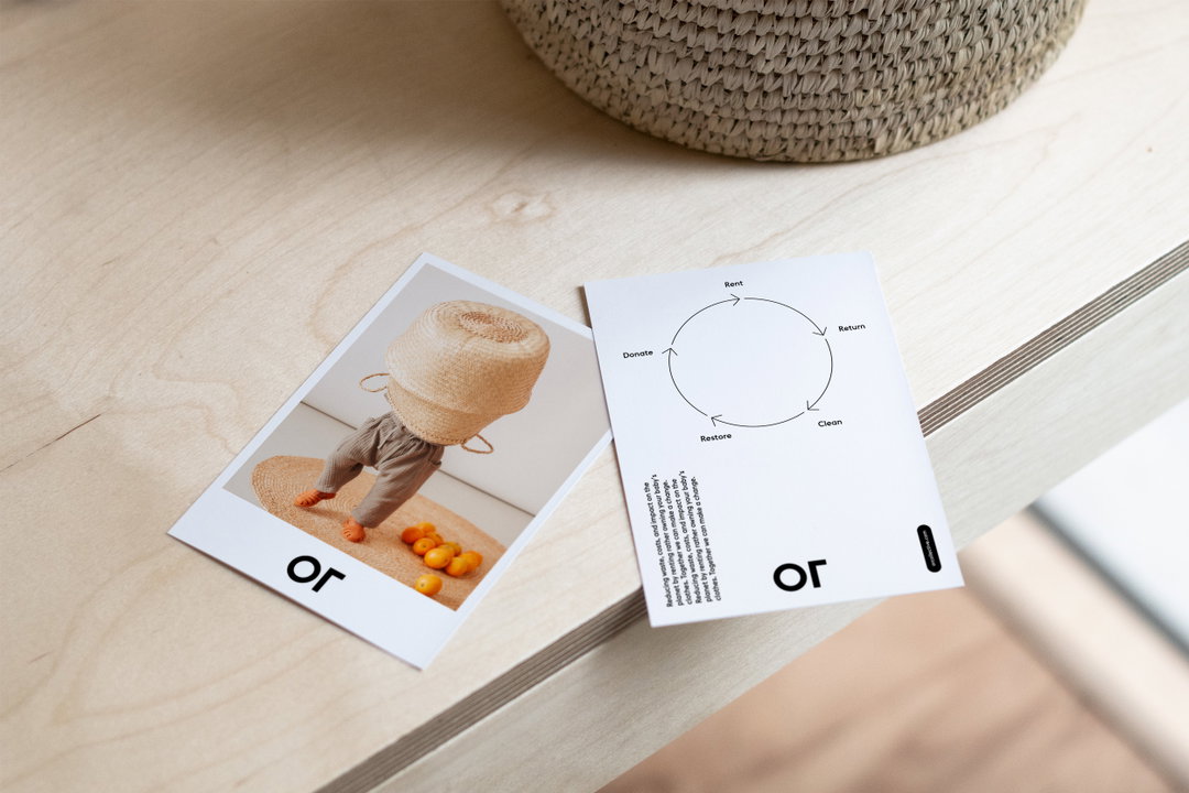
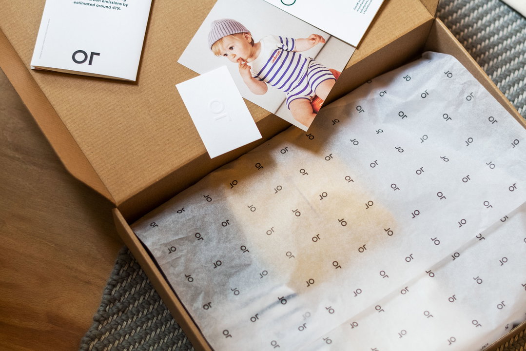
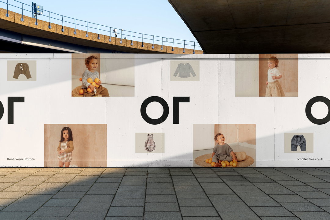
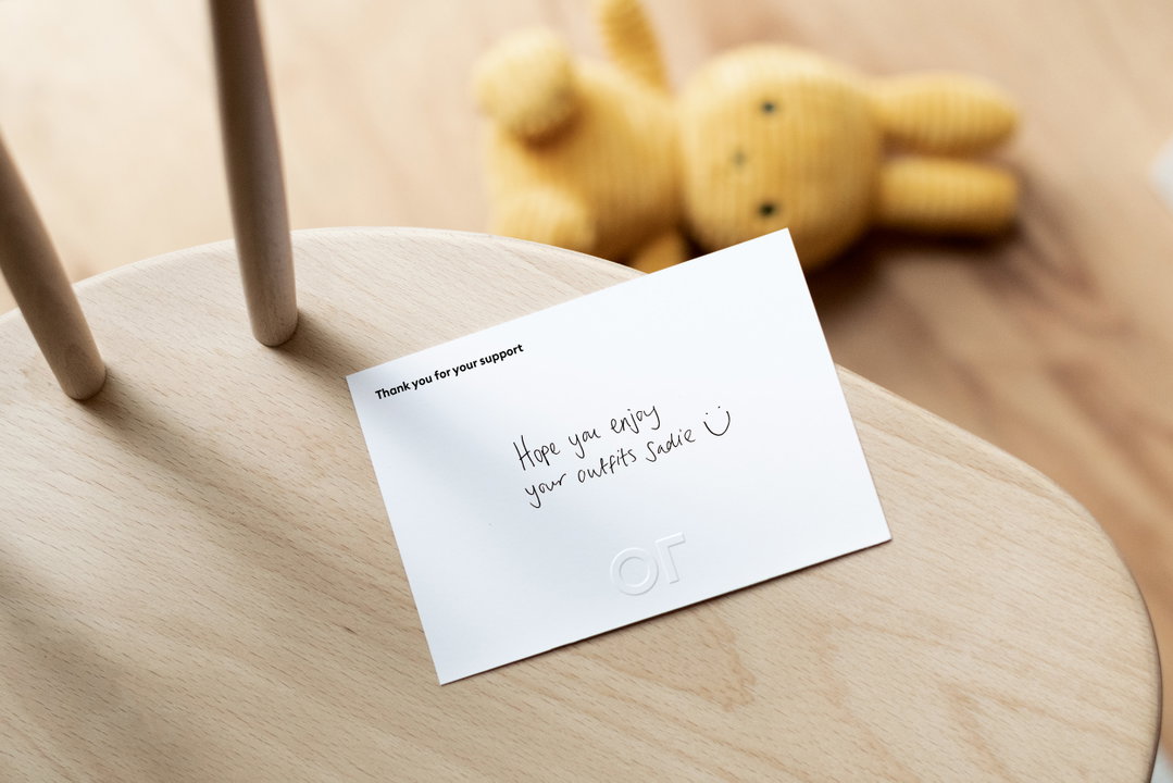
To begin, Parallel introduced a strapline focused on clarity – “Rent. Wear. Rotate.” – which would immediately communicate Or’s offering. The logo also had to get to the core of Or’s purpose. Paul explains: “Babies grow out of seven sizes in the first two years, meaning a lot of hardly used clothes are ending up in landfill.” Or’s aim – to reduce this waste – is summarised by a logo that is stripped back to the “bare minimum”, says Paul. Parallel also adds a playful twist with the wordmark, which cleverly rotates when in motion.
Studio Parallel: Or (Copyright © Or, 2022)
On the logo, Paul states: “It has an innocence that reflected simple shapes you may see in kids’ toys and books, but a minimal aesthetic that would also appeal to adults. Part of the brief was also to future proof the identity with the possibility of Or moving into adult clothing rental, so it was important to have an identity that wasn’t over childlike.”
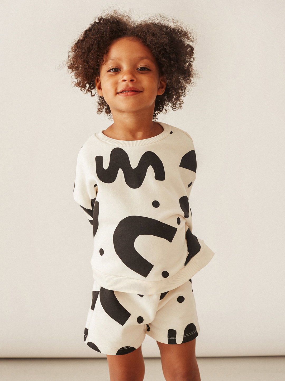
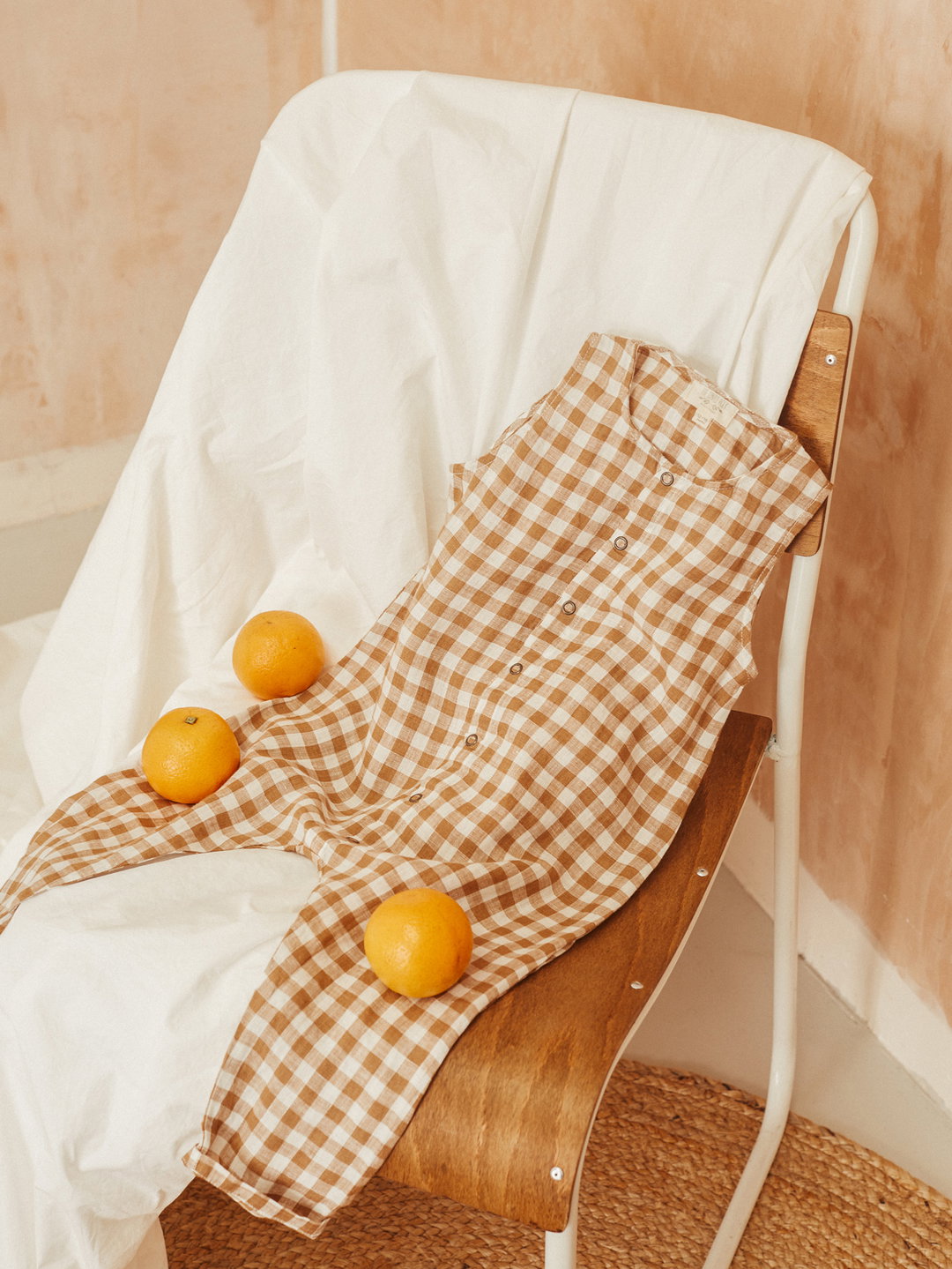
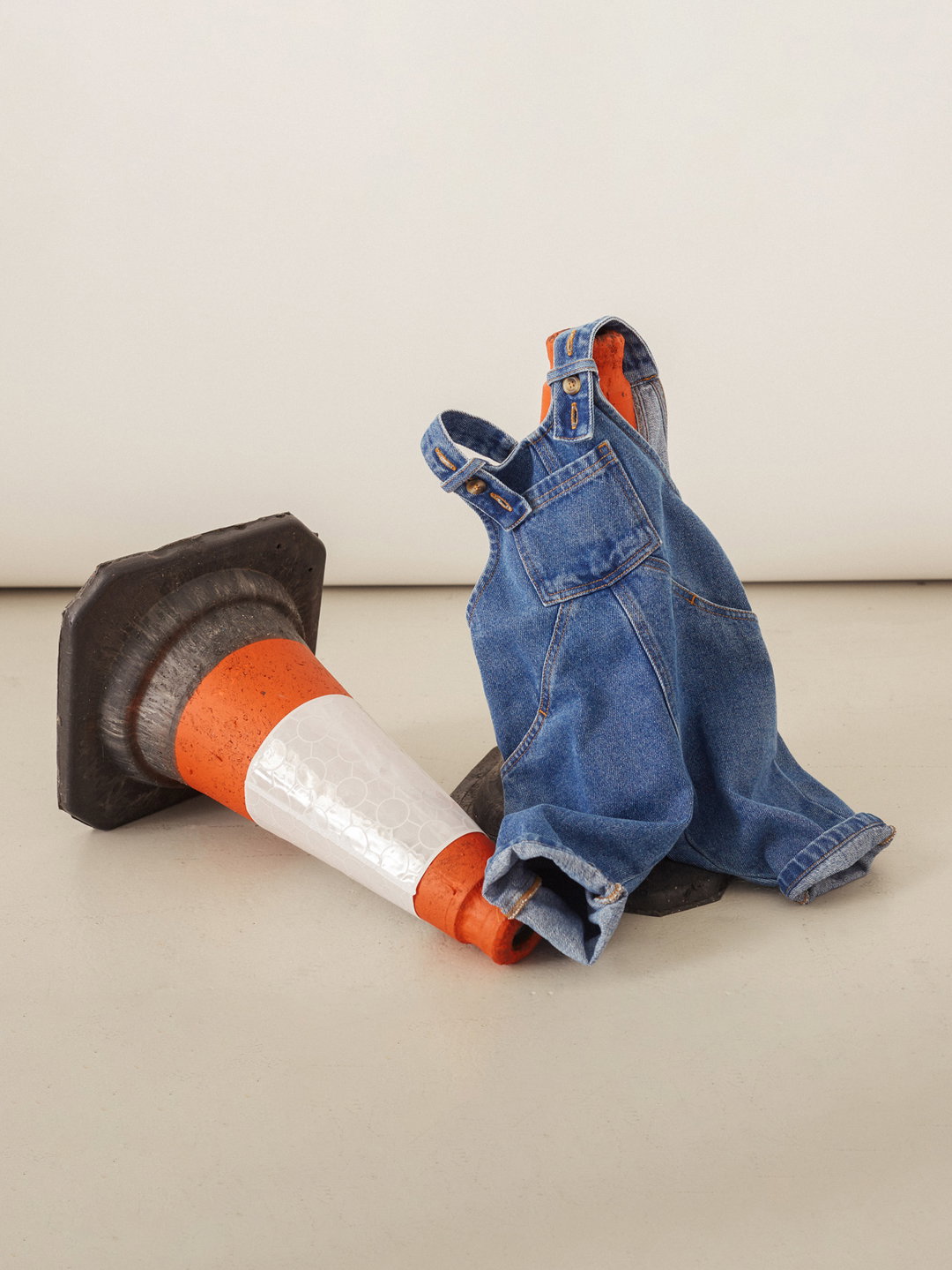
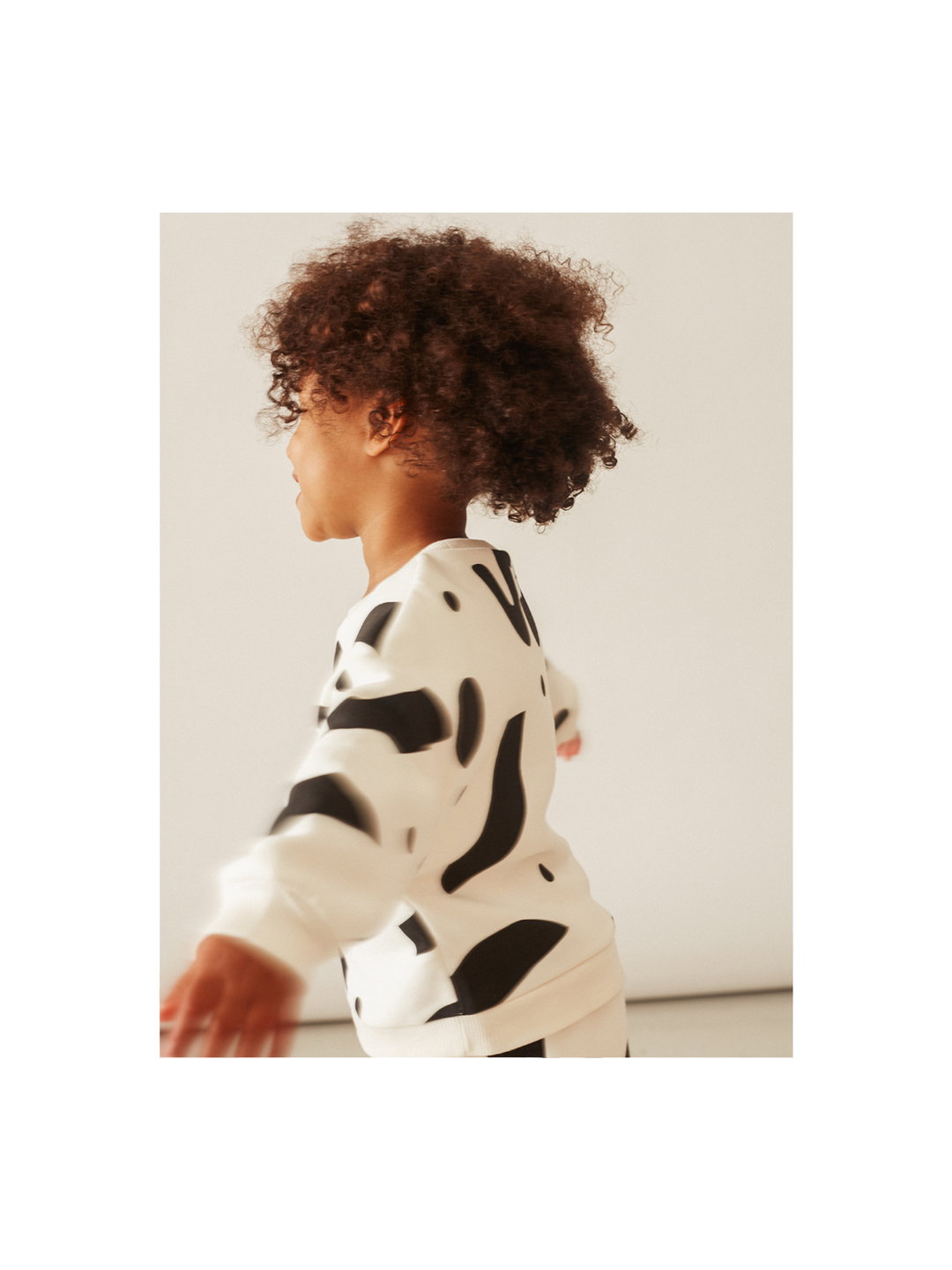
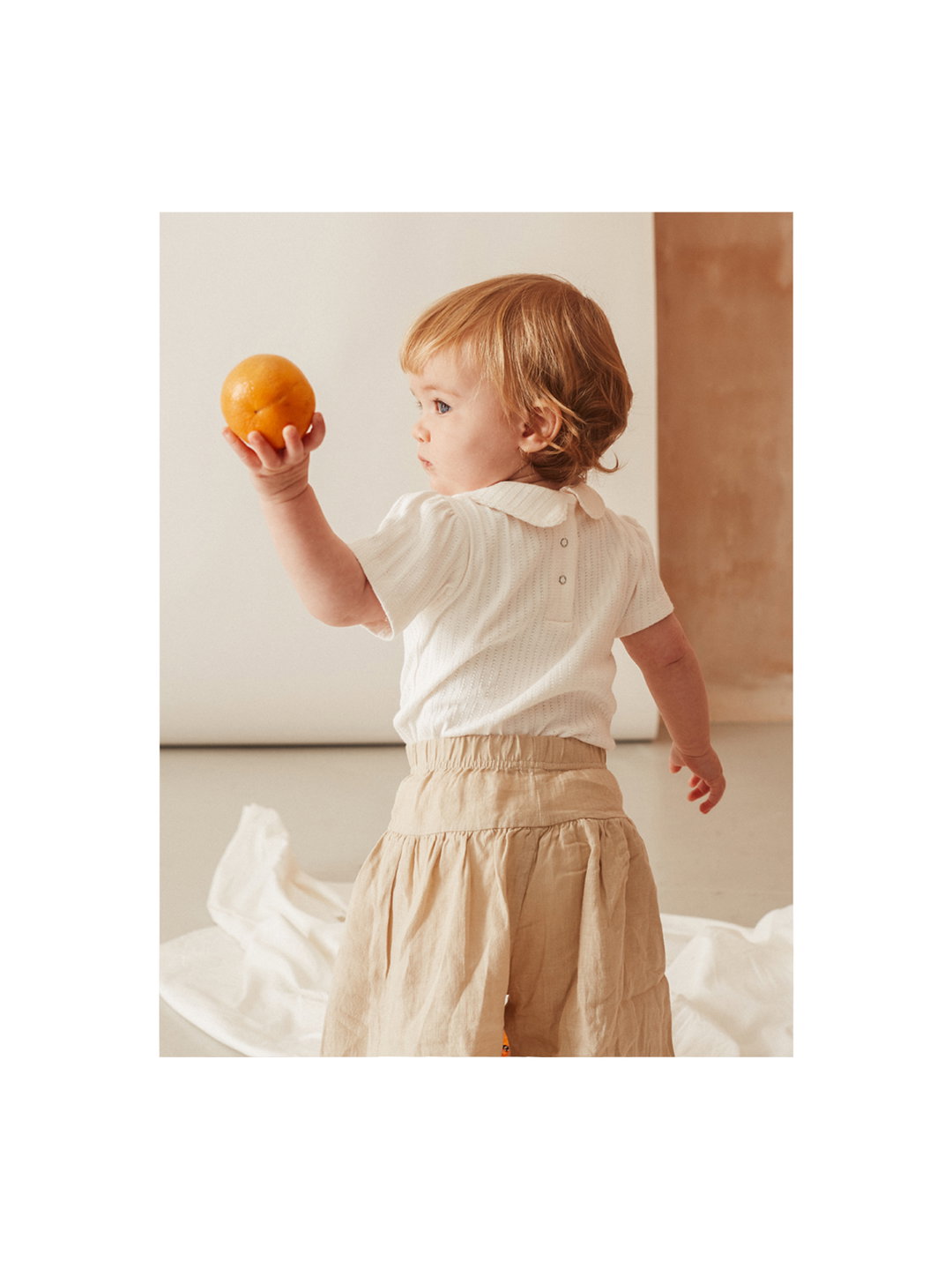
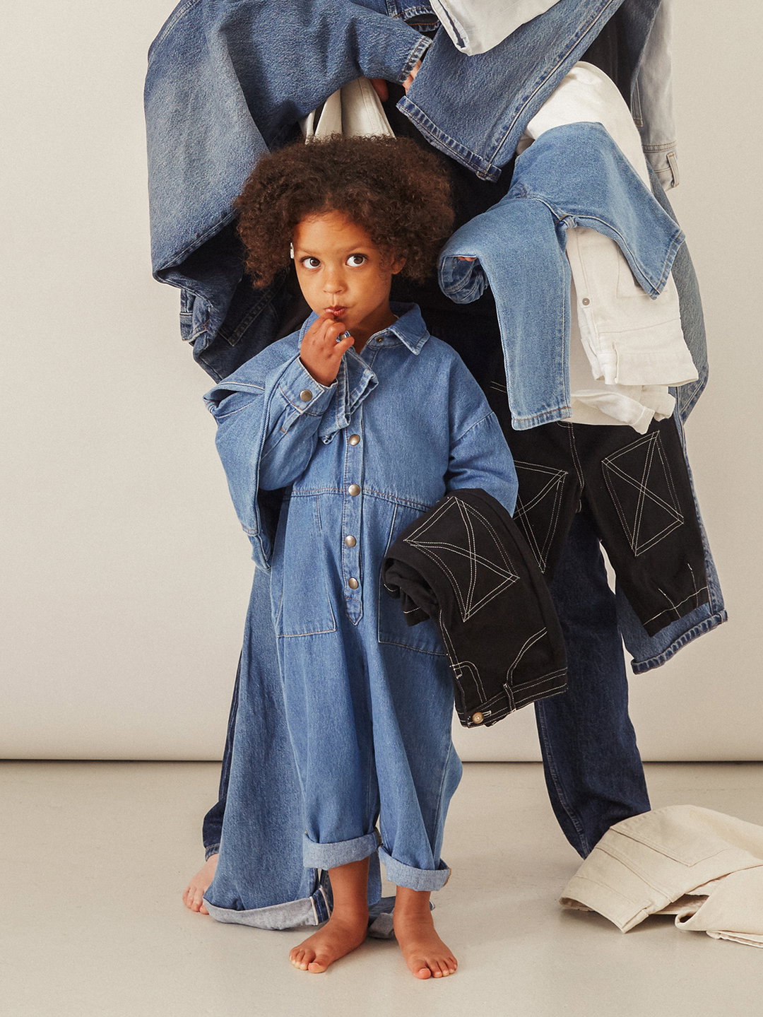
Euclid Circular from Swiss Typefaces was employed to give the identity a “friendly and clean appearance”. It also features minimal brand colours – black, white, warm greys and a hint of “sunset orange” – utilised to complement the clothing. The brand photography for Or is focused on fun and warmth. Bliss Staple, the founder of Or, headed the photography and states: “We were after a playful energy paired with a minimal, modern set and styling, giving a nod to our brand aesthetic while also capturing the fun that kids naturally bring to a shoot.” Through photographer Leonie Freeman, art director Hannah Coates and studio Too Young Too Simple, the final photographic result shows kids just being kids.
GalleryStudio Parallel: Or (Copyright © Or, 2022)
Hero Header
Studio Parallel: Or (Copyright © Or, 2022)
Share Article
About the Author
—
Liz (she/they) is the senior editor at Insights, a research-driven department within It’s Nice That. They previously ran the news section of the website. Get in contact with them for potential Insights collaborations or to discuss Insights’ public-facing reports.