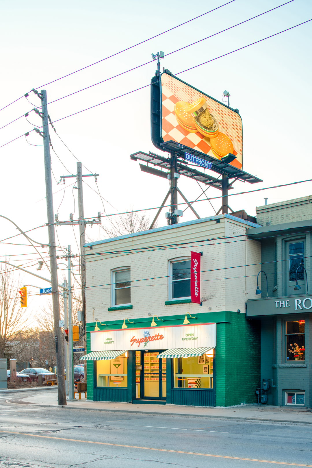
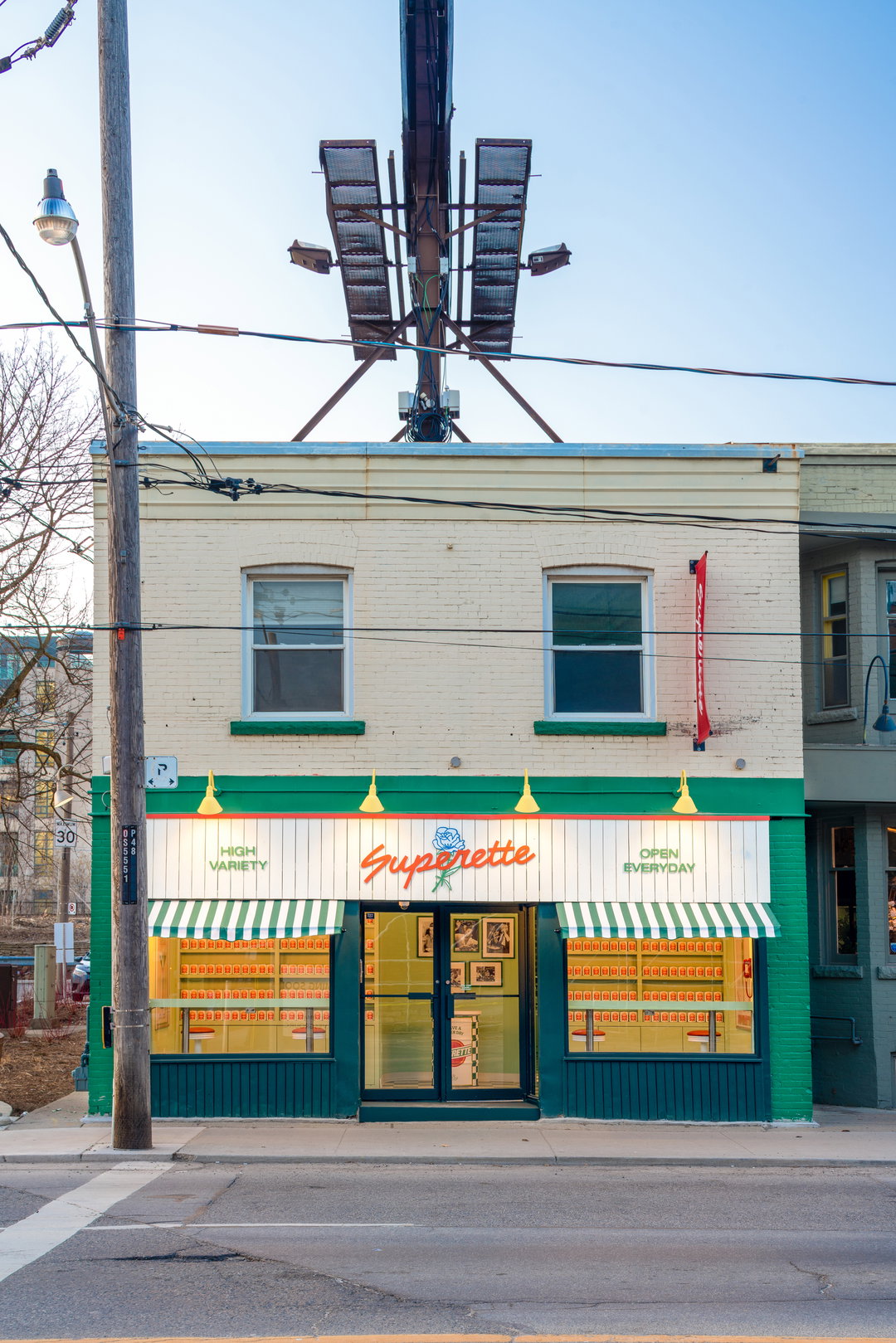
Superette’s new cannabis shop is designed to feel like a traditional deli with gastronomical branding
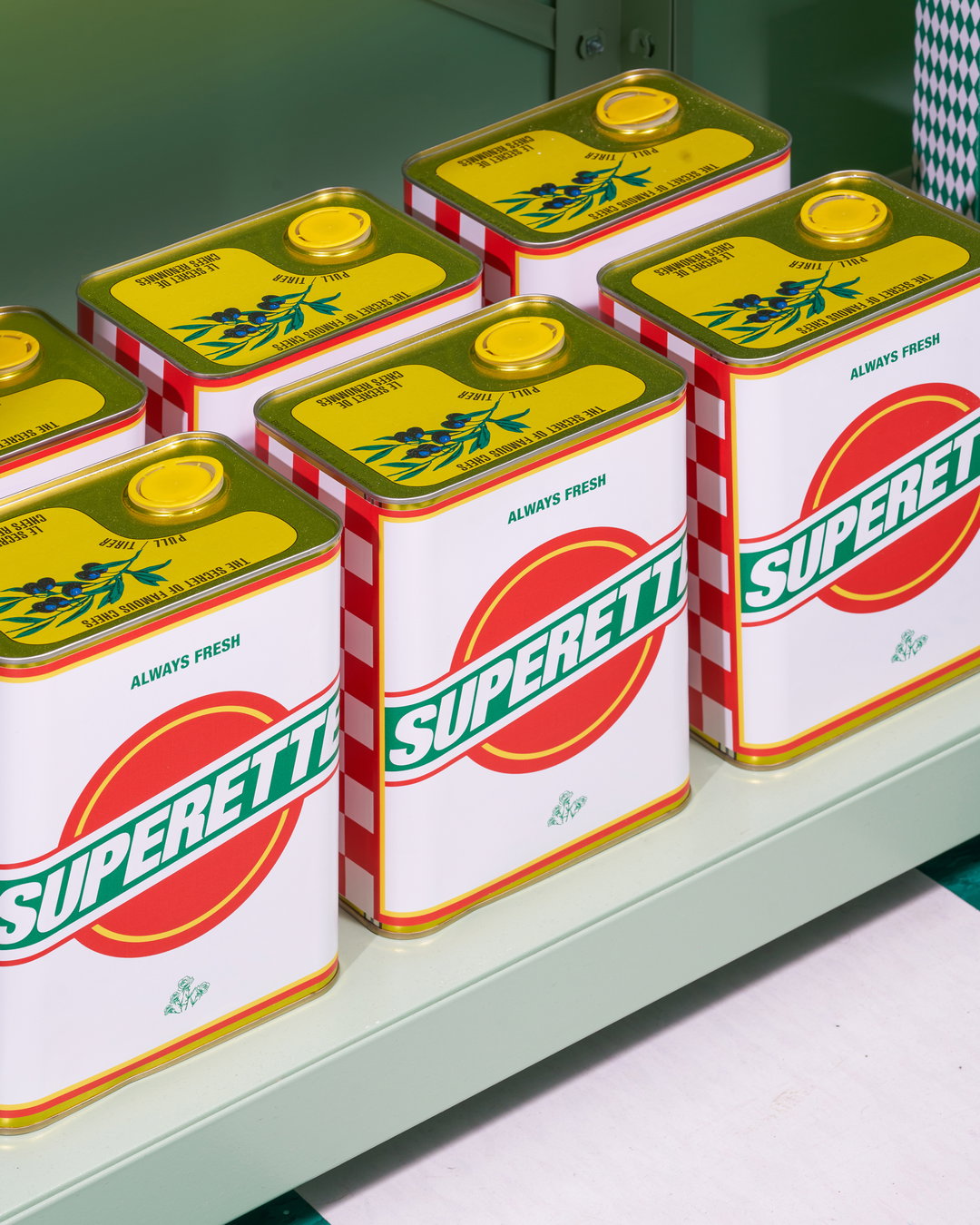
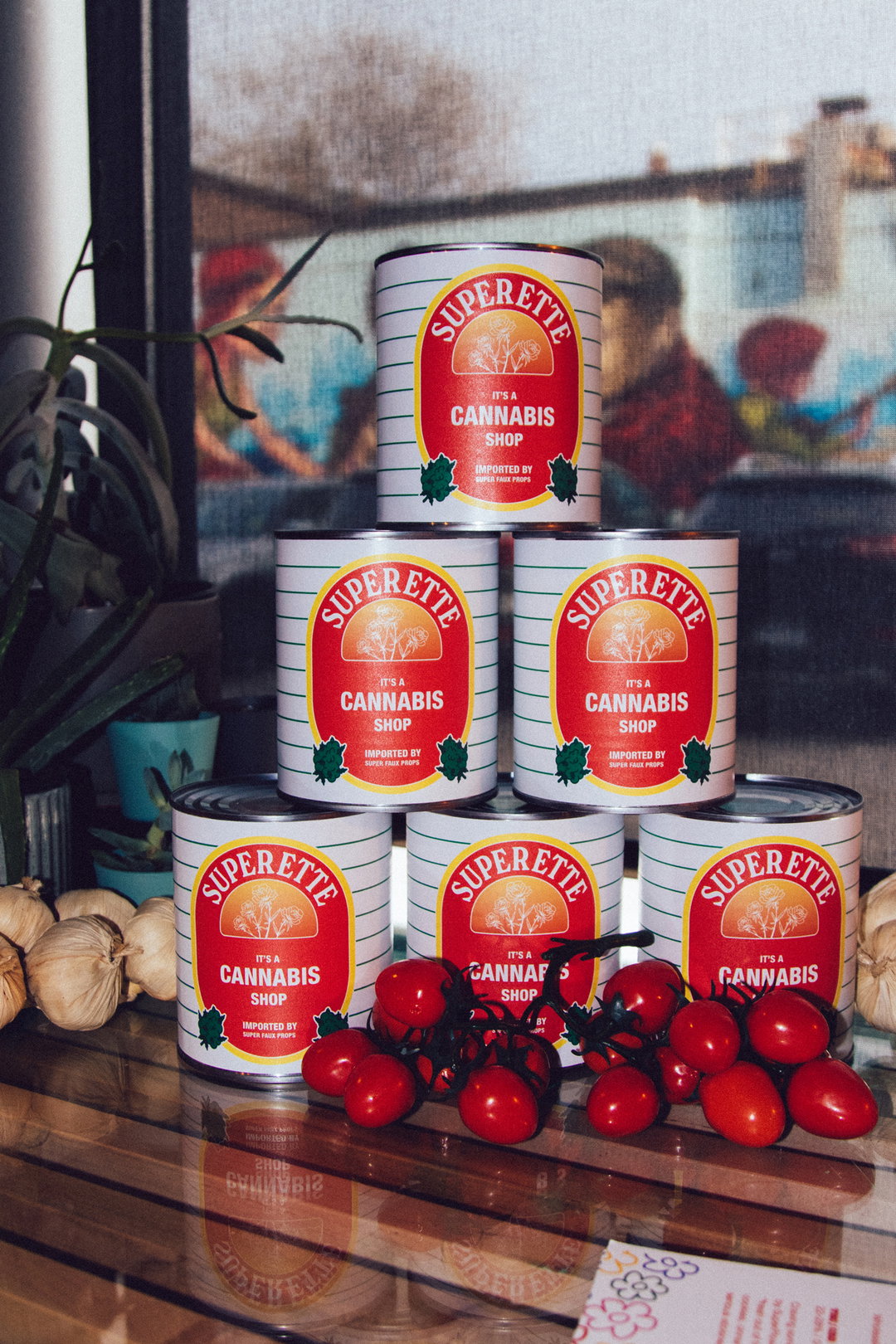
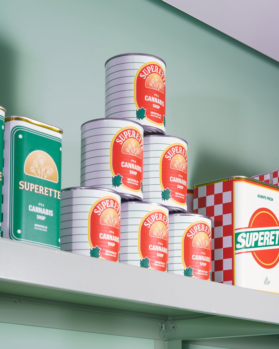
From Rega Tomato can labels to Genco olive oil packaging, The Annex builds its brand DNA on classic Italian deli aesthetics and hand-drawn fonts.
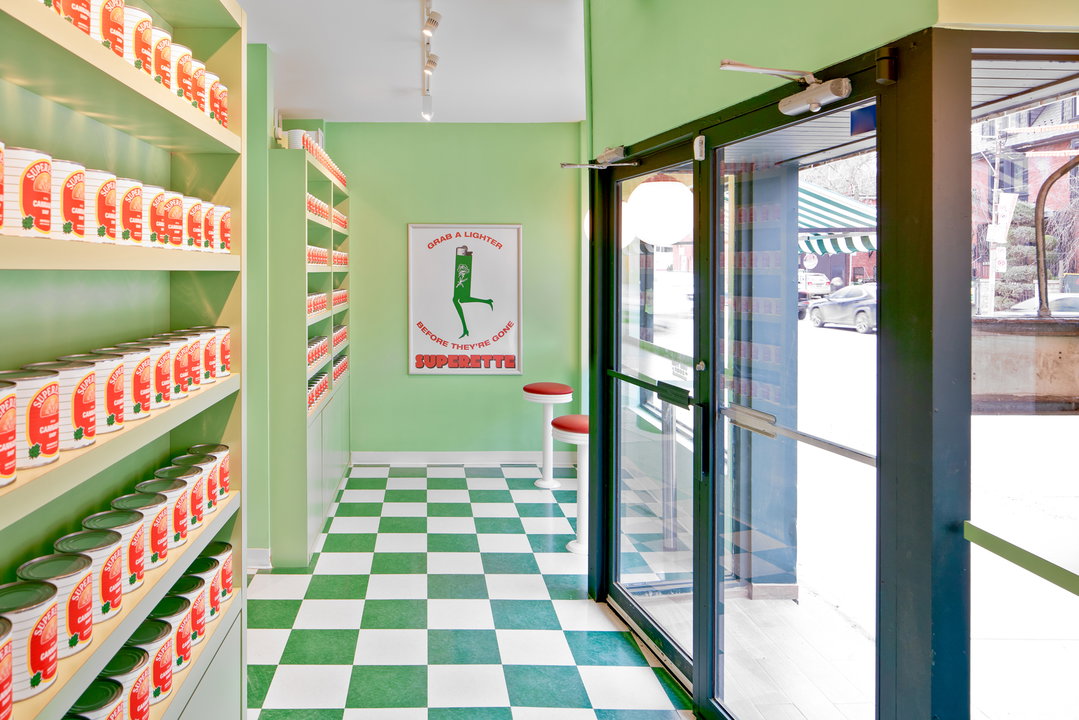
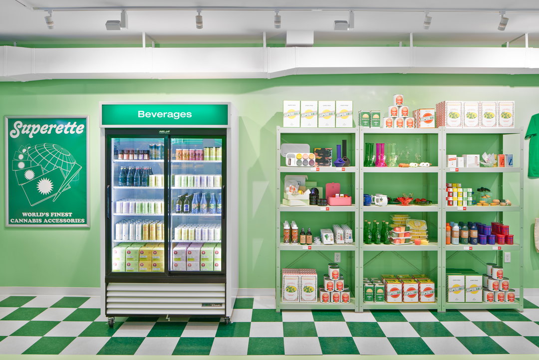
When discussing what inspired The Annex, Superette’s new cannabis dispensary Emily Robin, interior designer on the project, says it started how all great parties do: “with cheese!” With The Annex, Emily hopes to evoke the experience of walking into a cheese shop and picking out products from behind a glass counter; as touching cannabis products pre-purchase is prohibited in Canada, the dispensary has been designed to embrace the deli experience. To bring this immersive concept to life, the branding and product design throughout The Annex reflects exactly what you would expect of the inside of a deli: food.
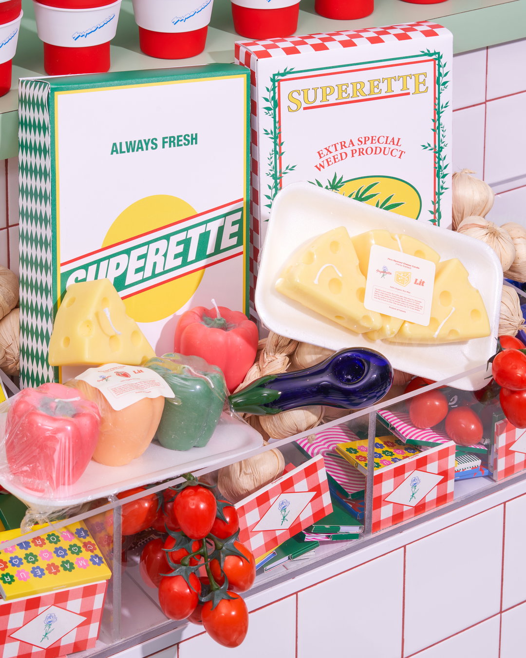
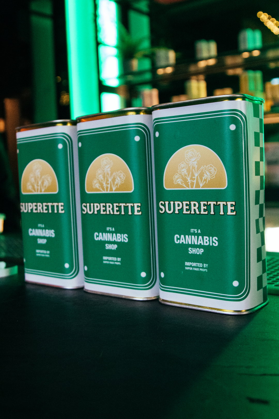
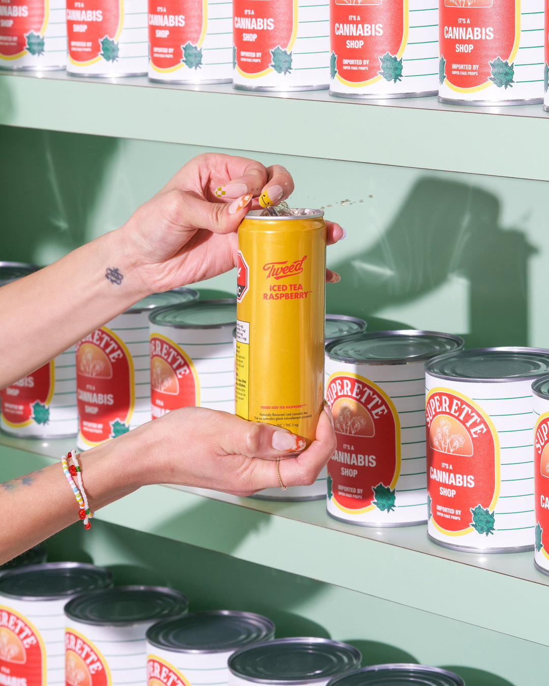
Paying particular attention to canned goods, posters, brand moments and product packaging in The Annex references a myriad of vintage gastronomical products. Alex Cirka, Superette creative director explains: “We found visual references that spanned many food and drink related ephemera such as ads from Martini (the brand, not the cocktail), Rega Tomato can labels, Genco olive oil packaging, Raos restaurant in NYC for its celeb photo wall, clothing/packaging by fashion brand Fiorucci and so many other points of influence that we pulled along the journey.”
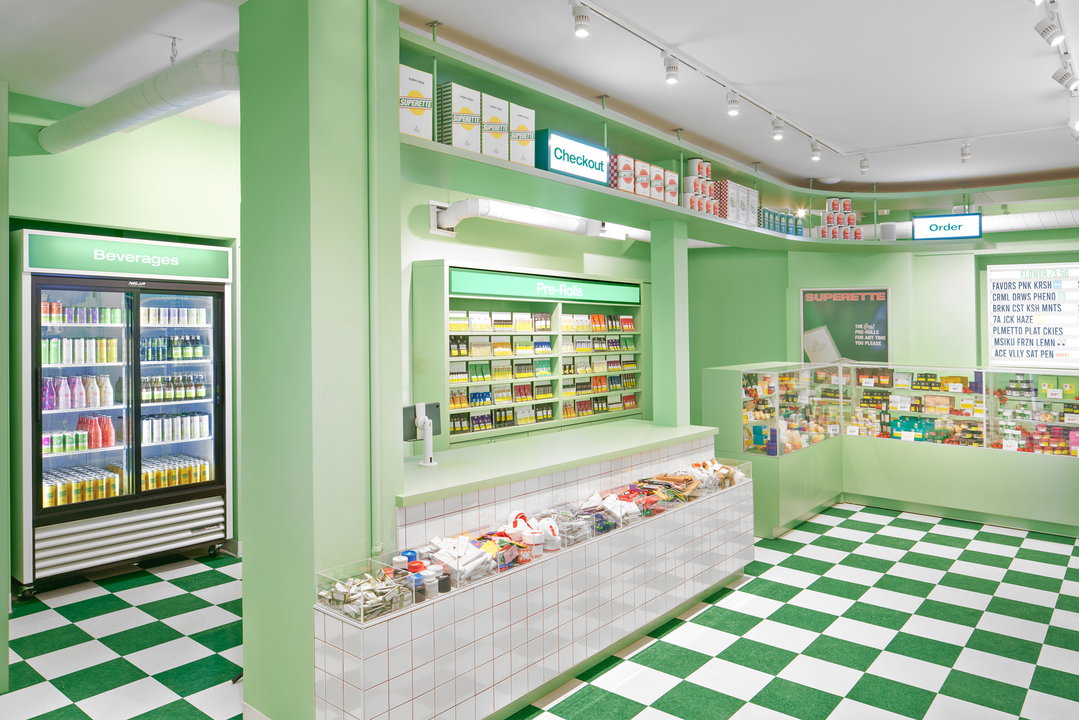
Superette: The Annex (Copyright © Superette, 2022)
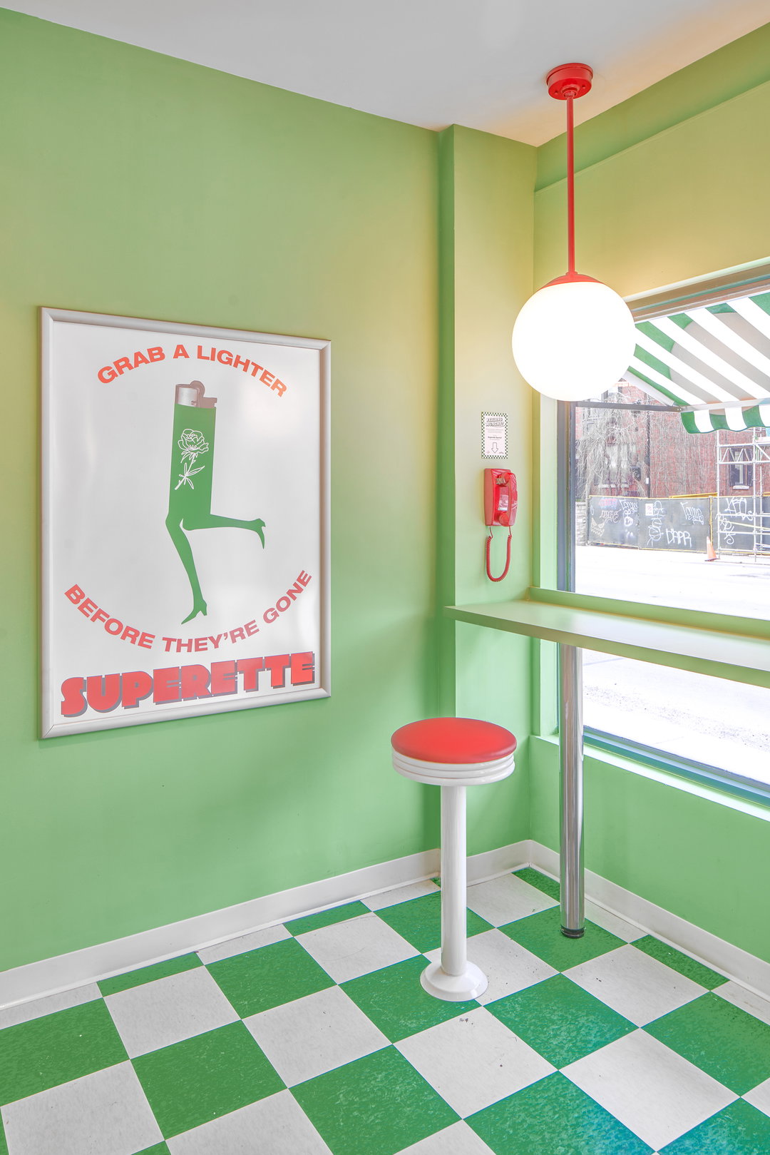
Converting these influences into the branding touchpoints, Superette carried out a fascinating archival design process. The design team looked to recreate “typefaces relevant to classic Italian retro aesthetics”, in some cases redrawing these letterforms by hand to extract “since those fonts were never digitised and remain frozen in time.” The same reference points translate to a colour palette of green, white, red, and hints of golden yellow, utilised to suggest deli rather than diner or cafeteria – the basis of some of Superette’s other concept stores.
As for the dispensary’s interior, Emily was driven by a singular thought: “If [cannabis] is fun to consume it, shouldn’t the store look fun too?” Creating custom-designed props and a host stand in the form of a giant tomato can, Superette aims to de-stigmatise cannabis consumption by keeping the storefront interactive and open. Aiming to offer an experience that suggests tactility, Superette hopes the store will mimic shopping in the supermarket, surrounded by shelves full of products.
The Annex is the first of three Superette openings slated for 2022; it will be the brand’s seventh location.
GallerySuperette: The Annex (Copyright © Superette, 2022)
Hero Header
Superette: The Annex (Copyright © Superette, 2022)
Share Article
Further Info
About the Author
—
Liz (she/they) is the senior editor at Insights, a research-driven department within It’s Nice That. They previously ran the news section of the website. Get in contact with them for potential Insights collaborations or to discuss Insights’ public-facing reports.