




The story of the Toys “R” Us rebranding that never saw life
Lippincott: Unrealised Toys “R” Us rebrand
As kids, we were all fascinated by toy shops. Whether Hamleys or the Disney Store, Toymaster or Games Workshop, toy shops were worlds in which we could get lost on a Saturday afternoon. Plastic-windowed boxes containing Lego blocks, Sylvanian families, Buzz Lightyear, Barbies and Polly Pocket lined the shelves that towered above our wandering, miniature frames.
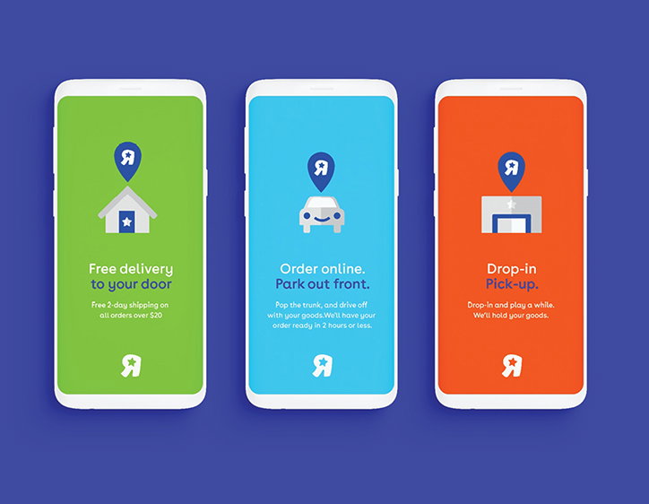
On September 19, 2017, Toys “R” Us filed for bankruptcy; in March 2018 it liquidated all U.S. stores. It is no secret that brick-and-mortar retailers have been struggling since the online revolution. Busy parents are less willing to make the trip to their local high street, turning to Amazon Prime for a smooth delivery and no (less) tantrums. Google has replaced grandparents, and with a click of the mouse, a digital fairy-godmother provides all.
In the six months leading up to the companies liquidation, the creative consultancy Lippincott connected with Carla Hassan and Lee Walker, creative director at Toys “R” Us. In an attempt to refresh the company before it was too late, the consultancy created a rebrand that never saw the light of day. Now when we look at it, we cannot help but wonder, what if? Perhaps this nostalgic remodelling would have encouraged “Parennials” (Millennial parents) to remember their past, bringing Toys “R” Us out from amongst the dust.
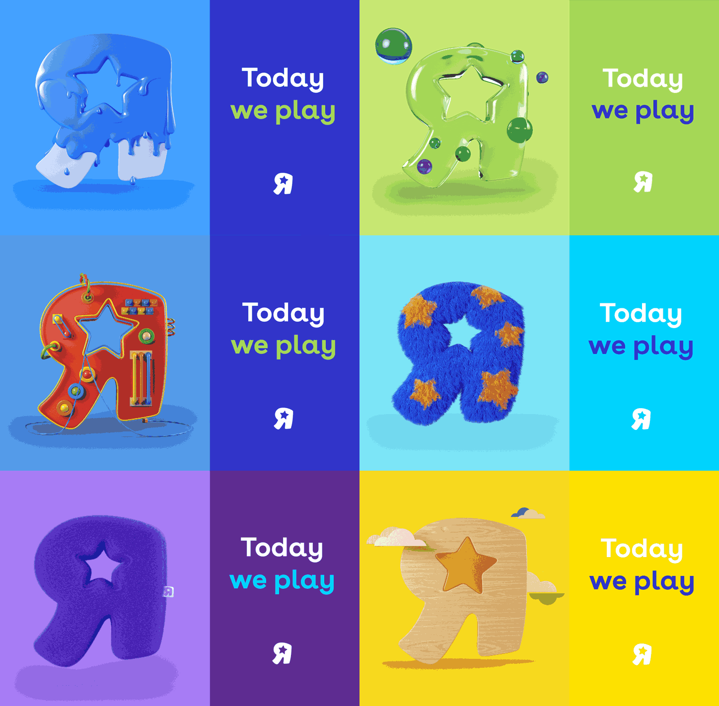
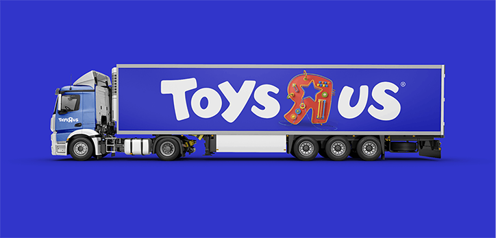
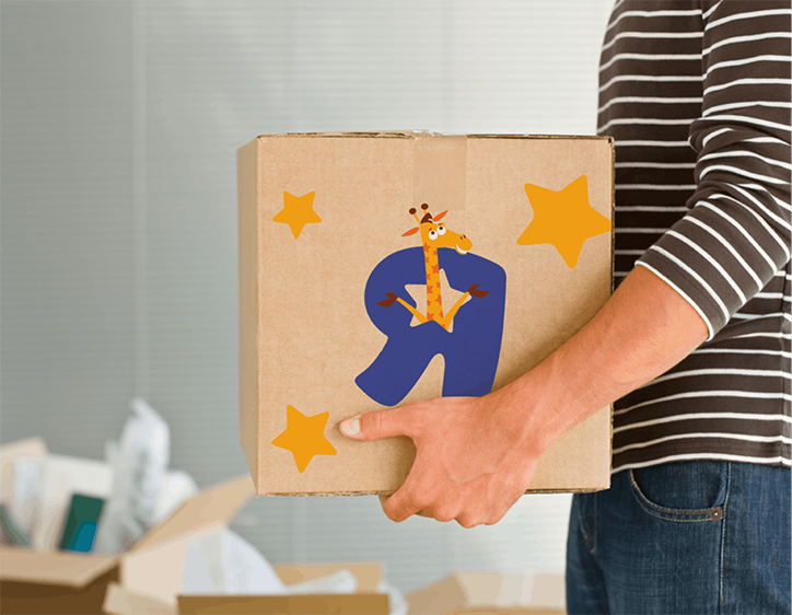
“For our Toys “R” Us reinvention to be successful, it would have to break through and connect with these new parents in a way no other stores had”, Lippincott comments. “We realised the nostalgic affinity we had with the brand started with the backwards R. To us, the childlike “R” personifies the whole idea of play; so we reclaimed it”.
The “R” became the shining beacon, the torch at the front of the rebranding. It could change under any context: first a wooden block, then a furry cushion, then getting splashed with paint, bubbles or fluff. The logo was reimagined with a child-like playfulness. It felt imaginative again.
“We also explored how we could infuse this new energy into Babies “R” Us”, comments Lippincott. “We modernised the brand with a bold new colour palette that broke down the stereotypes of blue and pink”. By choosing a gender-neutral purple, the creative consultancy pushed the company into a utopian future. However, unfortunately, it was one that was unattainable and unrealisable. We can only daydream about the branding that never came to be.
Lippincott: Unrealised Toys “R” Us rebrand
Lippincott: Unrealised Toys “R” Us rebrand
Lippincott: Unrealised Toys “R” Us rebrand
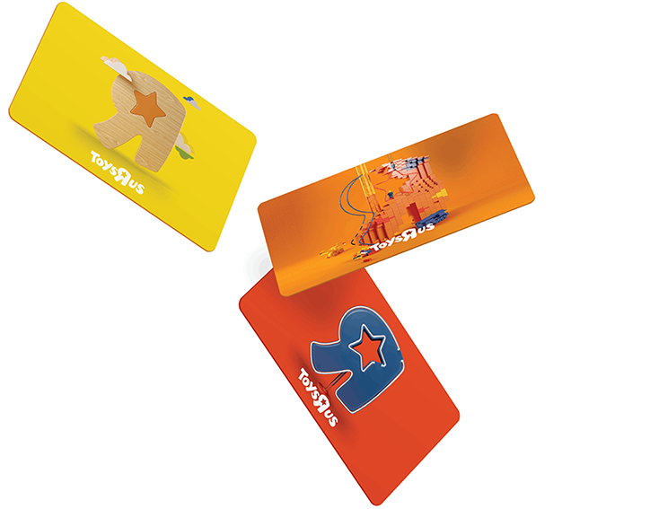
Lippincott: Unrealised Toys “R” Us rebrand
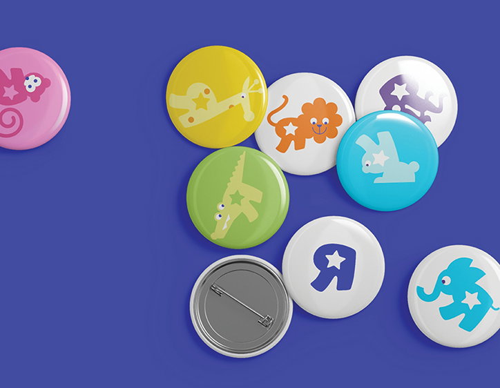
Lippincott: Unrealised Toys “R” Us rebrand
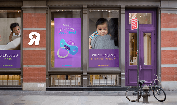
Lippincott: Unrealised Babies “R” Us rebrand
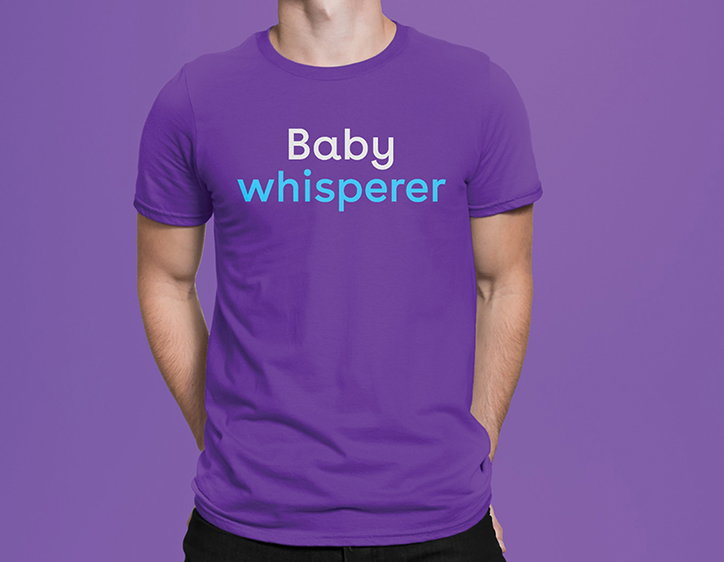
Lippincott: Unrealised Babies “R” Us rebrand
Share Article
Further Info
“www.lippincott.com/insight/toys-r-us/”

