




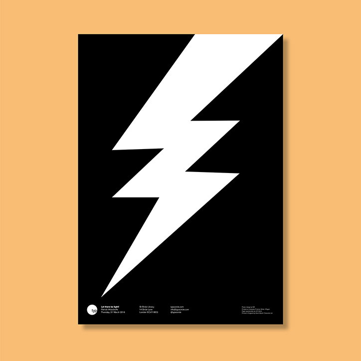
Typographic Circle celebrates its 40th anniversary with a new identity and London exhibition
This month Typographic Circle will launch a new identity as it celebrates its 40th anniversary this year. The identity, designed by Studio Sutherl& and NB Studio will appear on a publication that charts the history of the volunteer-run organisation that was founded as The Type Directors Club by Maggie Lewis in 1976. “The new logo has been crafted by typographer Bruno Maag of Dalton Maag to emphasise the ‘o’ in Typo and to visually reflect a circle,” says the organisation.
The anniversary will be accompanied with an exhibition of posters by designers who have presented at the TypoCircle events over the years, with work by the likes of Alan Kitching, Jonathan Barnbrook, Marina Willer and Snask on display. The accompanying large format book comprises of three sections of varying sizes including an essay Lynda Relph-Knight and research by designer and design educator Sallyanne Theodosiou.
“The Typo Circle is a unique organisation, run by volunteers who are responsible for an envious curation of talks, events and publications,” says Alan Dye of NB Studio, current chairman of TypoCircle. “The committee and I are very excited to launch our new logo, fantastic case history book and exhibition celebrating the past 40 years, but more importantly opening up a new and exciting future for The TypoCircle.”
John Bateson, president of TypoCircle adds: “The researching and the making this book has just shown us what a unique and remarkable history we have. We are all so enthusiastic to share, promote and just talk about all the great ideas out there now and also those that push at the boundaries of communication. So a great new start to the next 40, or dare I say it, 80 years.”
The exhibition will run at Protein Gallery, London from 21 – 23 October. For more details click here
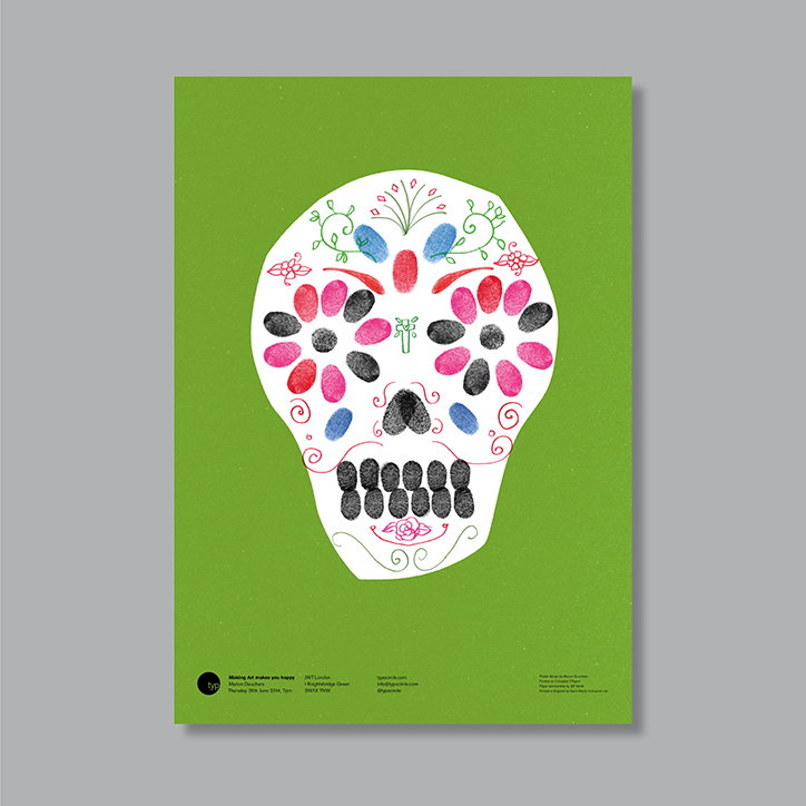
Marion Deuchars: Typographic Circle
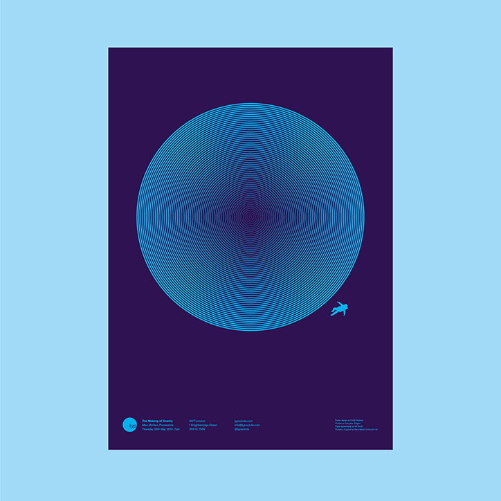
Mike McGee: Typographic Circle
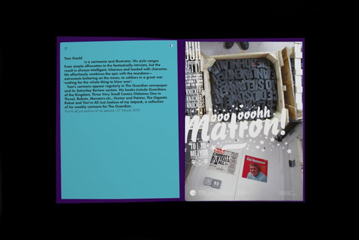
Studio Sutherl& and NB Studio: Typographic Circle
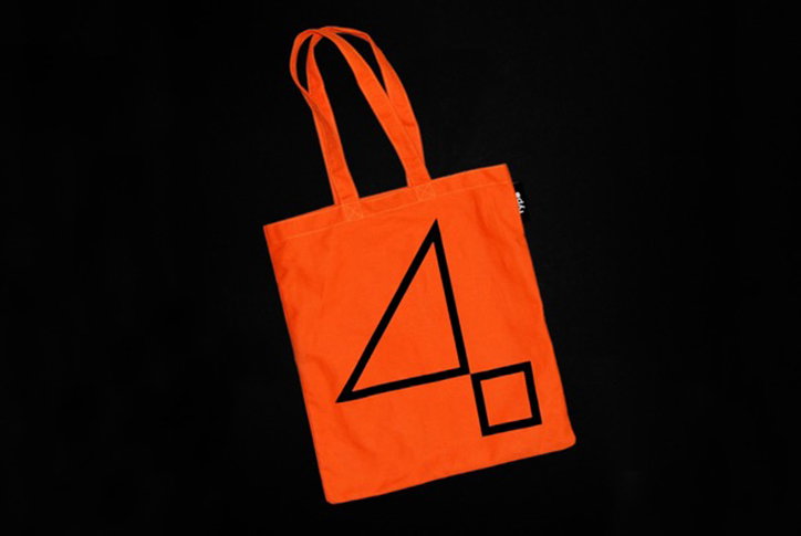
Studio Sutherl& and NB Studio: Typographic Circle
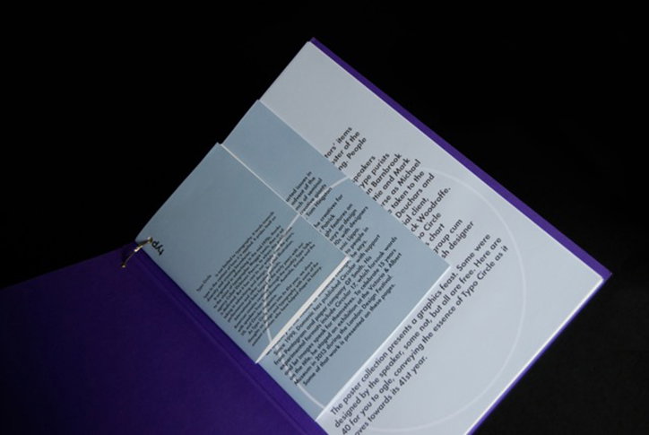
Studio Sutherl& and NB Studio: Typographic Circle
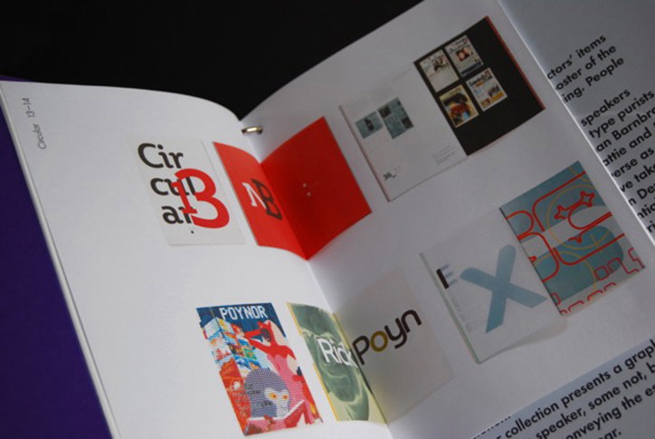
Studio Sutherl& and NB Studio: Typographic Circle
Share Article
Further Info
About the Author
—
Owen joined It’s Nice That as Editor in November of 2015 leading and overseeing all editorial content across online, print and the events programme, before leaving in early 2018.
