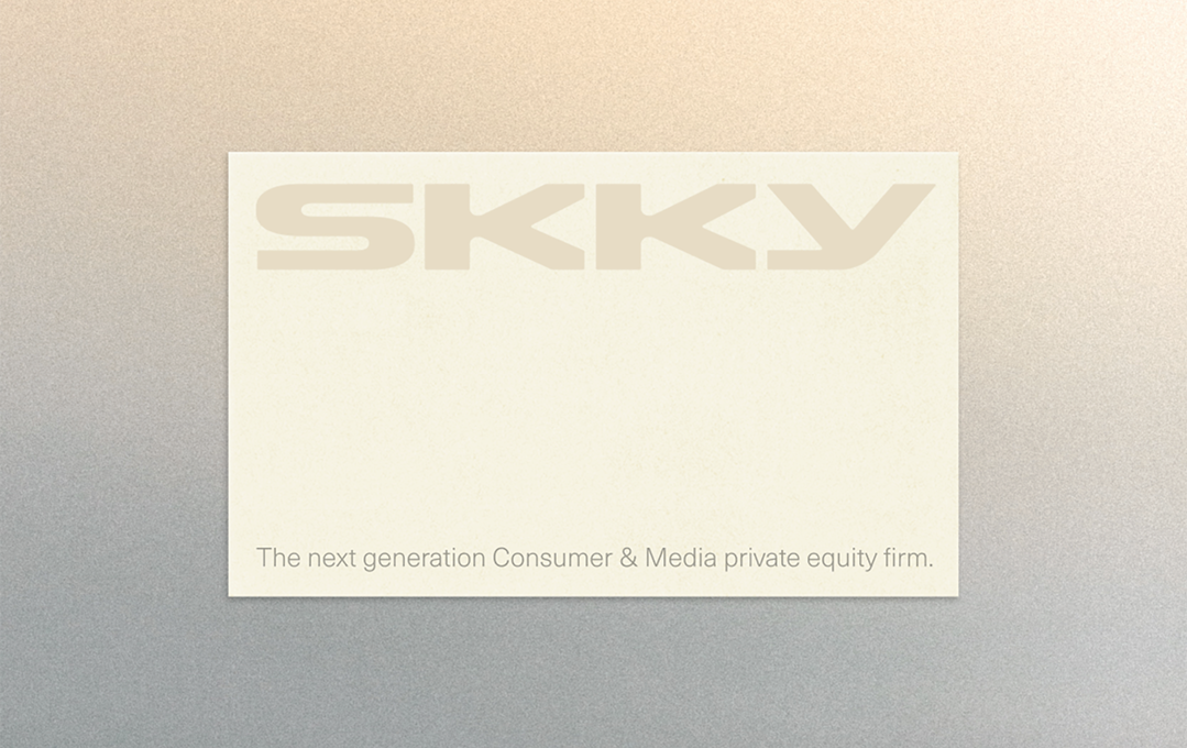
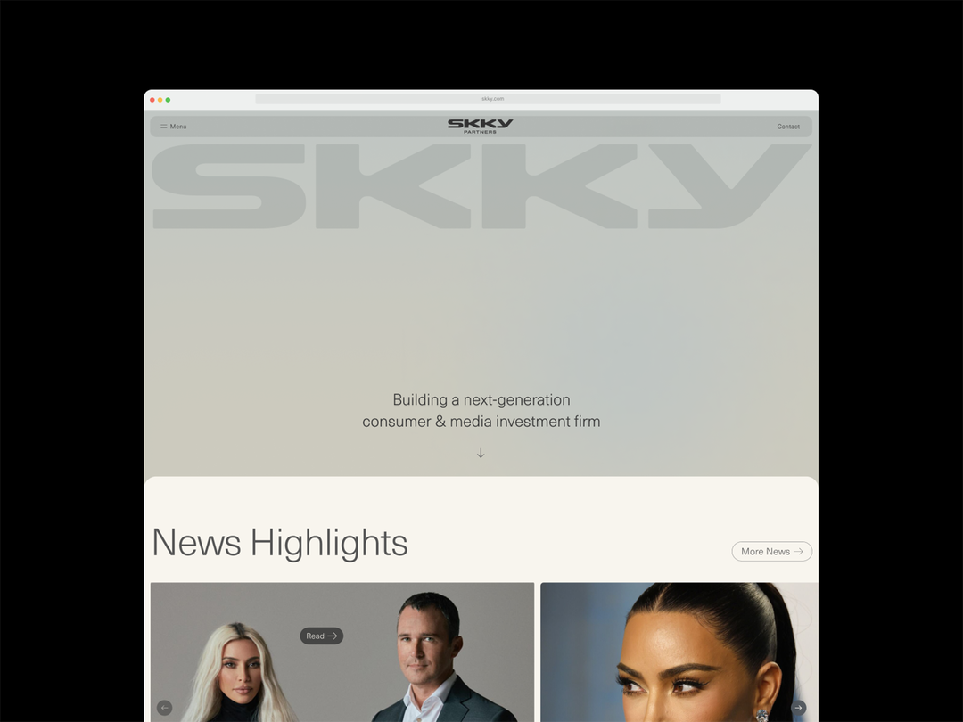
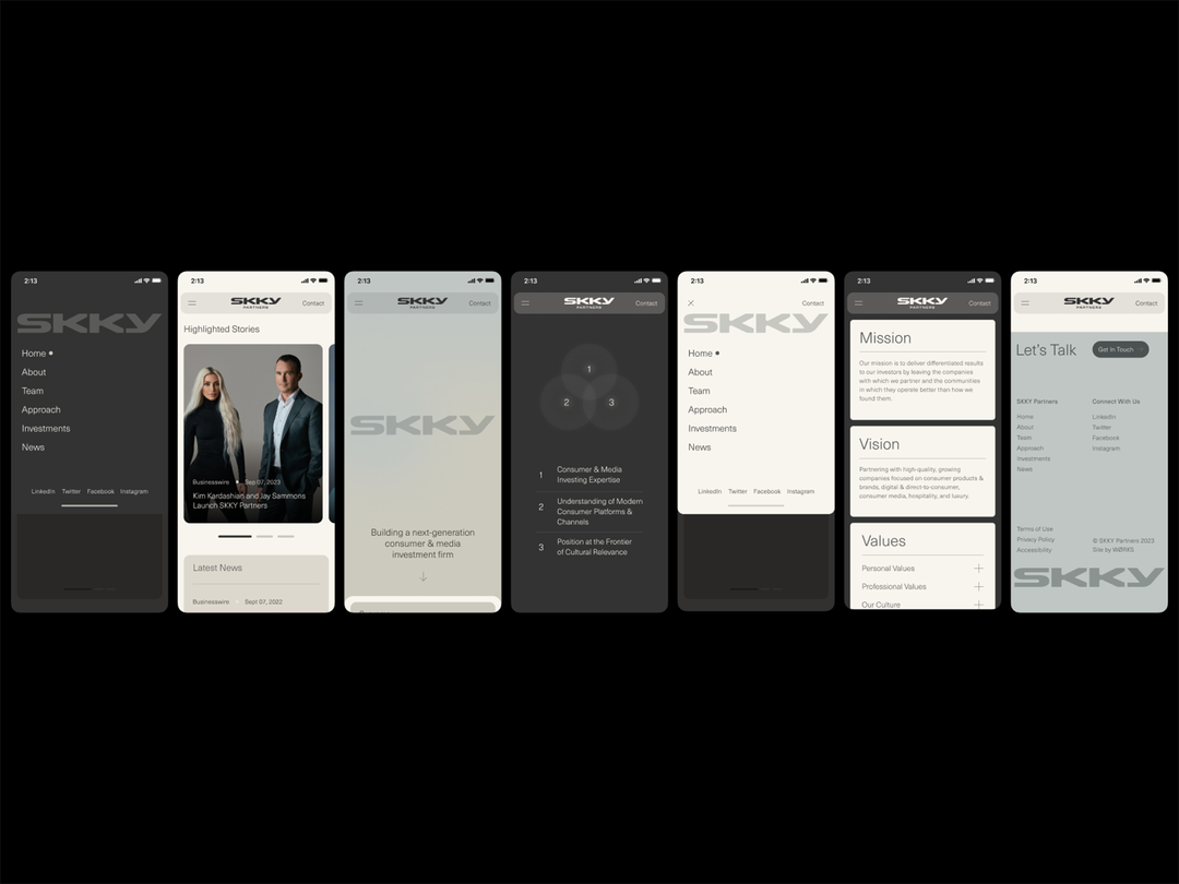
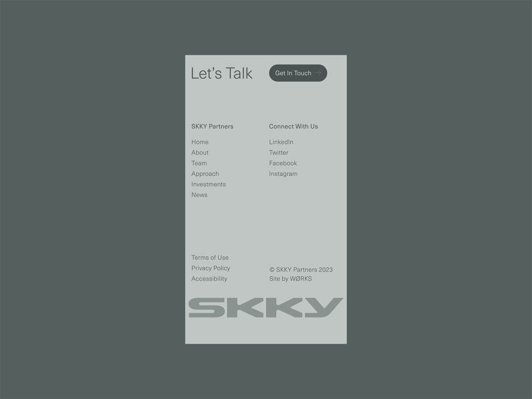
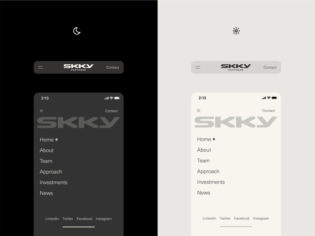
The New York studio Wørks has unveiled a first glimpse at the brand face for Skky, Kim Kardashian’s new private equity firm with Jay Sammons (who was a partner at the private equity fund Carlyle for 16 years). “Slightly futuristic” is how Wørks describes the wordmark developed for this venture, indicating a level of lightness. But it needed to convey “a level of trust endemic to the private equity space” too, says Wørks co-founder and CD Haris Fazlani.
Herein lies the challenge for the studio: creating a brand that would stand up next to other investment institutions and keeping with the personal style Kim has already transposed onto brands like Skkn and Skims.
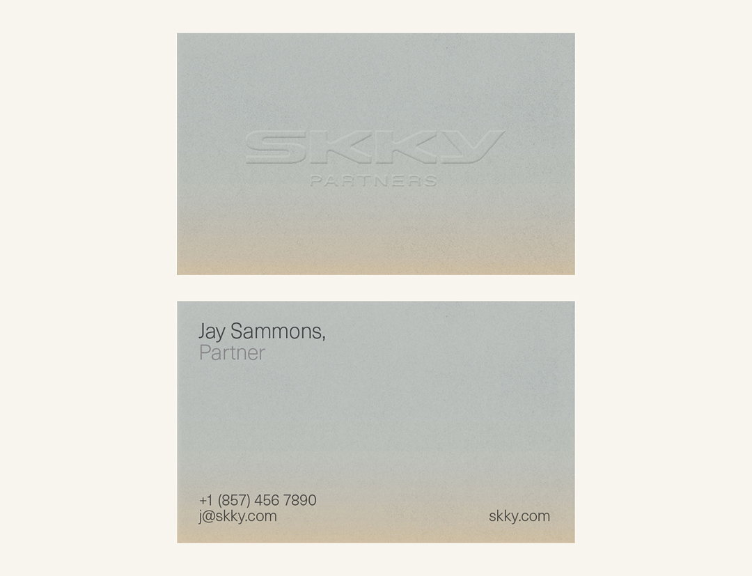
So what elements of the Kim K aesthetic are preserved? There’s the earthy tones and pared back minimalism we’ve come to know well. According to Wørks, the subtle gradients actually come from the patinas found on art and furniture in Kim Kardashian’s home – an interior story we’ve all followed for a while, thanks to Architectural Digest, then Vogue.

Wørks: Skky (Copyright © Wørks, 2023)
Another concept behind the brand was the idea of a gallery. “Skky would serve as a gallery of sorts, housing and elevating the brands within, facilitating their growth. This very human approach to investing felt in line with Kim’s existing brands – so we sought to bring this idea to life by making the brand feel as physical as possible.” Despite the coolness of the tones, warmth and humanity were important considerations for the studio.
Wørks says the Skky identity will act as an essential element in the mission of the firm, in that it can show potential partners its proven ability to create a “beautiful brand” itself. One of the first clients Skky has expressed interest in is the luxury truffle condiment brand, Truff.
GalleryWørks: Skky (Copyright © Wørks, 2023)
Hero Header
Wørks: Skky (Copyright © Wørks, 2023)
Share Article
Further Info
About the Author
—
Liz (she/they) is the senior editor at Insights, a research-driven department within It’s Nice That. They previously ran the news section of the website. Get in contact with them for potential Insights collaborations or to discuss Insights’ public-facing reports.