





Zoopla’s rebrand visualises the “twists and turns” of buying a home
Co-created by brand consultancy Zag and the property platform’s in-house team, the new identity features a new word mark, typeface and graphic system based on the idea of “journey lines”.
Share
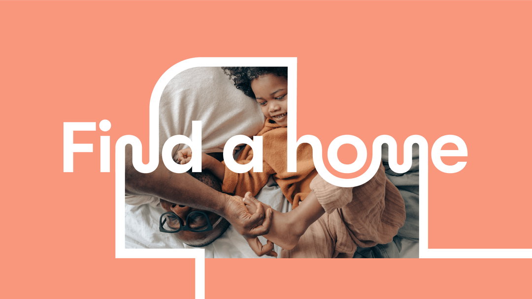
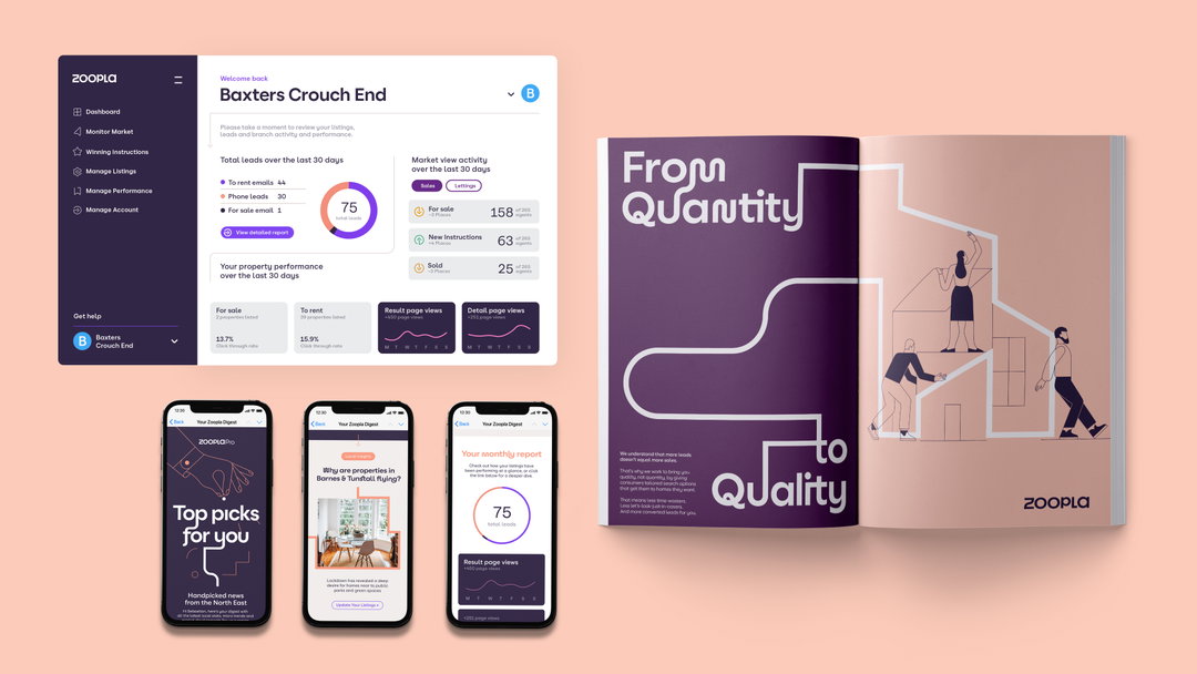
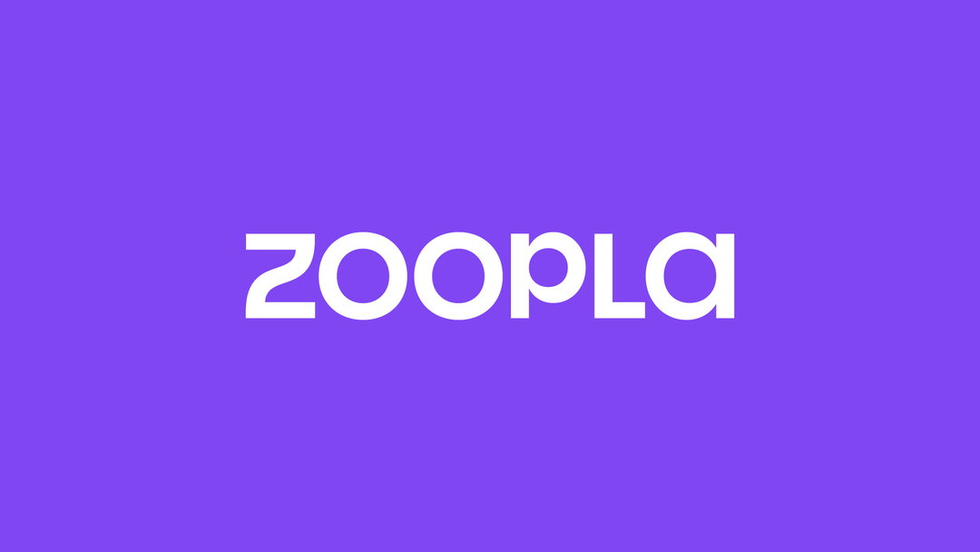
Property portal Zoopla has revealed a huge rebrand developed by its in-house team together with brand consultancy Zag. Its first major visual overhaul since launching in 2007 sees the brand change everything from its word mark to approach to illustration and motion design (while keeping its signature purple), all formed by a concept the team refers to as “journey lines”. This graphic device is literally a ribbon running through the identity, forming ligatures in typography and weaving through illustrations and infographics, to symbolise the fact that “moving home is never as simple as A to B”.
Zag design director Dan Green says the “journey lines” concept shows that Zoopla “understands the complexity of the home buying process. It’s full of twists and turns, welcome surprises and not-so-welcome-ones, rational decisions and emotional gotta-make-it-happens that change someone’s direction completely”. The winding lines are a “connecting thread” through the brand, joining letterforms in unexpected ways, acting as a frame or signpost in imagery, and zipping through animations to bring the brand to life.
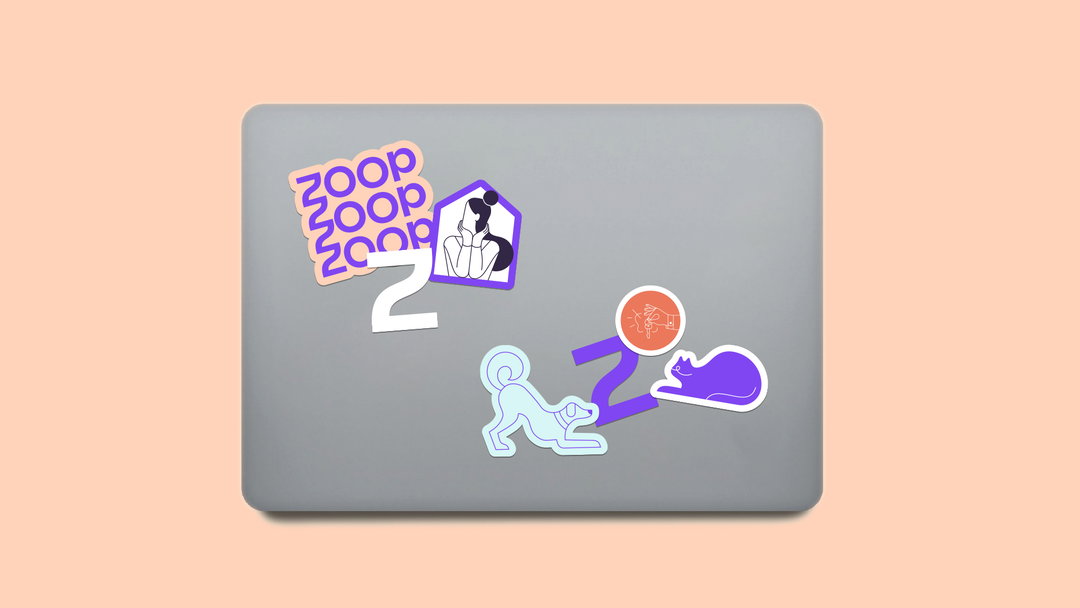
In the illustrations, created in collaboration with Anya Derevyanko, the “journey lines” make a primary path that form the basis of the illustration, Green explains, which is extrapolated with secondary thinner lines that form the details. “Building them this way enables them to become direct extensions of the journey lines, and helps give them a visual style that can be genuinely unique to Zoopla,” he adds. Motion graphics have been given consistent animation behaviours: “smooth moves, quick redirect and our graphic pings and pops,” Green describes, which help the brand move quickly between assets, and make the whole identity feel like an “exciting journey”.
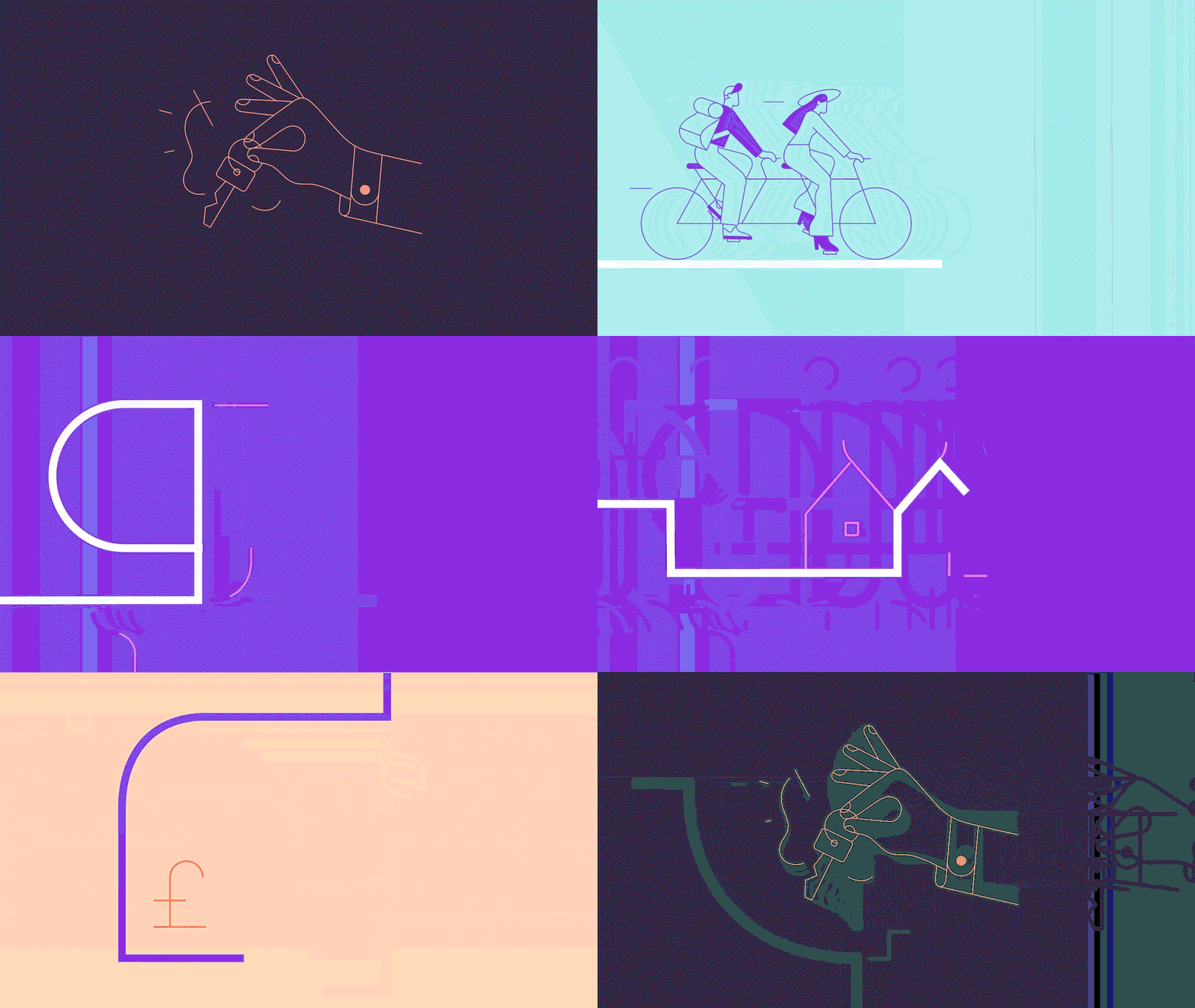
Zag: Zoopla rebrand (Copyright © Zoopla, 2021)
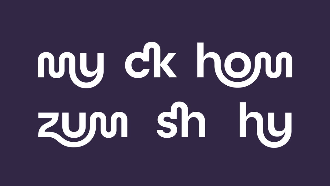
The typeface developed with foundry Family Type was designed to be flexible, “with different levels of expression that can be dialled up or down,” explains Zoopla design lead Gabriel Weichert. “At its most expressive level, it has a fully animated character set that really brings to life the journeys and connects dynamically to the design system. On the opposite side of the spectrum it is a highly accessible typeface that we will be using across all our digital platforms.” The foundry helped pushed the concept so it could connect in interesting ways, creating a character set with unique ligatures and alternative characters to connect graphic elements, plus various connecting pieces.
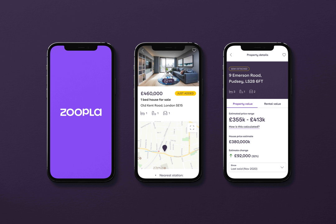
The whole design concept was borne from research done by Zag to rethink Zoopla’s entire customer value proposition – ie. what the brand is promising the consumer will get out of using its product. Research showed that at any stage in the home-buying process, consumers are “constantly balancing rational and emotional thinking”. So the new CVP, and in turn the brand identity, aims to show understanding of the peaks and troughs and unexpected diversions on their customers’ journeys. A big part of Zoopla’s revamp is a host of new features on its site and app, the key one being My Home – a new digital hub for homeowners which offers insight and information for their home-buying process.
The rebrand and new features are all part of Zoopla’s huge investment in staying at the cusp of the property market. When it launched in 2007, “it was the original prop tech disruptor,” says Zag executive creative director Neil Cummings “but since then the market has caught up”. So the brand needed to evolve, but do so with “that human spirit, joy, warmth and playfulness that the competitors don’t have,” Cummings adds. The renewed brand helps introduce customers to the new features and innovations, he explains, and keep them engaged, “retaining a brand that is full of personality, wit and playfulness,” and bringing back “the joy and excitement,” in moving home.
The new identity and features are being rolled out from spring 2021.
GalleryZag: Zoopla rebrand (Copyright © Zoopla, 2021)

Hero Header
Zag: Zoopla rebrand (Copyright © Zoopla, 2021)
Share Article
Further Info
About the Author
—
Jenny oversees editorial output across It’s Nice That. Get in touch with writing pitches for features or opinion pieces, big creative story tips, or questions about all things editorial. [email protected]
To submit your work to be featured on the site, please see our Submissions Guide.

