Exploring the treasure trove that is 2wice’s online visual archive by Pentagram’s Abbott Miller
A new website celebrates the designer’s 30 years of magazines for the esteemed arts foundation, with 700 images digitally preserved and explorable for the first time.
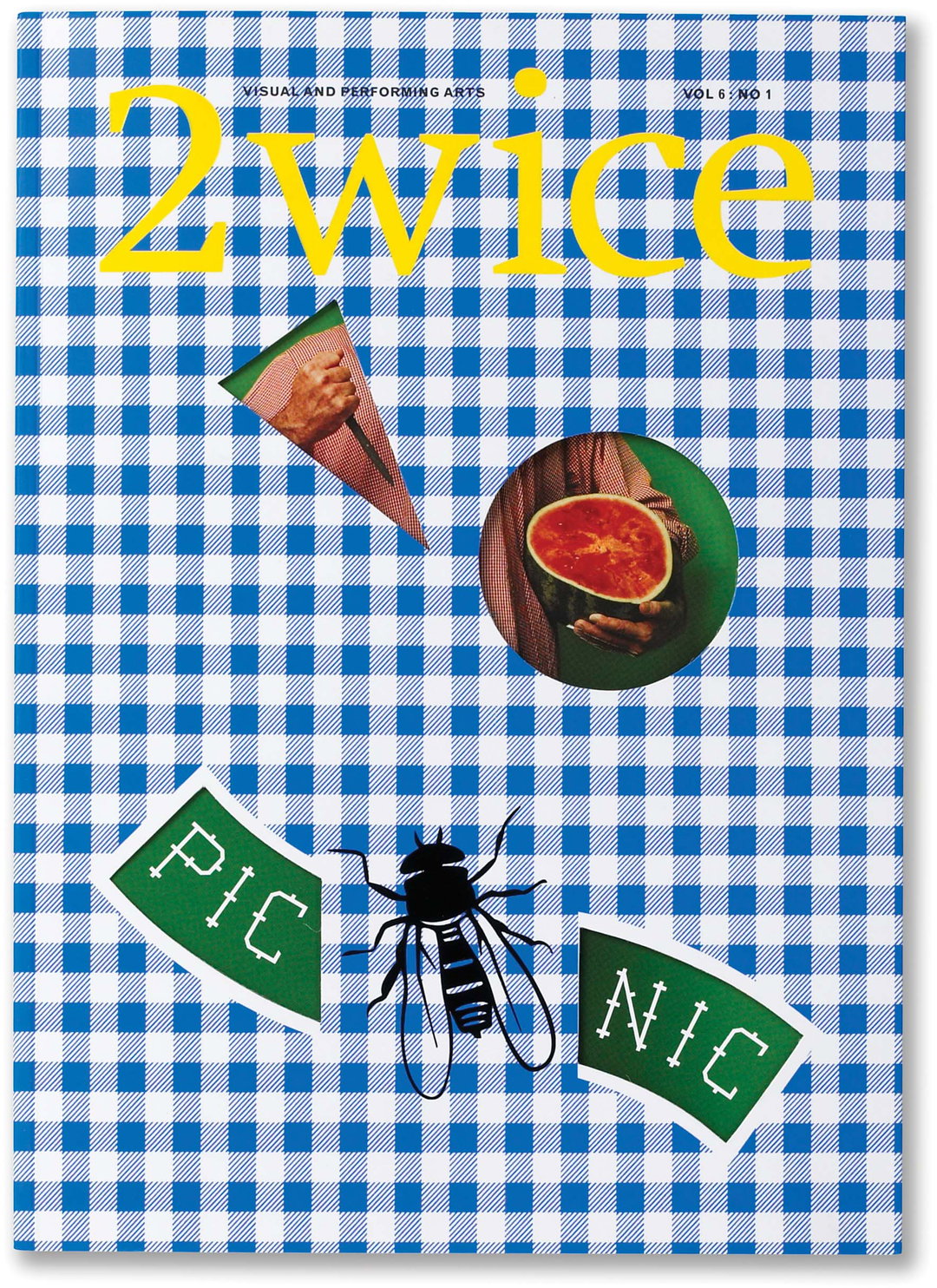
For 30 years, Pentagram partner Abbott Miller has collaborated with New York’s 2wice Arts Foundation and its founder Patsy Tarr to create magazines as a physical record of the ephemerality of dance. In the pages of Dance Ink (1989-1996), the NYC arts scene of the 80s and 90s was celebrated, and then in 2wice magazine (1997-ongoing) the remit expanded to become a journal of visual culture. These titles were pioneering in design, predating the indie magazine boom that followed, each issue completely different in theme, design and typography. They also featured photographic collaborations with the likes of Martin Parr, Christian Witkin, Duane Michals and Martin Schoeller, among many others over the decades.
Now at an important milestone in the longstanding relationship between Miller and the foundation, the graphic designer and his team have developed a new website for 2wice that explores in-depth its history and treasure trove of visual work. Featuring over 700 images from the magazines’ run, the process saw all the old issues rephotographed or rescanned to digitally preserve them in tact, now explorable by date, choreographer, photographer and artist. Serving as an archive and a new platform for 2wice to move forward in its digital content, the site honours its heritage as well as its firmly sustained place at the forefront of the NYC arts scene.
“It was a little uncanny,” Abbott tells It’s Nice That of the process of going through the archive for this project. “Like assembling family pictures and realising you lost touch with people that you had so much involvement with.” In Dance Ink, the photography was mostly printed in black-and-white, often with duotone printing, so the issues “are really hard to place in time,” he adds. “[It] makes you think they could be from the 1940s or 50s. There is some weird slippery sense of time to those issues.”
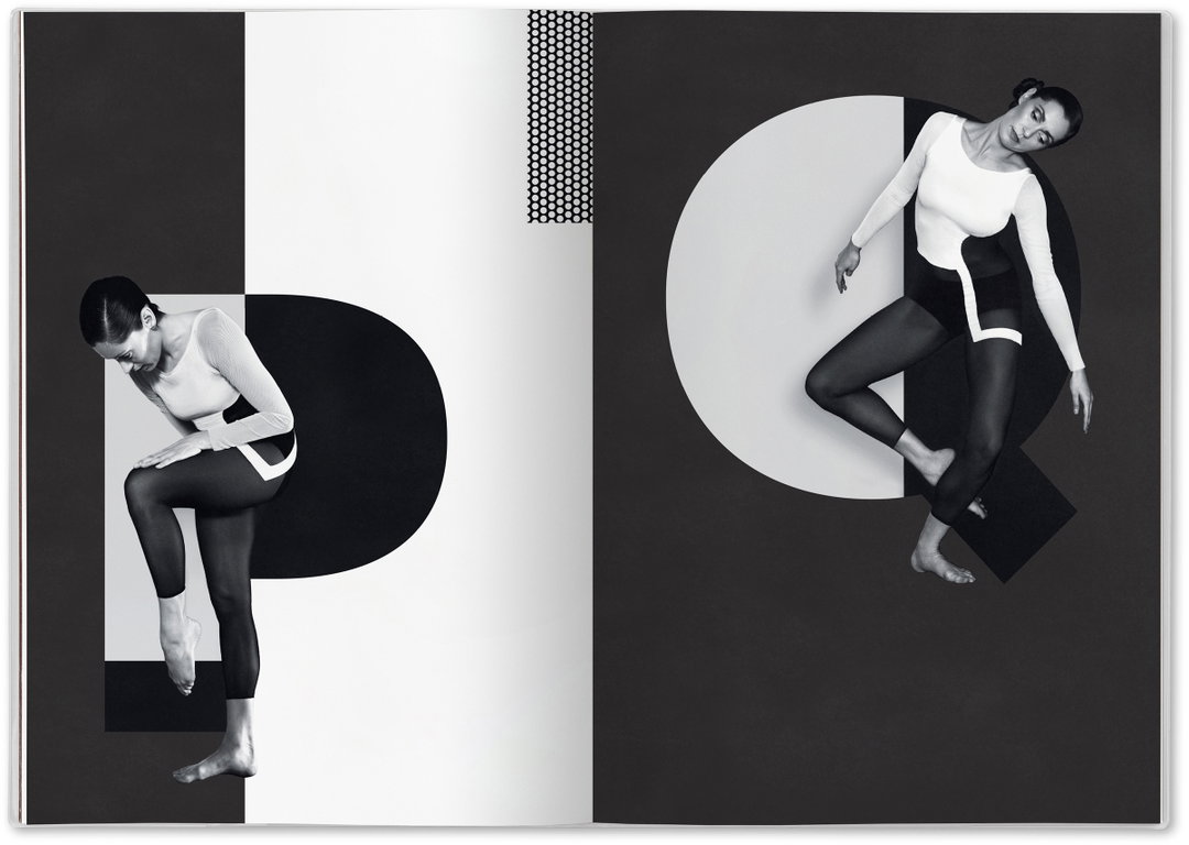
Abbott Miller: Dance Ink (Copyright © 2wice Arts Foundation, 2017)
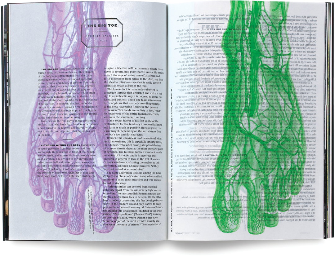
Abbott Miller: 2wice (Copyright © 2wice Arts Foundation, 1997)
Abbott, as designer and art director with editor Lise Friedman, and later editor, first set out to make Dance Ink a “space for performance” on the page rather than the stage. So rather than simply documenting existing choreography, the team worked with choreographers to create pieces for their very different canvas, which Abbott says was “liberating” for dancers and photographers alike. “It created clarity around the ‘event’ of the photoshoot. We aren’t documenting something that is already out in the world, we are creating a new piece. That idea, somewhat borrowed from improv or from site-specific installation art, was the thread across all of our projects, especially the apps (which came later), which took inspiration from the people we worked with, but had to consider the tablet as a new stage.”
The process of combing through his own work spanning decades was enlightening, and gave Abbott a chance to see the project’s evolution from a distance. “With Dance Ink I saw myself responding to the nature of the essays, but as we commissioned more and more photography, I wanted the typography to really interact with the imagery,” he explains. “When I look back I see how polite and even timid I was initially, and then you see the design become more assertive. That was not just a question of restraint, though, because I was really learning on the job. With Dance Ink it was about creating something that was visually cohesive within each issue. 2wice was different because I was developing the editorial as well as the visuals, so I needed thematic coherence as much as a visual thread.”
The website also allows this wide angle view of the work, much of which has never been seen before digitally, and provides another canvas – this time the web page – for the world of dance and performing arts to dabble with creatively. In this way, the archival portion of the site is just the start, Abbott concludes. “I would be the first to admit that the site prioritises the imagery over the narrative, and that is something I would like to re-balance over time. For the Foundation, the site gives a better understanding of the whole arc of work that we have accomplished, and it establishes a place where we can continue to share new work with a greater sense of the legacy that is already there.”
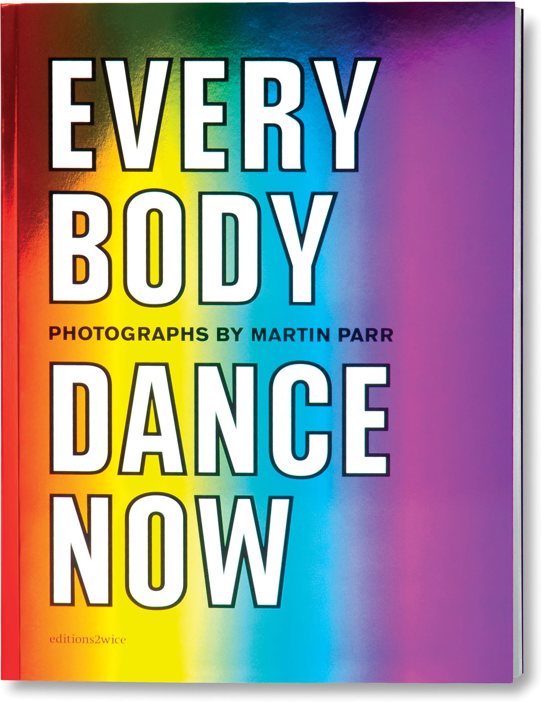
Abbott Miller: 2wice (Copyright © 2wice Arts Foundation, 2009)
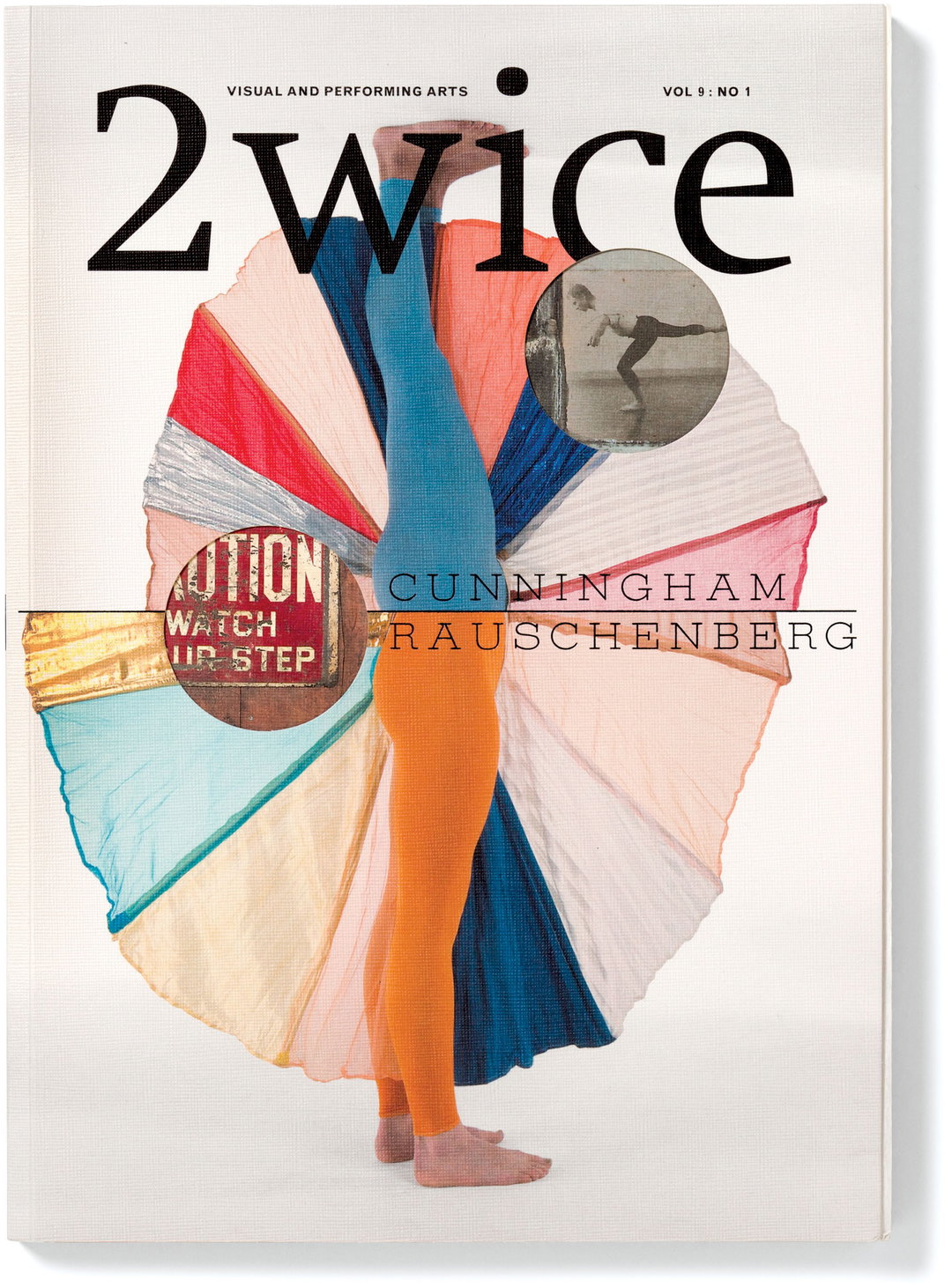
Abbott Miller: 2wice (Copyright © 2wice Arts Foundation, 2006)
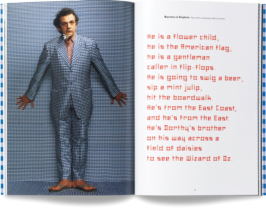
Abbott Miller: 2wice (Copyright © 2wice Arts Foundation, 2002)
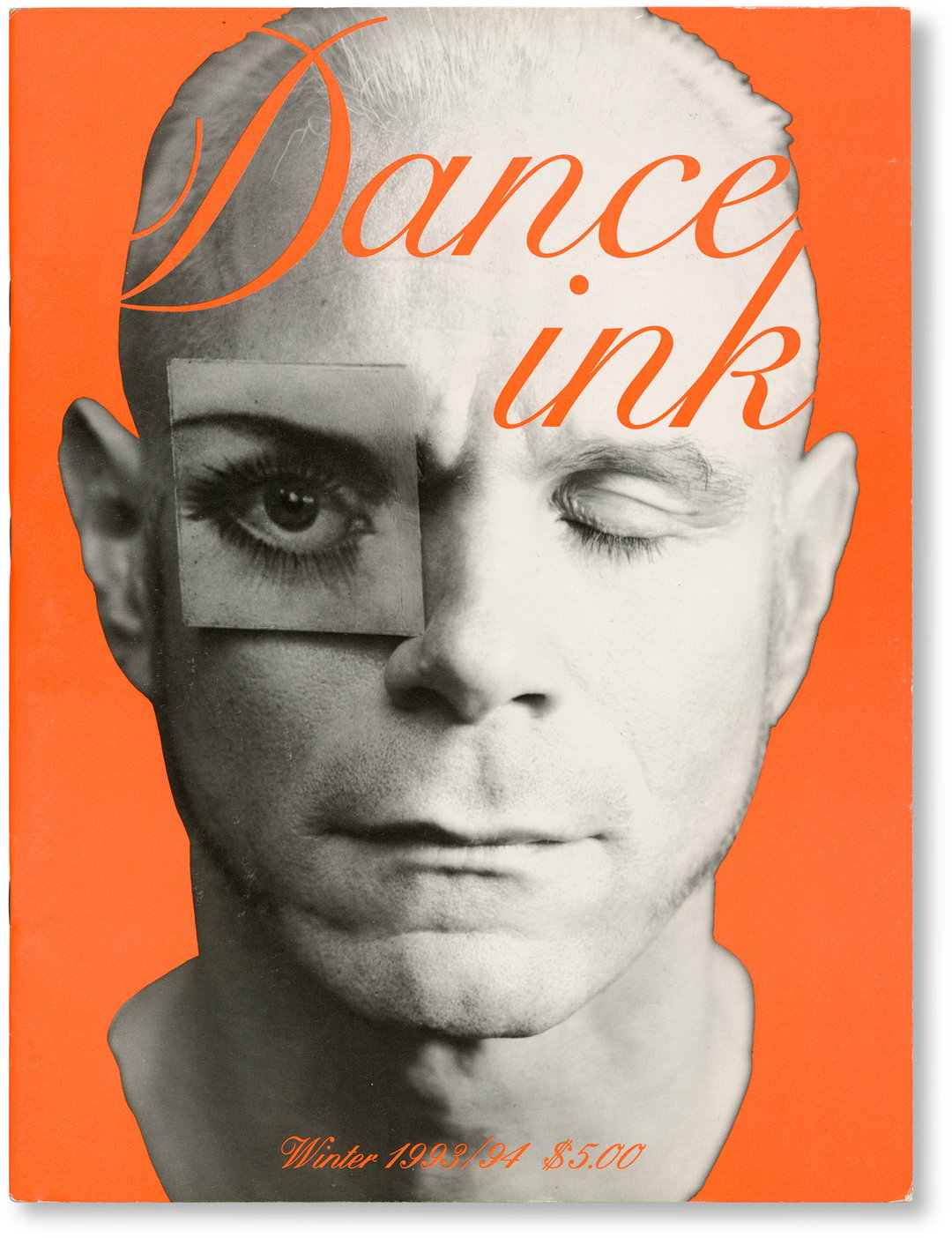
Abbott Miller: Dance Ink (Copyright © 2wice Arts Foundation, 1993)
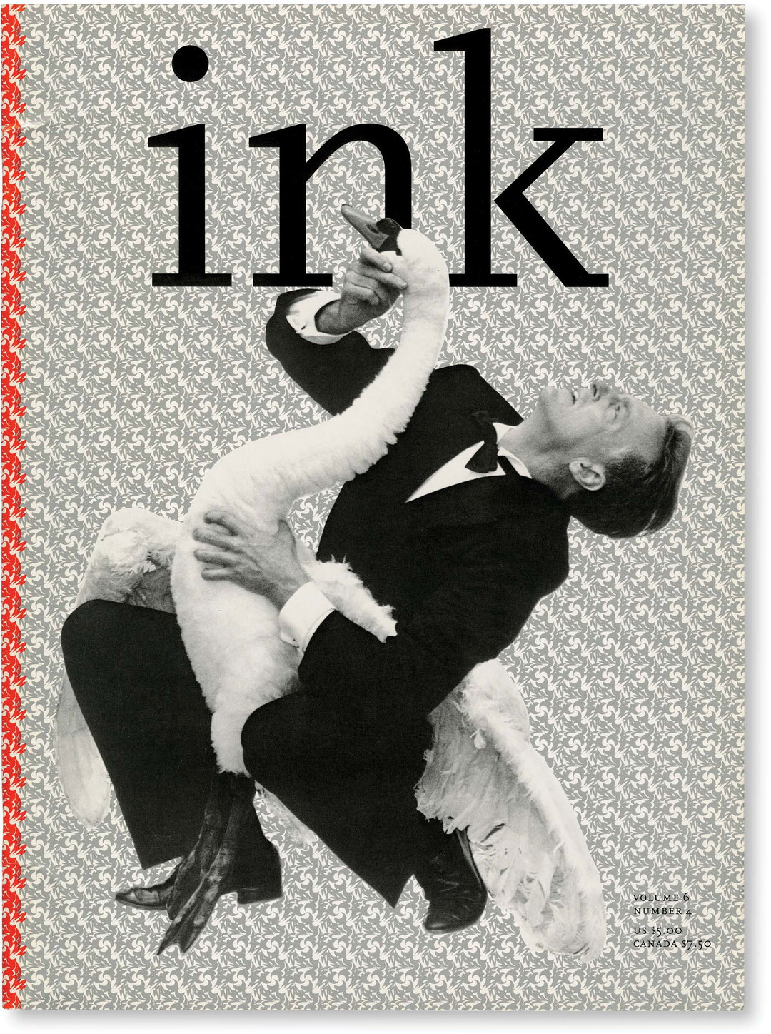
Abbott Miller: Dance Ink (Copyright © 2wice Arts Foundation, 1995)
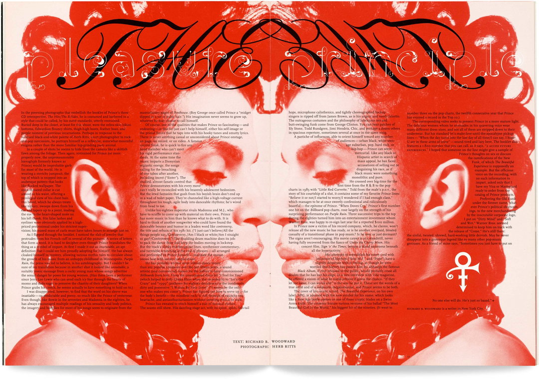
Abbott Miller: Dance Ink (Copyright © 2wice Arts Foundation, 1994)
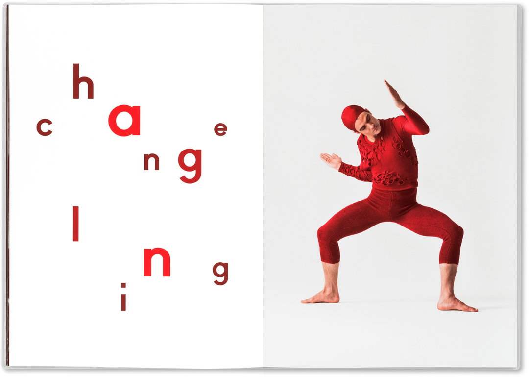
Abbott Miller: Dance Ink (Copyright © 2wice Arts Foundation, 2016)
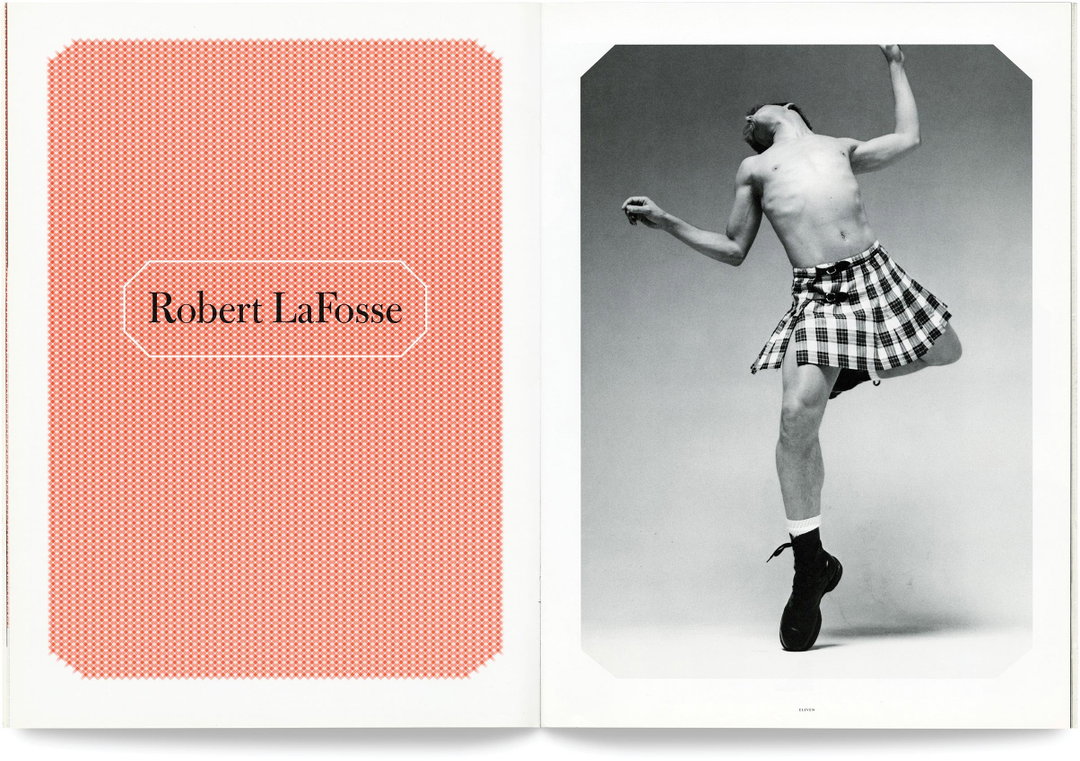
Abbott Miller: Dance Ink (Copyright © 2wice Arts Foundation, 1995)
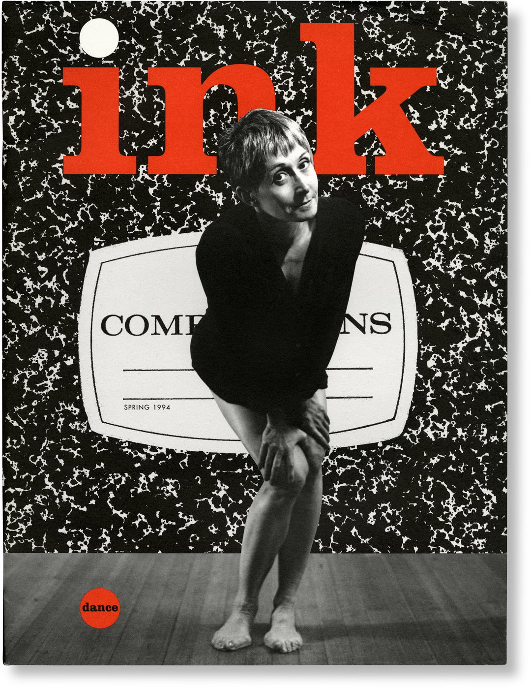
Abbott Miller: Dance Ink (Copyright © 2wice Arts Foundation, 1994)
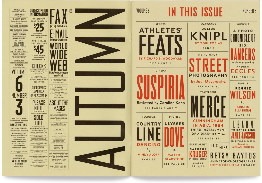
Abbott Miller: Dance Ink (Copyright © 2wice Arts Foundation, 1995)
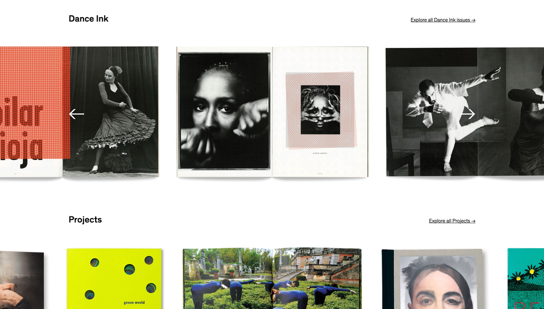
Abbott Miller: 2wice Arts Foundation website (Copyright © 2wice Arts Foundation, 2021)
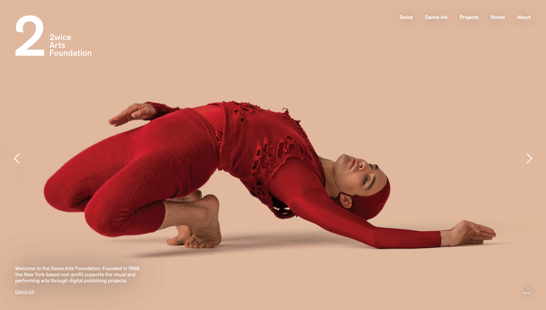
Abbott Miller: 2wice Arts Foundation website (Copyright © 2wice Arts Foundation, 2021)
Become an Extra Nice Supporter
Unlock an inspiring new way to explore It’s Nice That, get your hands on exclusive perks, and help bring meaningful creative projects to life.
Hero Header
Abbott Miller: 2wice (Copyright © 2wice Arts Foundation, 2002)
Share Article
Further Info
About the Author
—
Jenny oversees editorial output across It’s Nice That. Get in touch with writing pitches for features or opinion pieces, big creative story tips, or questions about all things editorial. [email protected]
To submit your work to be featured on the site, please see our Submissions Guide.