




Amateur(dot)rocks on the power of graphic design to incite political, social and cultural changes
“We love the idea of graphic design as a powerful tool to support and communicate points of view; be the visual and graphic voice of political, social and cultural changes,” says Amsterdam-based design studio Amateur(dot)rocks. Comprising of Jose Bessega and Ivo Pallucchini, both originally from San Juan, the studio has been undertaking commercial and experimental projects since its inception in 2013. While its outputs change – Amateur(dot)rocks works on campaigns, visual identities, packaging, publications and more – underpinning all of the studio’s work is a belief in the inherent relationship between design and words, placing typography at the heart of everything.
A major influence on the studio and its outlook are the several cities Jose and Ivo have been based in. Both born in San Juan where they grew up around the corner from each other, they have since lived and worked together in Cordoba, New York, Buenos Aires, Madrid, Lisbon and Berlin, before settling in Amsterdam last year. It’s a journey which has instilled a global and diverse perspective within the studio, something which is reflected in its work.
While working on big projects for brands such as Adidas, Amateur(dot)rocks still upholds a conceptual practice, meaning it also undertakes several non-commercial and self-initiated projects. “We are constantly pursuing projects that force us to go beyond the last project we did; no matter what the approach is, we need challenges and discomfort to let creativity come up,” Jose and Ivo tell us. “We try to find a balance between commissioned projects in which we focus on brand design and art direction and side projects that always involve in some point music, culture, art, politics or society.”
Amateur(dot)rocks: Periferia
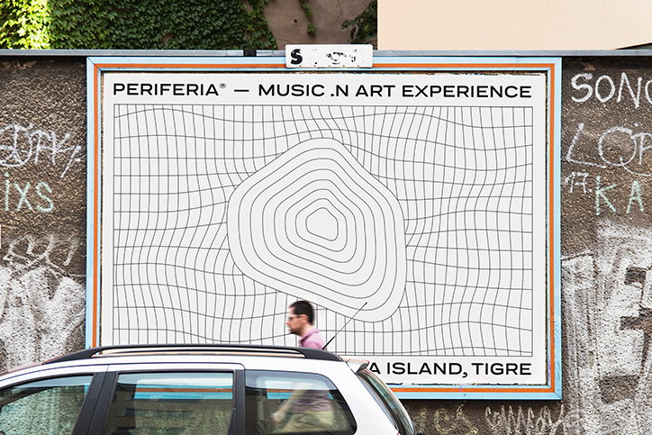
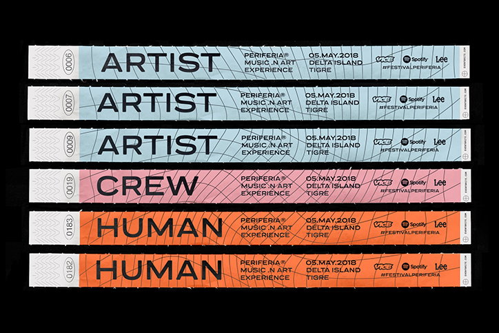
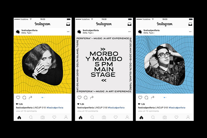
A project of Amateur(dot)rocks’ which particularly caught our eye is its identity for Periferia, a music festival on the island of Tigre Delta, just outside Buenos Aires. With a pink, blue and orange colour palette and a graphic system of vector shapes, it’s an identity which on the face of things appears simple, but which has tonnes of considered thought behind it.
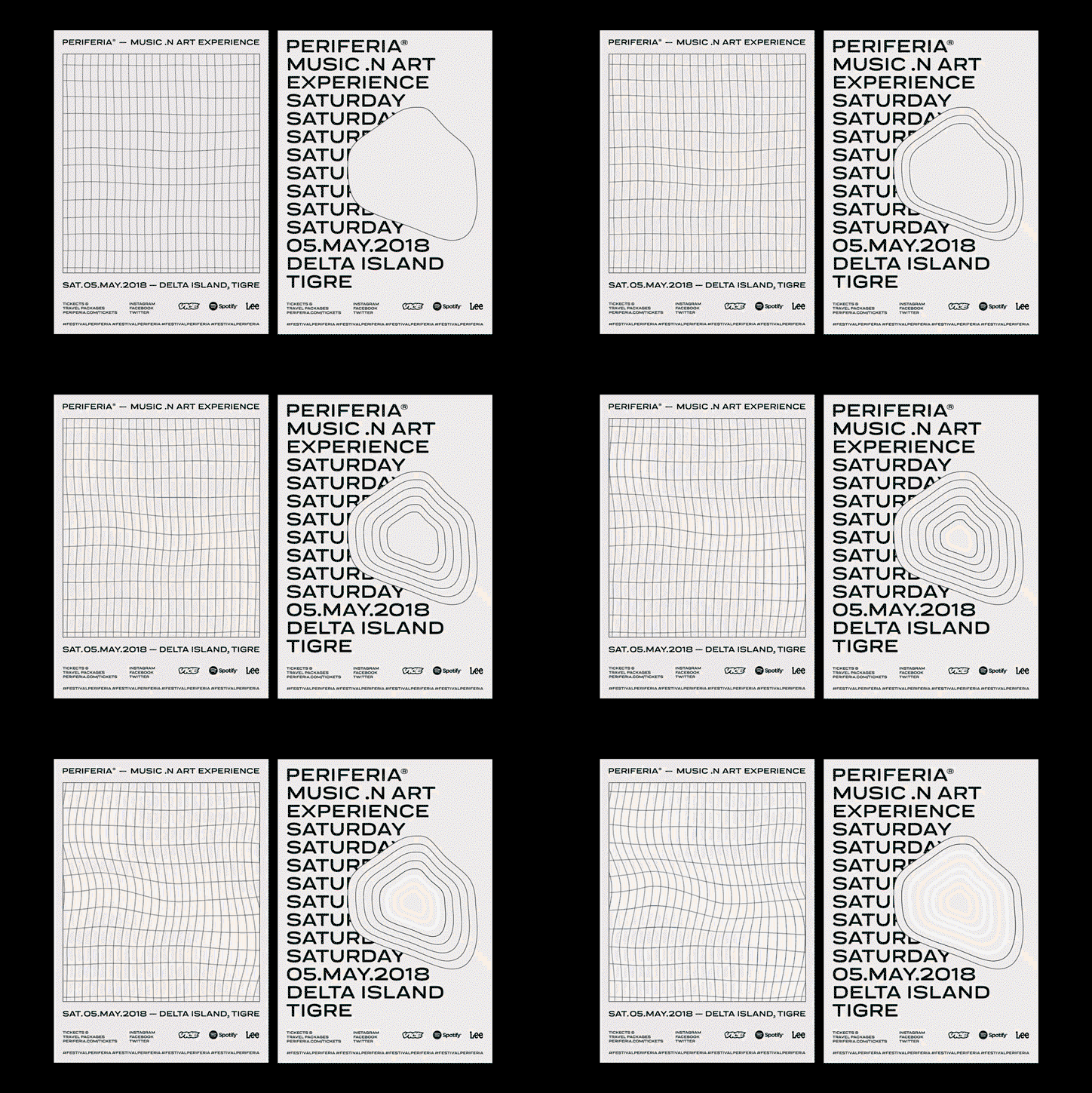
“Periferia (“outskirts” in English) is a variable concept that depends on each person,” the studio begins. “We decided to tackle this concept not only from the geographic point of view but also from the experiential perspective. Accordingly, the outskirts can be another town, country, the continent or for an astronaut, space; and at the same time it can be new personal experiences that demand to expand the mental and emotional limits.” In turn, Amateur(dot)rocks developed a concept playing with the morphology of the island, transforming it constantly to reflect different individuals’ experiences of the festival.
Amateur(dot)rocks outlines some more of its thinking: “This infinite expression lives together with a full typographic set, a dynamic and liquid grid coming from the waves alterations of the river and a wide colour palette inspired directly from the different sky shades (along a summer day) and the island landscapes.”
While this project incorporates bold, punchy graphic design into a rigid identity system, it’s by no means reflective of Amateur(dot)rocks’ portfolio at large. Not confined to one visual style, the studio instead takes each project as it comes, morphing its thinking and visual output accordingly. “Every project demands its voice and aesthetic,” the studio adds on this. It does, however, conclude that: “Going through our work, we can see certain visual consistency between projects, especially in the typography, universality, boldness, and no over-designing.”
Amateur(dot)rocks: Periferia
Amateur(dot)rocks: Periferia
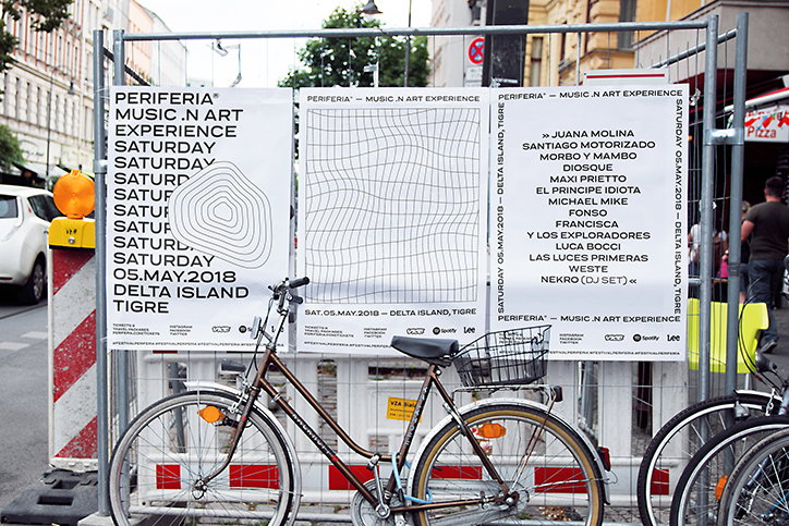
Amateur(dot)rocks: Periferia
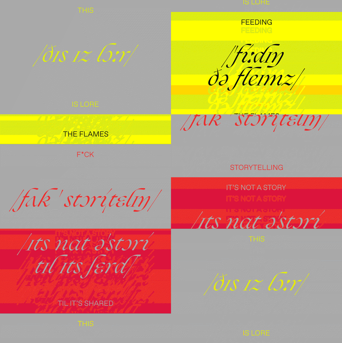
Amateur(dot)rocks: Studio Lore
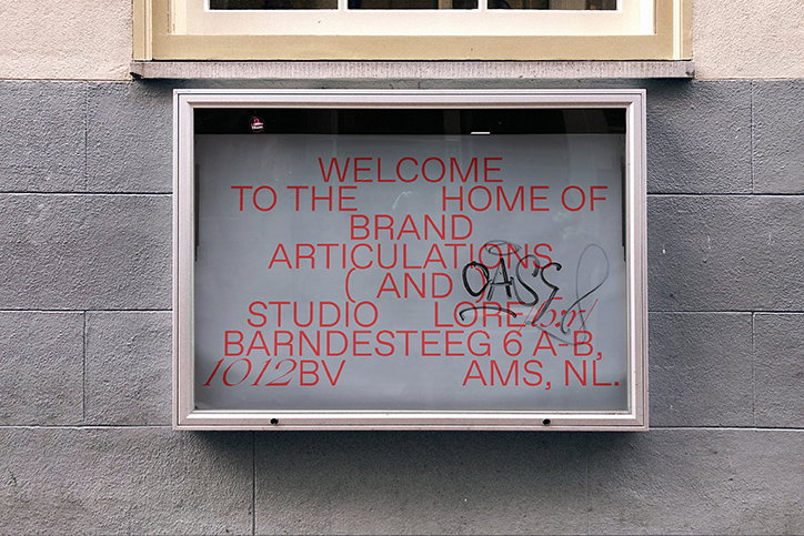
Amateur(dot)rocks: Studio Lore
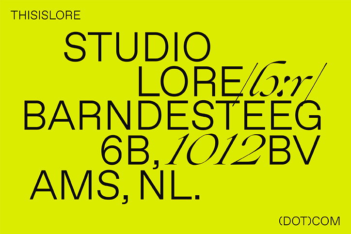
Amateur(dot)rocks: Studio Lore
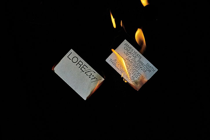
Amateur(dot)rocks: Studio Lore
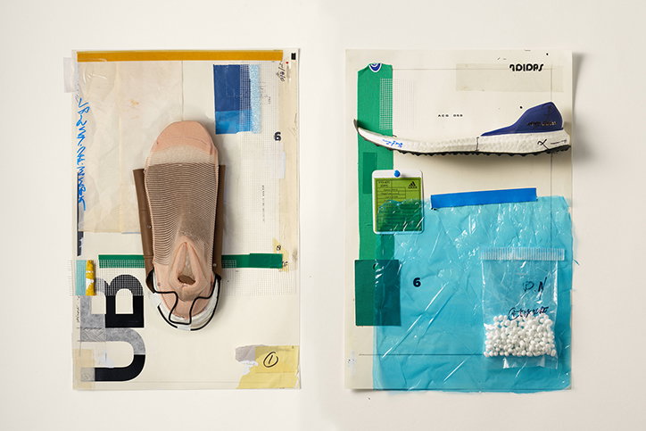
Amateur(dot)rocks: Adidas UB19
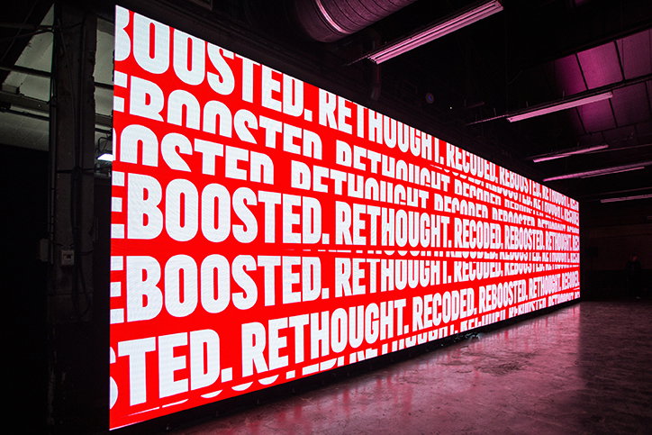
Amateur(dot)rocks: Adidas UB19
Share Article
Further Info
About the Author
—
Ruby is Senior Creative at It's Nice That, overseeing our visual output across platforms and projects. Before that, she was associate editor on the editorial team, after joining in September 2017 following graduation from Central Saint Martins.